Is there any post on this blog that doesn’t have to do with scaling the DNB or NCC?
I was going to title this post “Revisiting ‘Revisiting “Revisiting Scaling on the Solstice”‘”, but that would just be ridiculous. Besides the fact that we just passed an equinox (and are months away from a solstice), this post is more of a follow-up to our very first post.
If that was an introduction, this is a graduate level course. Well, maybe not. It won’t take a whole semester to read through this, unless you are a really slow reader. But, since Near Constant Contrast (NCC) imagery is coming to AWIPS in the very near future, now is a good time to prepare for what’s coming.
We start off with some good news: NCC imagery is coming to AWIPS! NCC imagery provides an alternative to ERF-Dynamic Scaling, CSPP Adaptive Scaling and whatever this is:
(I know that the above image uses the “Histogram Equalization” algorithm that was developed for CSPP originally. I was just being dramatic.) NCC imagery is an operational product, not some fly-by-night operation from CIRA or CIMSS (who both do great work, by the way).
Now the bad news: NCC imagery as viewed in AWIPS might not be the best thing since sliced bread. It may not solve all of our problems. To understand why, you have to know the inner workings of AWIPS (which I don’t) and the inner workings of the NCC EDR product (which I do).
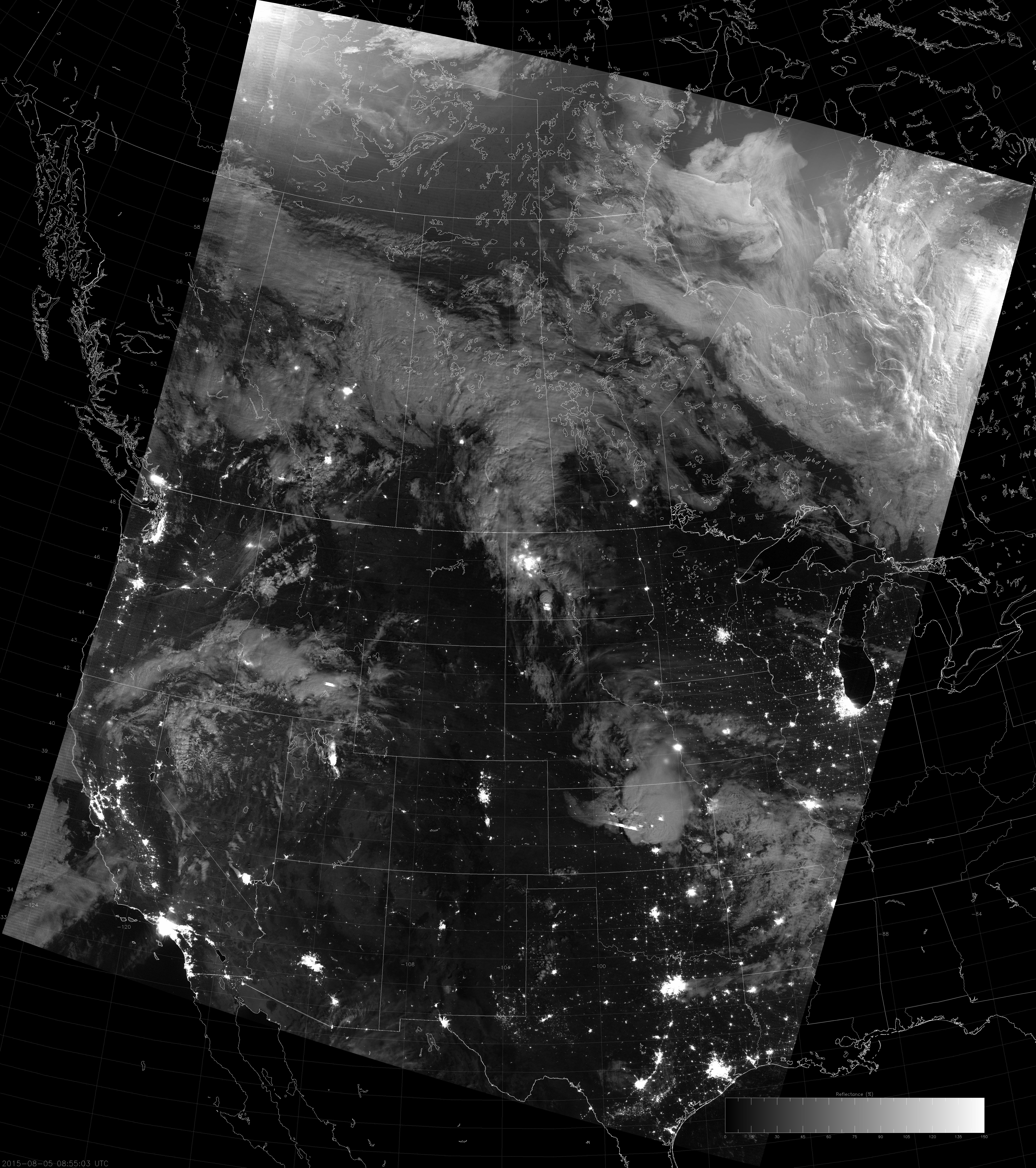
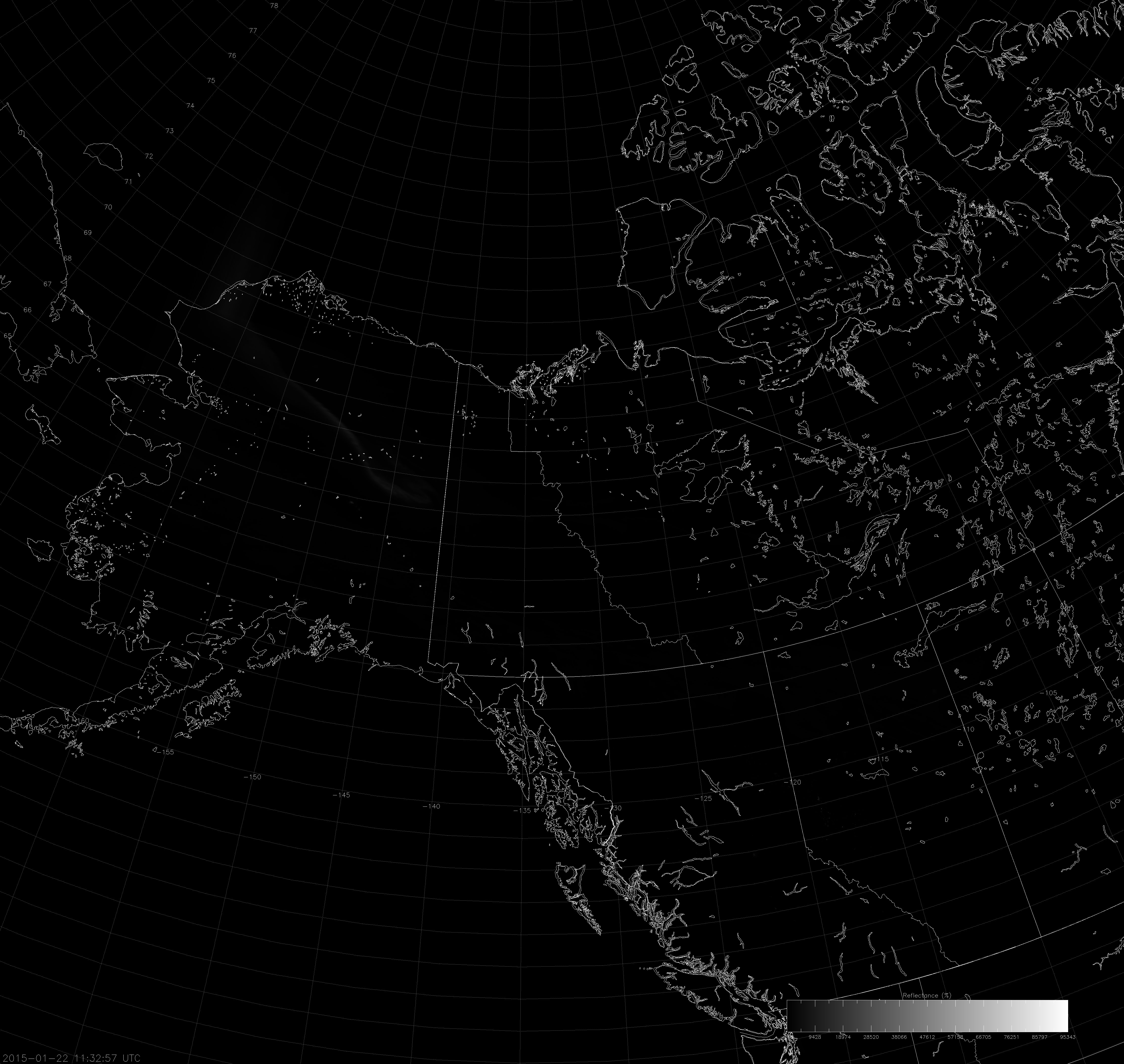
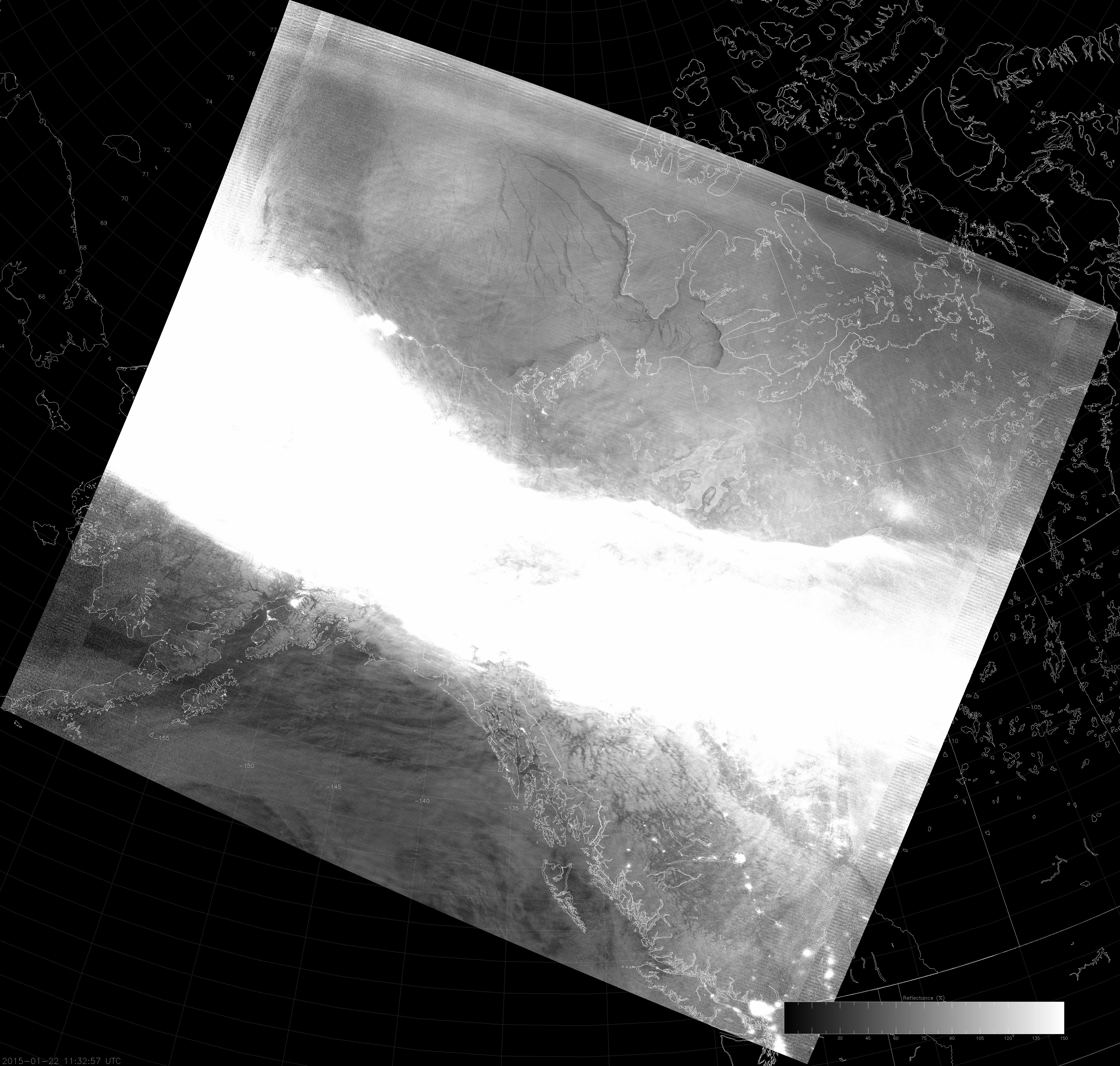
Here’s a first look at the NCC product as displayed in AWIPS:
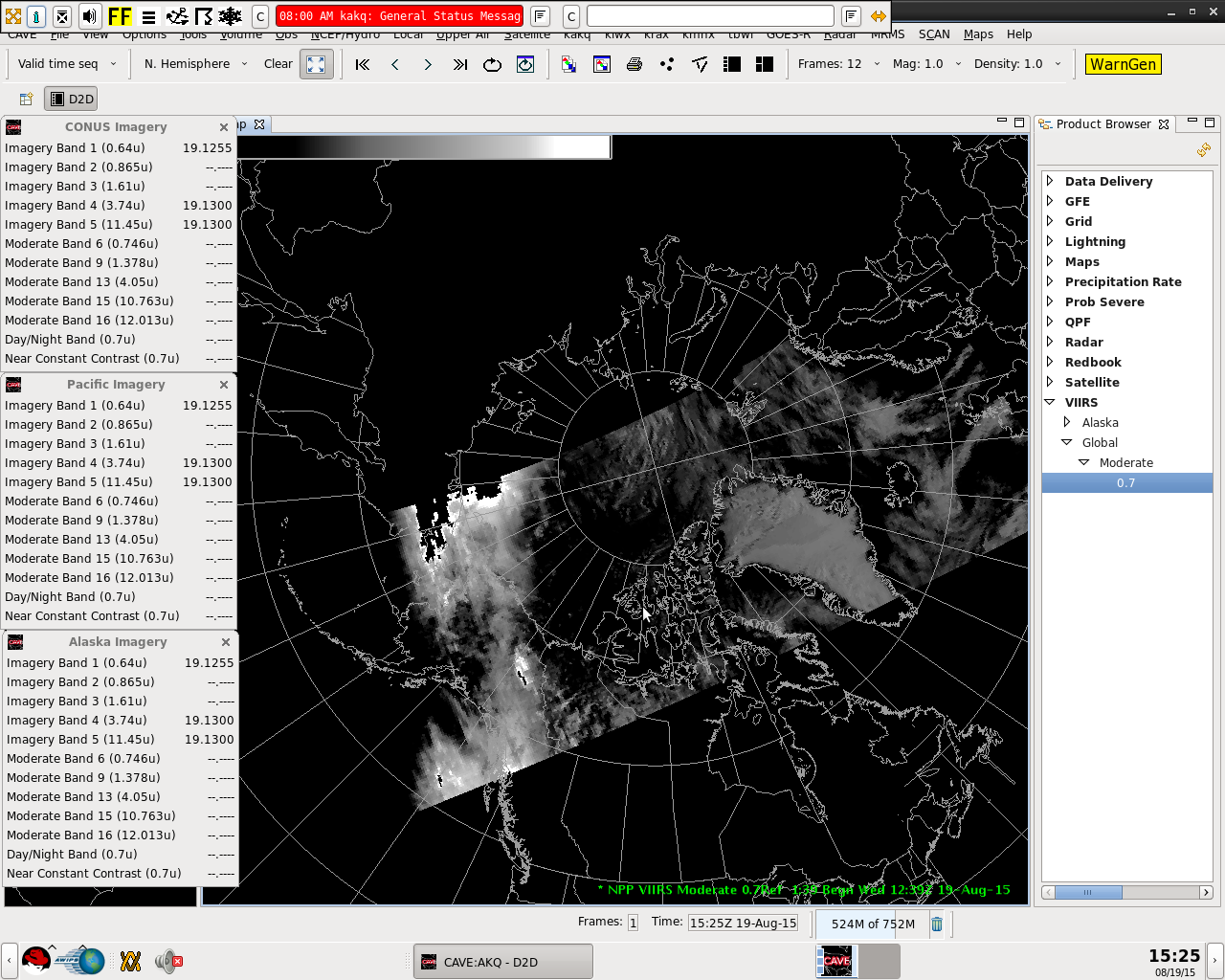
Notice the bright area of clouds northwest of Alaska that suddenly become black. Also notice the background surface just looks black, except for the Greenland Ice Sheet. These are examples of two different (but related) issues: the first being that AWIPS is blacking out areas where the image is saturated (the maximum value on the scaling bounds is too low), the second being that, at the low end of the scale, the image detail is lost (either the minimum value on the scaling bounds is too high, or AWIPS uses too few shades of gray in the display, which means you lose sensitivity to small changes in value).
If you read the first post on this blog (that I linked to), or you read my previous posts about ERF-Dynamic Scaling, you know that the primary problem is this: the VIIRS Day/Night Band is sensitive to radiance values that span 8 orders-of-magnitude from full sunlight down to the levels of light observed during a new moon at night. Most image display software, of which AWIPS is an example, are capable of displaying only 256 colors (or 96 colors if you use N-AWIPS). How do you present an 8-order-of-magnitude range of values in 256 colors without losing information?
Near Constant Constrast imagery does this by modeling the sun and moon to convert the Day/Night Band radiance values into a “pseudo-albedo”. Albedo (aka reflectance) is simply the percentage of incoming solar (and lunar) radiation that is reflected back to the satellite, so you end up with a decimal number between 0 and 1. That’s easy enough to display, but we’re not done. What happens when there is no moonlight at night because the moon is below the horizon (or it’s a new moon)? What happens when there is a vivid aurora, or bright city lights, or gas flares or fires? These light sources can all be several orders of magnitude brighter than the moon, especially when there is no moonlight. There are lots of light sources at night that the DNB detects that aren’t reflecting light – they’re emitting it. That’s why the NCC doesn’t provide a true albedo value.
When VIIRS first launched into space, the NCC algorithm assumed that pseudo-albedo values over the range from 0 to 5 would be sufficient to cover all these light sources, but that turned out to be incorrect. If you weren’t within a few days of a full moon, images contained fill values (no valid data) because these myriad light sources fell outside the allowed range of 0 to 5. It took a lot of work by the VIIRS Imagery Team to fix this and get the NCC algorithm to where it stands now. And where it stands now is that pseudo-albedo values are allowed to vary over the range from -10 to 1000. (The “-10” accounts for the occasional negative radiance in the DNB data and the “1000” allows for light sources up to three orders of magnitude brighter than the moon.) Now, the images don’t saturate or get blanked out by fill values at night away from a full moon. But, the range from -10 to 1000 still presents a challenge for those who want to display images properly.
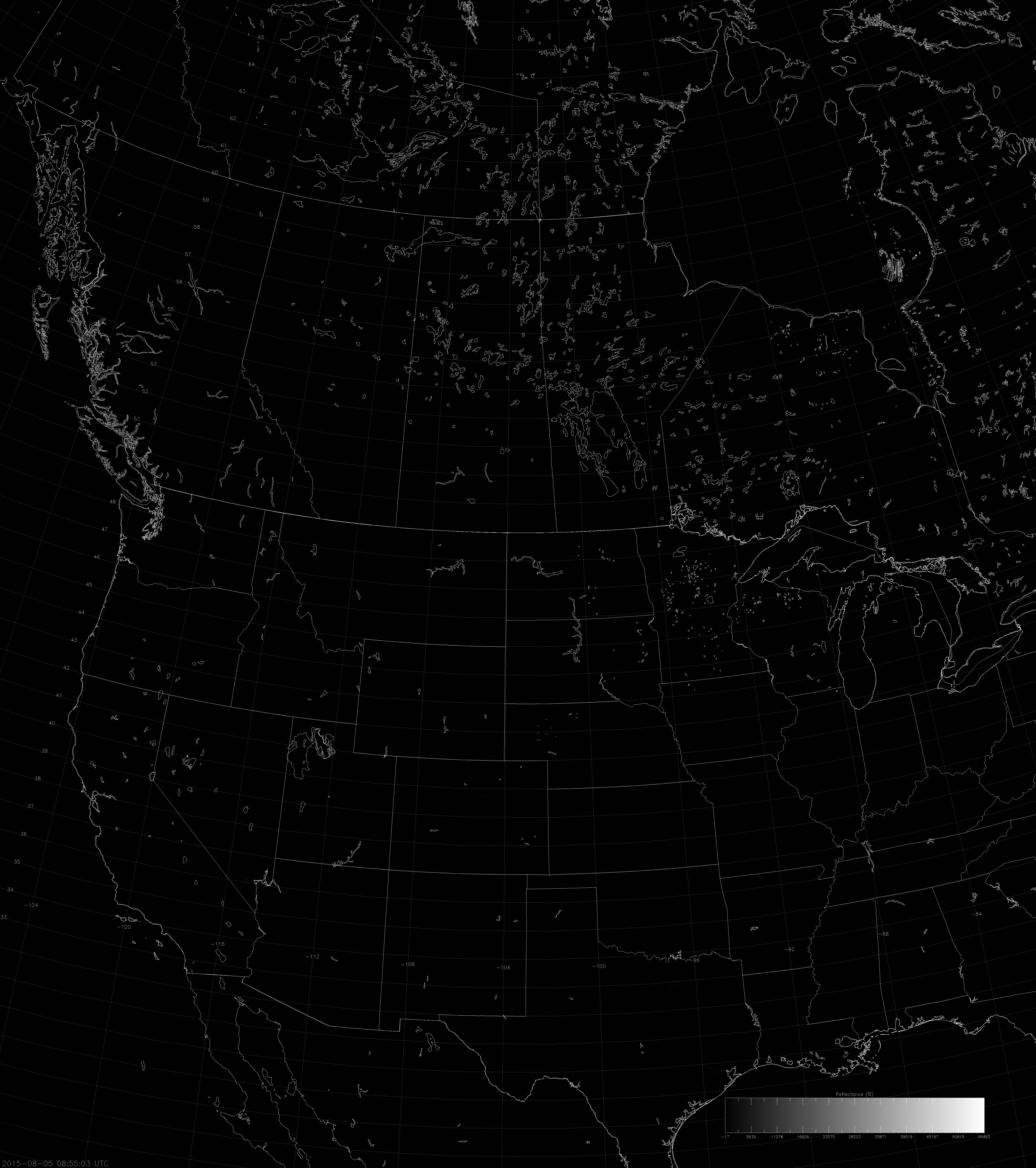
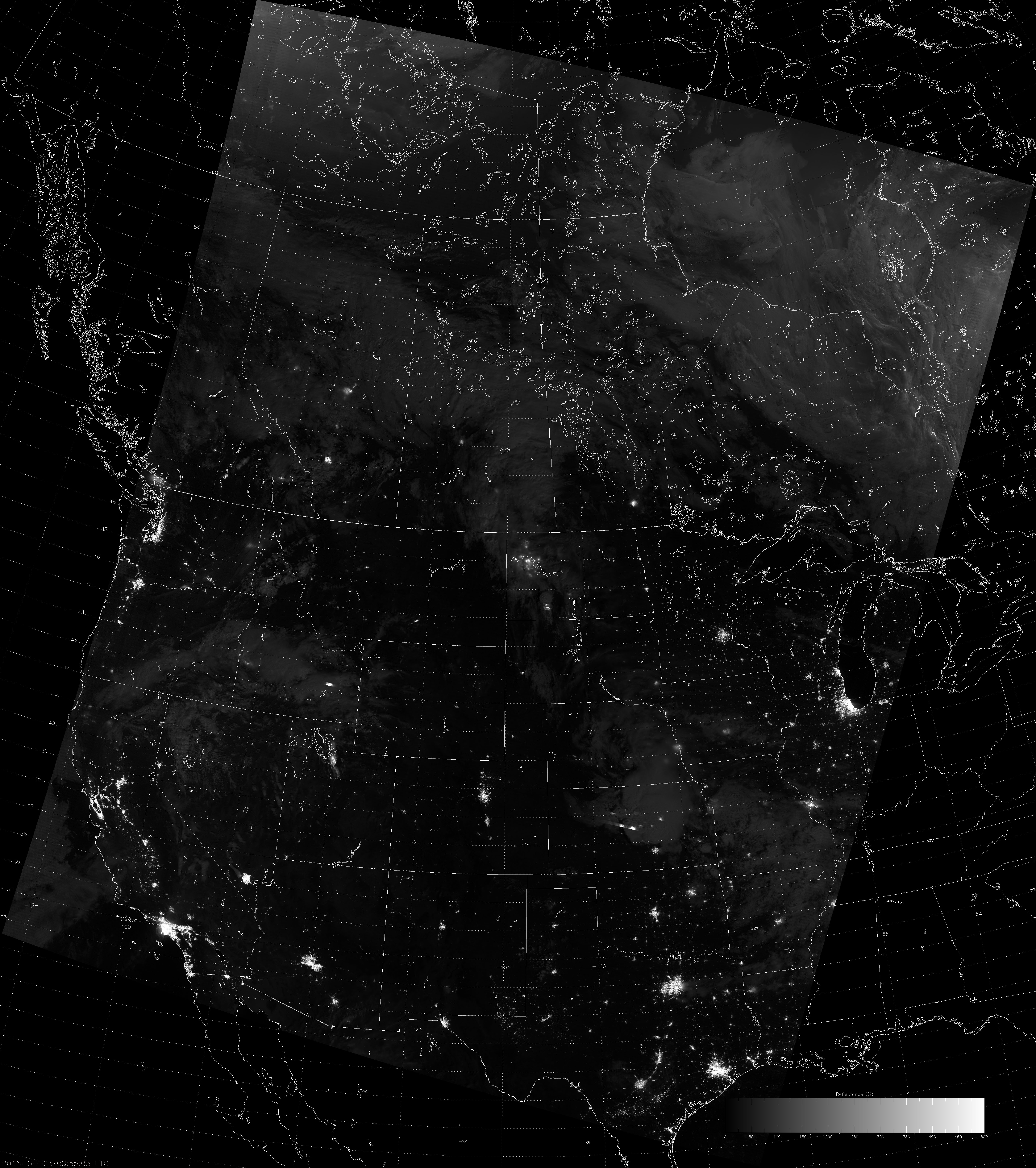
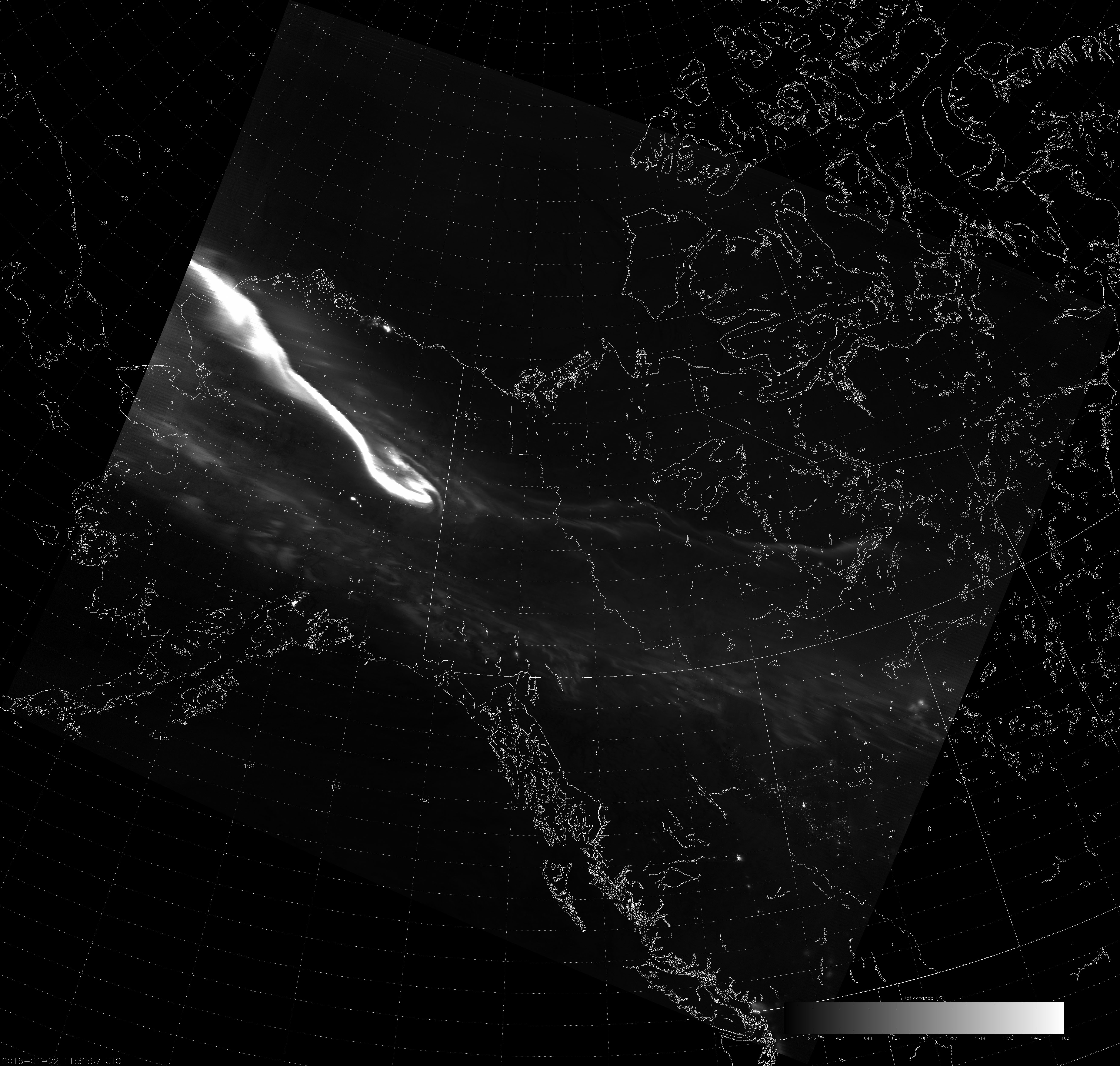
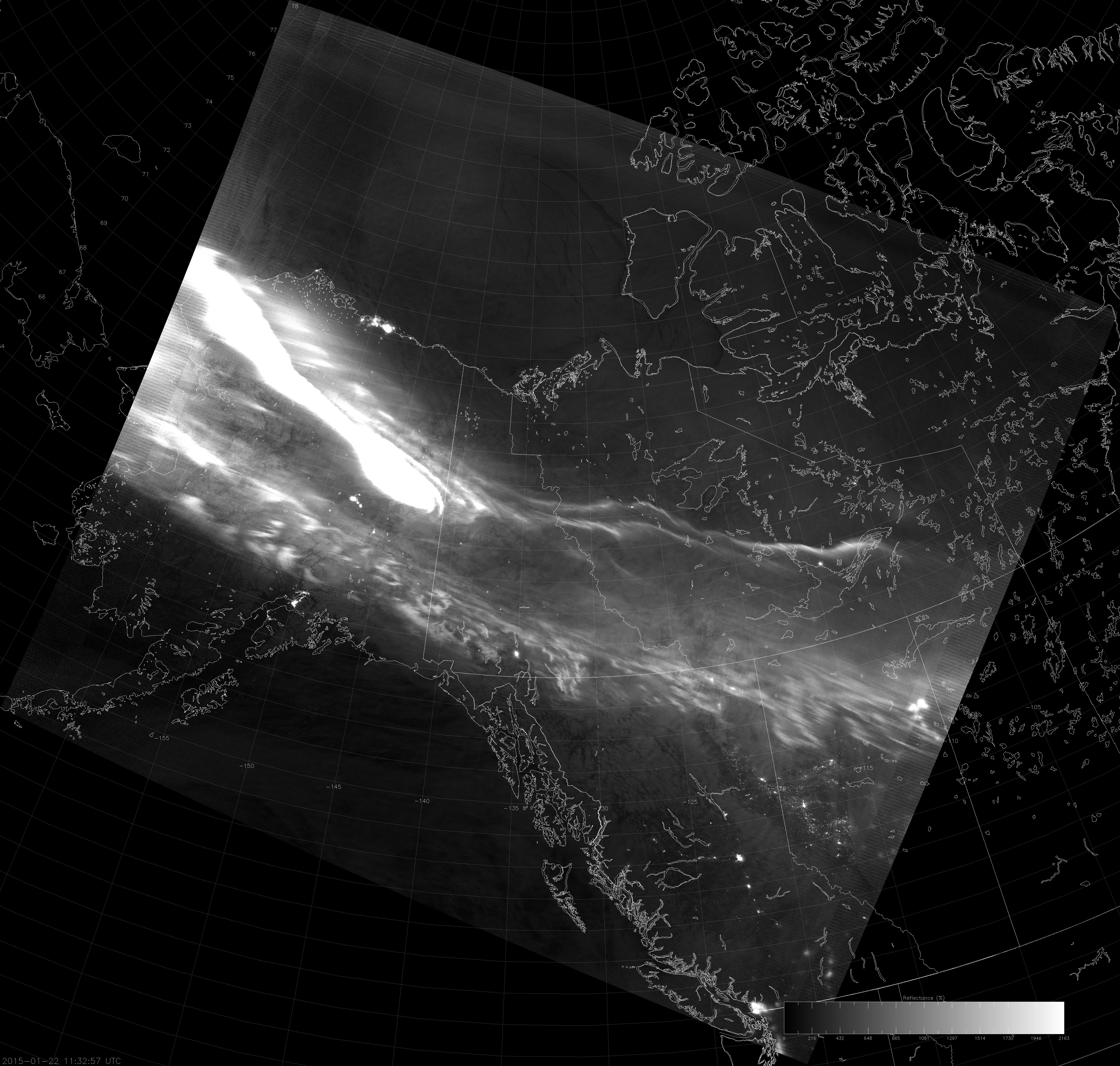
To show this, here are the same three VIIRS NCC images linearly scaled between the full range of values (-10 to 1000), the original range of values (0 to 5) and the ideal range of values (which was subjectively determined for this scene):
Can you see the one pixel that shows up in the above scaling? (There is one pixel with a value over 900.)
Now you can start to see some cloud features and the city lights, but this image still looks too dark.
Now we’re talking!
The above images were taken when there was moonlight available. What happens when there is no moonlight?
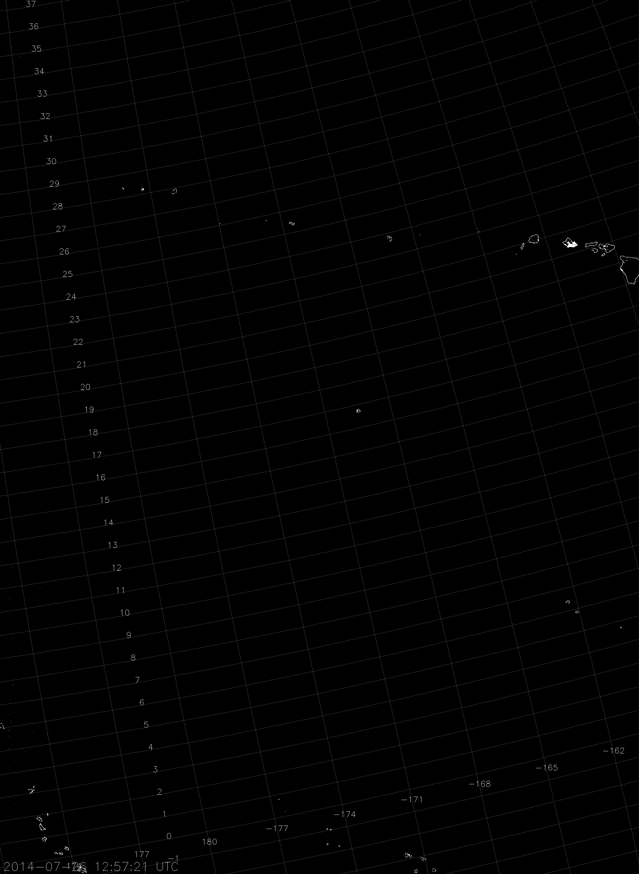
Scaling over the full range of values means you only see the city lights of Honolulu and the islands drawn on the map.
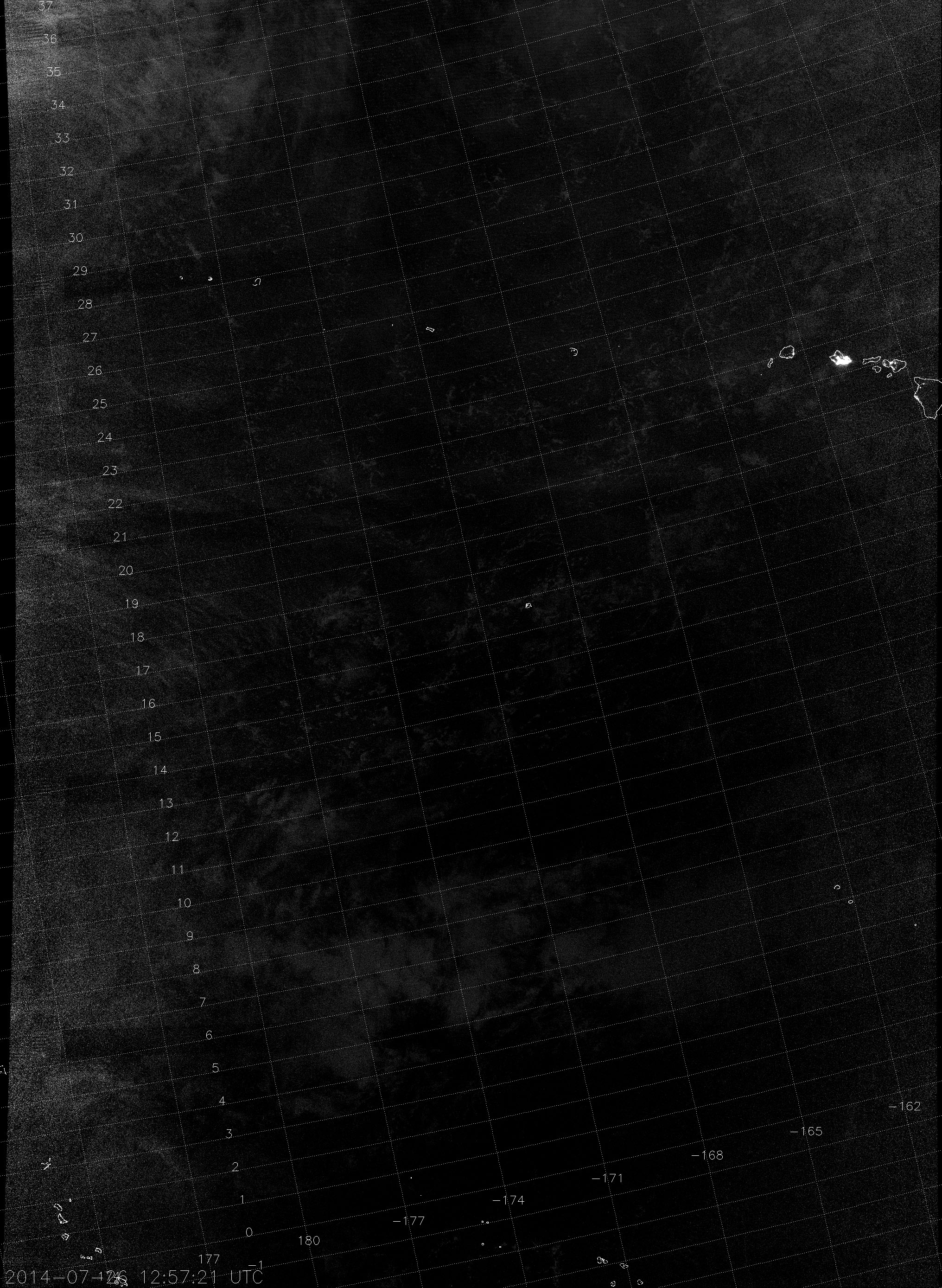
Scaling from 0 to 1 is better, but I would argue that it’s still too dark. Let’s stretch it further.
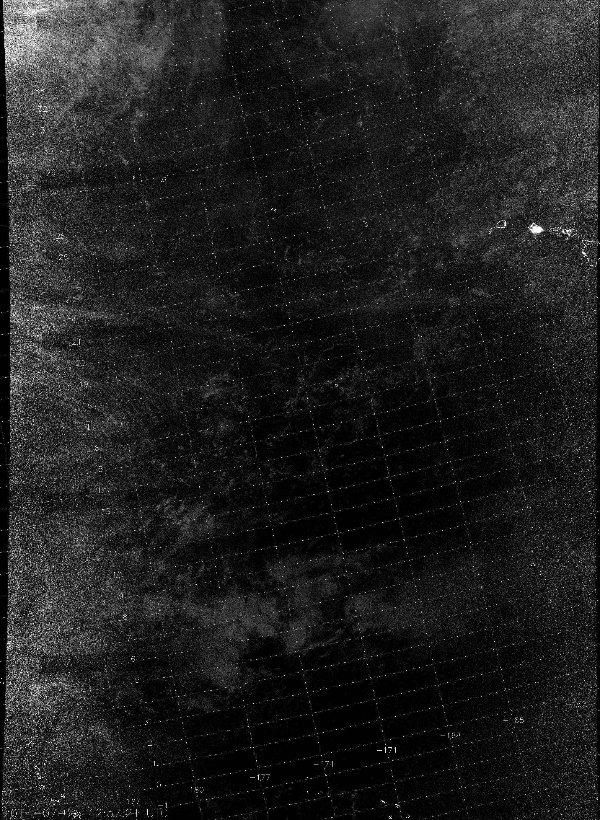
This is about as good as you can do without the image becoming too noisy.
And, of course, the presence of the aurora gives yet another result:
Can you see the aurora over northern Alaska? Maybe just barely. Once again, scaling over the full range of values doesn’t work (just like it wouldn’t for the DNB radiance values). What about using the scale of 0 to 1.5? It worked before…
GAHH! I’m blinded! Although, you can see the clouds over the Gulf of Alaska pretty easily as well as ice leads in the Arctic Ocean. But, the aurora is too bright and you can’t see any details over most of Alaska.
It turns out, in order to prevent the aurora from saturating this scene, the image needs to be scaled over a range of 0 to 21:
But, notice that you lose the detail of the cloud field over the Gulf of Alaska and the ice over the Arctic Ocean. This is a difficult case to scale correctly. More on that later.
So, we’ve seen that the optimum scaling bounds vary from scene to scene. The 0 to 1.5 scale seems to work for daytime and full moon scenes. New moon scenes require a scale more like 0 to 0.5 (or thereabouts) to be able to detect clouds, snow and ice. And the occasional scene requires a totally different scale altogether. Wouldn’t it be great if there were some way to automate this, so we wouldn’t have to keep fussing with the scaling on every image?
I’m here to say, “there might be.” And, it’s called “Auto Contrast.” The idea is to do what Photoshop and other image editing software do when they “automatically” improve the contrast in the image. The idea is to take the NCC image data, scaled over a range from 0 to 2, for example, bump up the maximum value bound of the scaling with the same kind of adjustment the ERF-Dynamic Scaling uses to prevent saturation in auroras, then apply something similar to Photoshop’s Auto Contrast algorithm to create the ideal scene contrast. Here’s what Auto Contrast does for the three cases above:


For the first two cases, Auto Contrast is very similar to the subjectively determined “ideal scaling”. For the aurora case, we can see that Auto Contrast is a compromise between “not allowing the aurora to saturate” and “allowing the aurora to saturate half of the image.” The aurora does saturate a portion of the scene, but you can still see ice on the Arctic Ocean and clouds over the Gulf of Alaska when you look closely.
Of course, there are a few caveats:
1) Auto Contrast has not been fully tested. These results are promising enough that I wanted to share it right away, but it might not produce ideal results in all cases. We are continuing to investigate this.
2) Sometimes, the image has poor contrast that Auto Contrast can’t fix. For example, a new moon case over land where there are lots of city lights or a vivid aurora. Non-city areas will be more like the Hawaii case, where clouds have pseudo-albedo value between 0 and 0.5, and the city lights or aurora will have pseudo-albedo values well over 100. If you stretch the scaling enough to see the clouds, you’ll be blinded by the city lights. If you scale it to the city lights, you won’t see the clouds or snow or ice.
3) Individual users may not care that the aurora saturated half the image in the third example because they can see the clouds and ice just fine. Auto Contrast makes the clouds and ice darker and harder to see. This is example of how “ideal contrast” not only varies scene to scene, but also from one user application to another. Pretty pictures are not always the same thing as usable images.
4) Demonstrating the utility of “Auto Contrast” is not the same thing as getting the algorithm up and running within AWIPS. (Or, sending files to AWIPS that have optimized contrast.) The JPSS Imagery Team is working with the developers of the AWIPS NCC product to improve how it is displayed, but it will likely take some time.
While it’s not clear how the NCC images are currently scaled in AWIPS, they almost certainly use a fixed scale. However, the examples shown here make it clear that the scaling needs to adjust from scene to scene – even if Auto Contrast is not the ultimate solution. So while we work to figure this out, if the NCC imagery looks sub-optimal in your AWIPS system, you know why.
One final thought: the Auto Contrast algorithm is designed to work with any image, not just NCC images. It’s possible that DNB images created with ERF-Dynamic Scaling may be improved with Auto Contrast as well. But, that’s a topic for another blog post about image scaling for the future. I may yet title a post “Revisiting ‘Revisiting “Revisiting Scaling on the Solstice”‘”.