A Graduate Level Course on DNB and NCC

Is there any post on this blog that doesn’t have to do with scaling the DNB or NCC?

I was going to title this post “Revisiting ‘Revisiting “Revisiting Scaling on the Solstice”‘”, but that would just be ridiculous. Besides the fact that we just passed an equinox (and are months away from a solstice), this post is more of a follow-up to our very first post.

If that was an introduction, this is a graduate level course. Well, maybe not. It won’t take a whole semester to read through this, unless you are a really slow reader. But, since Near Constant Contrast (NCC) imagery is coming to AWIPS in the very near future, now is a good time to prepare for what’s coming.

We start off with some good news: NCC imagery is coming to AWIPS! NCC imagery provides an alternative to ERF-Dynamic Scaling, CSPP Adaptive Scaling and whatever this is:
Example VIIRS DNB image displayed in AWIPS using the Histogram Equalization method
Example VIIRS DNB image displayed in AWIPS using the Histogram Equalization method. Courtesy Eric Stevens (UAF/GINA).

(I know that the above image uses the “Histogram Equalization” algorithm that was developed for CSPP originally. I was just being dramatic.) NCC imagery is an operational product, not some fly-by-night operation from CIRA or CIMSS (who both do great work, by the way).

Now the bad news: NCC imagery as viewed in AWIPS might not be the best thing since sliced bread. It may not solve all of our problems. To understand why, you have to know the inner workings of AWIPS (which I don’t) and the inner workings of the NCC EDR product (which I do).

Here’s a first look at the NCC product as displayed in AWIPS:
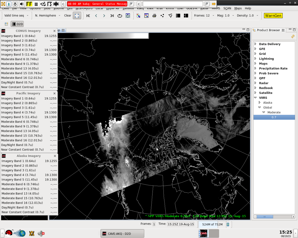
Example NCC image (12:39 UTC 19 August 2015) displayed in AWIPS II
Example NCC image (12:39 UTC 19 August 2015) displayed in AWIPS II. Image courtesy John Paquette (NOAA).

Notice the bright area of clouds northwest of Alaska that suddenly become black. Also notice the background surface just looks black, except for the Greenland Ice Sheet. These are examples of two different (but related) issues: the first being that AWIPS is blacking out areas where the image is saturated (the maximum value on the scaling bounds is too low), the second being that, at the low end of the scale, the image detail is lost (either the minimum value on the scaling bounds is too high, or AWIPS uses too few shades of gray in the display, which means you lose sensitivity to small changes in value).

If you read the first post on this blog (that I linked to), or you read my previous posts about ERF-Dynamic Scaling, you know that the primary problem is this: the VIIRS Day/Night Band is sensitive to radiance values that span 8 orders-of-magnitude from full sunlight down to the levels of light observed during a new moon at night. Most image display software, of which AWIPS is an example, are capable of displaying only 256 colors (or 96 colors if you use N-AWIPS). How do you present an 8-order-of-magnitude range of values in 256 colors without losing information?

Near Constant Constrast imagery does this by modeling the sun and moon to convert the Day/Night Band radiance values into a “pseudo-albedo”. Albedo (aka reflectance) is simply the percentage of incoming solar (and lunar) radiation that is reflected back to the satellite, so you end up with a decimal number between 0 and 1. That’s easy enough to display, but we’re not done. What happens when there is no moonlight at night because the moon is below the horizon (or it’s a new moon)? What happens when there is a vivid aurora, or bright city lights, or gas flares or fires? These light sources can all be several orders of magnitude brighter than the moon, especially when there is no moonlight. There are lots of light sources at night that the DNB detects that aren’t reflecting light – they’re emitting it. That’s why the NCC doesn’t provide a true albedo value.

When VIIRS first launched into space, the NCC algorithm assumed that pseudo-albedo values over the range from 0 to 5 would be sufficient to cover all these light sources, but that turned out to be incorrect.  If you weren’t within a few days of a full moon, images contained fill values (no valid data) because these myriad light sources fell outside the allowed range of 0 to 5. It took a lot of work by the VIIRS Imagery Team to fix this and get the NCC algorithm to where it stands now. And where it stands now is that pseudo-albedo values are allowed to vary over the range from -10 to 1000. (The “-10” accounts for the occasional negative radiance in the DNB data and the “1000” allows for light sources up to three orders of magnitude brighter than the moon.) Now, the images don’t saturate or get blanked out by fill values at night away from a full moon. But, the range from -10 to 1000 still presents a challenge for those who want to display images properly.

To show this, here are the same three VIIRS NCC images linearly scaled between the full range of values (-10 to 1000), the original range of values (0 to 5) and the ideal range of values (which was subjectively determined for this scene):
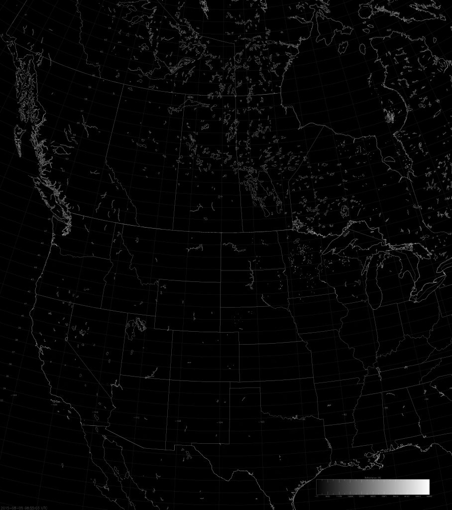
Example VIIRS NCC image (08:55 UTC 5 August 2015) linearly scaled between -10 and 1000
Example VIIRS NCC image (08:55 UTC 5 August 2015) linearly scaled between -10 and 1000.

Can you see the one pixel that shows up in the above scaling? (There is one pixel with a value over 900.)
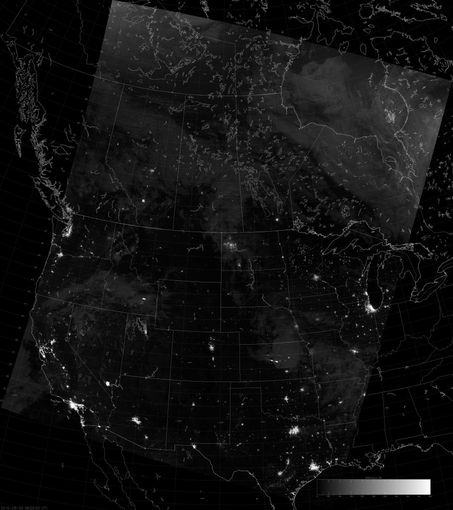
Example VIIRS NCC image (08:55 UTC 5 August 2015) scaled between 0 and 5
Example VIIRS NCC image (08:55 UTC 5 August 2015) scaled between 0 and 5.

Now you can start to see some cloud features and the city lights, but this image still looks too dark.

Example VIIRS NCC image (08:55 UTC 5 August 2015) scaled between 0 and 1.5
Example VIIRS NCC image (08:55 UTC 5 August 2015) scaled between 0 and 1.5.

Now we’re talking!

The above images were taken when there was moonlight available. What happens when there is no moonlight?
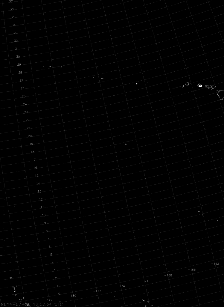
Example VIIRS NCC image (12:57 UTC 26 July 2015) scaled from -10 to 1000
Example VIIRS NCC image (12:57 UTC 26 July 2015) scaled from -10 to 1000.

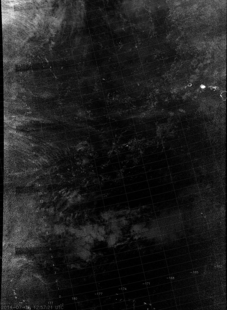
Scaling over the full range of values means you only see the city lights of Honolulu and the islands drawn on the map.
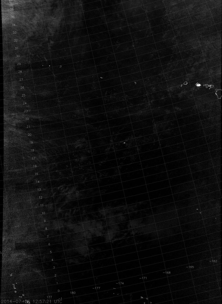
Example VIIRS NCC image (12:57 UTC 26 July 2014) scaled from 0 to 1
Example VIIRS NCC image (12:57 UTC 26 July 2014) scaled from 0 to 1.

Scaling from 0 to 1 is better, but I would argue that it’s still too dark. Let’s stretch it further.
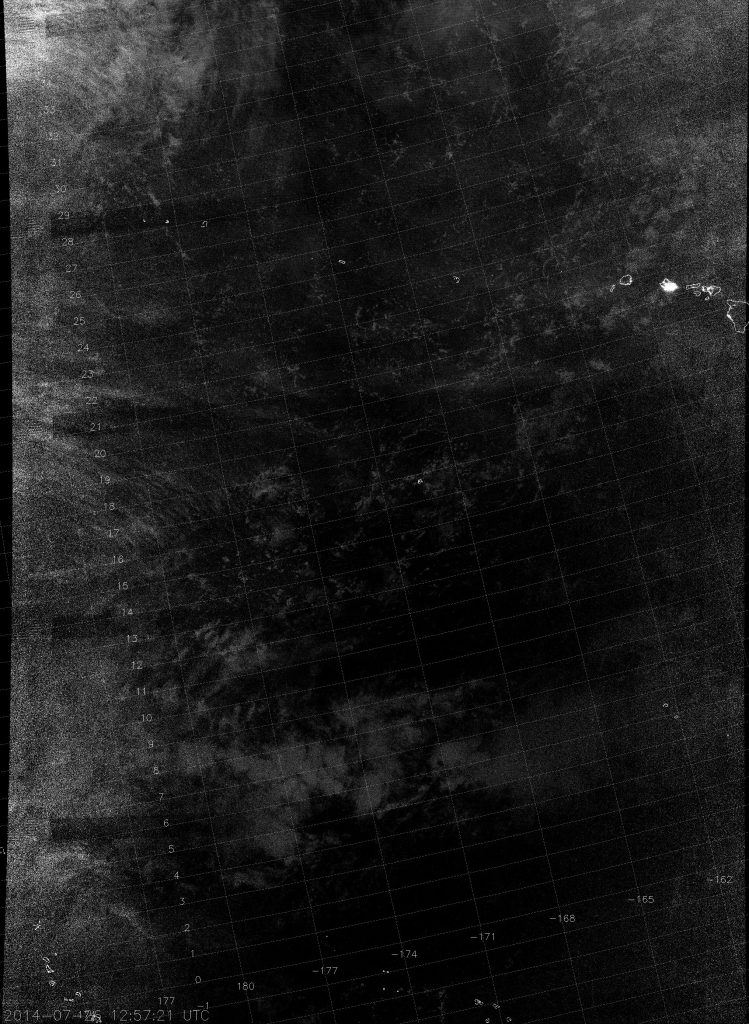
Example VIIRS NCC image (12:57 UTC 26 July 2015) scaled between 0 and 0.5
Example VIIRS NCC image (12:57 UTC 26 July 2015) scaled between 0 and 0.5.

This is about as good as you can do without the image becoming too noisy.

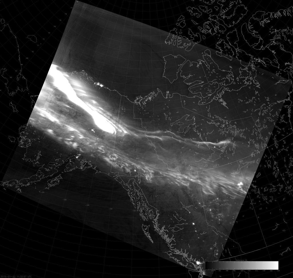
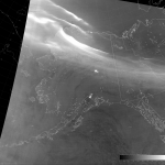
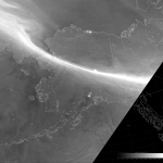
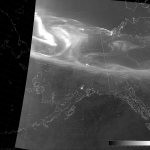
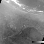
And, of course, the presence of the aurora gives yet another result:
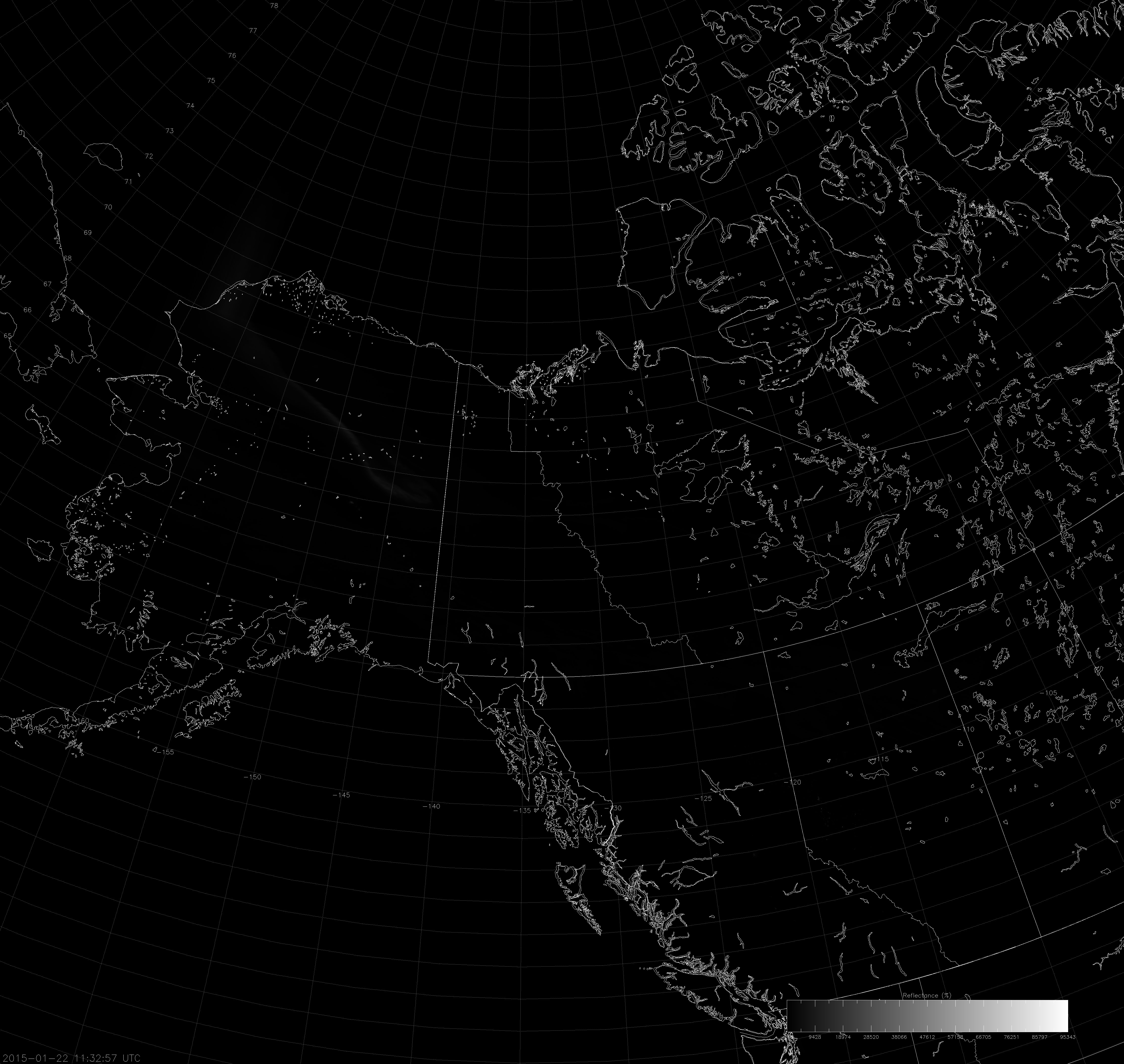
Example VIIRS NCC image (11:32 UTC 22 January 2015) scaled from -10 to 1000
Example VIIRS NCC image (11:32 UTC 22 January 2015) scaled from -10 to 1000.

Can you see the aurora over northern Alaska? Maybe just barely. Once again, scaling over the full range of values doesn’t work (just like it wouldn’t for the DNB radiance values). What about using the scale of 0 to 1.5? It worked before…
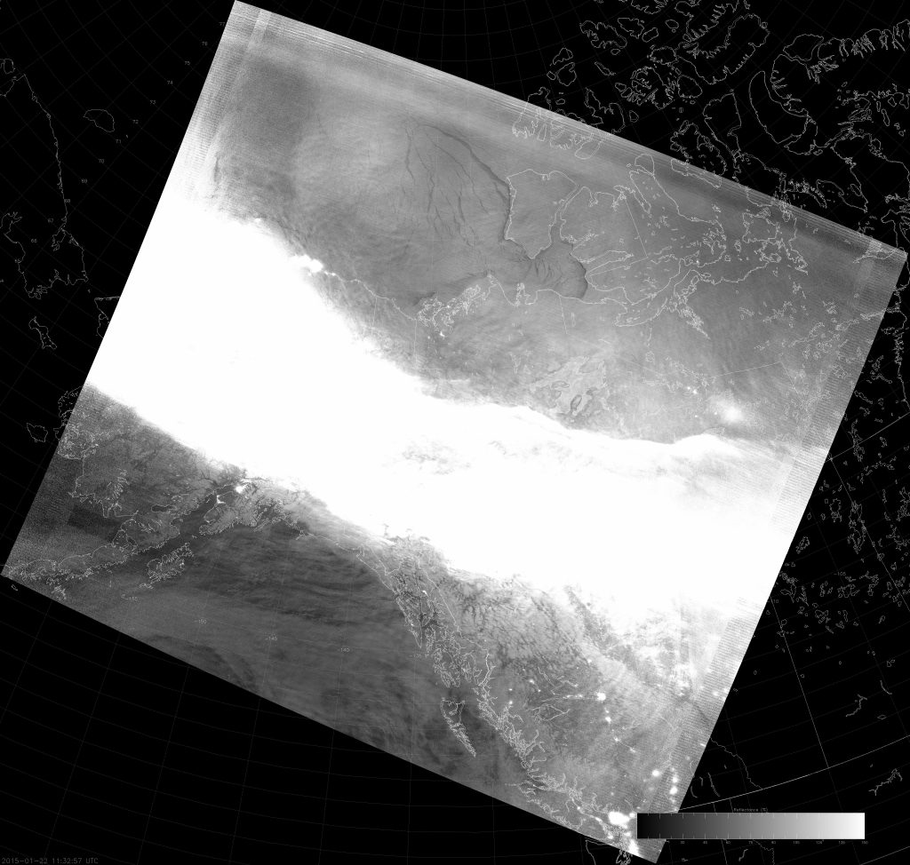
Example VIIRS NCC image (11:32 UTC 22 January 2015) scaled from 0 to 1.5
Example VIIRS NCC image (11:32 UTC 22 January 2015) scaled from 0 to 1.5.

GAHH! I’m blinded! Although, you can see the clouds over the Gulf of Alaska pretty easily as well as ice leads in the Arctic Ocean. But, the aurora is too bright and you can’t see any details over most of Alaska.

It turns out, in order to prevent the aurora from saturating this scene, the image needs to be scaled over a range of 0 to 21:
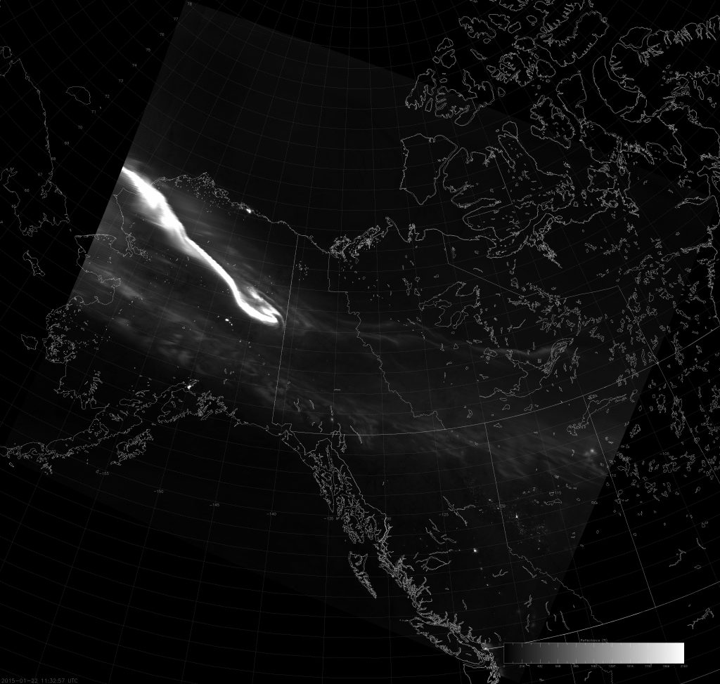
Example VIIRS NCC image (11:32 UTC 22 January 2015) scaled from 0 to 21
Example VIIRS NCC image (11:32 UTC 22 January 2015) scaled from 0 to 21.

But, notice that you lose the detail of the cloud field over the Gulf of Alaska and the ice over the Arctic Ocean. This is a difficult case to scale correctly. More on that later.

So, we’ve seen that the optimum scaling bounds vary from scene to scene. The 0 to 1.5 scale seems to work for daytime and full moon scenes. New moon scenes require a scale more like 0 to 0.5 (or thereabouts) to be able to detect clouds, snow and ice. And the occasional scene requires a totally different scale altogether. Wouldn’t it be great if there were some way to automate this, so we wouldn’t have to keep fussing with the scaling on every image?

I’m here to say, “there might be.” And, it’s called “Auto Contrast.” The idea is to do what Photoshop and other image editing software do when they “automatically” improve the contrast in the image. The idea is to take the NCC image data, scaled over a range from 0 to 2, for example, bump up the maximum value bound of the scaling with the same kind of adjustment the ERF-Dynamic Scaling uses to prevent saturation in auroras, then apply something similar to Photoshop’s Auto Contrast algorithm to create the ideal scene contrast. Here’s what Auto Contrast does for the three cases above:
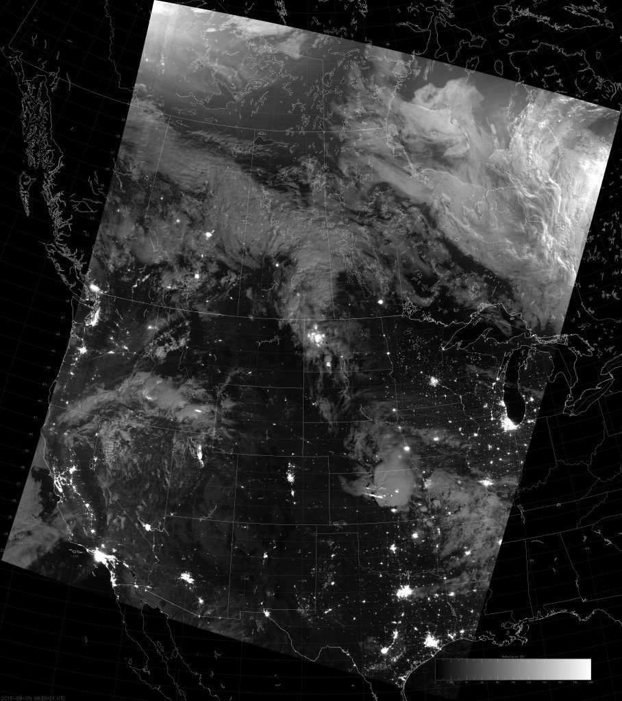
Example VIIRS NCC image (08:55 UTC 5 August 2015) scaled with Auto Contrast
Example VIIRS NCC image (08:55 UTC 5 August 2015) scaled with Auto Contrast.
Example VIIRS NCC image (12:57 UTC 26 July 2015) scaled with Auto Contrast
Example VIIRS NCC image (12:57 UTC 26 July 2015) scaled with Auto Contrast.
Example VIIRS NCC image (11:32 UTC 22 January 2015) scaled with Auto Contrast
Example VIIRS NCC image (11:32 UTC 22 January 2015) scaled with Auto Contrast.

For the first two cases, Auto Contrast is very similar to the subjectively determined “ideal scaling”. For the aurora case, we can see that Auto Contrast is a compromise between “not allowing the aurora to saturate” and “allowing the aurora to saturate half of the image.” The aurora does saturate a portion of the scene, but you can still see ice on the Arctic Ocean and clouds over the Gulf of Alaska when you look closely.

Of course, there are a few caveats:

1) Auto Contrast has not been fully tested. These results are promising enough that I wanted to share it right away, but it might not produce ideal results in all cases. We are continuing to investigate this.

2) Sometimes, the image has poor contrast that Auto Contrast can’t fix. For example, a new moon case over land where there are lots of city lights or a vivid aurora. Non-city areas will be more like the Hawaii case, where clouds have pseudo-albedo value between 0 and 0.5, and the city lights or aurora will have pseudo-albedo values well over 100. If you stretch the scaling enough to see the clouds, you’ll be blinded by the city lights. If you scale it to the city lights, you won’t see the clouds or snow or ice.

3) Individual users may not care that the aurora saturated half the image in the third example because they can see the clouds and ice just fine. Auto Contrast makes the clouds and ice darker and harder to see. This is example of how “ideal contrast” not only varies scene to scene, but also from one user application to another. Pretty pictures are not always the same thing as usable images.

4) Demonstrating the utility of “Auto Contrast” is not the same thing as getting the algorithm up and running within AWIPS. (Or, sending files to AWIPS that have optimized contrast.) The JPSS Imagery Team is working with the developers of the AWIPS NCC product to improve how it is displayed, but it will likely take some time.

While it’s not clear how the NCC images are currently scaled in AWIPS, they almost certainly use a fixed scale. However, the examples shown here make it clear that the scaling needs to adjust from scene to scene – even if Auto Contrast is not the ultimate solution. So while we work to figure this out, if the NCC imagery looks sub-optimal in your AWIPS system, you know why.

One final thought: the Auto Contrast algorithm is designed to work with any image, not just NCC images. It’s possible that DNB images created with ERF-Dynamic Scaling may be improved with Auto Contrast as well. But, that’s a topic for another blog post about image scaling for the future. I may yet title a post “Revisiting ‘Revisiting “Revisiting Scaling on the Solstice”‘”.

The Land of 10,000 Fires

Minnesota calls itself the “Land of 10,000 Lakes” – they even put it on their license plates. To an Alaskan, it seems funny to brag about that since Alaska has over 3,000,000 lakes. That’s like a Ford Escort bragging to a Bugatti Veyron that it can achieve highway speeds!

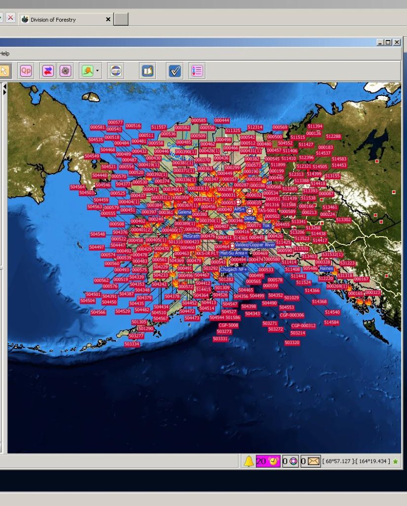
Alaska has Minnesota beat in one other area, and it’s one they’re definitely not putting on their license plates: the number of wildfires. OK, so it may not be 10,000 fires as my title implies, but there sure are a lot:

AICC Fire Map (28 June 2015)
Map of known wildfires (23 June 2015), courtesy Alaska Interagency Coordination Center

That map shows the number of known wildfires in Alaska on 23 June 2015 and was produced by the Alaska Interagency Coordination Center (AICC). To say that 2015 has been an active fire season in Alaska is an understatement. That would be like saying a Bugatti Veyron is a vehicle capable of achieving highway speeds! (By the way, if anyone in the audience works at Bugatti, and would like to compensate me for this bit of free advertising by, say, giving me a free Veyron, it would be much appreciated.)

Imagine being the person responsible for keeping track of all these fires! (That’s what the good folks at AICC do on a daily basis. There’s also a graduate student at the University of Alaska-Fairbanks working on this very same problem, who has come up with this solution.)  This is being called the worst fire season in Alaska since, well, the beginning of recorded history. 2004 was the worst on record, but 2015 is on pace to shatter that. By 26 June 2015, Alaska’s fires had burned over 1.5 Rhode Islands worth of land area (or, alternatively, 0.8 Delawares). By 2 July, the total burned acreage had achieved 3 Rhode Islands (1.6 Delawares; 2/3 of a Connecticut). On 7 July, the total hit 3,000,000 acres (1 Connecticut; 2.5 Delawares; 5 Rhode Islands). (2004 ended at 2 Connecticuts worth of land burned, so there is a chance the pattern could switch and Alaska will get enough rain to fall short of the record, but at this rate, that seems unlikely.)

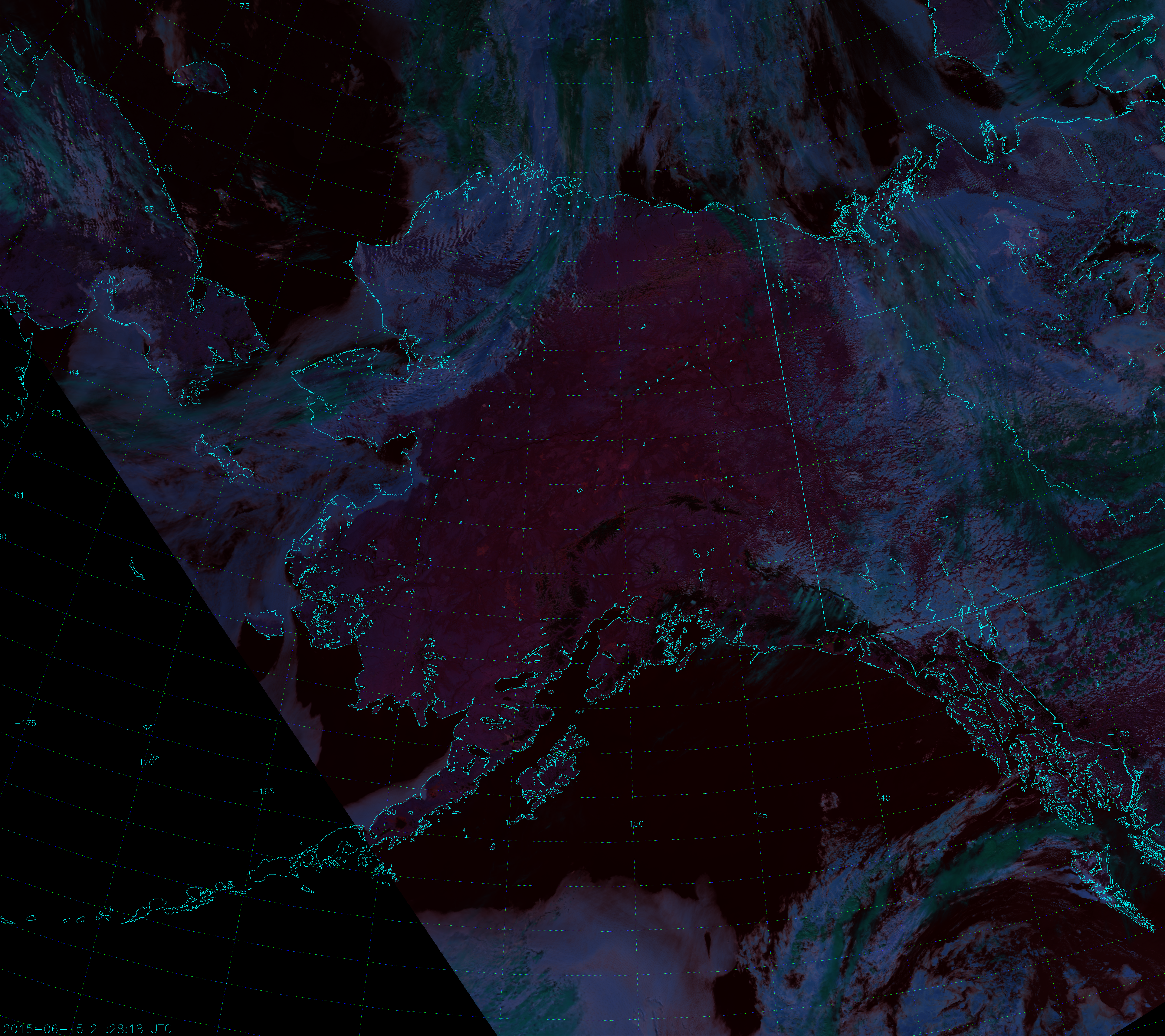
It’s interesting to see how this came to be, given that there were only a couple of fires burning in the middle of June:

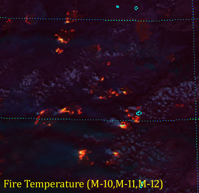
VIIRS Fire Temperature RGB composite of channels M-10, M-11 and M-12 (21:28 UTC 15 June 2015)

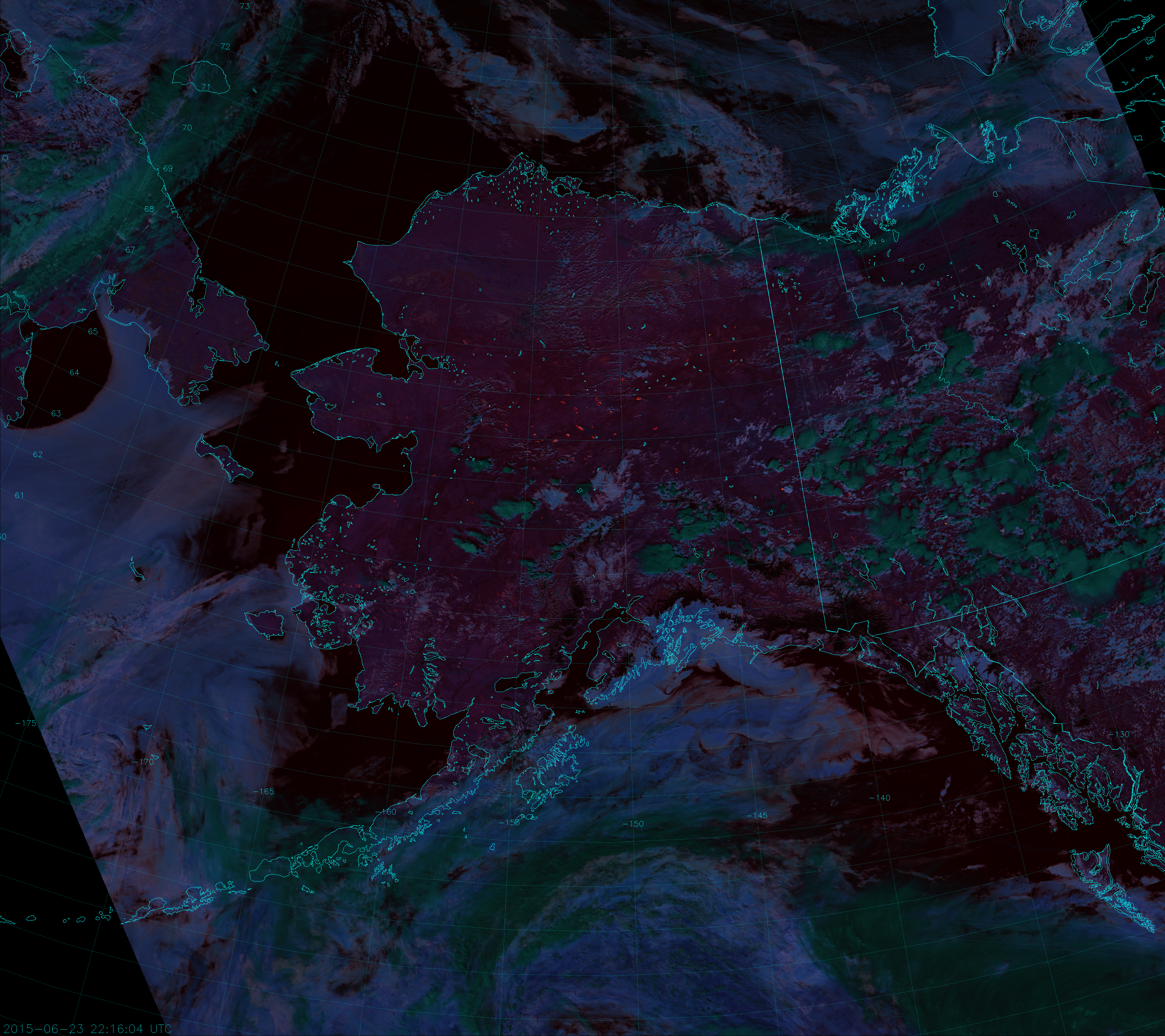
If you followed this blog last year, you should know about this RGB composite, called “Fire Temperature.” If not, read this and this. Click to the full size image and see if you can see the six obvious fires. (Two are in the Yukon Territory.) Now, count up the number of fires you see in this image from just one week later:

VIIRS Fire Temperature RGB composite of channels M-10, M-11 and M-12 (22:16 UTC 23 June 2015)

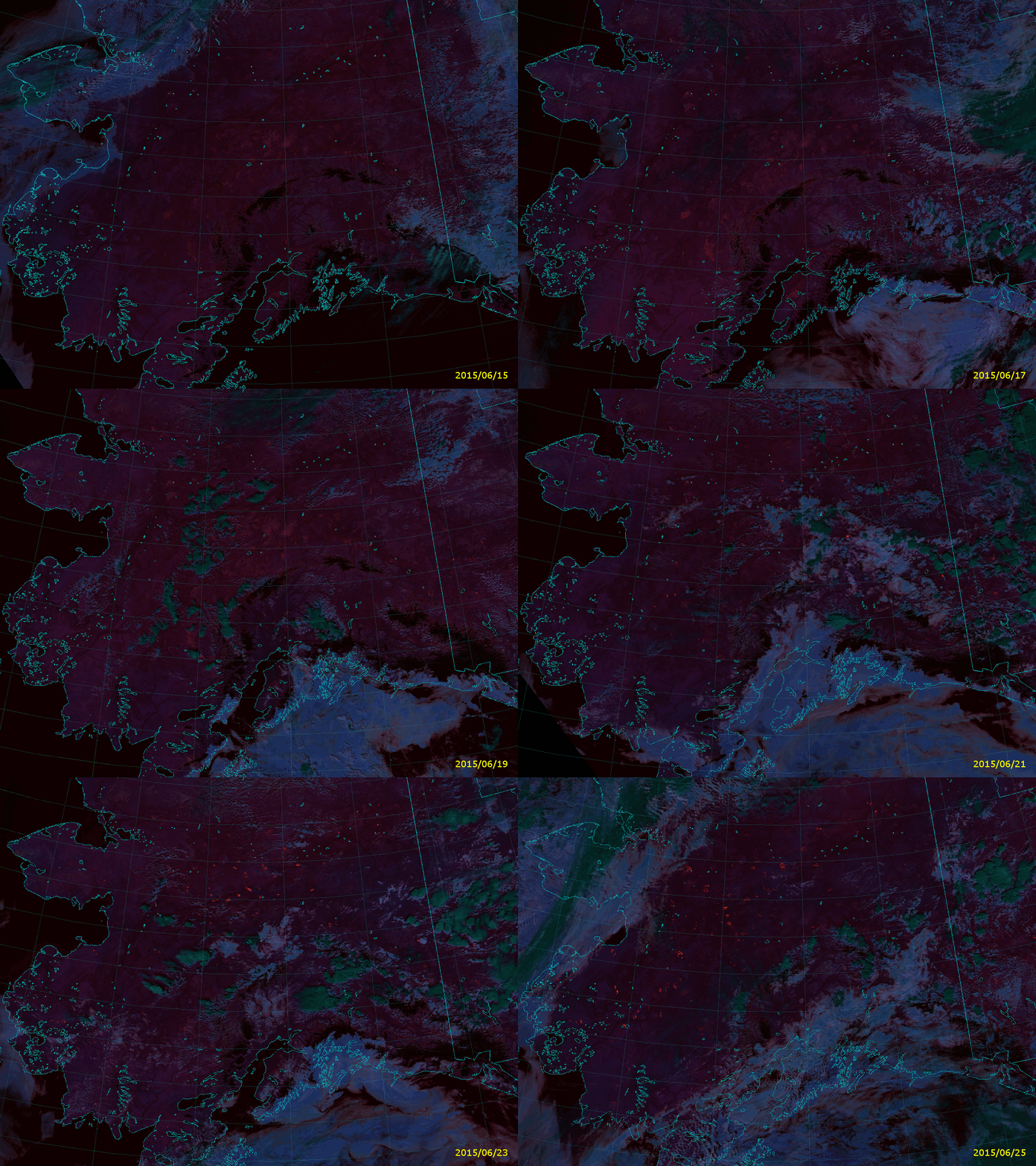
Why so many fires all of a sudden? Well, it has been an abnormally dry spring following a winter with much less snow than usual. Plus, there have been a number of dry thunderstorms that produced more lightning than rain. You can see them in the image above as the convective clouds, which appear dark green because they are topped with ice particles. (Ice clouds appear dark green in this composite. Liquid clouds appear more blue.) A number of thunderstorms filled with lightning formed on the 19th of June, and a lot of fires got started shortly after. Here is an animation of Fire Temperature RGB images from 15-25 July (showing only the afternoon VIIRS overpasses):

Animation of VIIRS Fire Temperature RGB images (15-25 June 2015)

It’s difficult to see the storms that led to all these fires, because the storms don’t last long and they typically form and die in between images. Plus, some of the fires may have started from hot embers of other fires that were carried by the wind.

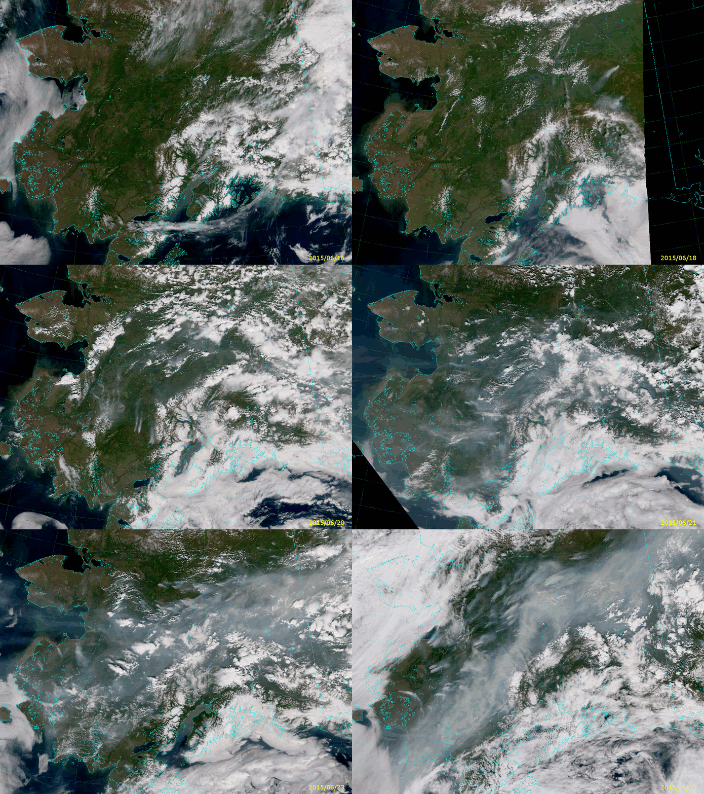
Of course, when there’s smoke there’s fire. I mean – when there’s fire there’s smoke. Lots of it, which you’d never be able to tell from the Fire Temperature RGB. The Fire Temperature RGB uses channels at long enough wavelengths that it sees through the smoke as if it weren’t even there. But, the True Color RGB is very sensitive to smoke. Here’s a similar animation of True Color images:

Animation of VIIRS True Color RGB images (16-25 June 2015)

Look at how quickly the sky fills with smoke from these fires. And also note that the area covered by smoke by the end of the loop (25 June 2015) is too large to be measured in Delawares – units of Californias might be more useful.

The last frame in each animation comes from the VIIRS overpass at 21:30 UTC on 25 June 2015. It’s nice to know that you can still detect fires in the Fire Temperature RGB even with all that smoke around.

Another popular RGB composite to look at is the so-called “Natural Color”. This is the primary RGB composite that can be created from the high-resolution imagery bands I-1, I-2 and I-3. The Natural Color RGB is sort-of in-between wavelengths compared to the Fire Temperature and True Color. The True Color uses visible wavelengths (0.48 µm, 0.55 µm and 0.64 µm), the Fire Temperature uses near- and shortwave infrared wavelengths (1.61 µm, 2.25 µm and 3.7 µm), and the Natural Color spans the two (0.64 µm, 0.87 µm and 1.61 µm). This means the Natural Color is not as sensitive to smoke and not as sensitive to fires – except in the case of very intense fires and very thick smoke plumes.
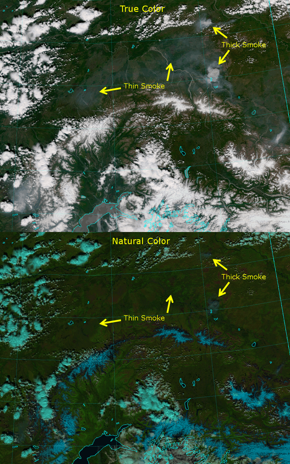
Well, guess what? These fires in Alaska have been intense and have been putting out a lot of smoke, so they do show up. Here’s a comparison between the True Color and Natural Color images from 19 June 2015:

Animation comparing the True Color and Natural Color RGB composites (21:50 UTC 19 June 2015)

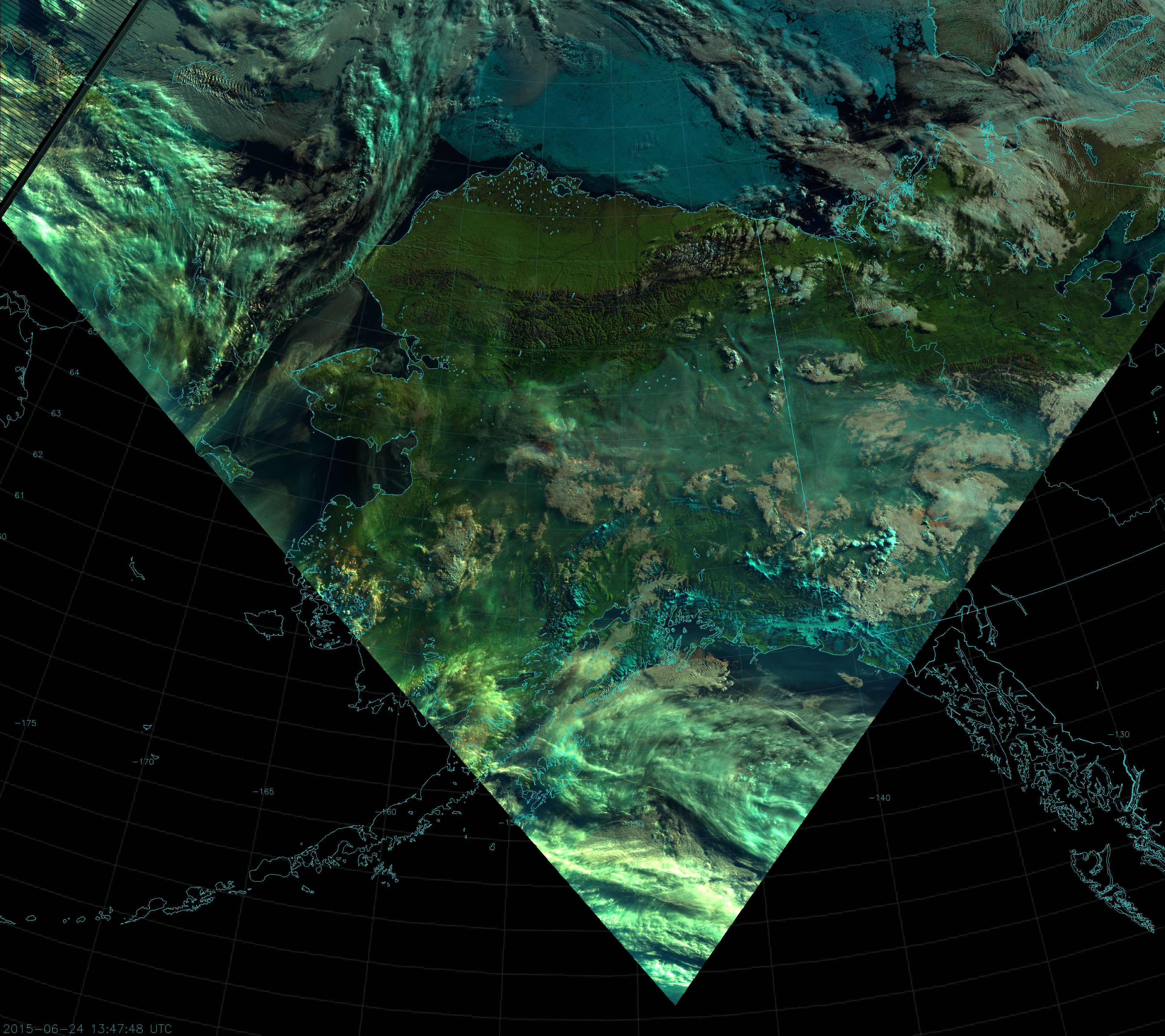
Thin smoke is invisible to the Natural Color, but thick smoke appears blueish (because the blue component at 0.64 µm is the most sensitive to it). As you go from visible wavelengths to near-infrared wavelengths, the smoke’s influence on the radiation transitions from Rayleigh scattering to Mie scattering, and the light is scattered more in the forward direction. This makes the smoke much more visible in the Natural Color composite when the sun is near the horizon, as in this image from 13:47 UTC on 24 June:

VIIRS Natural Color RGB composite of channels I-1, I-2 and I-3 (13:47 UTC 24 June 2015)

Notice the red spot in the clouds at 154 °W, 65 °N? (Click on the image to zoom in.) Here, the smoke plume is optically thick at 0.64 µm (blue component) and 0.87 µm (green component), but transparent at 1.61 µm (red component). It’s like the smoke is casting a shadow in two of the three wavelengths, but is invisible in the other. It’s the combination of large smoke particles and large solar zenith angle creating a variety of Rayleigh and Mie scattering effects leading to this interesting result.

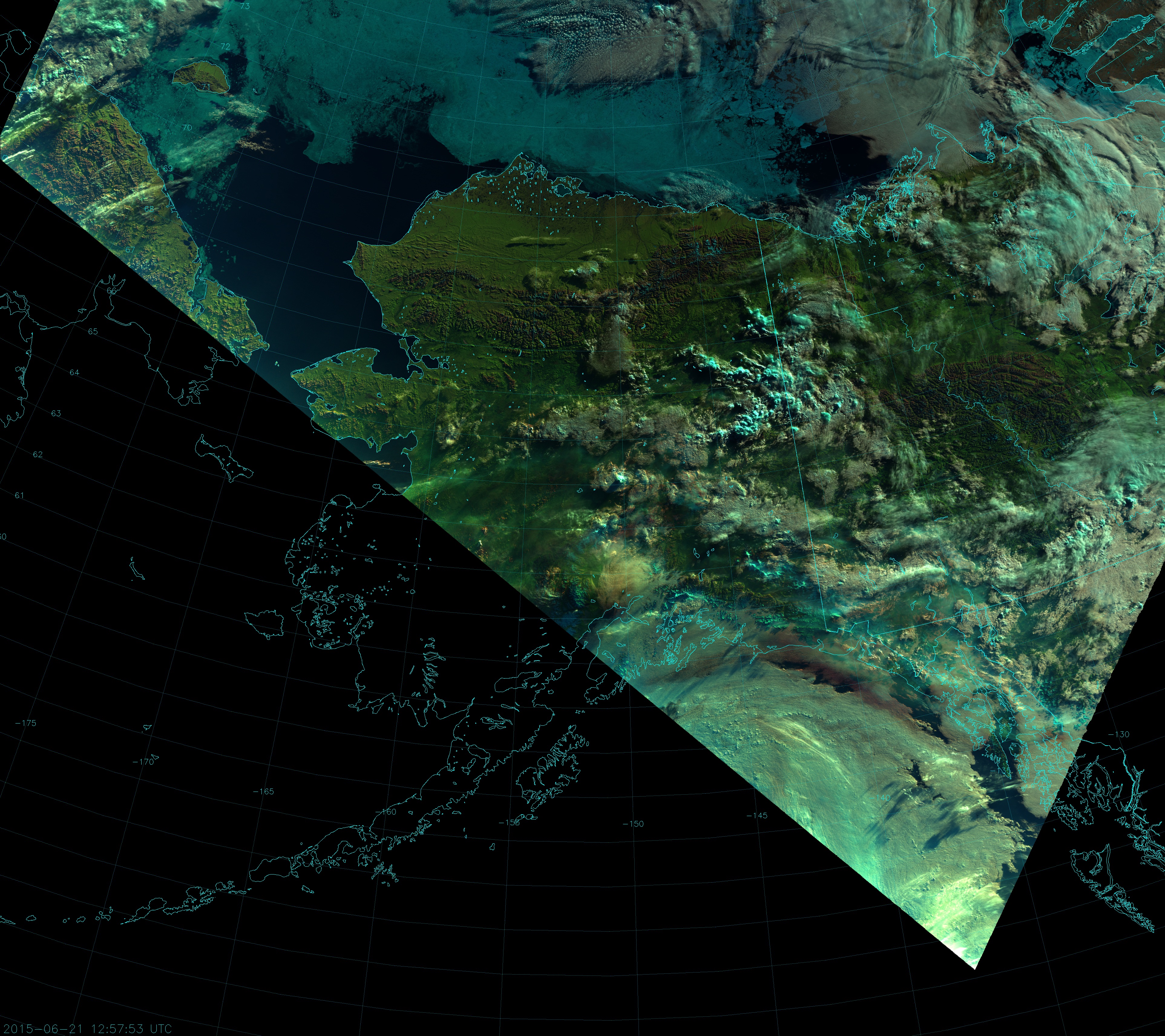
A more dramatic example of this can be seen from the 12:57 UTC overpass on 21 June:

VIIRS Natural Color RGB composite of channels I-1, I-2, and I-3 (12:57 UTC 21 June 2015)

Notice the reddish brown band of clouds just offshore along the coast of southeast Alaska.

But, that’s not all! Really intense fires may be visible at 1.6 µm, so it’s possible the Natural Color composite can see them. Here’s the Natural Color composite from 22:09 UTC on 4 July zoomed in on an area of intense fires:

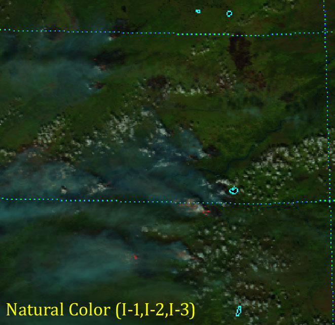
VIIRS Natural Color RGB composite of channels I-1, I-2 and I-3 (22:09 UTC 4 July 2015)

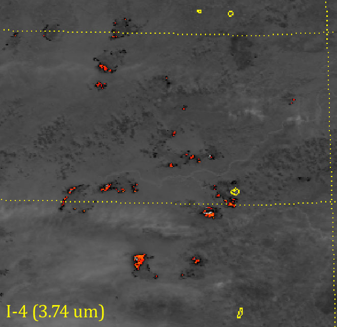
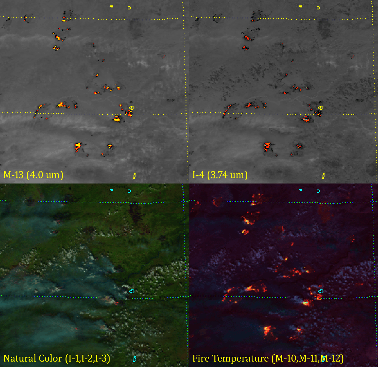
Notice the salmon- and red-colored pixels at the edges of some of the smoke plumes? Those are very intense hot spots showing up at 1.6 µm (I-3). In fact, the fires were so intense that they saturated the sensor at 3.7 µm (I-4) and this lead to “fold-over“:

VIIRS shortwave IR (I-4) image (22:09 UTC 4 July 2015)
VIIRS shortwave IR (I-4) image (22:09 UTC 4 July 2015). The color scale highlights pixels with a brightness temperature above 340 K.

Fold-over is when the sensor detects so much radiation above its saturation point, the hardware is “tricked” into thinking the scene is much colder than it is. In the image above, colors indicate pixels with a brightness temperature above 340 K. The scale ranges from red at 340 K to orange to yellow at 390 K. Channel I-4 reaches its saturation point at 368 K. Notice the white and light gray pixels inside the hot spots: the reported brightness temperature in these pixels is ~ 210 K – much colder than everything else around – even the clouds! This is an example of “fold-over”.

The reddish pixels in the Natural Color image match up very closely with the saturated, “fold-over” pixels in I-4:

Animation comparing the Natural Color RGB and I-4 images (22:09 UTC 4 July 2015)

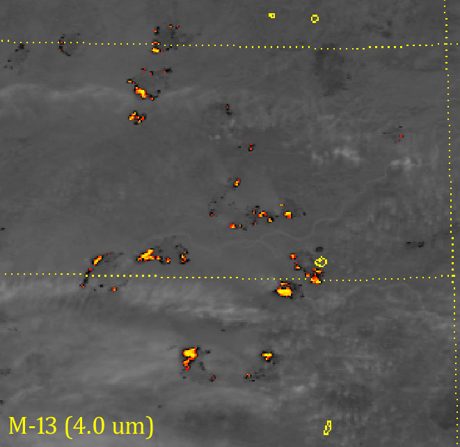
What to do if we have fires saturating our sensor? Use M-13 (4.0 µm), which has a sensor designed to not saturate in these conditions:

VIIRS shortwave IR (M-13) image (22:09 UTC 4 July 2015)

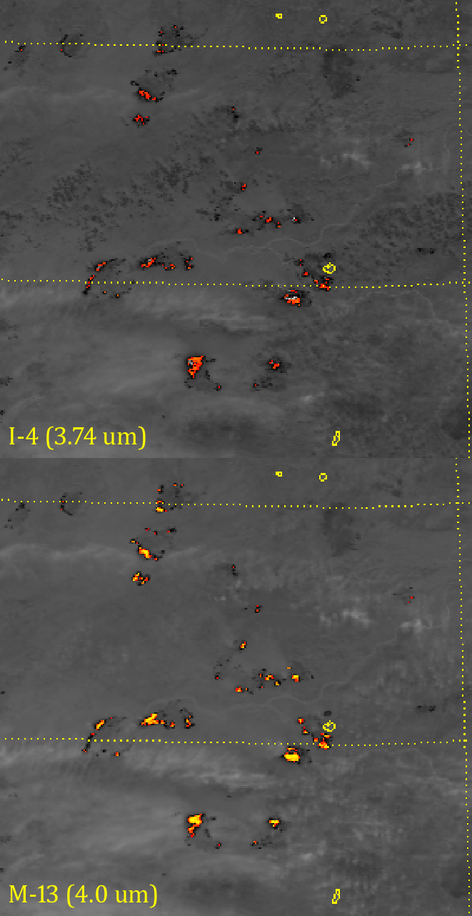
Here, we have reached color table saturation (yellow is as high as it goes), but M-13 did not saturate. In fact, the “fold-over” pixels in I-4 have a brightness temperature above 500 K in M-13. That’s 130-140 K above the saturation point of I-4 (110-120 K above the top of the color table)! The lack of saturation is also why the hot spots appear hotter in M-13, even though it has lower spatial resolution:

Animation comparing VIIRS shortwave IR bands I-4 and M-13 (22:09 UTC 2015)

The fact that intense fires show up at 1.6 µm is part of the design of the Fire Temperature RGB. Most fires show up at 3.7 µm (red component). Moderately intense fires are also visible at 2.25 µm (green component) and will appear orange to yellow. Really intense fires, like these, appear at 1.6 µm (blue component) and will appear white (or nearly white):

VIIRS Fire Temperature RGB composite of M-10, M-11, and M12 (22:09 UTC 4 July 2015)
VIIRS Fire Temperature RGB composite of M-10, M-11, and M-12 (22:09 UTC 4 July 2015)

And, if you’re curious as to how all four of these images compare, here you go:

Animation comparing VIIRS images of intense wildfires (22:09 UTC 4 July 2015)

Shortwave infrared wavelengths are good for detecting fires, visible wavelengths are good for detecting smoke and the Natural Color composite, which uses wavelengths in-between, might just detect both – especially when intense fires exist.

The nice (and dedicated) people of N-ICE

Imagine this scenario: you’re stuck on a boat in the Arctic Ocean in the middle of the night. The winds are howling, the air is frigid, and the boat you’re in is completely encased in ice. Step off the boat and your face is constantly sand-blasted by tiny ice particles. Blink at the wrong time and your eyes freeze shut. The ice may crack under your feet (or between you and the boat)  – without notice – leaving icy water between you and the only warm place for hundreds of kilometers. Have to swim for it? Look out for jellyfish. Decide to stay on your crumbling patch of ice? I hear polar bears can get pretty hungry. Death awaits every misstep and every wrong turn. Cowering in the boat? Internet access is limited, there are no re-runs of Friends to keep you entertained, and the shuffleboard court is outside. (Actually, it’s worse than that: there is no shuffleboard court!)

Now imagine this: you actually wanted to be there!

Most people would say, “That’s crazy! I would never do that!” But, for the scientists and crew aboard the research vessel (RV) Lance, it is a unique opportunity to further our understanding of the Arctic and its role in the Earth’s climate system.

You see, we are nearing the mid-point of the N-ICE 2015 field experiment, which is taking place from 1 January to 1 August 2015. The idea behind the experiment is to take a boat, freeze it in the Arctic ice sheet, and constantly monitor the environment around the boat for about six months. A group of scientists work in six-week shifts where they monitor everything from the weather to local biology. Of course, the primary objective is to see what happens with the ice itself.

One of our very own researchers at CIRA (and one of the world’s leading experts on snow) was on board during the first leg of the experiment.  So, what is a snow expert doing on a ship whose primary purpose is to study ice?

Here’s the lowdown. There are two types of ice that concern Arctic researchers: “young” and “multi-year”. As the name implies, multi-year ice is ice that survives the summer and lasts for more than one year. Young ice does not reach its first birthday – it melts over the summer. Arctic researchers have been finding out that, not only is the Arctic ice sheet shrinking, it’s lost most of its multi-year ice, which is being replaced by young ice.

Multi-year ice is thicker, more resilient and tends to be brighter (more reflective), while young ice is thinner, darker (less reflective of sunlight), and less resilient. The less sunlight that is reflected, the more sunlight is absorbed into the system and this leads to warming, which melts more ice (and is a positive feedback). The less ice there is, the more open ocean there is, and open water is a lot less reflective than ice, which leads to more absorption of sunlight, more warming, more melting, etc.

The thinner “young ice” breaks up more easily due to wind and waves. This creates more leads of open water. The water, being much warmer than the air above it, pumps heat and moisture into the atmosphere, creating more clouds and snow – just like lake-effect or sea-effect snow. And, while most people have a hard time believing it, snow is a good insulator. Snow on top of the ice will create a blanket that protects the ice from the really cold air above. This reduces the rate at which the ice thickens up, keeping the ice thinner, and we have another positive feedback.

That’s just one of the things being studied on the 2015 Norwegian Young Sea Ice Cruise. Of course, I wouldn’t be mentioning any of this unless VIIRS could provide information to help out with the mission.

Go back to the N-ICE 2015 website. Notice the sliding bar/calendar on the bottom of the map. You can use that to follow the progress of the ship. Or, you can use the VIIRS Day/Night Band.

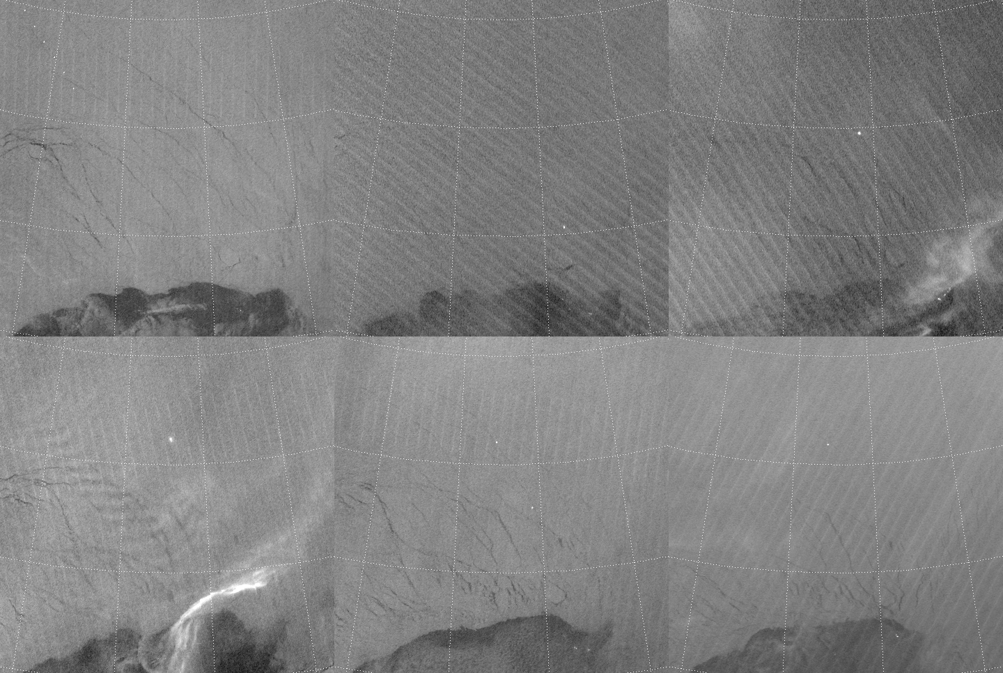
At the time of this writing, the Lance is docked in Longyearbyen, the largest town on the island of Spitsbergen in Norway. (Spitsbergen is part of the Svalbard archipelago, which has a direct connection to VIIRS. Svalbard has a receiving station used by NOAA that collects and distributes data from nearly all of their polar-orbiting satellites.) Longyearbyen is where the RV Lance and Norwegian icebreaker KV Svalbard departed for the Arctic back in mid-January. KV Svalbard escorted the RV Lance into the ice sheet, then returned to Longyearbyen while the Lance froze itself into the ice. See if you can see that in this loop of VIIRS Day/Night Band images from 12 – 17 January 2015:

Animation of VIIRS Day/Night Band images from 12-17 January 2015
Animation of VIIRS Day/Night Band images from 12-17 January 2015. These images cover the area of the N-ICE field experiment, north of Svalbard.

Notice how the one bright light follows a lead in the ice until it stops. Then the light appears to split in two, with one light source heading back the way it came and the other stuck in the ice. That is the start of N-ICE 2015!  The KV Svalbard did its duty. If you look closely, there are also some other boats hanging out in the open water near the edge of the ice sheet during this time.

If you suspect there are jumps in the images you’re right. VIIRS passes over this area every day 6-8 times between 00 and 12 UTC, with no overpasses for the next 12 hours.

Toward the end of January you can see how the RV Lance drifted to the west along with the ice:

Animation of VIIRS Day/Night Band images from 23-30 January 2015
Animation of VIIRS Day/Night Band images from 23-30 January 2015. These images cover the area of the N-ICE field experiment, north of Svalbard.

This was all according to plan. But, then, in February, the winds shifted and helped the ice spit the boat back out towards the open water:

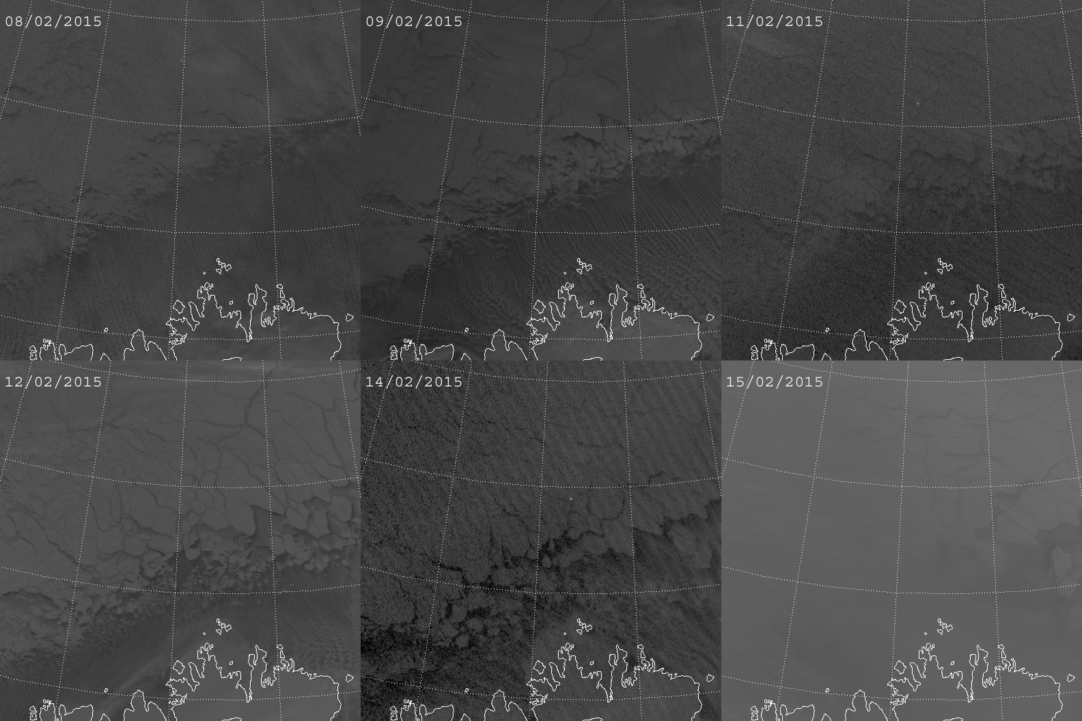
Animation of VIIRS Day/Night Band images from 8-15 February 2015
Animation of VIIRS Day/Night Band images from 8-15 February 2015. These images show the area of the N-ICE field experiment, north of Svalbard.

After this, the RV Lance needed help from the KV Svalbard to be repositioned in the ice sheet near where it started a month earlier. Otherwise, all the instruments they placed in the ice would no longer be in the ice – they’d be at the bottom of the ocean as the ice sheet broke up all around them.

If you want to know why the ship seems to disappear and reappear every day, you can thank the sun. You see, the first few weeks of the experiment took place during the long polar night. But, by mid-February, twilight began to encroach on the domain during the afternoons. This was enough light to drown out the light from the ship. (Sunrise occurred in early March.)

Another thing to notice with these last two animations: the cloud streets that form over the open water near Svalbard. The direction these cloud streets move gives a pretty good indicator of where the ice is going to go, since both the clouds and icebergs are being pushed and pulled by the same wind.

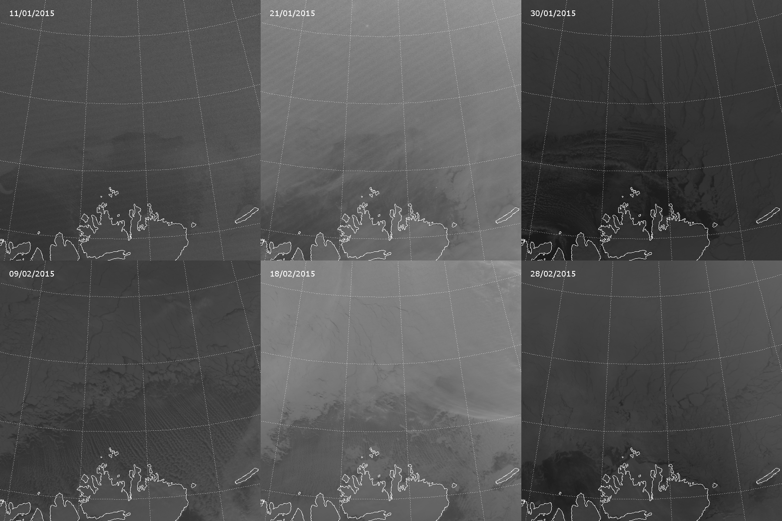
It’s fascinating to watch the movement of the ice over the first 6 weeks of the field experiment. To save on file size and downloading time, the animation below only uses one image per day (between 10 and 11 UTC). Here’s 6 weeks of images in 5 seconds:

Animation of VIIRS Day/Night Band images from 11 January to 28 February 2015
Animation of VIIRS Day/Night Band images from 11 January to 28 February 2015. These images show the area of the N-ICE field experiment, north of Svalbard.

And you probably thought of sea ice as being relatively static.

Once again, we lose sight of the RV Lance because of afternoon twilight in mid-February, so we can’t see it or the KV Svalbard after that. And note that there’s a lot less open water near Svalbard by the end of the period.

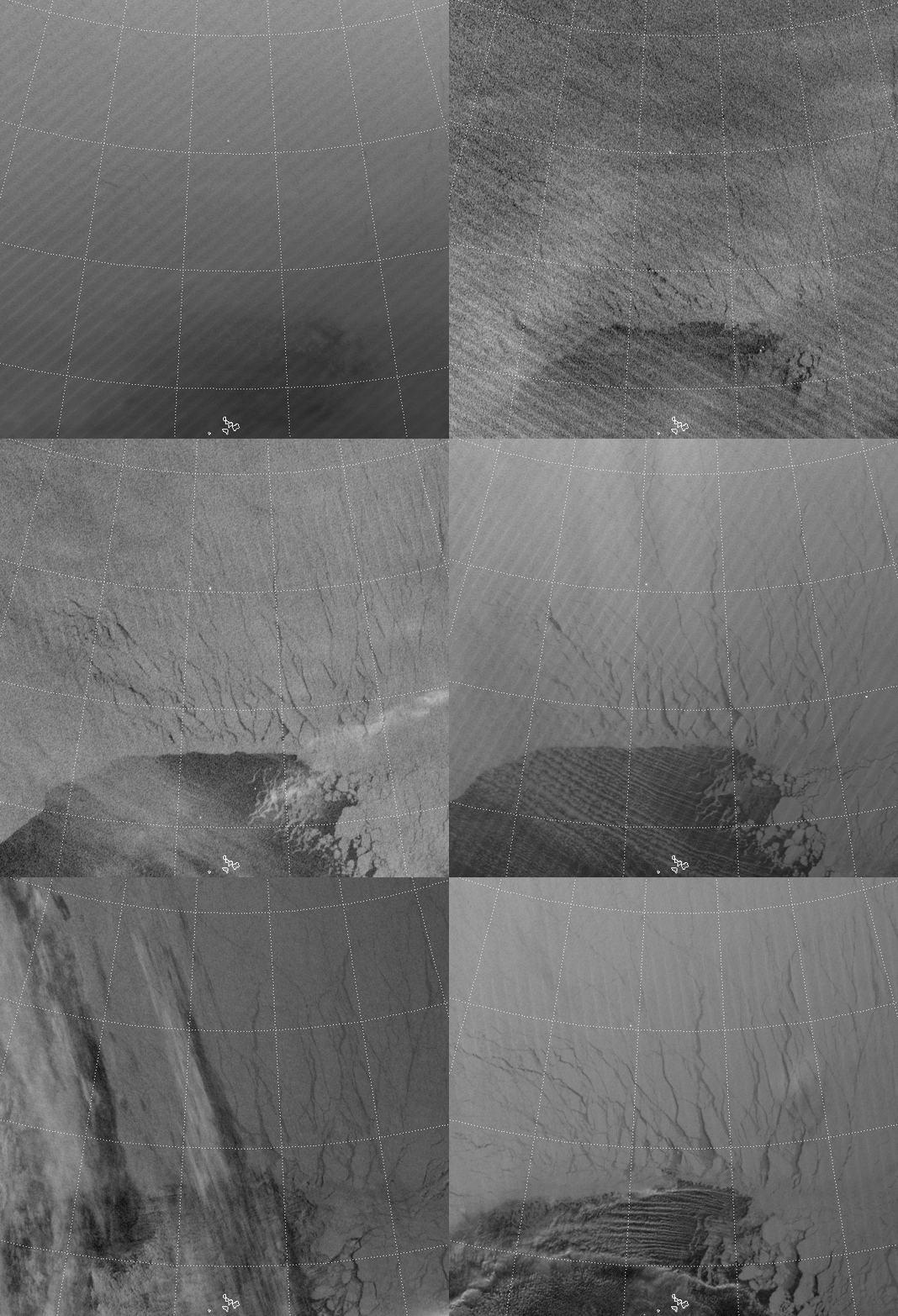
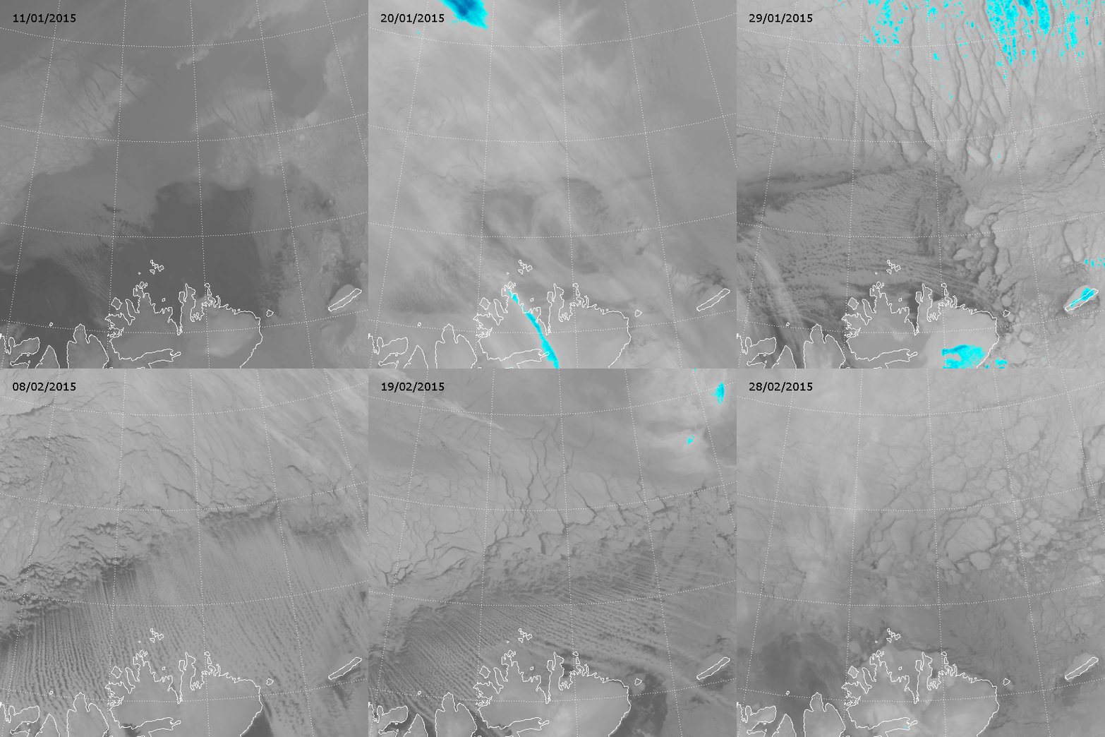
What if we didn’t have the Day/Night Band? You wouldn’t be able to see the ships at all, that’s for sure! Plus, this area was under darkness (no direct sunlight) for this six week period, so none of the other visible wavelength channels will work.  That leaves us with the infrared (IR), which looks like this:

Animation of VIIRS IR (M-15) images from 11 January to 28 February 2015
Animation of VIIRS IR (M-15) images from 11 January to 28 February 2015. These images cover the area of the N-ICE field experiment, north of Svalbard.

Note that clouds appear to have a greater impact on the detection of ice (and distinction between ice and clouds) in the IR. When it’s relatively cloud-free, there is enough of a temperature contrast between the open water and ice to see the icebergs but, pretty much any cloud will obscure the ice. So, why doesn’t the Day/Night Band have this problem?

That has to do with the optical properties of clouds at visible and IR wavelengths. Most of these clouds are optically thick in the IR and optically thin in the visible. The Day/Night Band can see through these clouds (most of them, anyway) while channels like M-15 (10.7 µm) shown here, can’t. We’ve seen more extreme examples of this before.

In the rapidly changing Arctic, it is nice to know that there are a few dedicated individuals who risk frostbite, hypothermia and polar bears to provide valuable information on how the ice impacts the environment both locally and globally. Me: I’ll just stick to analyzing satellite data from my nice, comfortable office, thank you.

By the way, the N-ICE field experiment has it’s own blog, and pictures and other snippets of information about the people and progress of the mission are regularly posted to Instagram, Facebook and Twitter.

Revisiting “Revisiting Scaling on the Solstice”

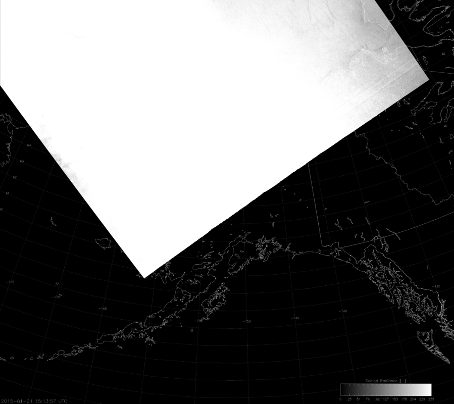
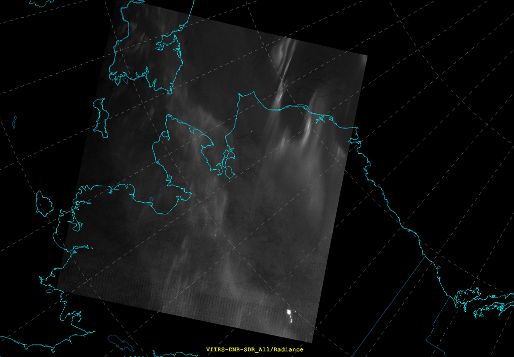
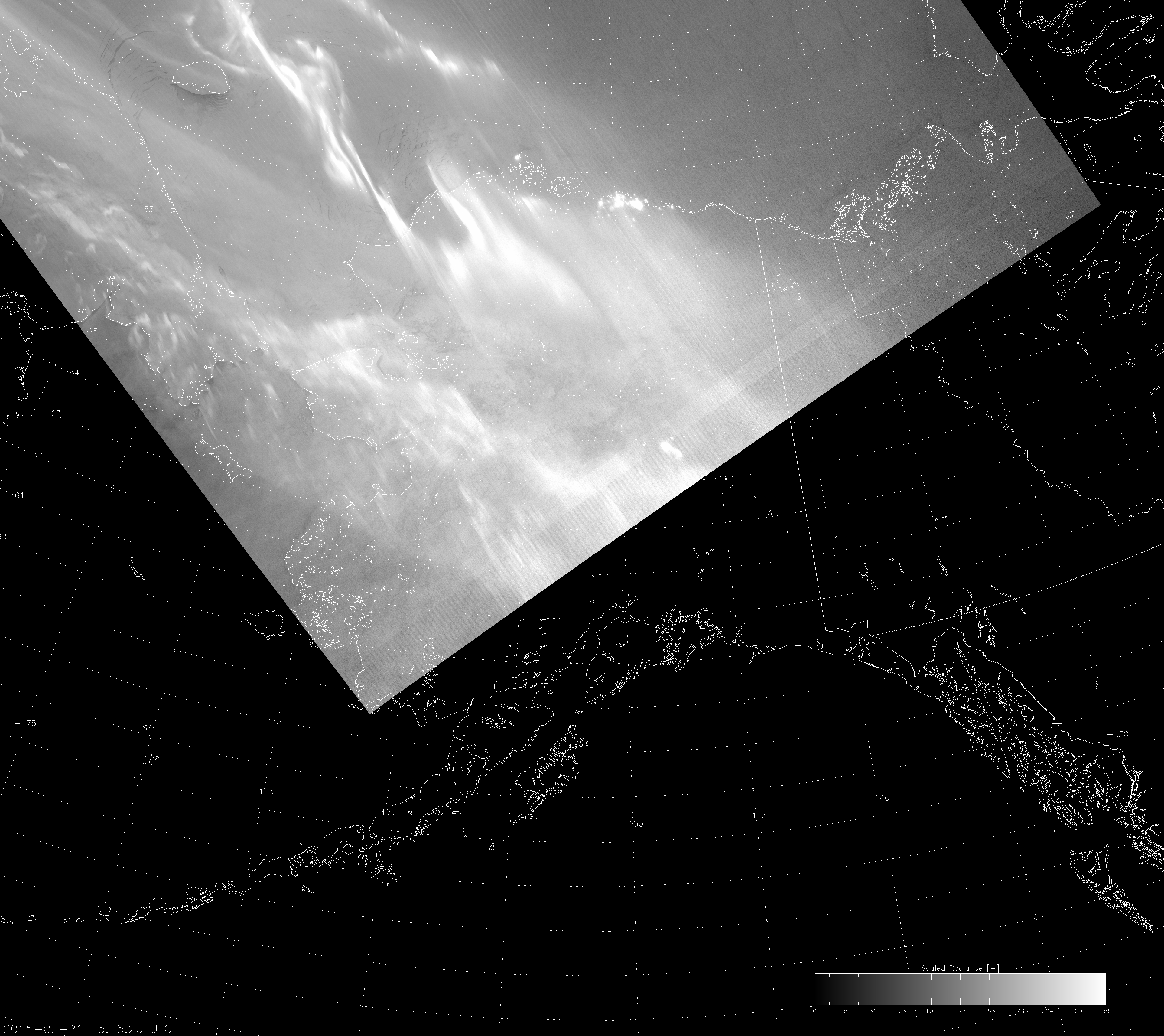
Imagine that you are an operational forecaster. (Some of you reading this don’t need to imagine it, because you are operational forecasters.) You’ve been bouncing off the walls from excitement because of all the great information the VIIRS Day/Night Band (DNB) provides. “This is so great! Visible imagery at night! It helps in so many ways,” you say to yourself or to anyone within earshot. What’s more: you read this blog and, in particular, you’ve read this blog post and/or this paper. “All our problems have been solved! We can use the DNB for any combination of sunlight and moonlight! I am so happy!” Then you come across an image like this:

VIIRS DNB image created using "erf-dynamic scaling" (15:14 UTC 21 January 2015)
VIIRS DNB image created using “erf-dynamic scaling” (15:14 UTC 21 January 2015)

If you’re short tempered, you’re thinking, “@&*!@#&#!!!” If you have better control of your emotions, you’re thinking, “Me-oh-my! Whatever happened here?” Welcome to the third installment of the seemingly-never-ending series on how difficult it is to display the highly variable DNB radiance values in an automated way.

In the previous installment, which I will keep linking to until you click on it and re-read it, I outlined a great new way to scale the radiance values as a function of solar and lunar zenith angles that I call the “erf-dynamic scaling” (EDS) algorithm because it is based on the Gaussian error function (erf). This algorithm uses smooth, continuous functions to account for the 8 orders-of-magnitude variability in DNB data that occurs between day and night, and which was demonstrated to beat many previous attempts at image scaling. Unfortunately, that algorithm produced the image you see above.

So, is my algorithm a failure?

Well, if you’re going to jump right to “failure” based on this, you need to calm down and back off the hyperbole. Do you feel like a failure every time you make a mistake? Besides, mistakes are opportunities for learning.

My demonstration of the quality of the EDS method was based on images taken near the summer solstice. Now, we’re a month after winter solstice. And you know what happens in the winter that doesn’t happen in the summer? The aurora! (Actually, the aurora is present just as much in the summer, but you can’t see it because the sun is still shining.) Now that the nights are so long and dark, the aurora is easily visible.

My EDS method accounts for sunlight and moonlight. It doesn’t account for auroras and they can be several orders of magnitude brighter than the moonlight – especially near new moon when there is no moonlight. And guess when the image above was taken relative to the lunar cycle.

Now, I knew auroras would mess up my scaling algorithm (“Oh, sure you did!”), but I underestimated their occurrence. As a “Lower-48er,” I’ve seen the aurora once in my life. But, at high latitudes (*cough* Alaska *cough*) they happen almost every night in the winter. They’re not always visible due to clouds, but you can’t call them a “rare occurrence”.

From the perspective of DNB imagery, auroras can get in the way. Or, auroras can act as another illumination source to light up important surface features. Let’s look at the above image, with the data re-scaled by manually tweaking the settings in McIDAS-v:

VIIRS DNB image manually scaled (15:14 UTC 21 January 2015)

Of course, this image is rotated differently, but that’s not important. The important thing is that you can see now that it’s an aurora and you can see surface features underneath it. Cracks in the sea ice are visible! (And, remember, there is no moonlight here – just aurora and airglow.) Much better than the wall of white image, right? This proves that it’s a problem with my scaling and not with the DNB itself.

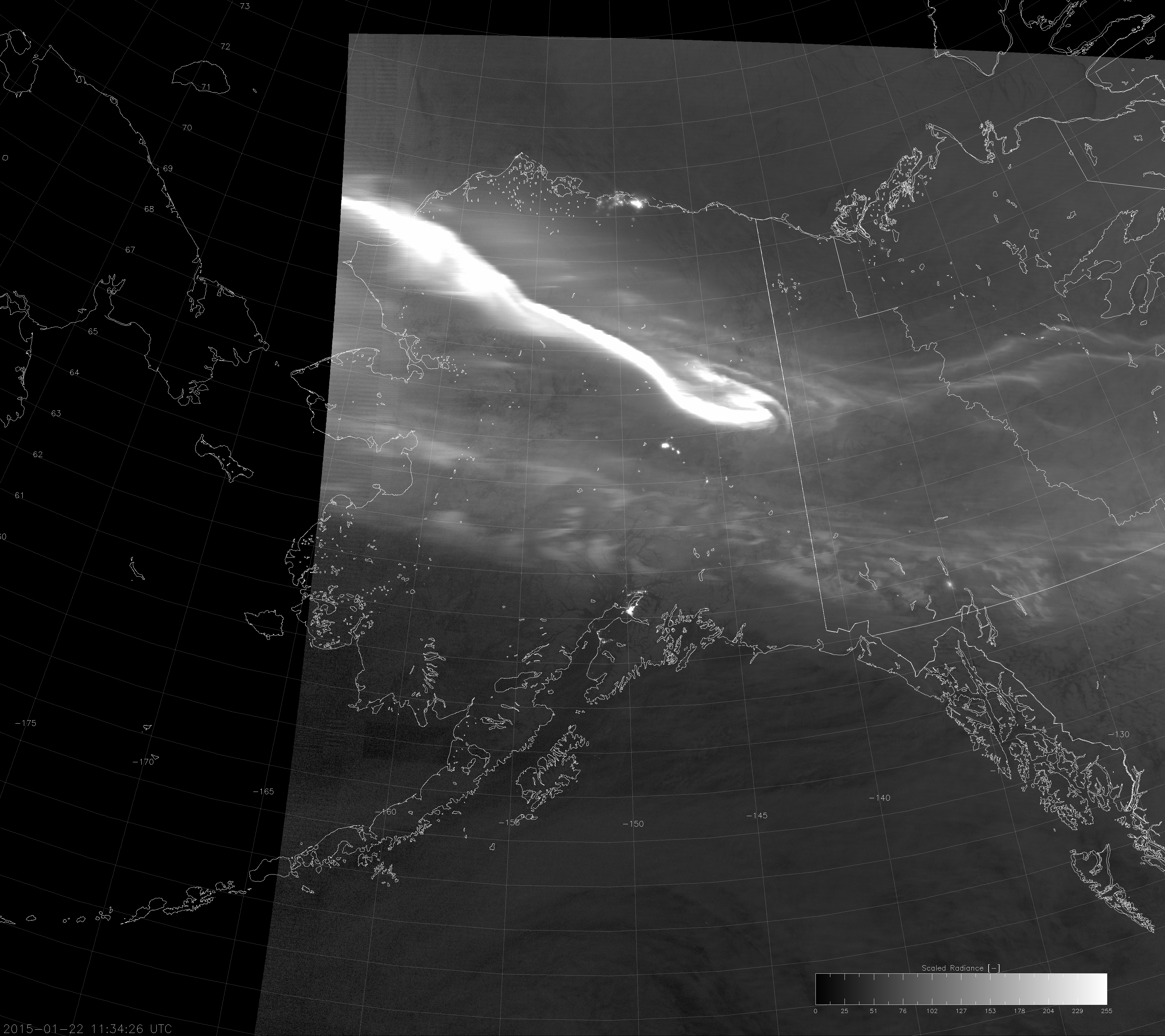
So, how do we get my scaling to work for this case? In theory, the answer is simple: bump up the max values until it’s no longer saturated. In practice, however, it’s not that simple. This was a broad, relatively diffuse aurora that was barely brighter than the max values. Some auroras are much more vivid (and much brighter than the max values), like this one:

VIIRS DNB image with modified "erf-dynamic scaling" (11:34 UTC 22 January 2015)
VIIRS DNB image with modified “erf-dynamic scaling” (11:34 UTC 22 January 2015)

If you increase the max values until nothing is saturated, you’ll only be able to see the brightest pixels (which are usually city lights) and nothing else. And, don’t forget: we don’t want to increase the max values everywhere all the time, because the algorithm works as-is when the aurora isn’t present (or when the moonlight is brighter than the aurora).

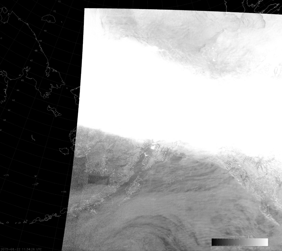
Here’s the solution: calculate max and min values with the EDS method as before, but increase the max values by 10% at a time until only a certain percentage of the image is saturated. That’s what I’ve done in the last image above, where I’ve adjusted the max values until only 0.5% of the image is saturated. In case you’re wondering, here’s the same image without this additional correction:

VIIRS DNB image with un-modified "erf-dynamic scaling" (11:34 UTC 22 January 2015)
VIIRS DNB image with unmodified “erf-dynamic scaling” (11:34 UTC 22 January 2015)

The correction makes it much better. What about for the first case I showed? Here’s the corrected version:

VIIRS DNB image with modified "erf-dynamic scaling" (15:14 UTC 21 January 2015)
VIIRS DNB image with modified “erf-dynamic scaling” (15:14 UTC 21 January 2015)

Once again, much better than before. You can see the cracks in the sea ice now! (Maybe it’s not as good as the manual scaling but, because it’s automated, it takes less time to produce. )

Of course, this correction assumes that less than 0.5% of the image is city lights or wildfires or lightning. And, it might not work too good if the data spans all the way from bright sunlight to new-moon night beyond the aurora because it darkens the non-aurora parts of the scene (as can be seen in the images from 22 January 2015). But, the great thing is: if the scene is not saturated by the aurora (or some other large bright feature) no correction is applied, so you still get the same great EDS algorithm results you had before.

As a bonus to make up for the initial flaws in the EDS algorithm (and to get any short-tempered viewers to stop cursing), enjoy the images below of a week’s worth of auroras as seen by the DNB (with the newly modified scaling). Make sure you look for the “Full Resolution” link to the upper right of each image in the gallery to see the full resolution version:

Oh, How the Seasons Change!

The transition between winter and summer happens twice a year. Unless you live in the tropics. Then you don’t really have winter. If there are seasons there, they are “dry” and “wet”. But, at high latitudes, the transition from summer to winter is often abrupt and cannot be mistaken for anything else. It’s hard not to notice when 22 hours of sunlight turns into 2 hours of sunlight and back again the following year. For places like the interior of Alaska, it’s also hard not to notice the temperatures in the 70s F giving way to temperatures below 0 °F. (Of course, here in Colorado, our temperatures went from 70 °F to 10 °F in a period of about 36 hours hours this week. Not to brag or anything.)

Summers are short at high latitudes but, autumns are shorter. So, what can VIIRS tell us about the changing seasons?

We’re going to focus on the “Natural Color” RGB composite. In this composite, the red component is the reflectance at 1.6 µm, the green component is the reflectance at 0.87 µm and the blue component is the reflectance at 0.64 µm (a red visible wavelength). The Natural Color RGB is useful for detecting snow and ice, determining cloud top phase, monitoring vegetation and detecting flooding. So, it’s good to get familiar with it.  Plus, it’s one of the best RGB composites you can make with the high-resolution (375 m) channels on VIIRS.

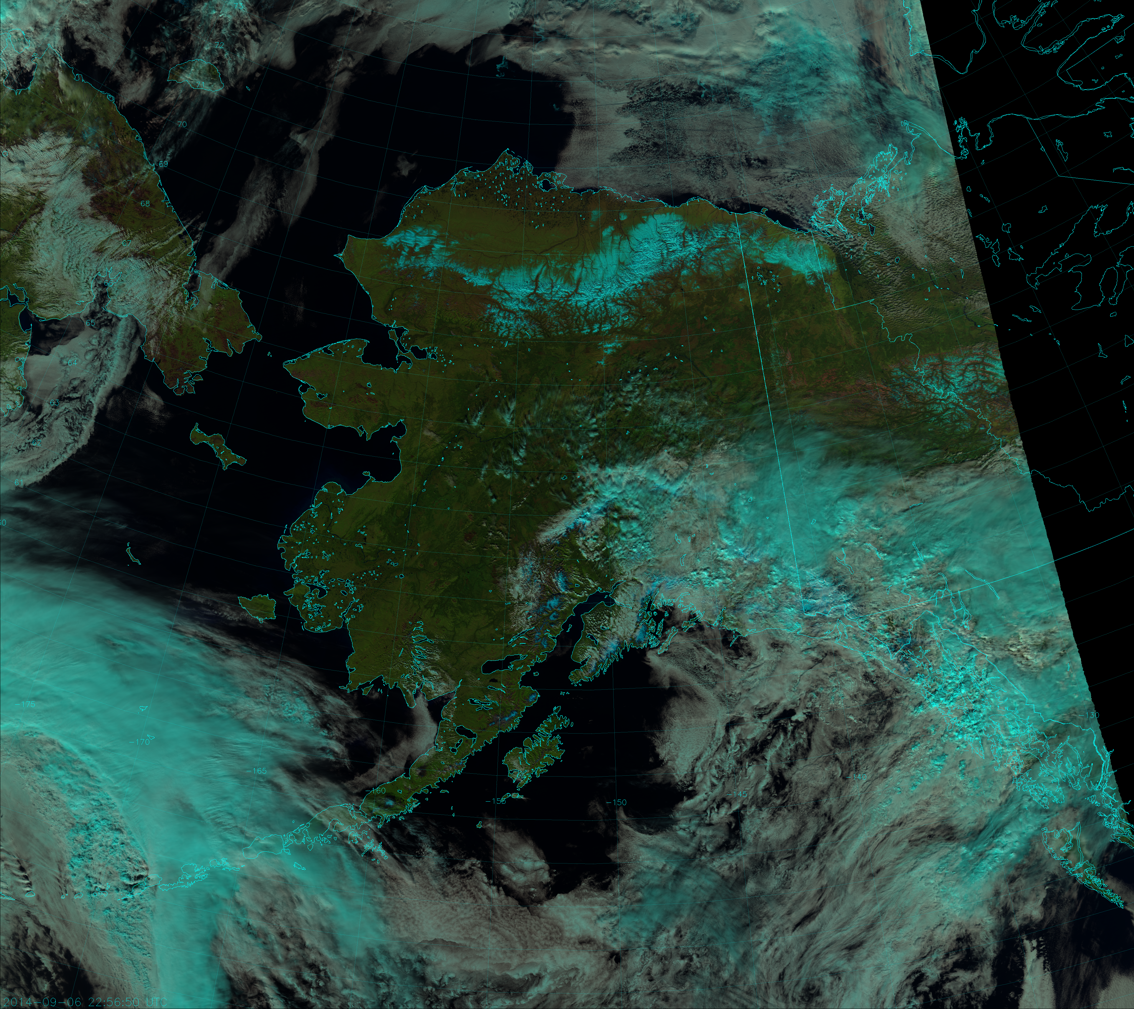
Here is a Natural Color RGB image of Alaska from 6 September 2014 – at the end of summer:

VIIRS Natural Color RGB composite of channels I-1, I-2 and I-3, taken 22:56 UTC 6 September 2014
VIIRS Natural Color RGB composite of channels I-1, I-2 and I-3, taken 22:56 UTC 6 September 2014.

It’s easy to pick out the ice clouds from the liquid clouds, just as it’s easy to see the snow on the Brooks Range. They appear cyan instead of white (as they would in the True Color RGB composite). If you want to know why snow and ice appear cyan in this composite, click here. But, I want to draw your attention to the third and nineteenth longest rivers in the US. Lower-48ers that didn’t click on the link are probably wondering which rivers I’m referring to. But, of course, Alaskans know which rivers I’m talking about, right?

OK, fine. Just to make sure we’re all on the same page, I’m talking about the Yukon and the Kuskokwim. These rivers are wide enough to be seen by VIIRS. Did you find them in the above image? Click on the image to see it in full resolution and make sure you see them.

Notice how the rivers are almost black. That’s because water is poorly reflective at these three wavelengths. This will come in handy later on. Now, let’s look again at these rivers a month later (7 October 2014):

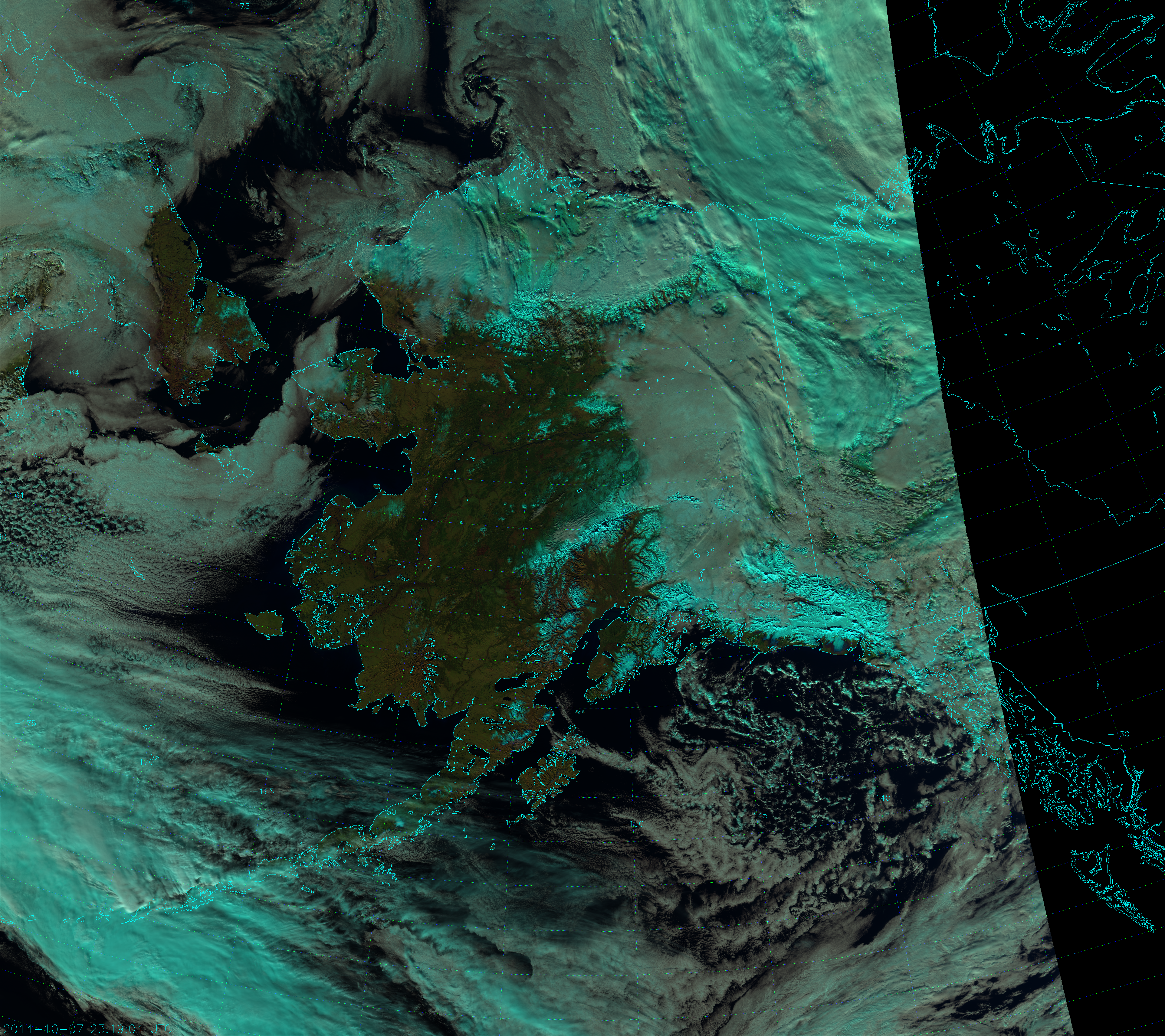
VIIRS Natural Color RGB composite of channels I-1, I-2 and I-3, taken 23:19 UTC 7 October 2014
VIIRS Natural Color RGB composite of channels I-1, I-2 and I-3, taken 23:19 UTC 7 October 2014.

Why are the rivers surrounded by brown when a month earlier the river valleys were green? Deciduous trees like to hang out in the river valleys of southwestern Alaska, and these trees have already changed color and lost all their leaves over the course of this month, leaving behind only the bare branches and trunks. This is one sign of the changing seasons. (Note, however, that it is just a coincidence that these areas appear brown here. This is a false-color composite. The brown color is due to the reduced reflectivity of the deciduous forests at 0.87 µm caused by the lack of leaves, not because the tree trunks are brown. Read this if you want to learn more.)

Another sign of the changing seasons is the additional snow present. Everywhere north of the Brooks Range is snow covered. Plus, you can see pockets of snow in the Kilbuck and Kuskokwim Mountains, the Aleutian Range and in the hills and mountains surrounding Norton Sound.

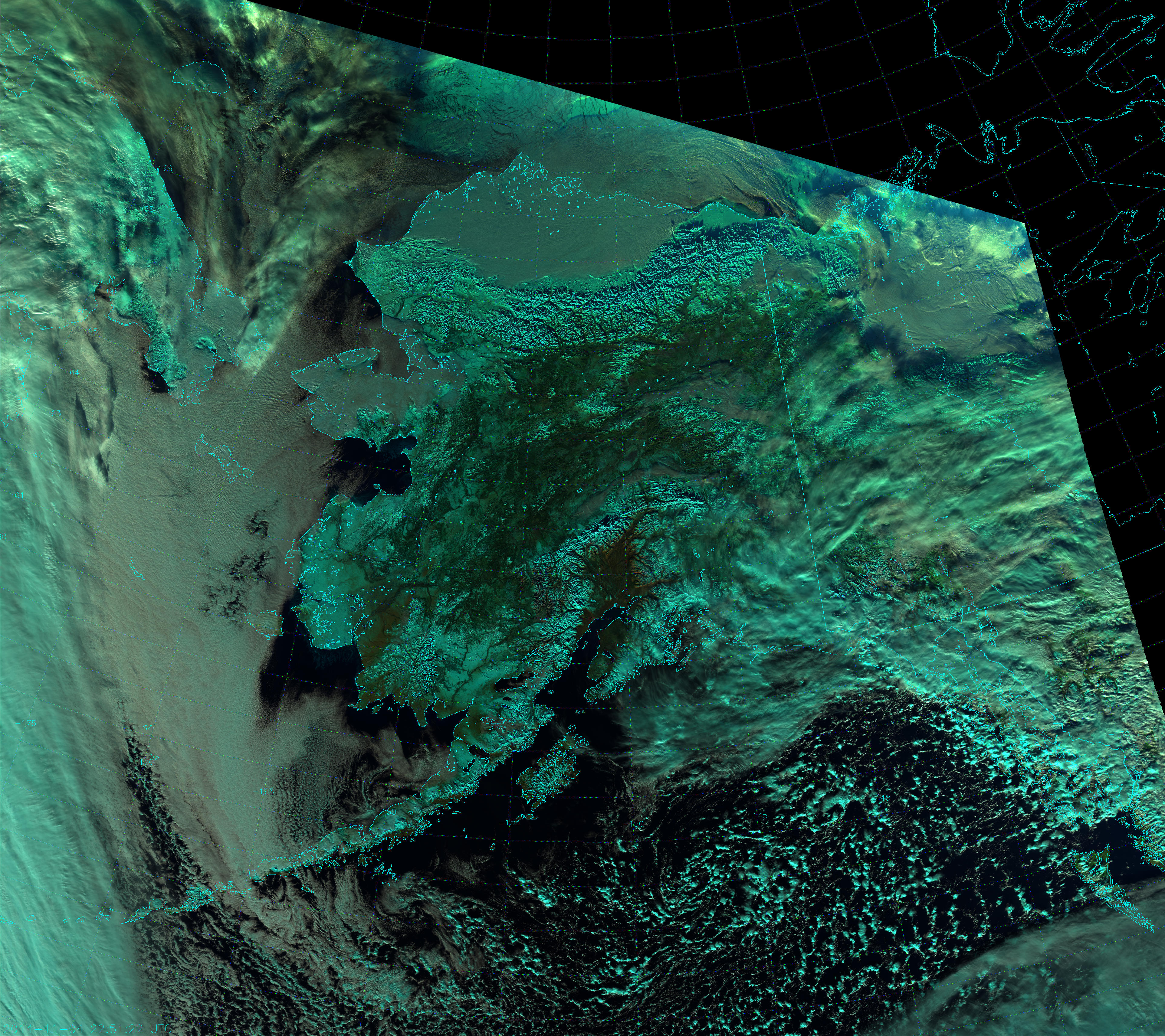
Fast forward another month to 4 November 2014:

VIIRS Natural Color RGB composite of channels I-1, I-2 and I-3, taken 22:51 UTC 4 November 2014
VIIRS Natural Color RGB composite of channels I-1, I-2 and I-3, taken 22:51 UTC 4 November 2014.

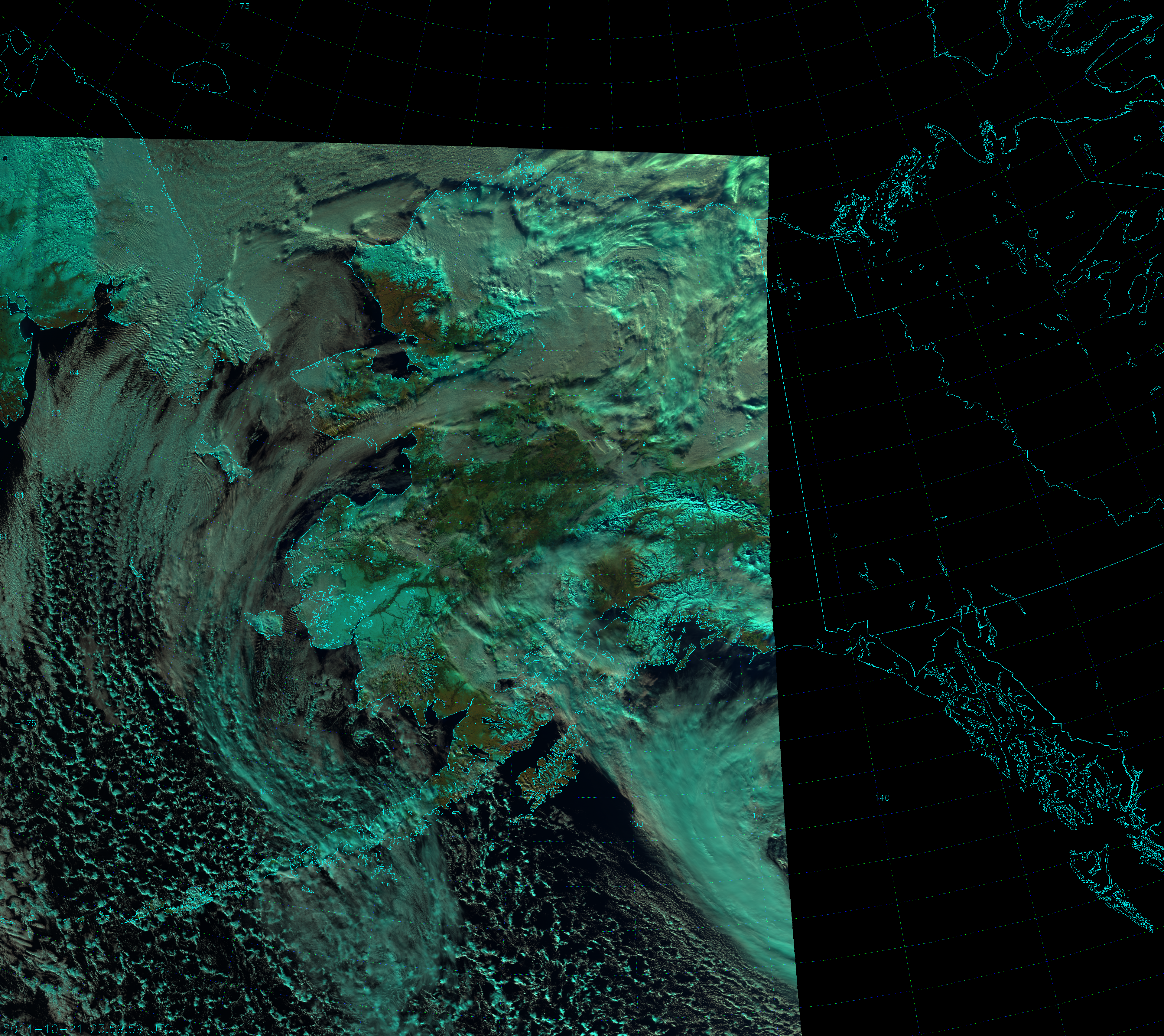
Now, almost the whole state is covered by snow. But, look at the rivers! They are no longer black – they are cyan, which means they have frozen over. Although, if you look closely, you can see a few pixels suggesting open water on the lower sections of the Yukon, generally between Russian Mission and Mountain Village. Also, look closely where the Kuskokwim River flows into Kuskokwim Bay, downstream from Bethel – there is ice along the shores, but open water in the middle. Ice is also forming in Norton Sound and has covered Baird Inlet.

Two weeks earlier (21 October 2014), there is more of a mix of ice and open water on the Yukon and Kuskokwim:

VIIRS Natural Color RGB composite of channels I-1, I-2, and I-3, taken 23:59 UTC 21 October 2014
VIIRS Natural Color RGB composite of channels I-1, I-2, and I-3, taken 23:59 UTC 21 October 2014.

Identifying ice and open water on the rivers is very important. When the two coexist, ice jams can occur. When an ice jam forms, it blocks the flow of the river, which can flood areas upstream of the jam. When the jam breaks, it can cause a flash flood downstream.

Ice jams, even on small rivers, can show their power:

Imagine what they can do on the third and nineteenth largest rivers in the country!

Sometimes, you don’t have much time to get out of the way. Note: you might not want to watch this one if you are prone to motion sickness:

Who remembers what happened to Crooked Creek on the banks of the Kuskokwim in 2011? Or on the Yukon River at Eagle in 2013?

Of course, once the rivers are completely frozen over, there is no threat of an ice jam or flooding. But, now that you know how to spot ice forming on these rivers in the fall, you’ll hopefully be able to spot the return of open water in the spring, when the threat returns.

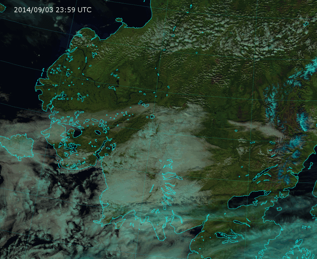
To really capture the changing of the seasons, here’s an animation of the relatively cloud-free images from 3 September 2014 to 6 November 2014:

Animation of VIIRS Natural Color RGB composites from 3 September 2014 to 6 November 2014
Animation of VIIRS Natural Color RGB composites from 3 September 2014 to 6 November 2014.

Click on the image to view the animation. It’s 17 MB, so it may take a while to load. See if you can pick out when the first ice forms on either river.


Revisiting Scaling on the Solstice

OK, so by this time, it’s about a month after the Summer Solstice in the Northern Hemisphere. If the title bothers you, just replace “solstice” with “summer”. Then replace “on the” with “now that it’s” to make the sentence grammatically correct.

If you read the very first post on this blog (you may want to go back and read it again, even if you already did) you would know that it’s difficult to display VIIRS Day/Night Band (DNB) imagery when the day/night terminator is present. The data varies by 6-8 orders of magnitude between day and night (depending on the moon and other factors), which is tough to represent when you only have 256 colors available to make an image. That’s why the Near Constant Contrast EDR exists.

But, what if you don’t have access to the Near Constant Contrast (NCC) data? Is there anything one can do to get useful information on both sides of the terminator in the same image?

The short answer is: yes. The long answer is: yesss. But, that’s not to say the results are always going to be perfect.

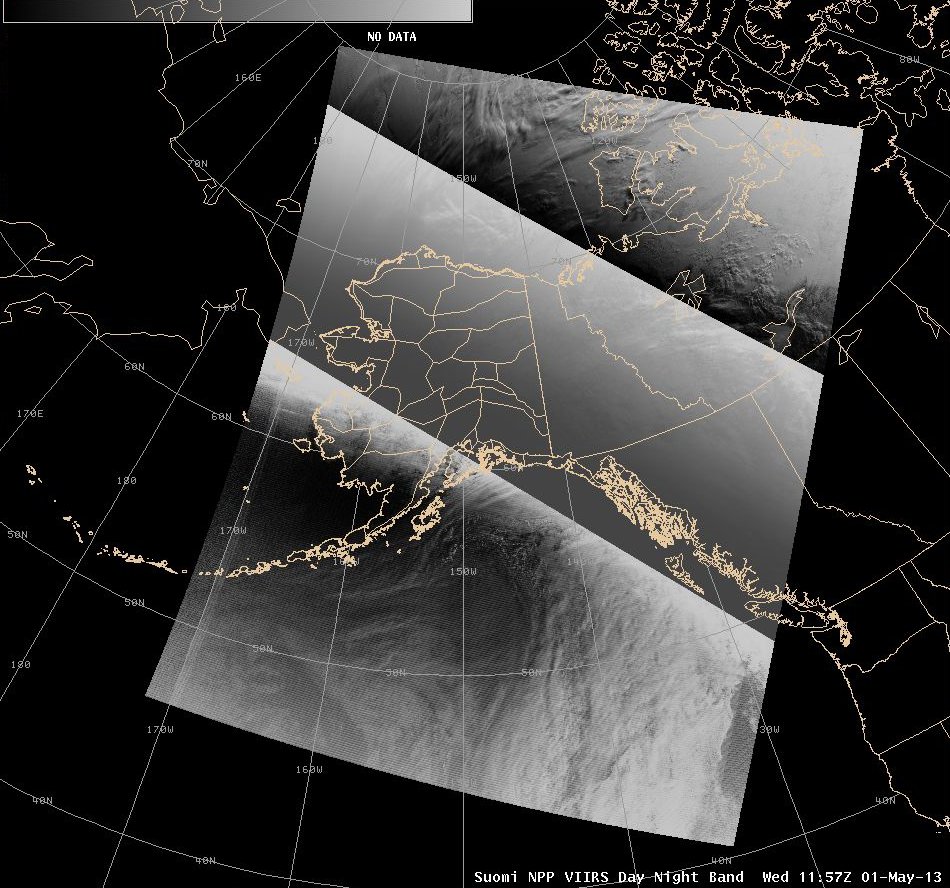
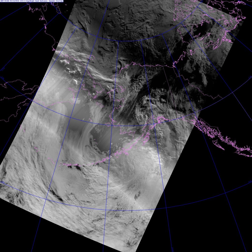
Over the years, I have acquired examples of things that various people or groups have tried that didn’t work. Like this one:

VIIRS DNB example from 11:57 UTC 1 May 2013
VIIRS DNB example from 11:57 UTC 1 May 2013. This image is scaled for “day”, “night” and “twilight” regions. Image courtesy GINA.

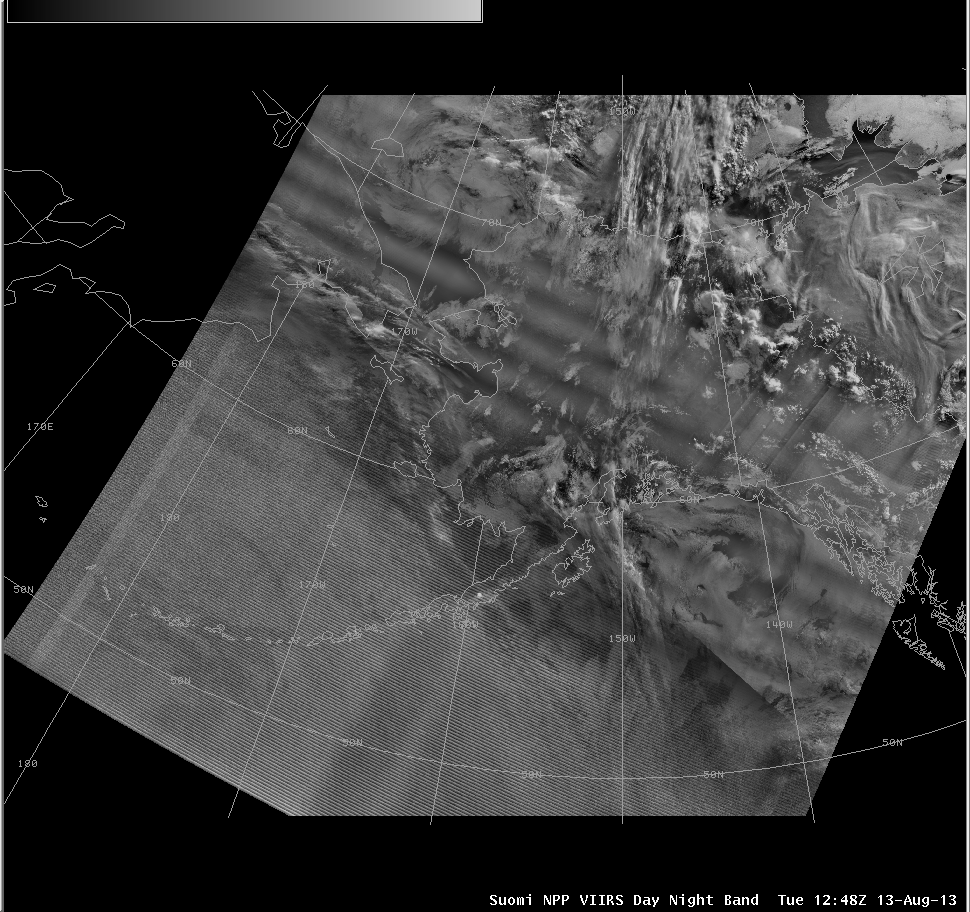
Or this one that you should have seen before (if you re-read the blog post I told you to read):

DNB example using solar zenith angle-dependent scaling.
VIIRS DNB example from 12:48 UTC 13 August 2013. This image uses solar zenith angle-dependent scaling. Image courtesy of GINA.

This is not to single anyone out (especially because I don’t know the names of the people who produced these images) – I’ve tried a number of things that didn’t work out either. Knowing why they don’t work is the key to finding something that does work.

The first example tried to divide up the image into a “day” side, “night” side and “twilight” area in-between, then scale each region independently of the others. Of course, that leads to discontinuities at the boundaries of each region. (The brightest “twilight” pixels border the darkest “day” pixels, etc.)

The second example broke up the image into many different zones based on solar zenith angle, and then (I assume) applied some kind of smoothing to prevent discontinuities. But, you still end up with a wavy pattern of anomalously brighter and darker areas within each solar zenith angle zones. That’s distracting.

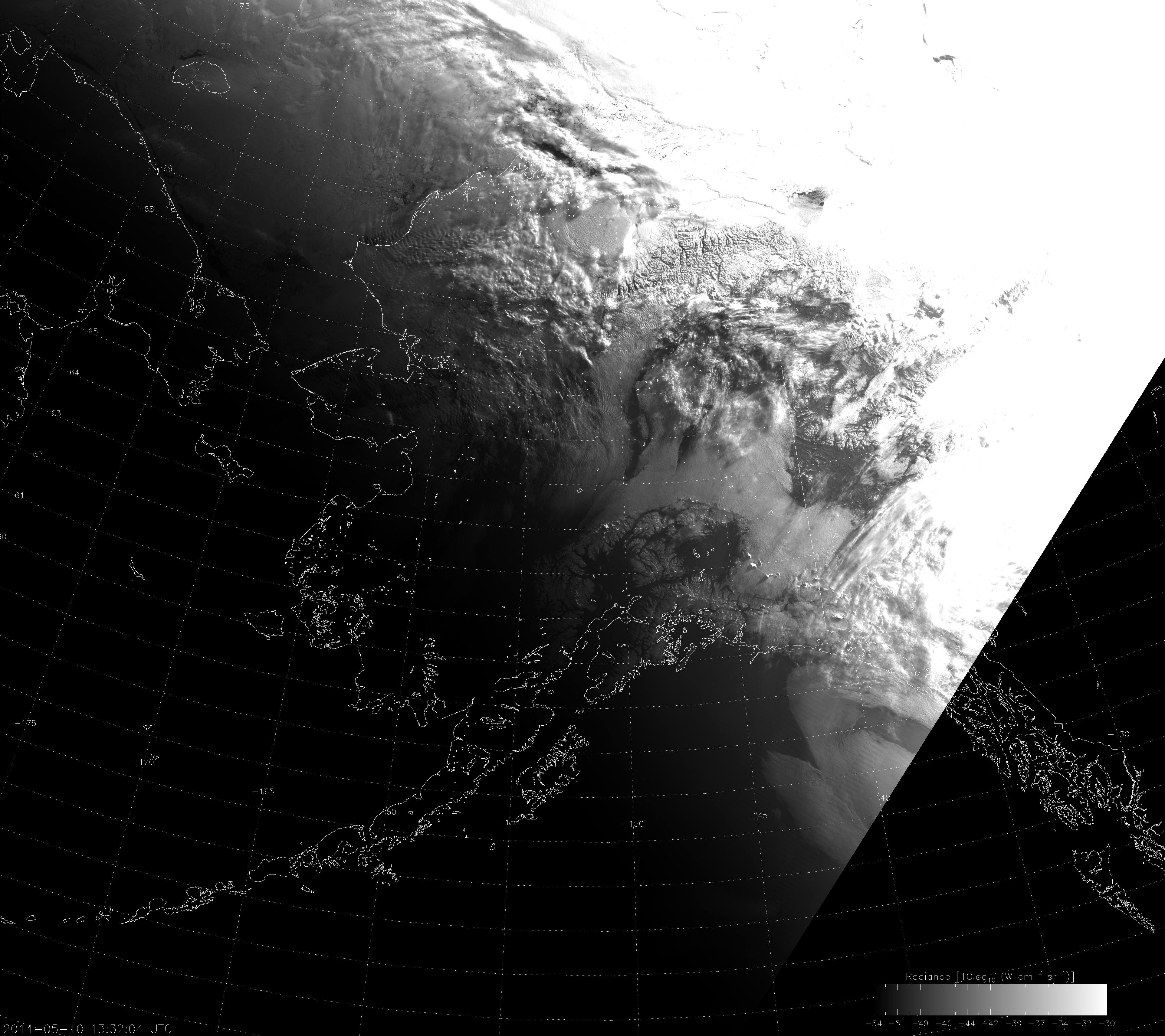
When I was developing software to produce Day/Night Band imagery from across the globe, I thought I had something when I scaled the imagery based on the median radiance values in the image. (If you want to know how it worked, it was along these lines: scale the image linearly between max and min values where max = [median*8 < maximum data value] and min = max/256) You didn’t need to know if it was day or night. Unlike before, this scaling didn’t highlight the day side or the night side when the terminator was in the scene. It highlighted the twilight zone (Ahhh! Run away!), like this:

VIIRS DNB image from 13:32 UTC 10 May 2014
VIIRS DNB image from 13:32 UTC 10 May 2014. This image uses “median-based” linear scaling, as described in the text.

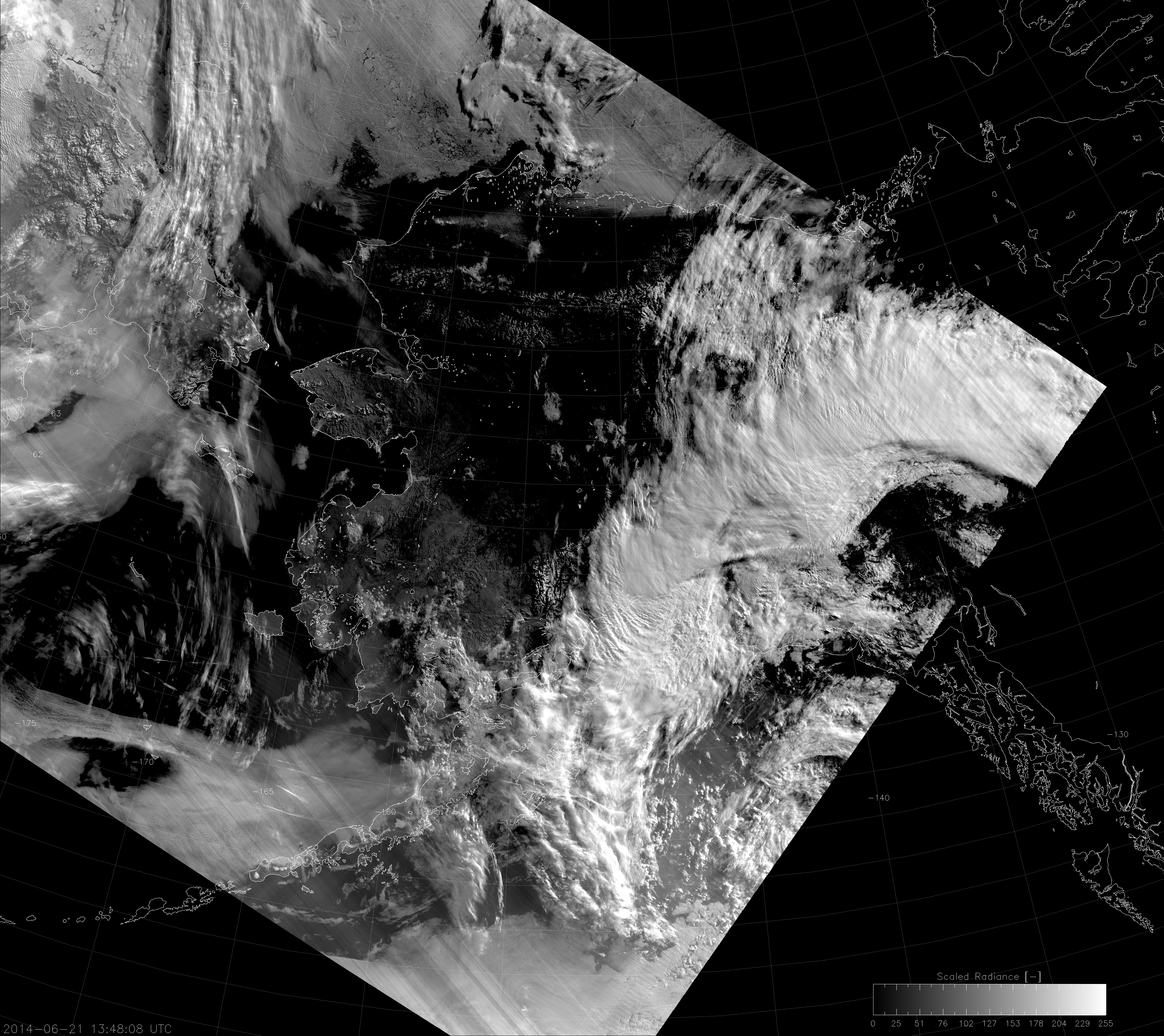
Not perfect. But, in my defense, this scaling does work for most of the globe. The tropical group at CIRA uses it for their DNB images on “TC Realtime“. Also, it doesn’t work too bad near the solstice, when most of Alaska is on the “day” side of the terminator, even in the primary “nighttime” overpass:

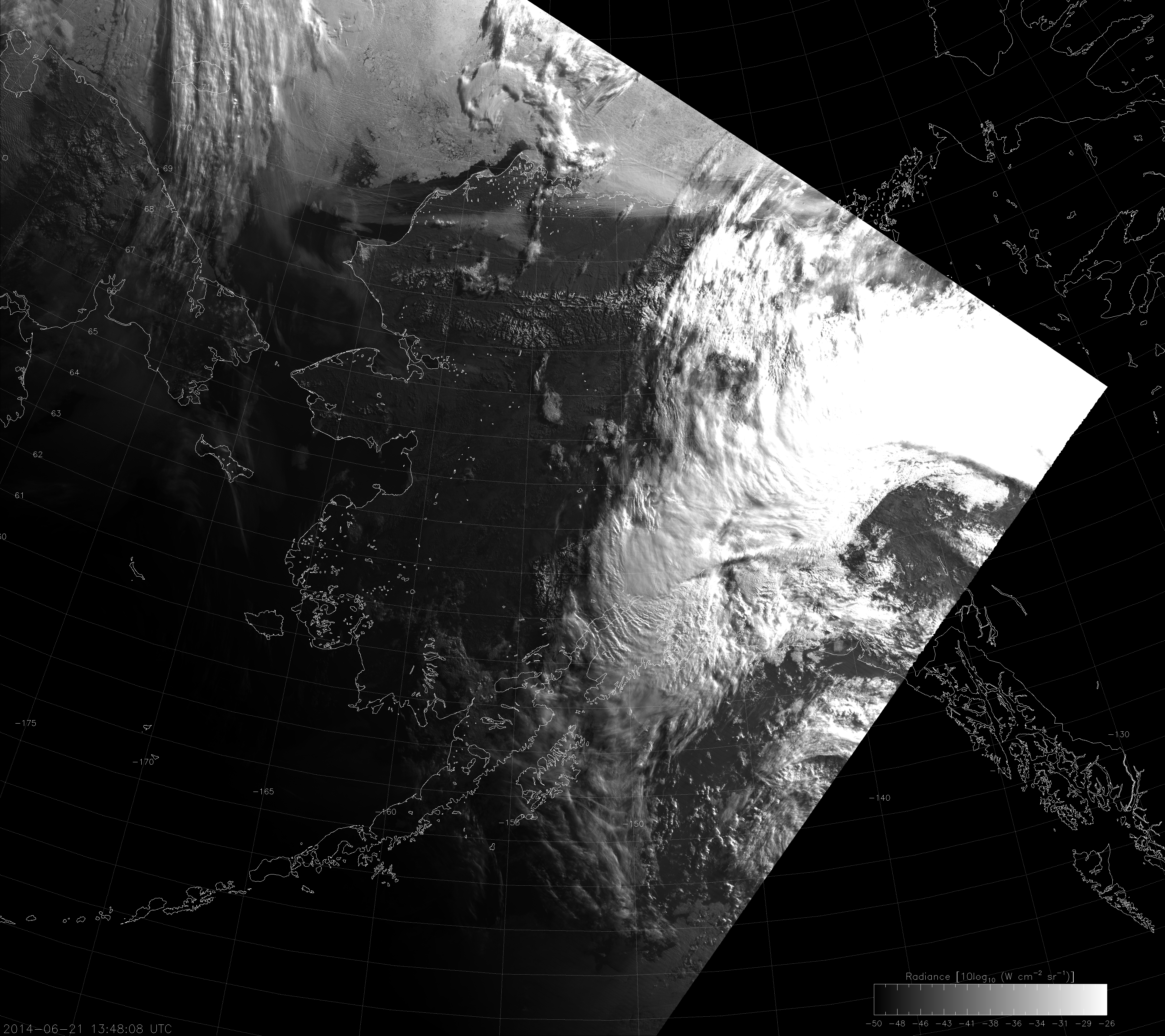
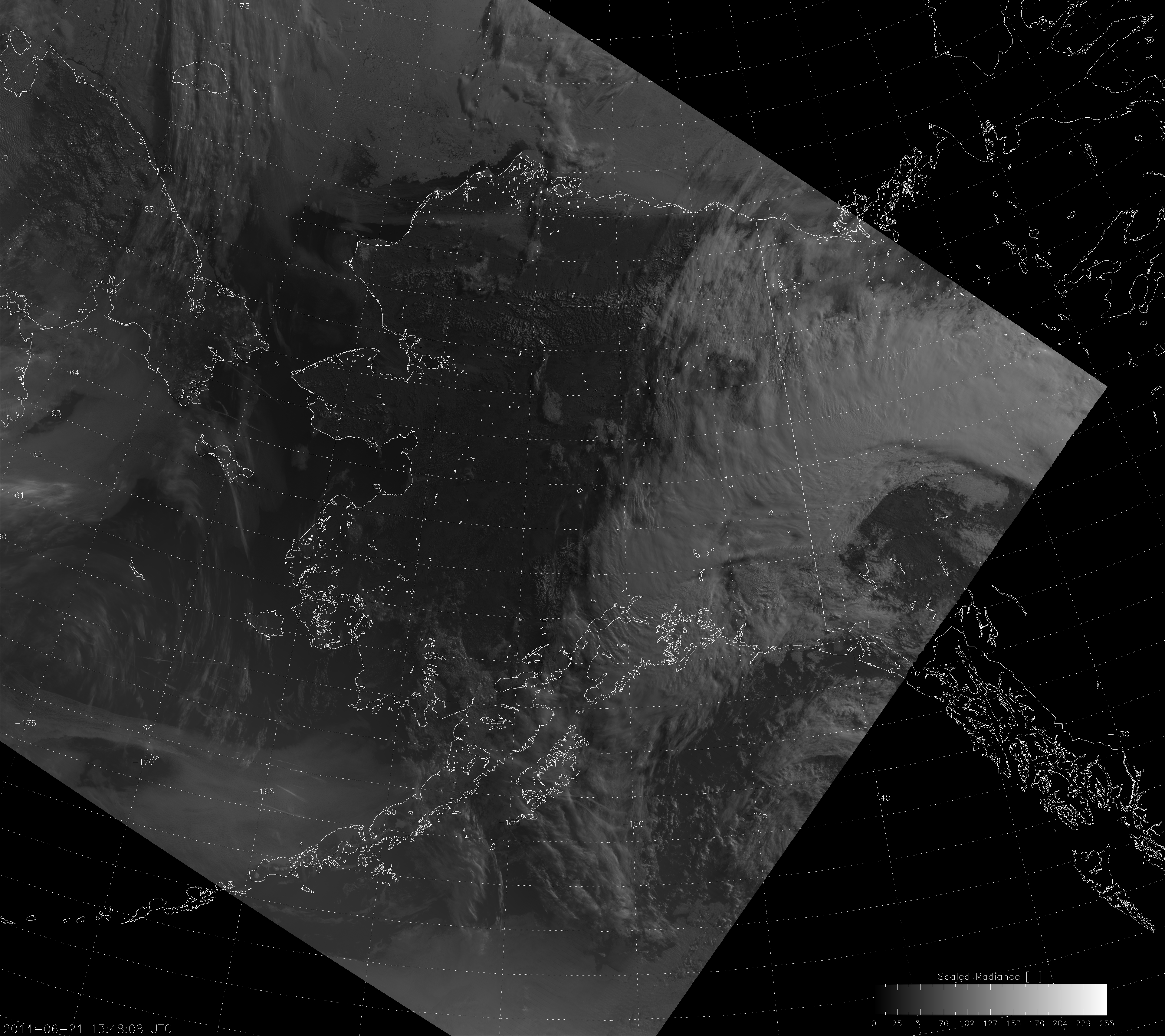
VIIRS DNB image from 13:48 UTC 21 June 2014
VIIRS DNB image from 13:48 UTC 21 June 2014. This image uses “median-based” linear scaling, as described in the text.

It has the added benefit that you can associate each level of brightness with a specific radiance value.

Now, I was going to leave my DNB scaling as is because, “Hey, we can just use the Near Constant Contrast (NCC) in these situations. Why break my back trying to re-invent the wheel?” That is, after all,  the primary point of the NCC – to make it easy to display DNB across the terminator. Then CIRA temporarily lost access to NCC data. My hand was forced. I had to think of a solution.

How about this idea: instead of finding the median value of the whole domain, break up the domain into small zones according to solar zenith angle, and then apply the same “median-based” linear scaling? Here’s what you get if you break up the image into solar zenith angle bins of 0.01 degrees:

VIIRS DNB image from 13:48 UTC 21 June 2014
VIIRS DNB image from 13:48 UTC 21 June 2014. This image uses “median-based” linear scaling over zones grouped by solar zenith angle.

Not bad. You get a lot of contrast throughout the image (particularly on the “night” side), but it still has stripes in it. This is due to the fact that the presence or absence of clouds (or city lights or whatever) is constantly changing the distribution of radiances within each solar zenith angle bin. The stripes get larger if you use larger bins. Smaller bins means a smaller sample size and, therefore, “less stable” median values. What we need is more of an absolute scale rather than a relative scale.

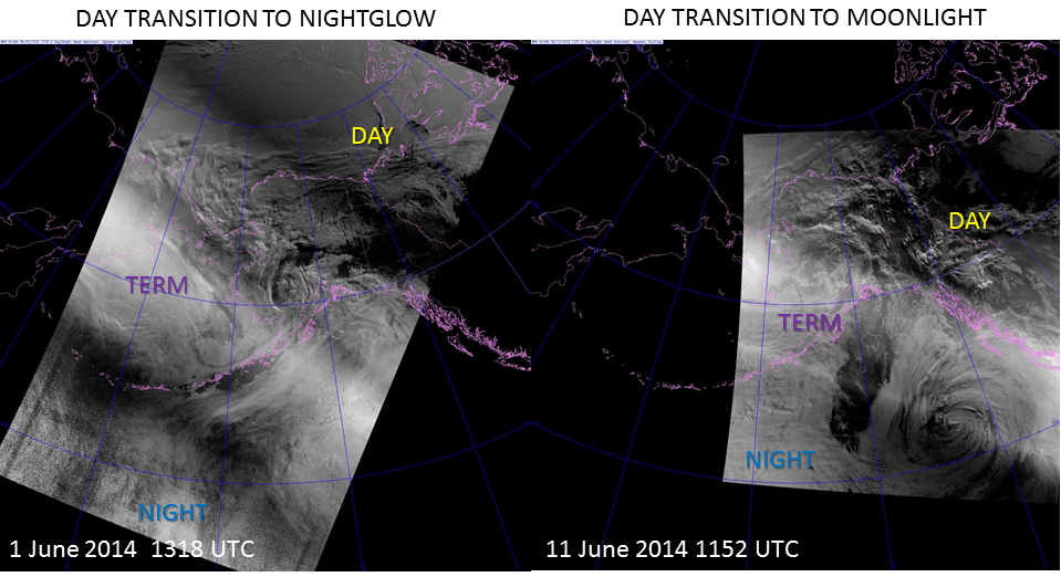
At this point, it occurred to me that Steve Miller at CIRA (my boss, but that doesn’t mean I’m brown-nosing) already came up with a solution. He developed a “dynamic scaling” method where max and min are based solely on the solar and lunar zenith angles.

VIIRS DNB images from 1 June 2014 and 14 June 2014 spanning the terminator
VIIRS DNB images from 1 June 2014 and 14 June 2014 spanning the terminator. These images use “dynamic scaling” as defined in the text.

As you can see, the dynamic scaling produces good contrast on both sides of the terminator, which is what users are typically looking for. It’s important to be able to identify clouds and surface features (like icebergs, for example) throughout the entire image – not just on one side or the other or just in the middle.

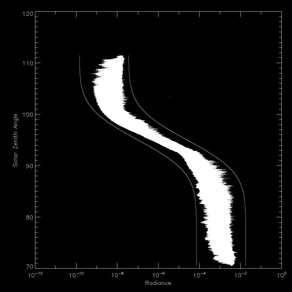
In my bungled attempt to apply his dynamic scaling within my software, I had another epiphany. If you plot the radiance values (on a log-scale) as a function of solar zenith angle across the terminator, you get something that looks like this:

Observed DNB radiance values as a function of solar zenith angle
Scatterplot of observed DNB radiance values as a function of solar zenith angle for the 13:53 UTC 12 July 2014 overpass. Gray curves represent the max and min bounds used for the scaling.

Doesn’t that look a lot like the error function turned sideways? This became the basis for a new form of “dynamic scaling”: find the error function that fits the maximum and minimum expected values of the data as a function of solar and lunar zenith angles.  In fact, those are the curves plotted on the graph. Steve Miller’s dynamic scaling is simply a piecewise linear approximation to my error function curves. (Or, more correctly, you could say my error function curves are a continuous approximation of his piecewise functions.)

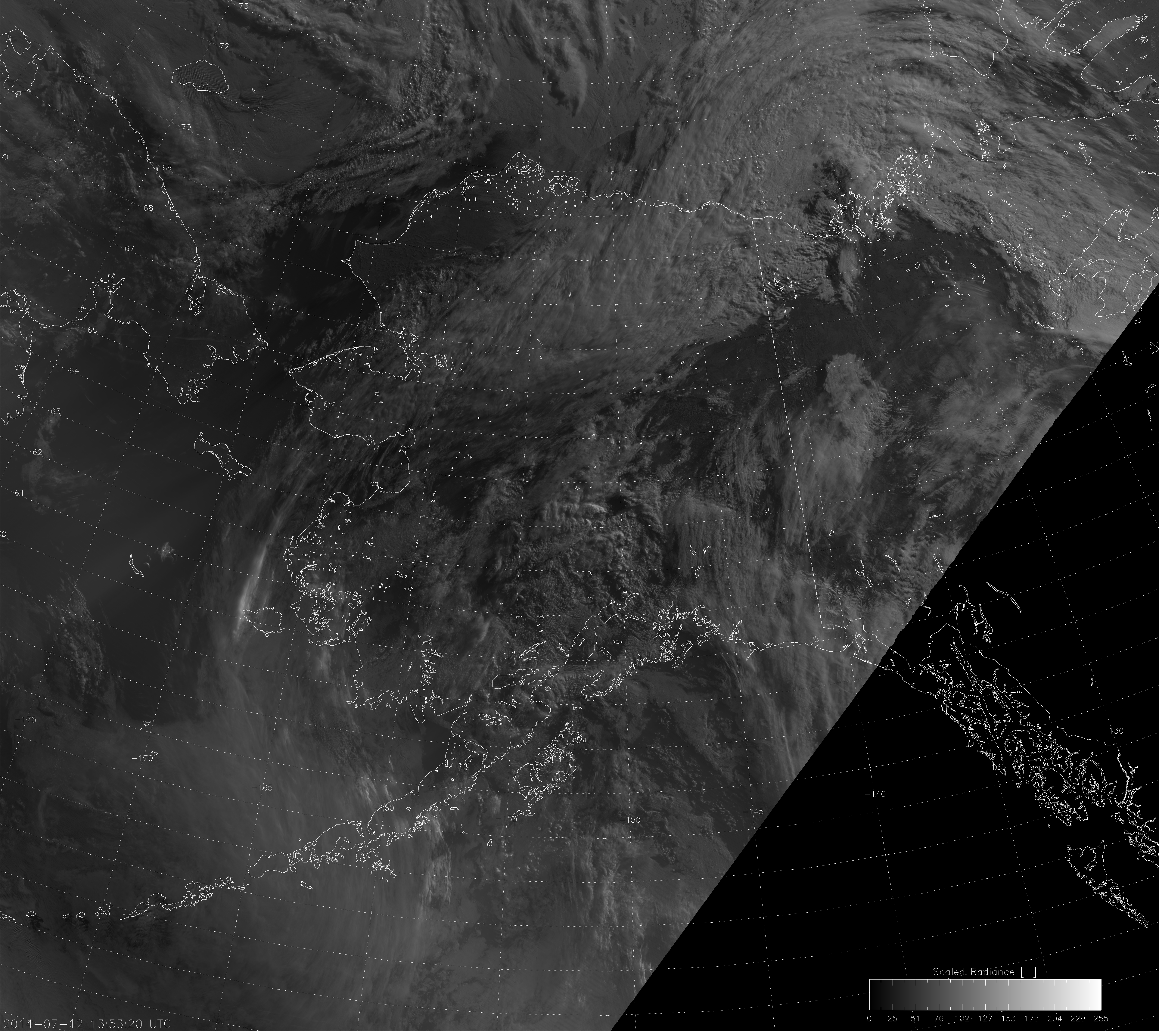
A similar error-function-like distribution of radiance values occurs across the moon/no-moon terminator, except the range is only 2-3 orders of magnitude instead of 6-7. We simply multiply the lunar zenith angle-fitted error function and the solar zenith angle-fitted error function on the “night” side to account for the variation in radiance from full moon to new moon.  When you do that (and apply a square-root correction), you get this image from a night with a full moon:

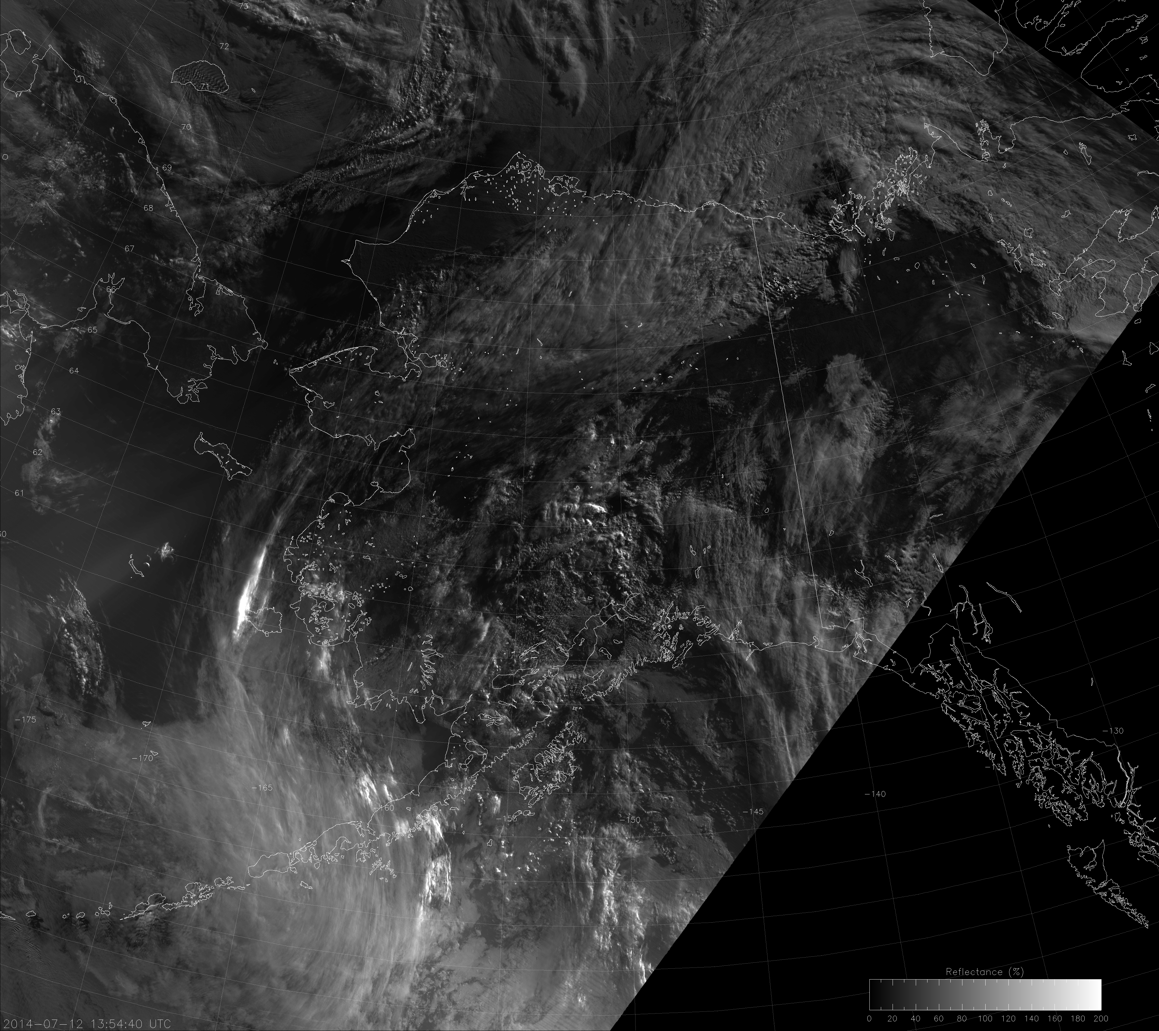
VIIRS DNB image from 13:53 UTC 12 July 2014
VIIRS DNB image from 13:53 UTC 12 July 2014. This image uses “erf-dynamic scaling” as described in the text.

And this image from a few nights after last quarter moon:

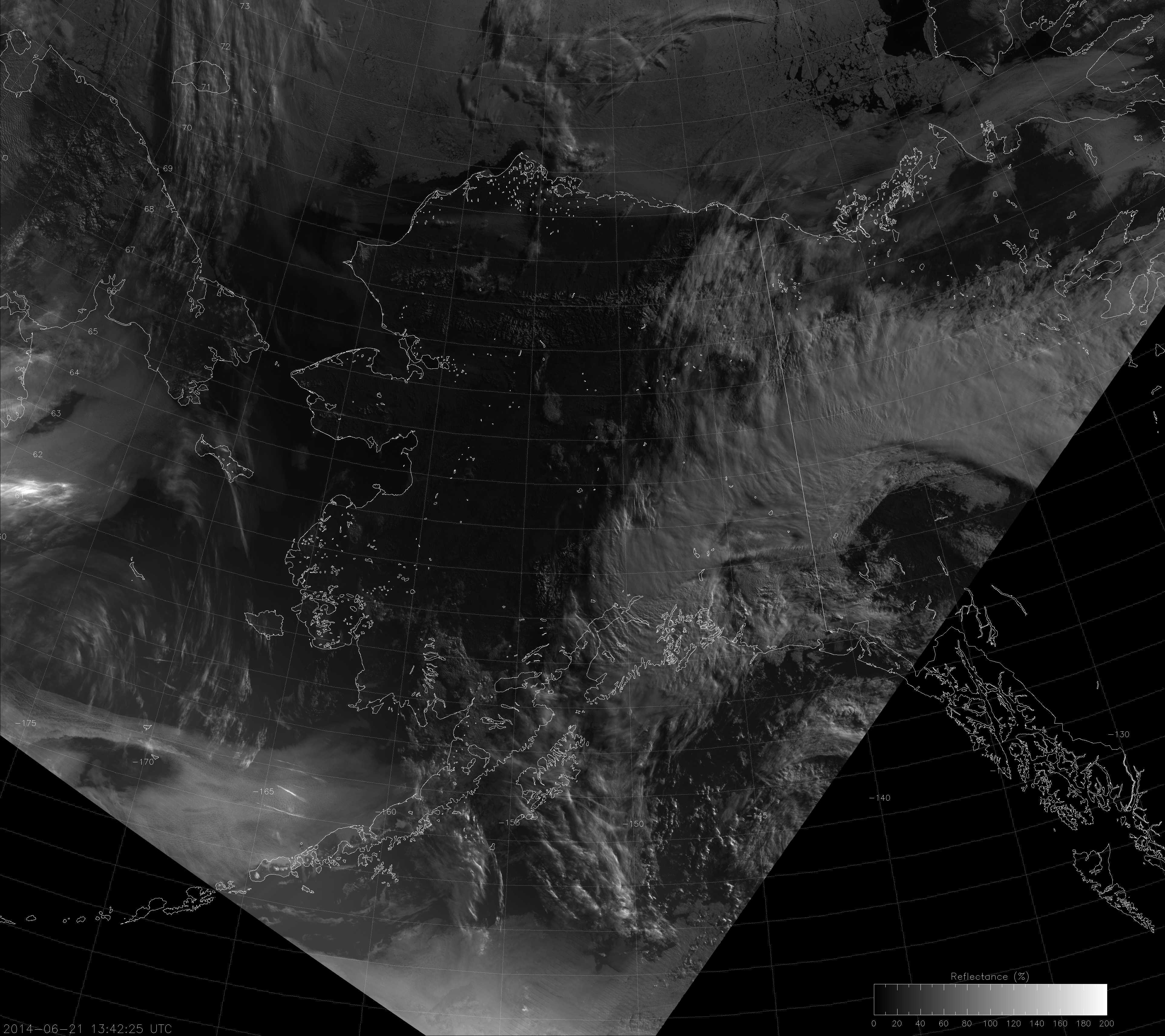
VIIRS DNB image from 13:48 UTC 21 June 2014
VIIRS DNB image from 13:48 UTC 21 June 2014. This image uses “erf-dynamic scaling” as described in the text.

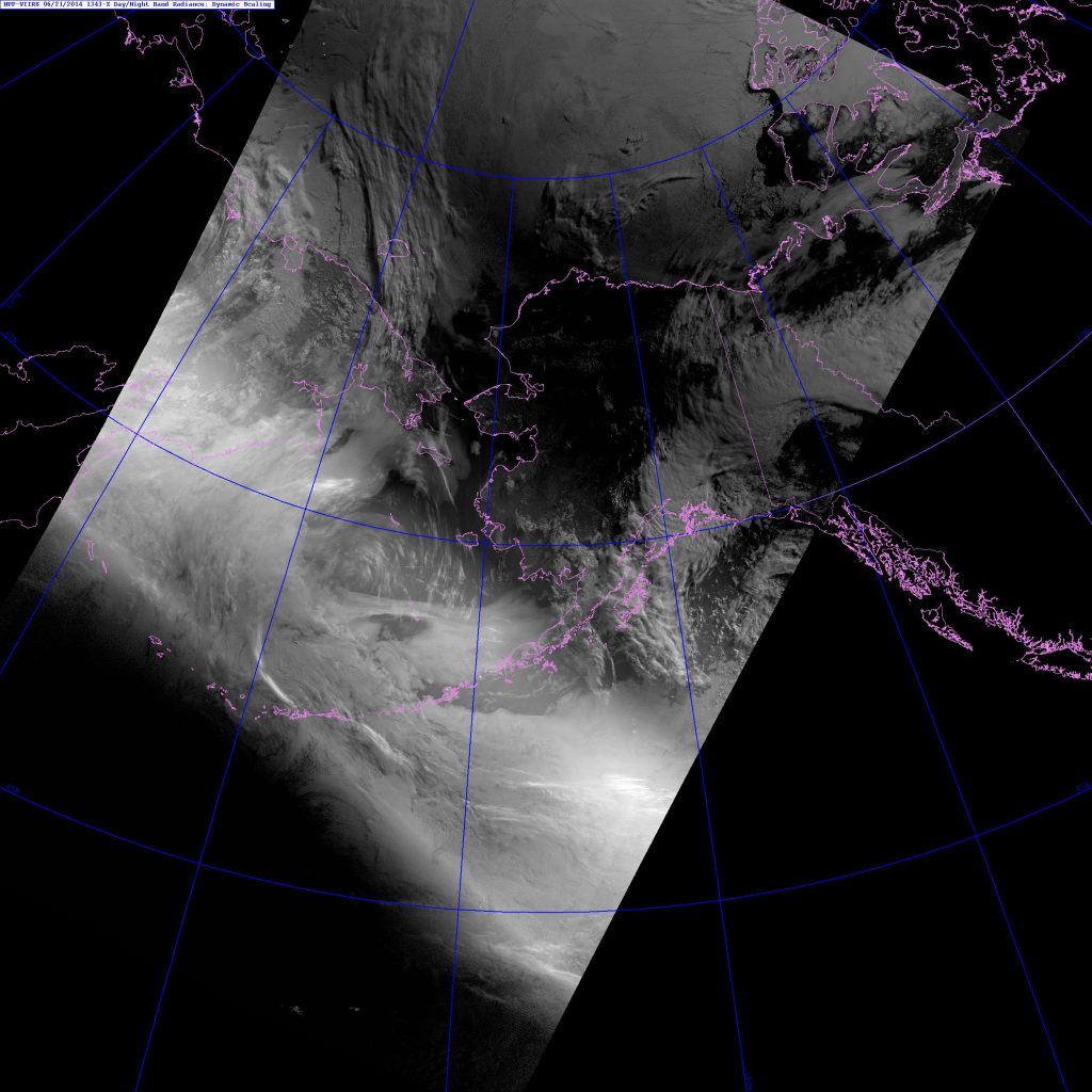
These compare pretty well with the Near Constant Contrast imagery from the same times:

VIIRS NCC image from 13:53 UTC 12 July 2014
VIIRS NCC image from 13:53 UTC 12 July 2014.
VIIRS NCC image from 13:48 UTC 21 June 2014
VIIRS NCC image from 13:48 UTC 21 June 2014.

Here’s what the piecewise linear dynamic scaling gives you:

VIIRS DNB image from 13:43 UTC 21 June 2014
VIIRS DNB image from 13:43 UTC 21 June 2014. This image uses “dynamic scaling” as described in the text.
VIIRS DNB image from 13:31 UTC 13 July 2014
VIIRS DNB image from 13:31 UTC 13 July 2014. This image uses “dynamic scaling” as described in the text.

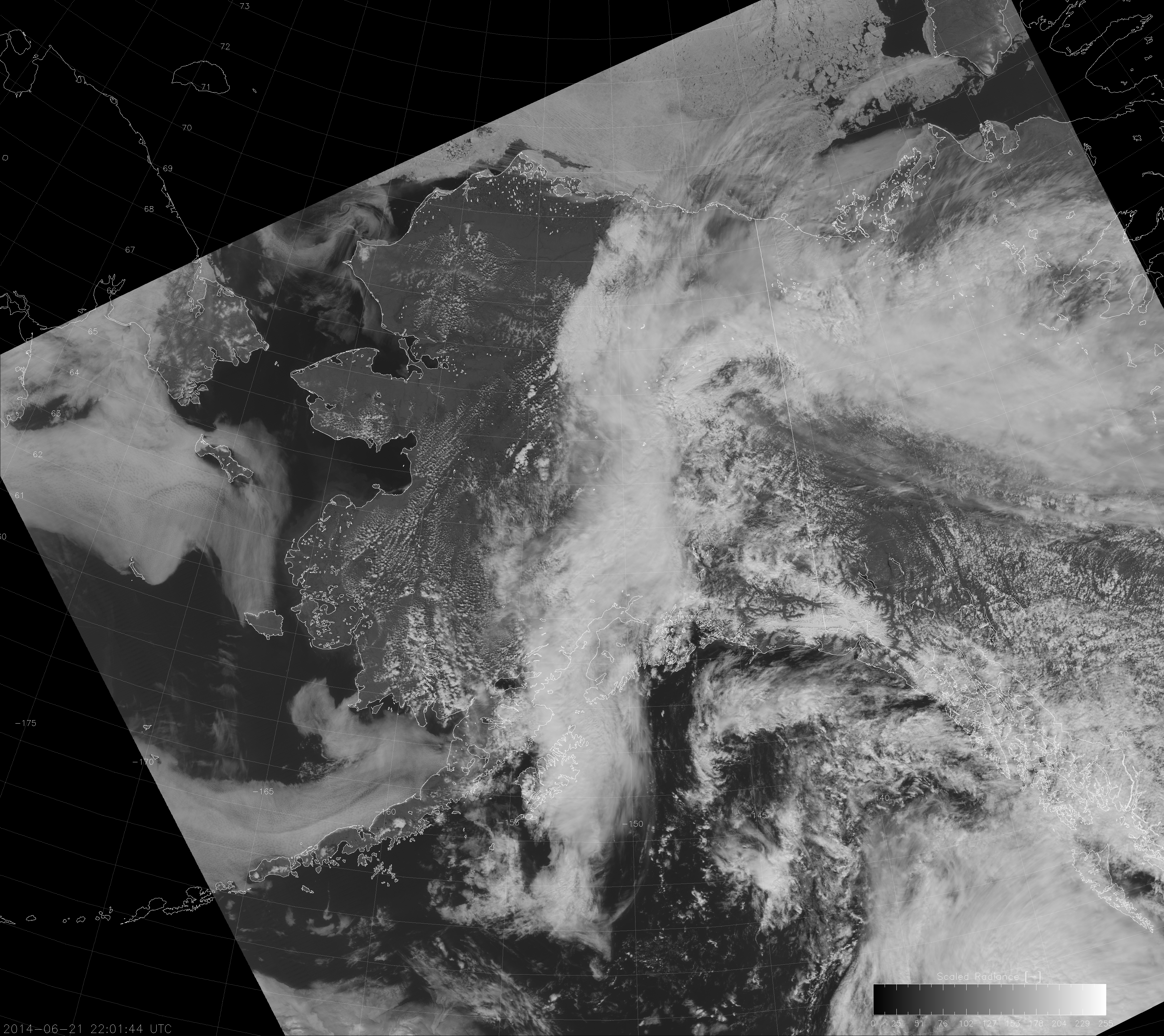
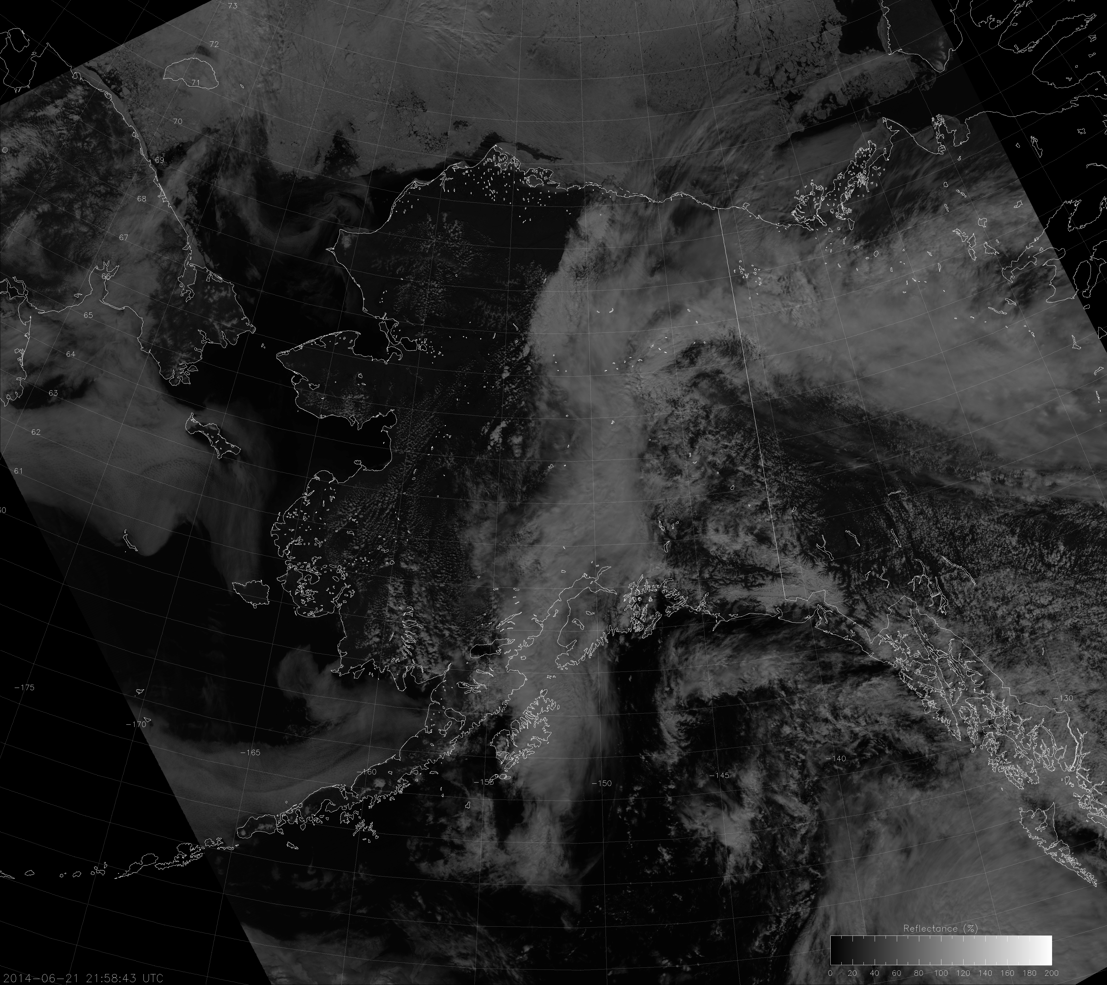
And, if you’re curious, the “erf-dynamic scaling” works just as well during the day as it does at the terminator. Here is an example of the DNB with this scaling, followed by the associated NCC image:

VIIRS DNB image from 22:01 UTC 21 June 2014
VIIRS DNB image from 22:01 UTC 21 June 2014. This image uses “erf-dynamic scaling” as described in the text.
VIIRS NCC image from 21:58 UTC 21 June 2014
VIIRS NCC image from 21:58 UTC 21 June 2014.

Of course, the exact form of the error functions could be tweaked here or there to provide a better fit to the natural variability of the observed radiances. But, after one lunar cycle of testing, the results look promising. It is possible to scale the Day/Night Band across the terminator to provide useful information for “day” and “night” (and even across the scary twilight zone)!


UPDATE (27 January 2015): The “erf-dynamic scaling” algorithm has been implemented in CSPP. So users of that software product should be on the look-out for the latest version. (It was added in October or November 2014. I don’t know the actual date.) Thanks to the folks at CIMSS who develop CSPP for quickly adding this! We look forward to collaborating more with the CSPP developers on future products.  Also, you can read about a correction to the “erf-dynamic scaling” algorithm here.