Funny River Isn’t Laughing

Imagine you’re getting ready for bed. You take one last look out of your bedroom window and you see this:
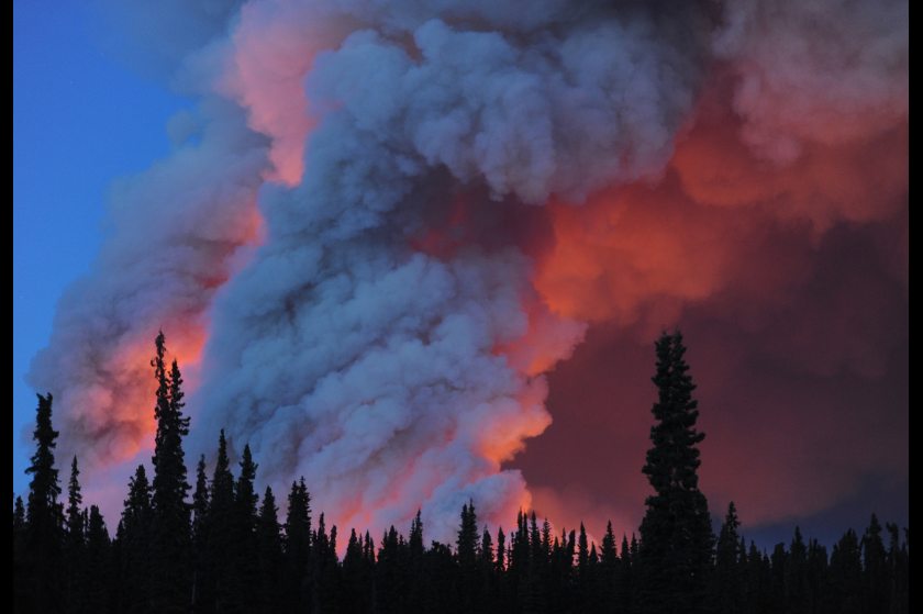
Photo of Funny River Fire
Photo of the Funny River Fire, taken near 1:00 AM local time (0900 UTC), 21 May 2014. Courtesy Bill Roth/Alaska Dispatch.

Good luck sleeping!

That is the light and smoke from the Funny River Fire, which started on 20 May 2014 and rapidly grew to over 44,000 acres in under 48 hours. Rapidly expanding fires like this one burn through a lot of fuel and can create a lot of smoke. Enough smoke to be seen by radar:

And certainly enough smoke to be seen from space:
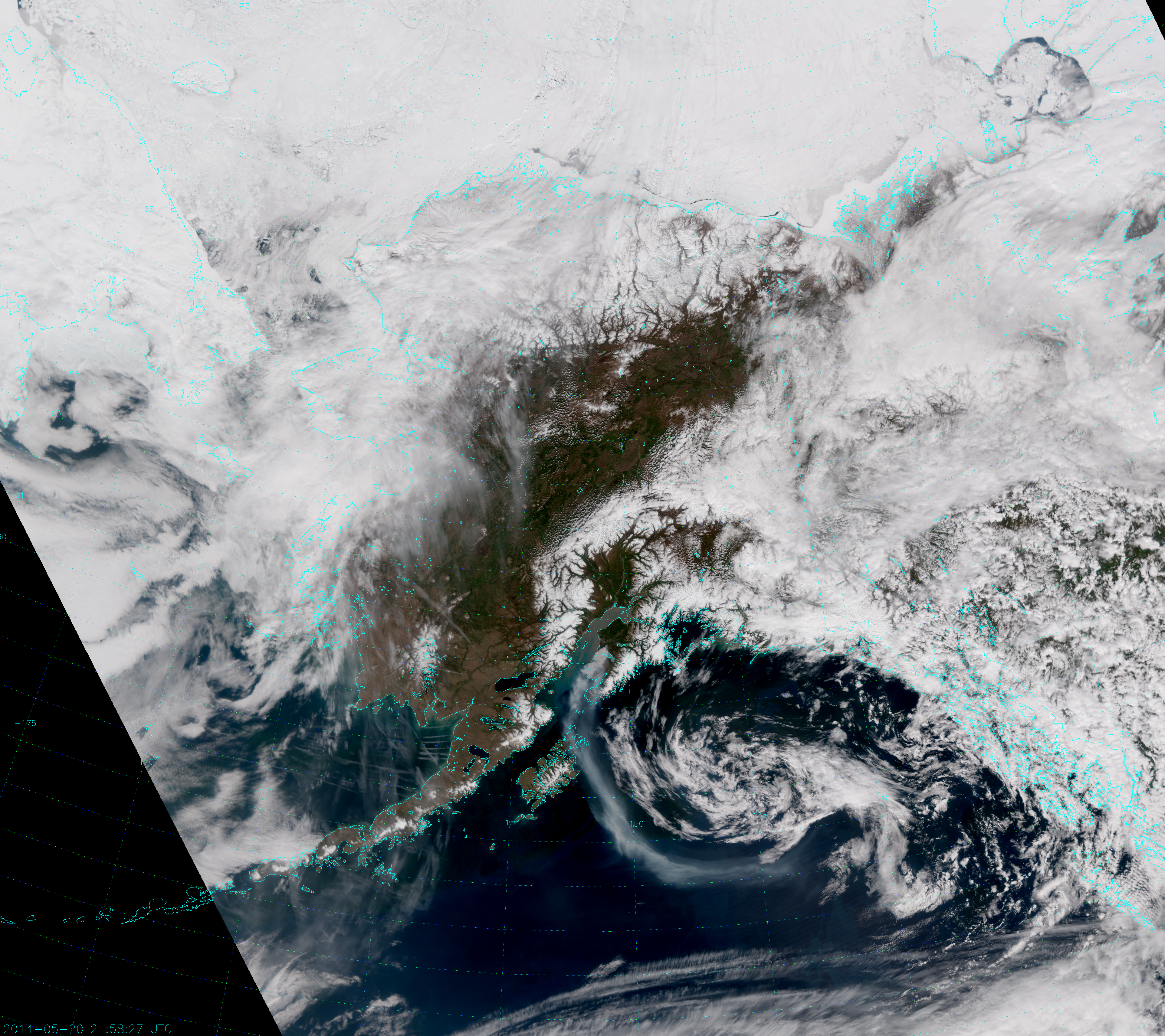
VIIRS "True Color" RGB Composite, taken 21:58 UTC 20 May 2014
VIIRS “True Color” RGB Composite of channels M-3, M-4 and M-5, taken 21:58 UTC 20 May 2014

Look for the grayish plume arcing from the Kenai Peninsula out over the Gulf of Alaska. That is one impressive smoke plume!

The image above is what we like to call a “True Color” image. It is a combination of the red, green and blue visible-wavelength channels of VIIRS (M-5, 0.67 µm; M-4, 0.55 µm; M-3, 0.48 µm, respectively), so named because it represents the “true” color of objects as the human eye would see them. It is the most commonly used “RGB composite”, which is why a number of people simply refer to it as the “RGB”. To add more confusion, other people call it “Natural Color” because it is only an approximation of the “true” color and has to be corrected for atmospheric effects (i.e. Rayleigh scattering) to look right. However, we want to distinguish this from the EUMETSAT definition of “Natural Color”, which looks like this:
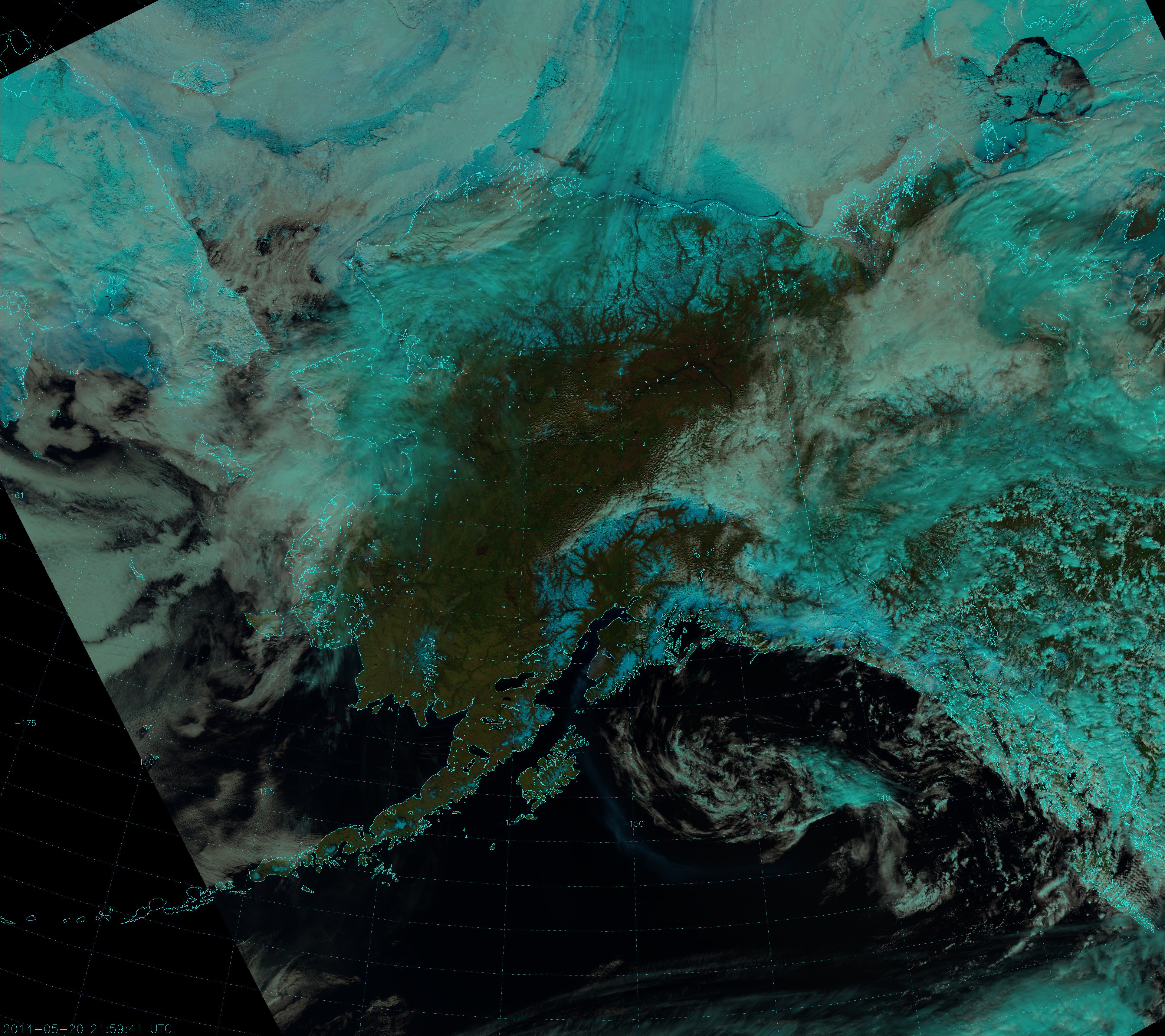
VIIRS "Natural Color" composite, taken 21:58 UTC 20 May 2014
VIIRS “Natural Color” composite of channels I-1, I-2 and I-3, taken 21:58 UTC 20 May 2014

Notice that the smoke plume isn’t as easy to see in the Natural Color image. This is because we are looking at longer wavelengths {1.61 µm (I-3, red component), 0.87 µm (I-2, green component) and 0.64 µm (I-1, blue component)} and smoke scatters less solar radiation back to the satellite as the wavelength increases. This is also why the smoke appears blue – the only channel of the three really able to see the smoke plume is I-1 (the blue component). The fact that we are able to see the smoke at all in the Natural Color image is a testament to just how much smoke there is!

Here’s another Natural Color image from a few orbits before, which happened to be right after sunrise:
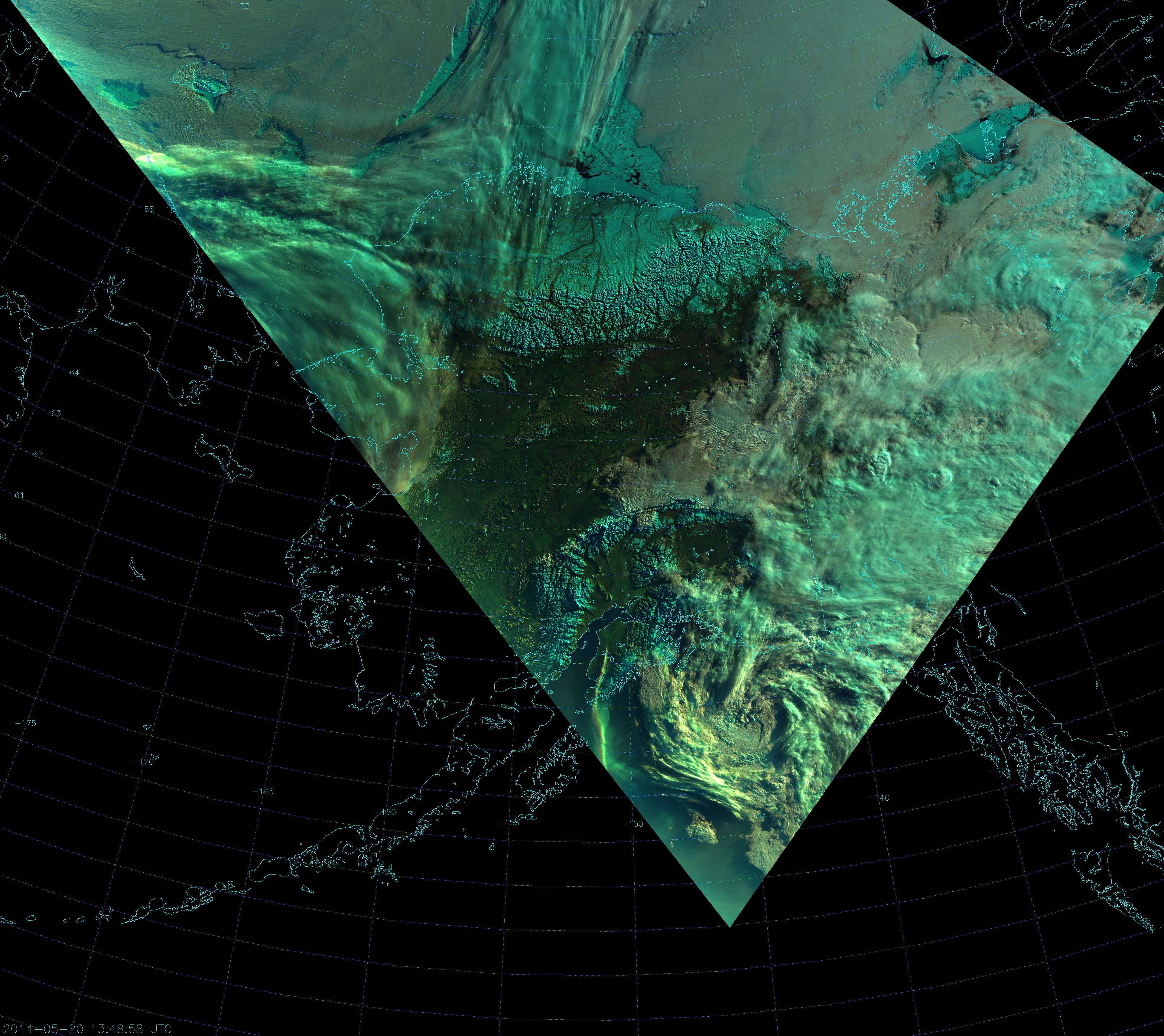
VIIRS "Natural Color" composite, taken 13:48 UTC 20 May 2014
VIIRS “Natural Color” composite, taken 13:48 UTC 20 May 2014

The smoke plume is as optically thick as a cloud, and is even casting shadows!

Now, the Funny River Fire is the perfect opportunity to introduce another RGB composite being developed at CIRA for use with VIIRS, which we call the “Fire Temperature RGB”. This RGB composite uses the near-IR and shortwave-IR channels to highlight fires. The blue component is M-10 (1.61 µm), the green component is M-11 (2.25 µm) and the red component is M-12 (3.70 µm). Here’s what the Fire Temperature RGB looks like for the 21:58 UTC overpass:
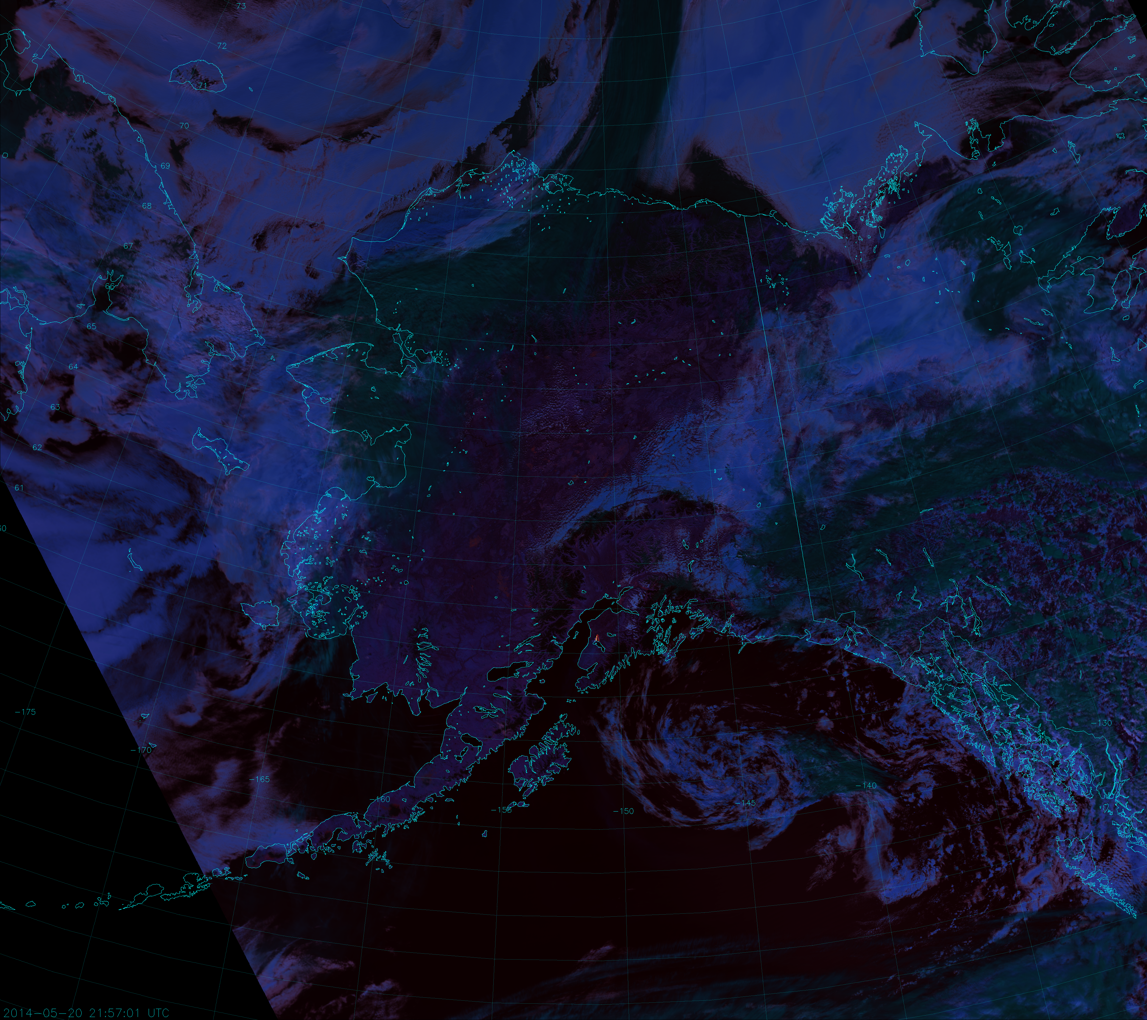
VIIRS "Fire Temperature" composite, taken 21:58 UTC 20 May 2014
VIIRS “Fire Temperature” composite of channels M-10, M-11 and M-12, taken 21:58 UTC 20 May 2014

This is yet another example of just how large a fire this is!

The Fire Temperature RGB provides information on how hot (or how “active”) the fire is. This is due to the fact that fires generally show up best around 4 µm. At shorter wavelengths, the amount of background solar radiation increases, so fires need to be hotter to be visible. This means that relatively cool or small fires will only show up in M-12 and appear red. Hotter fires will show up in M-11 and M-12 and appear yellow. The hottest, most active fires will be detected in all three channels and show up white. Also, there’s very little sensitivity to smoke, as you can see, so the imagery provides useful information even with such a thick smoke plume. Due to radiative differences between liquid droplets and ice particles, ice clouds tend to appear dark green, while liquid clouds appear more blue.

At night, M-11 doesn’t produce valid data (although there is a push from several user groups to change that), but M-10 and M-12 still provide valuable information. In fact, the only thing you can see at night in M-10 are fires and gas flares. Even without M-11 at night, we can use the Fire Temperature RGB to monitor the fire around the clock (whenever VIIRS is overhead) and here’s an animation to prove it:
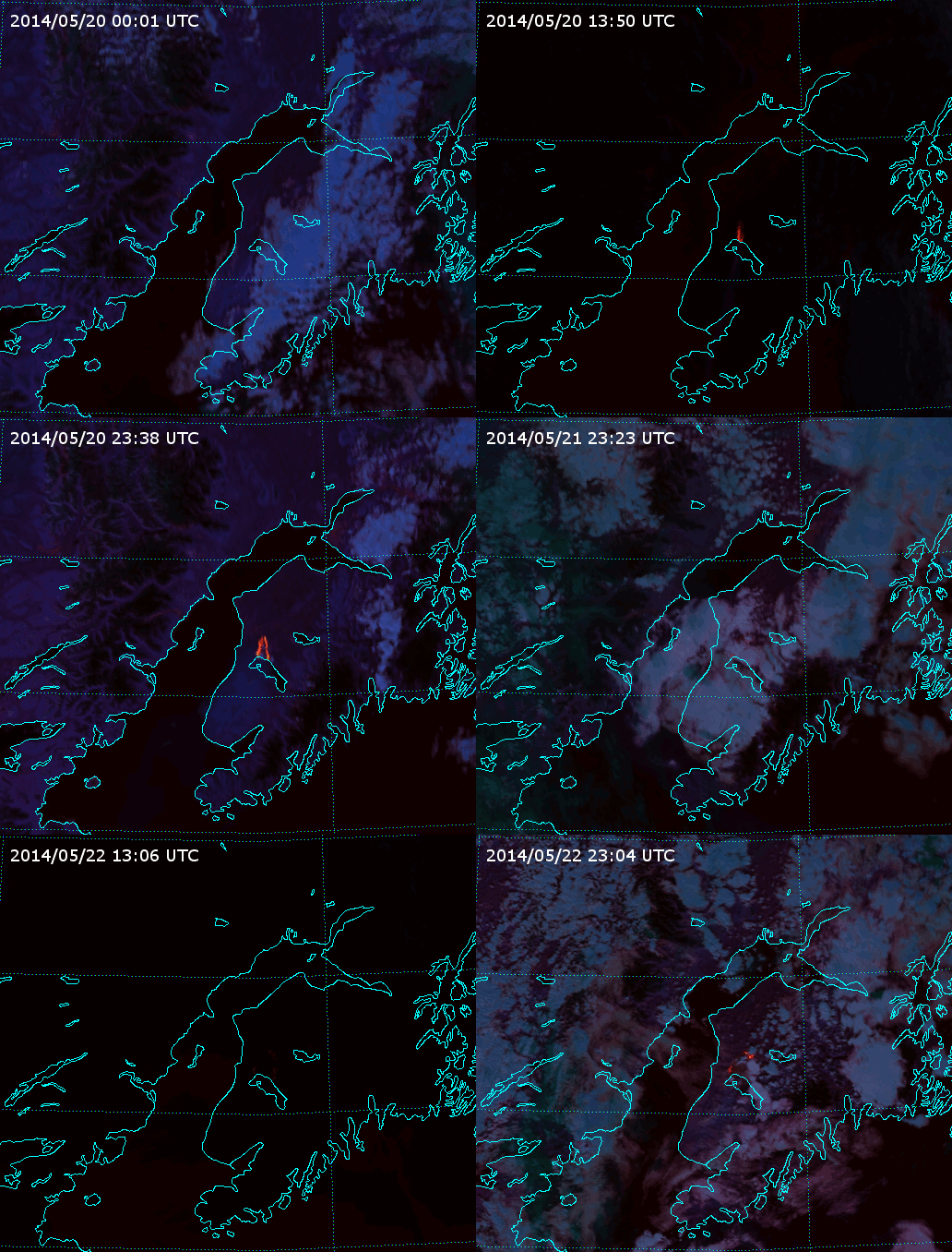
Animation of VIIRS Fire Temperature RGB images of the Funny River Fire (2014).

In the first frame, the fire is obscured by clouds (we still can’t see through those) but, after that, you can see the fire was pushed to the shores of Tustumena Lake. With nowhere else to go, the fire expanded east and west.  The fire slowly loses intensity until the last two frames, when activity picks up on the north side. (Although, clouds block the view of the east flank of the fire at that time, so we can’t say how active it is there.) Also notice on the second and third nights  (11:00 to 13:00 UTC) that the fire appears less intense. This is probably due to the combination of reduced fire activity at night and the presence of clouds that are not visible at night in this RGB composite.

Here’s what the Funny River Fire looked like in the high-resolution fire detection channel (I-4, 3.74 µm) for the same times:
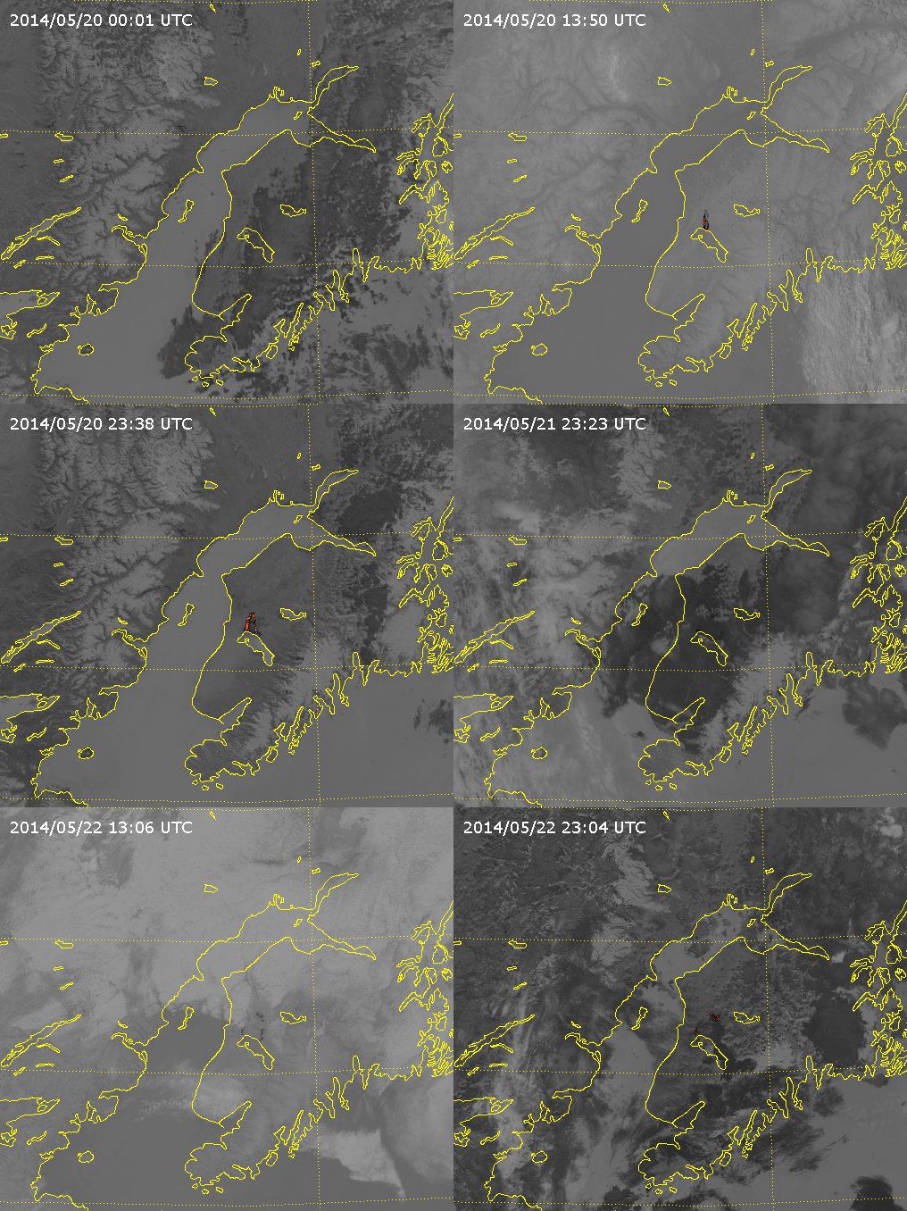
VIIRS channel I-4 images of the Funny River Fire (2014)

For this image, cooler pixels appear light, while warmer pixels appear dark. Pixels with a brightness temperature above 340 K have been colored. This channel by itself shows the clouds over the fire at night, but it can be ambiguous during the day because liquid clouds are highly reflective at this wavelength, so they also look warm.

It has already been demonstrated that the Day/Night Band is capable of detecting fires at night (click here and here for examples). So, why not just use it here? I tell you why: the day/night terminator is already encroaching on the nighttime overpasses. This makes it difficult to see fires, since the light from the fire is competing with light from the sun. This was a particularly intense fire on the first night though, so the Day/Night Band was able to see it (as evidenced by this Near Constant Contrast [NCC] image):
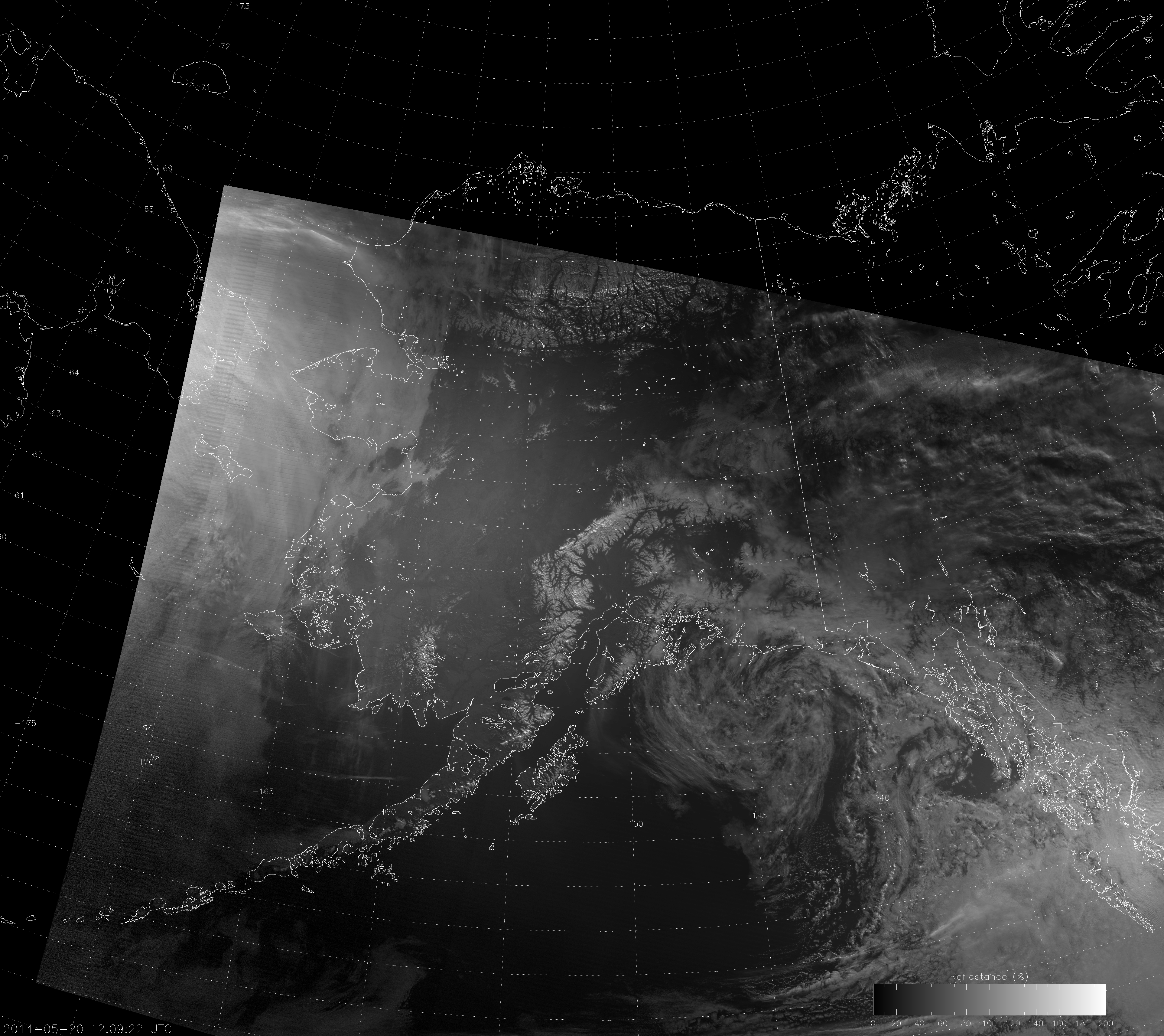
VIIRS NCC image, taken 12:09 UTC 20 May 2014

As you can see, the NCC product shows both the fire and the smoke plume. Notice also that you can’t see any city lights, even though it’s still nighttime over the fire because there is enough twilight to drown out the signal. That makes fire detection with the Day/Night Band tricky when the terminator is so close. It’s only because the Funny River Fire was so intense that we are able to see it.  Of course, since it was so intense, we are able to see the smoke easily even if we can’t see the light from the fire.

Glow-in-the-dark Water

Have you ever started looking for something, only to find something else that was more interesting than what you were originally looking for?

Back on 10 January 2014, there were widespread rumors of a significant aurora event that would be visible much further south than usual. It got a lot of people excited, even in our backyard here in Colorado. But did it happen?

If you’re curious, here is an explanation as to why the aurora forecasts were a bust. But, that’s not to say the aurora didn’t exist anywhere on the globe. The VIIRS Day/Night Band image below shows there was an aurora that made it as far south as Iceland.

VIIRS Day/Night Band image, taken 02:31 UTC 10 January 2014

What about on the next orbit? Was the aurora still there?

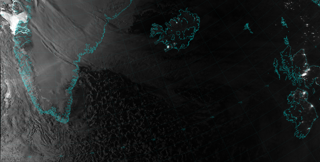
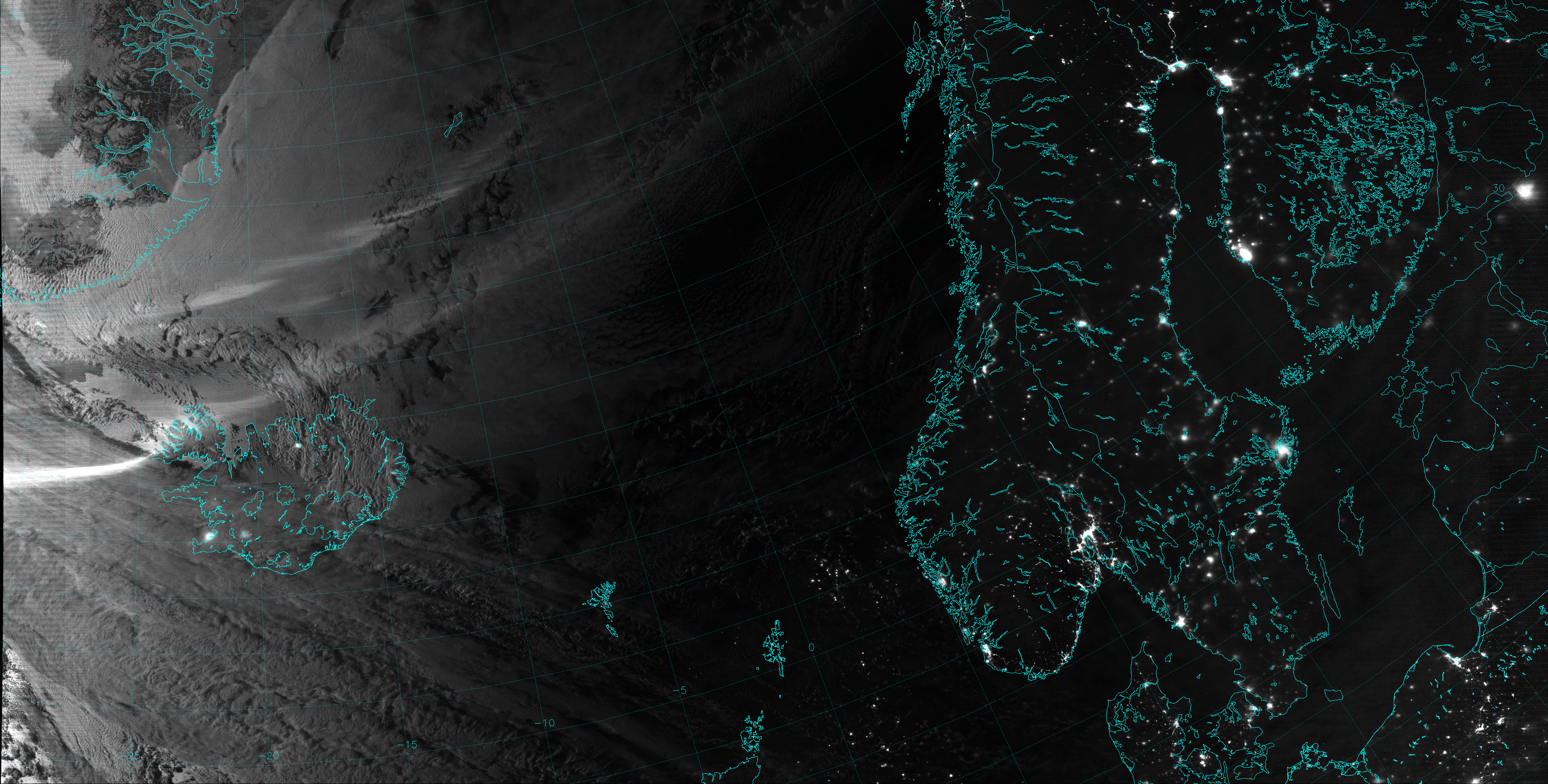
VIIRS Day/Night Band image, taken at 04:13 UTC 10 January 2014

If you squint, you can maybe see it over south-central Greenland. But, hold on a minute! What’s that in the upper-left corner? Why is the water so bright off the west coast of Greenland?

This is a nighttime scene, as evidenced by the city lights over Iceland, Ireland and the UK, although you might not think that by looking at only the left side of the image. And, let me assure you, the day/night terminator never appears at this angle at this time of day in January.

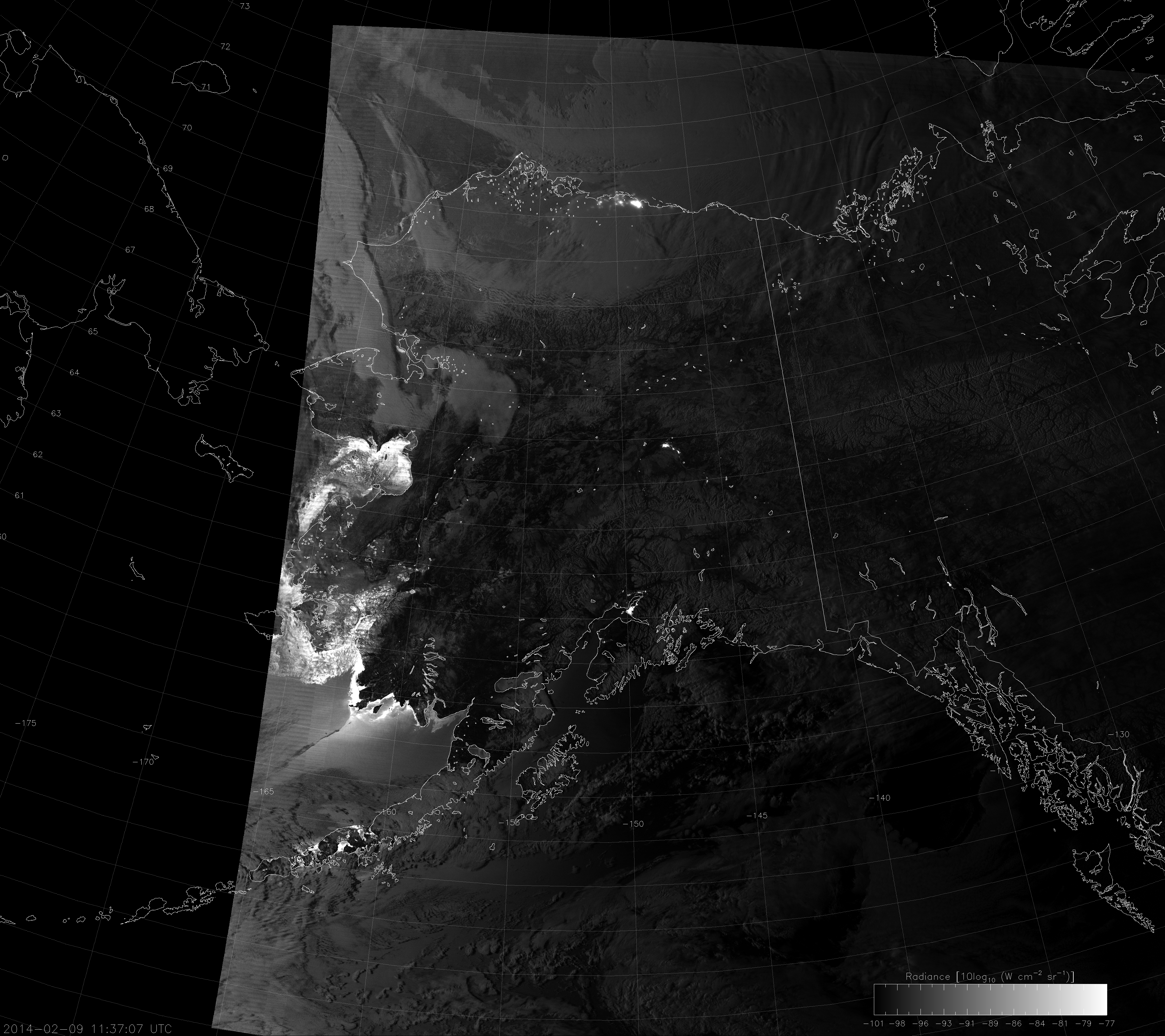
CIRA researchers have recently begun producing VIIRS imagery centered on Alaska on a quasi-operational basis. About a month ago, I noticed this image that also shows “glow-in-the-dark” water, and the mystery deepened:

VIIRS Day/Night Band image, taken 11:37 UTC 9 February 2014

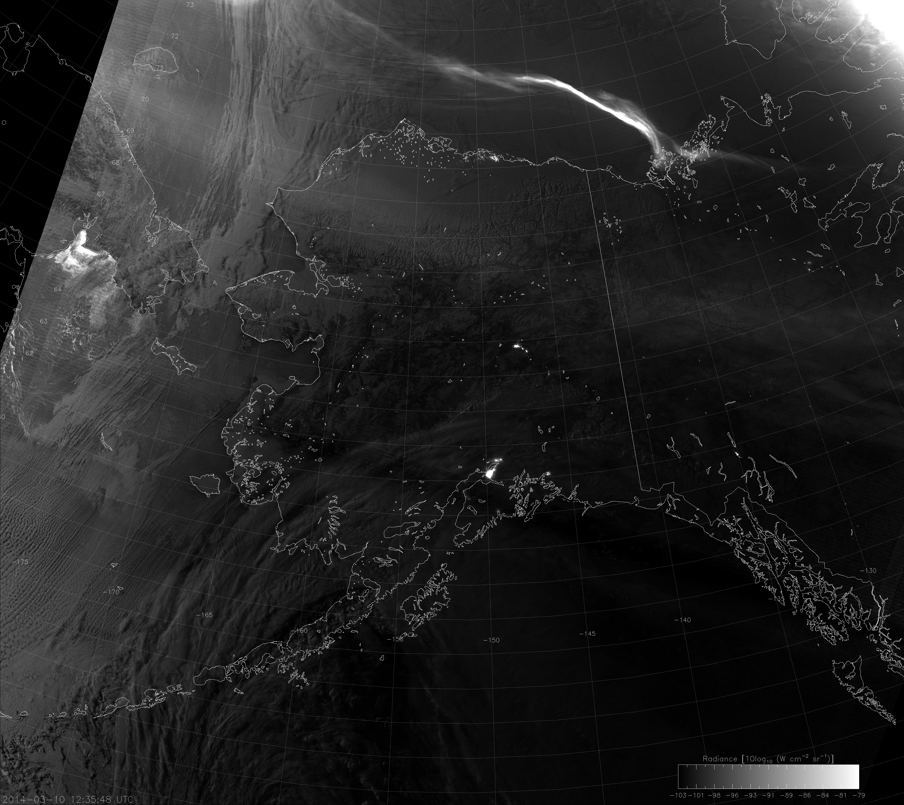
And again, a few days ago, the Day/Night Band captured this image:

VIIRS Day/Night Band image, taken 12:35 UTC 10 March 2014

This time, there is a pretty vivid aurora but, you can also see bright water off the southern coast of Russia.  So, what’s with water that appears to be glowing in the dark?

Is it some kind of bio-luminescent phenomenon, like milky seas? Is it some kind of radioactivity that makes everything glow, like in The Simpsons? Or an alien-UFO conspiracy to control the world’s population?

Sorry to get your hopes up, “truthers,” but it’s a pretty mundane explanation. (Either that, or I’m a member of the Illuminati. MWAH HA HA!) Have you ever looked at a body of water and saw glare from the sun? Or seen glare off of snow and ice? We call that sunglint. It is related to the Bi-directional Reflectance Distribution Function (BRDF), the mathematical way we describe that incoming light on a surface reflects more at certain angles than others. But, it’s not only sunlight that causes glint. Moonlight does it, too. (What is moonlight, if not reflected sunlight?)

Notice that the images with the glowing water were taken roughly a month apart. That’s not just a coincidence. According to this website, each of those images was taken 2-3 days after the moon reached first quarter, when the moon was 75-80% full. Why is this important? Because the phase of the moon is related to when the moon rises and sets, and this determines where the moon is in the sky when VIIRS passes overhead.

From a day or two after last quarter to new moon to a day or two after first quarter, the moon is below the horizon when VIIRS passes overhead during the nighttime overpass. (It’s above the horizon on the daytime overpass, but you can’t tell because the sun is so bright.) From just after first quarter to full moon to just after last quarter, the opposite is true – the moon is up at night and down during the day. When you get to 2-3 days after first quarter, that’s when the moon is close to the western horizon when VIIRS passes over at night. That’s why the left sides of the above images are brighter than the right sides. And, that’s also when this form of moon glint occurs, just like in this clip.

It’s not aliens or UFOs or mysterious radioactivity. It’s the geometry between the satellite, the Earth and the moon and the preferential reflection of light off of a body of water. It’s repeatable and predictable. It’s science.


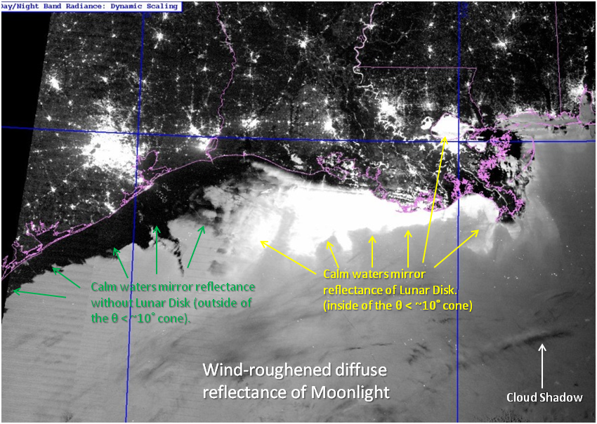
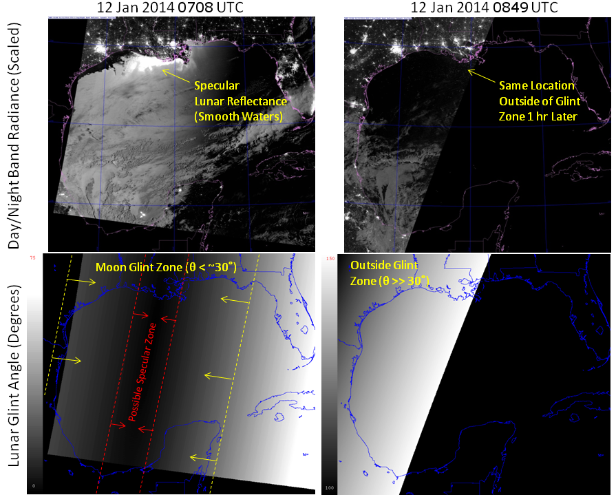
UPDATE (3/14/2014): “Glow-in-the-dark” water is not confined to high latitudes like Greenland and Alaska. It happens anywhere the angle between the satellite, the Earth’s surface and the moon is in the glint range. Steve Miller (CIRA) forwarded information about a case he looked at off the coast of Louisiana. Here’s one of his images with everything labelled:

VIIRS Day/Night Band image, taken 07:41 UTC 12 January 2014
VIIRS Day/Night Band image, taken 07:08 UTC 12 January 2014. Interesting features have been identified and labelled.

This case occurred when the moon was 90% full. The brightest water occurs where the surface is calm and the “glint angle” is less than 10°.  When the surface is not calm, waves scatter the light in different directions and only a portion of the light is reflected to the satellite. This makes the water appear not as bright. For glint angles between 0° and 30°, waves will scatter some of the light back to the satellite, and the water won’t appear dark. Calm water outside the 10° glint zone will appear dark, though, because the angle of the water surface isn’t right to reflect the moonlight back to the satellite. This is what you see along the coast of Texas. Outside of the 30° zone, waves aren’t at the proper angle to reflect light back to the satellite.

To demonstrate this, here’s a comparison with the same area on the next orbit along with the glint angles:

Comparison between DNB images and lunar glint angle for consecutive VIIRS overpasses on 12 January 2014
Comparison between DNB images and lunar glint angle for consecutive VIIRS overpasses on 12 January 2014.

On the next overpass, about 100 minutes later, all the water is outside the glint zone (the glint angles are all higher than 100°) and the water is dark everywhere, as expected.

Camouflage Clouds

The natural world is full of examples of animals that have evolved camouflage. Check out this list and see how many of the animals you can find. Another example that I find particularly interesting is the Potoo bird. Some animals, like the Potoo, use camouflage to hide from predators, while others, like the Polar Bear, are predators who use camouflage to hide from their prey and make it easier to sneak up on them. Clouds also use camouflage (or at least it seems that way) to hide from weather satellites. Are they predators trying to hunt down and destroy innocent weather forecasts? Are they hiding because they fear some atmospheric phenomenon will find them and glaciate them? It’s tough to tell what goes on in the mind of a cloud, since it isn’t alive and has no brain.

Did you click on the first link above and take the test? If so, you are now aware of the skills you’ll need to detect clouds in the Arctic.

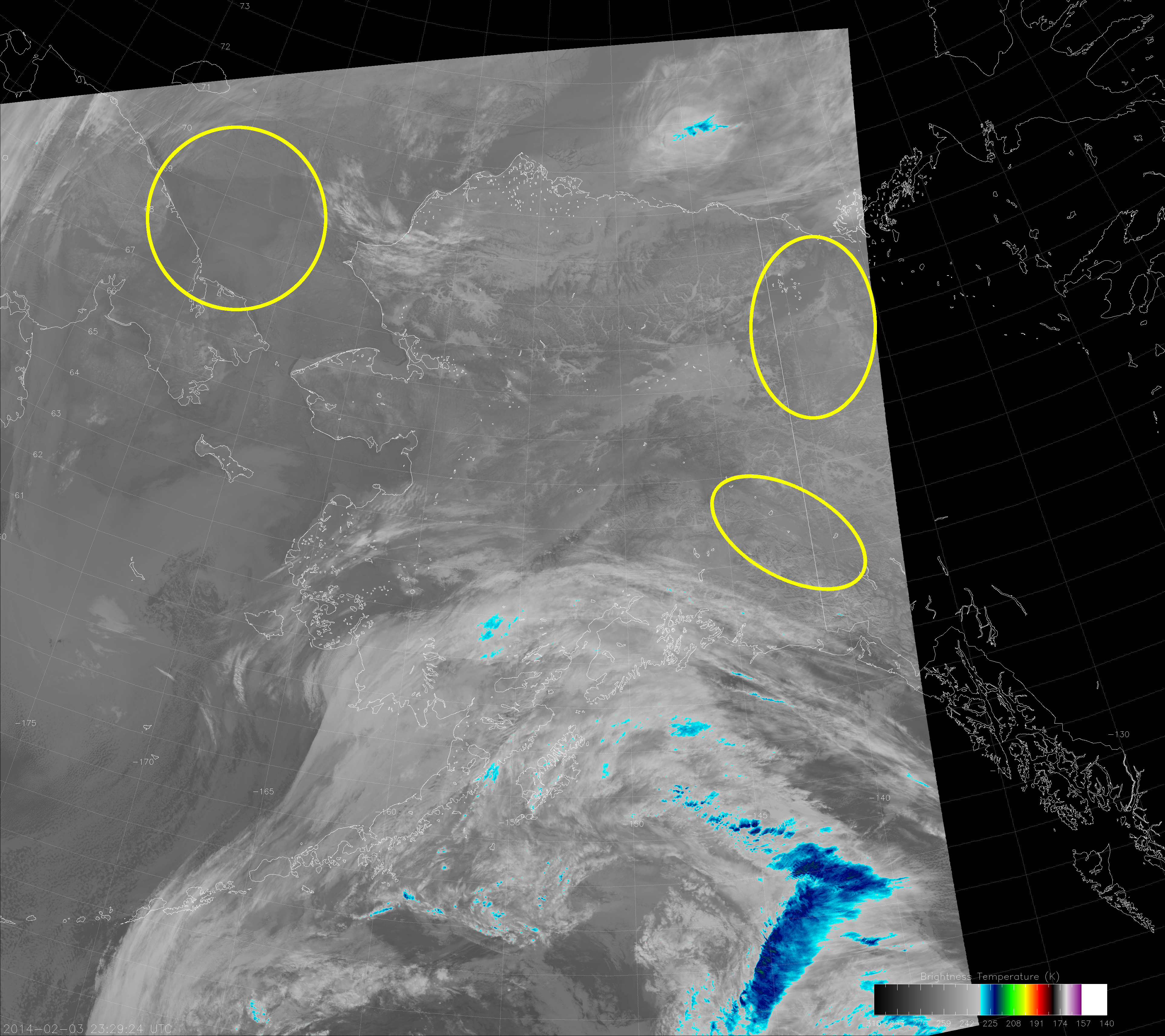
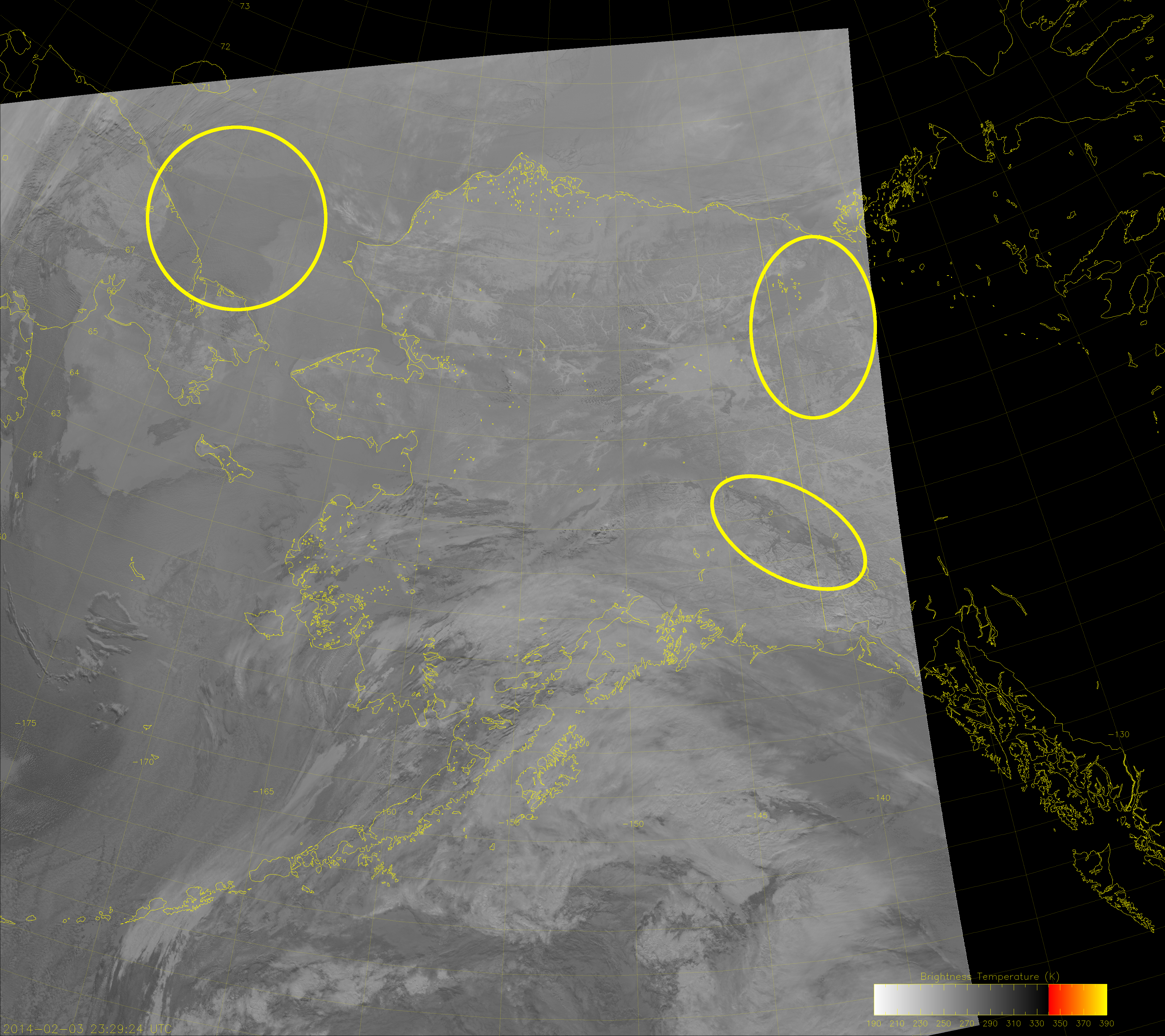
Let’s start with an infrared (IR) image of Alaska taken by VIIRS at 23:29 UTC on 3 February 2014:

VIIRS IR image (I-5), taken at 23:29 UTC 3 February 2014

The question is: where are all the clouds?

Colors correspond to the color table in the lower right corner of the image. IR images typically use color tables like this one to highlight the structures of cold cloud tops. And given the long Arctic winter nights, IR images like this are typically all that are available. The problem that arises is that low clouds, like fog and stratus, have a brightness temperature similar to the background surface, making them hard to spot. Sometimes temperature inversions exist and the low clouds in the image are warmer than the background surface. Cloud-free valleys and the ice in the Arctic Ocean may be colder than the clouds you’re trying to see, so you can’t always use temperature or temperature differences to detect clouds.

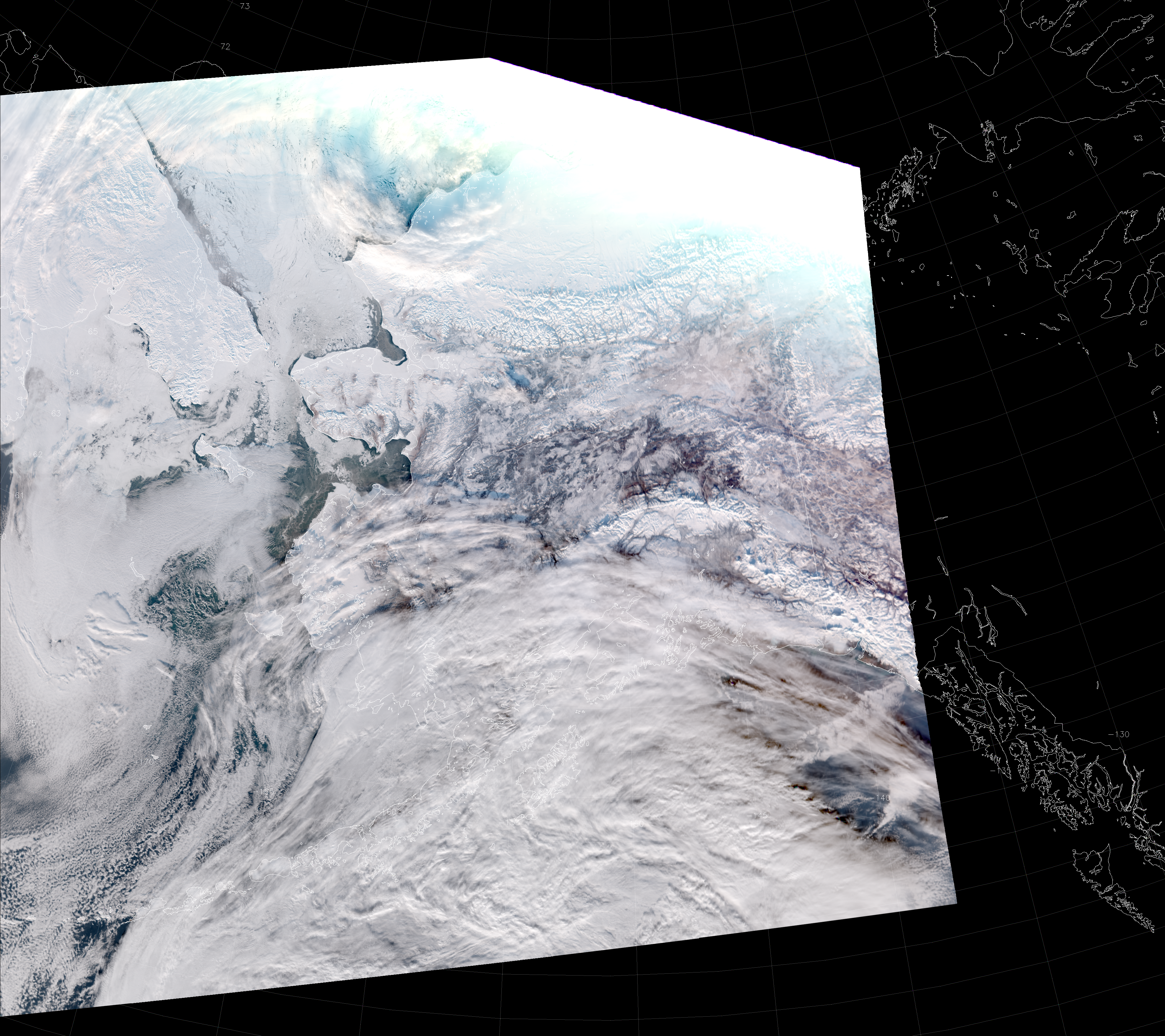
Now, we’ll get some help for this case, since 23:29 UTC is 2:30 in the afternoon (for most of Alaska), so there is some sunlight. This allows us to compare the IR image above with visible-wavelength images. Of course, that doesn’t always help, since clouds can be camouflaged at many different wavelengths. Here’s the VIIRS “True Color” RGB composite (a composite of M-3, M-4 and M-5, which are at blue, green and red portions of the visible spectrum, respectively):

VIIRS "True Color" RGB composite of  M-3, M-4 and M-5, taken 23:29 UTC 3 February 2014
VIIRS “True Color” RGB composite of M-3, M-4 and M-5, taken 23:29 UTC 3 February 2014

Many of the clouds here are still camouflaged because the clouds and snow and ice all appear white. The clouds that are easy to spot in the IR image (e.g. over the Gulf of Alaska) are similarly easy to spot in the True Color image. But, what about the clouds that are still hiding?

For now, we’re going to focus on three interesting regions that contain camouflage clouds: the Tanana River valley near Tok, the Arctic Ocean north of Russia, and the northern tip of the Yukon Territory. Keen-eyed observers may already be able to spot the clouds I’m referring to by noticing cloud shadows or by remembering where forests or mountains are located that are now obscured. (Although, the clouds in the northwest Yukon Territory are really difficult to see because of saturation issues at the terminator.) The three areas I’m referring to are highlighted below:

VIIRS IR image (I-5), taken 23:29 UTC 3 February 2014
VIIRS IR image (I-5), taken 23:29 UTC 3 February 2014. The areas of interest discussed in the text are highlighted.

Clouds are not so easy to see in these three areas, are they? (Remember, you can click on any image to see the high-resolution version.)

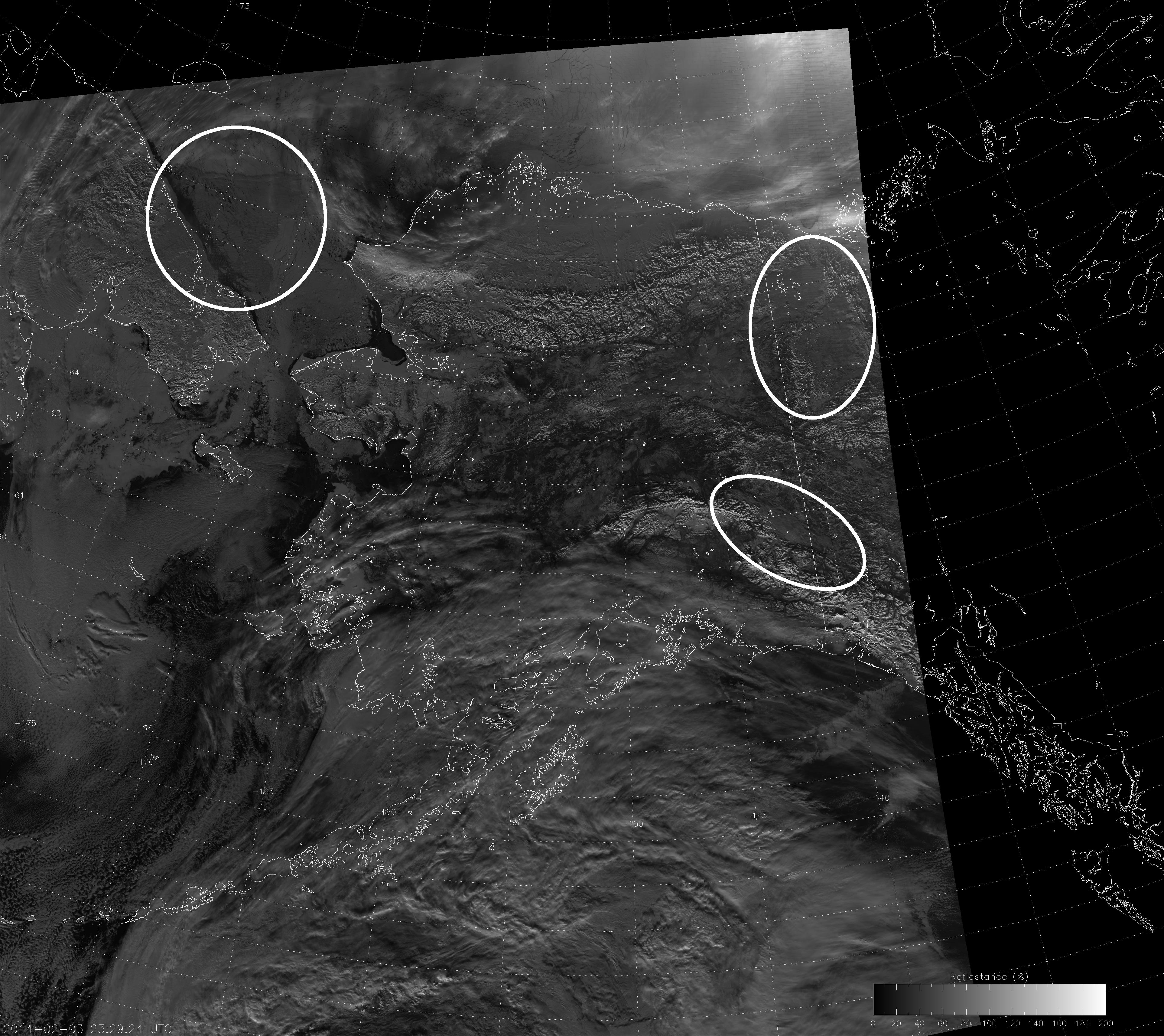
The Day/Night Band (and its Near Constant Contrast counterpart) show the clouds in these areas a bit better than the True Color image (and certainly better than the IR image). Here we show the Near Constant Contrast (NCC) image, so we’re not impacted by the presence of the day/night terminator:

VIIRS NCC image, taken 23:29 UTC 3 February 2014
VIIRS NCC image, taken 23:29 UTC 3 February 2014.

The clouds over Tok (lower right oval) are bit difficult to see, but you should be able to see the shadow they cast.

The clouds over northern Yukon Territory (upper right oval) are interesting for a couple of reasons: they obscure the terrain (the easiest way to tell those are clouds); they hug the surface so they aren’t casting any shadows; and the cloud on the northwest side of the oval is much warmer than the cloud on the southeast side of the oval even though they look similar at visible wavelengths (compare the visible images with the IR images).

The left oval over the Arctic Ocean shows the big difference in opacity between looking at a cloud in the IR versus the visible wavelengths.  The IR image shows an opaque, slightly darker (i.e. warmer) shape barely discernible from the background ocean and ice. The NCC image shows a semi-transparent cloud (also slightly darker [i.e. less reflective] than the background ice) with a lot of structure due to gravity waves. Underneath the cloud feature, you can clearly see where the icebergs and open water are located. Try doing that with the IR image.

The shortwave (or what the JPSS program office calls “midwave”) IR image (I-4) is not the most intuitive to interpret, but it also shows these camouflage clouds (some better than others):

VIIRS shortwave IR image (I-4), taken 23:29 UTC 3 February 2014

The I-4 band is centered at 3.74 µm, a wavelength where reflection of solar radiation and the Earth’s emission both play an important role in what you are seeing. In the color table used here (best at highlighting wildfires and volcanic eruptions), highly reflective objects and warm objects show up darker. Ice clouds, snow and sea ice are all poorly reflective and cold, so they appear brighter. Liquid clouds are highly reflective, which makes the clouds over Tok easily visible.

The Yukon clouds are still pretty camouflaged because, even though they are liquid, they are colder, and don’t have as big a contrast with the background surface. As mentioned before, the clouds to the northwest in the oval are darker (warmer) than the clouds in the southeast part of the oval.

The Arctic Ocean clouds are interesting here. The reflective component reveals the gravity waves, but the emissive component obscures the ice and open water below. These clouds are not only camouflaged in certain wavelengths, they also act as camouflage for the ice below!

This example shows that not all clouds are easy to see with individual channels – even when looking at two or three different wavelengths. But, it does show that the visible-wavelength information provided by the NCC image is quite a bit different from the IR information that is typically used. And, even though this was a daytime scene, all the stuff I wrote still applies at night (except you lose the reflective component to the shortwave IR imagery).

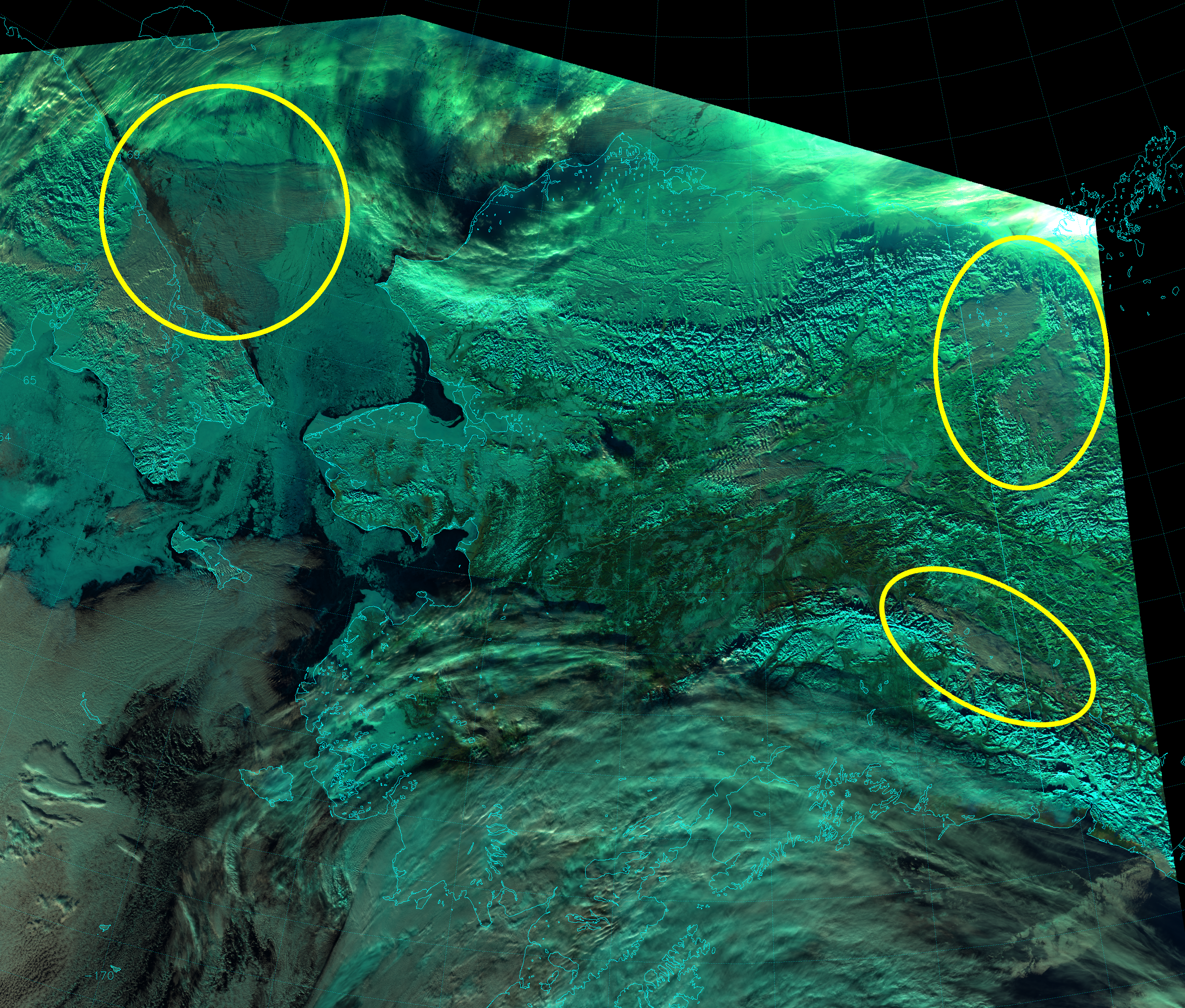
Finally, let’s look at another RGB composite, what EUMETSAT calls “Natural Color”:

VIIRS "Natural Color" composite of I-1, I-2 and I-3, taken 23:29 UTC 3 February 2014
VIIRS “Natural Color” composite of I-1, I-2 and I-3, taken 23:29 UTC 3 February 2014. This image has been cropped relative to the other images to reduce the file size.

This composite uses bands I-1 (0.67 µm), I-2 (0.86 µm) and I-3 (1.61 µm) as the blue, green and red components, respectively. Snow, ice and ice clouds appear the bluish color known as cyan because they are highly reflective in I-1 and I-2, but poorly reflective in I-3. Liquid clouds appear white, to dirty white, to a grayish, pale cyan color depending on particle size and reflectivity. Vegetation is very green. Unlike the True Color RGB composite, the low liquid clouds in all three ovals are easier to see here because now they are a significantly different color than their respective backgrounds. Plus, the Arctic Ocean clouds are still transparent enough to show the ice and open water below.

The Natural Color composite may be the best way to detect low liquid clouds in this region, but it’s only available when the sun is above the horizon. The Day/Night Band (or NCC) is a useful stand-in, when it’s not available.

It just goes to show: the clouds may try to hide, but VIIRS can always find them!

The Calving of B-31

Full disclosure: this is not the only blog I maintain. I also write about the uses of VIIRS for all kinds of events around the globe for the JPSS Imagery and Visualization Team Blog. You can find that blog by clicking on the link “VIIRS Imagery Blog” below the banner image at the top of the page.

Sometimes, events happen that have appeal to both audiences. The calving of the B-31 iceberg from the Pine Island Glacier is one such event. I know the subtitle of this blog is “VIIRS in the Arctic” and Pine Island Glacier is part of Antarctica (opposite side of the world), but that doesn’t mean this is not applicable to people in the Arctic. Glacier calving and the break-up of ice sheets happen in both places.

If you want to read the full, original blog post I wrote, you can click here. Otherwise, on this blog post, I’ll focus on the practical applications that Arctic aficionados should be aware of.

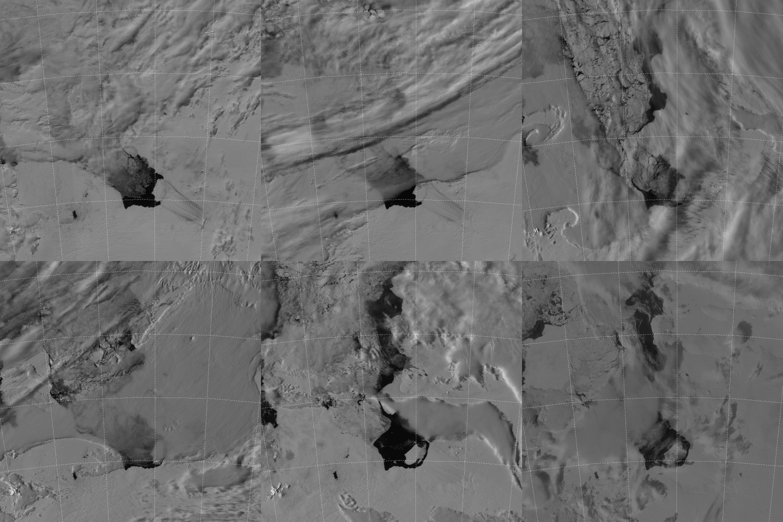
Now, this event started in October 2011, before VIIRS was even launched. A group of NASA researchers flying over Pine Island Glacier noticed a large crack beginning to form in the ice.  Two years later, a chunk of ice estimated to be the size of the land area of Singapore had completed the calving process and the resulting iceberg has been named B-31. NASA released these images of B-31 from MODIS and Landsat-8.

Now VIIRS has something MODIS and Landsat do not have: the Day/Night Band (DNB), which is used to create Near Constant Contrast (NCC) imagery. Even though it is summer in Antarctica right now, Pine Island Glacier is at a latitude where the day/night terminator passes over our region of interest on an almost daily basis (i.e. except near the December solstice). As explained before, these twilight scenes are where the NCC imagery really proves its worth.

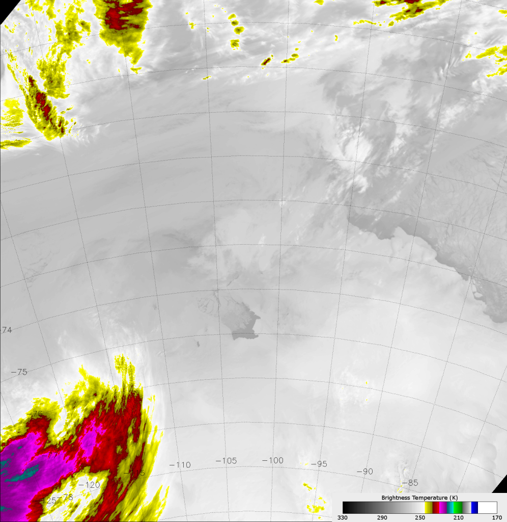
Being able to detect visible wavelength radiation at all hours of the day is very valuable. To demonstrate this, take a look at the VIIRS infrared image (M-15, 10.7 µm) below. Images in the “infrared window” (the N-band window, according to this site) used to be the only way to detect surface features and clouds at night. At these wavelengths, the amount of radiation detected by the satellite is a function of the temperature of the objects the instrument is looking at.

VIIRS IR image (M-15) taken 23:34 UTC 7 November 2013

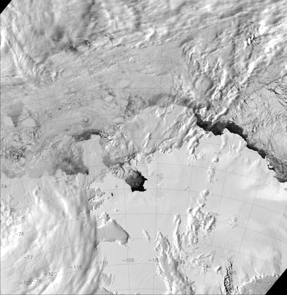
See that slightly darker gray area near the center of the image? That’s open water in Pine Island Bay, which is only slightly warmer than the ice and low clouds surrounding it. Otherwise, there isn’t much detail in this picture. What really stands out are the cold, high clouds that are highlighted by the color scale. Contrast this with a visible wavelength image from the same time (M-5, 0.67 µm):

VIIRS visible (M-5) image, taken 23:34 UTC 7 November 2013

The open water in Pine Island Bay shows up clear as day because, well, it is daytime and the ice and snow reflect a lot more sunlight back to the satellite than the open water does. Icebergs can easily be distinguished from the low clouds now. You can even see through some of the low clouds to identify individual icebergs that are not visible in the infrared image. In fact, it is difficult to identify any icebergs in the infrared image. And, even though this is a daytime scene, the same holds true at night when only moonlight is available.

Since VIIRS is on a polar-orbiting satellite, it views the poles every orbit (~101 minutes). This provides a lot of overpasses with which to capture the calving of B-31, which hadn’t happened yet in the images above. If we zoom in on Pine Island Bay, it is quite easy to see this major calving event:

Animation of VIIRS NCC images of the Pine Island Glacier from 7-18 November 2013
Animation of VIIRS NCC images of the Pine Island Glacier from 7-18 November 2013.

I should say that the above animation does not include images from every orbit. I’ve subjectively removed images that were too cloudy to see anything as well as images where the VIIRS swath didn’t cover enough of the scene. This left 25 images over the 11 day period. Even so, VIIRS captured the moment of B-31 breaking free quite well.

Notice how easy it is to monitor the motions of the icebergs in this loop – even in the presence of thin clouds.

VIIRS was able to track the B-31 iceberg in the weeks following the calving event, which occurred on or about 11 November 2013. To prove it, here is a video (in MP4 format) of NCC images from the start of the above animation (7 November 2013) all the way to 26 December 2013:

Animation of VIIRS NCC images from 7 November – 26 December 2013 (.mp4 file)

You may need an appropriate browser plug-in or add-on (or whatever your browser calls it) to be able to view the video.

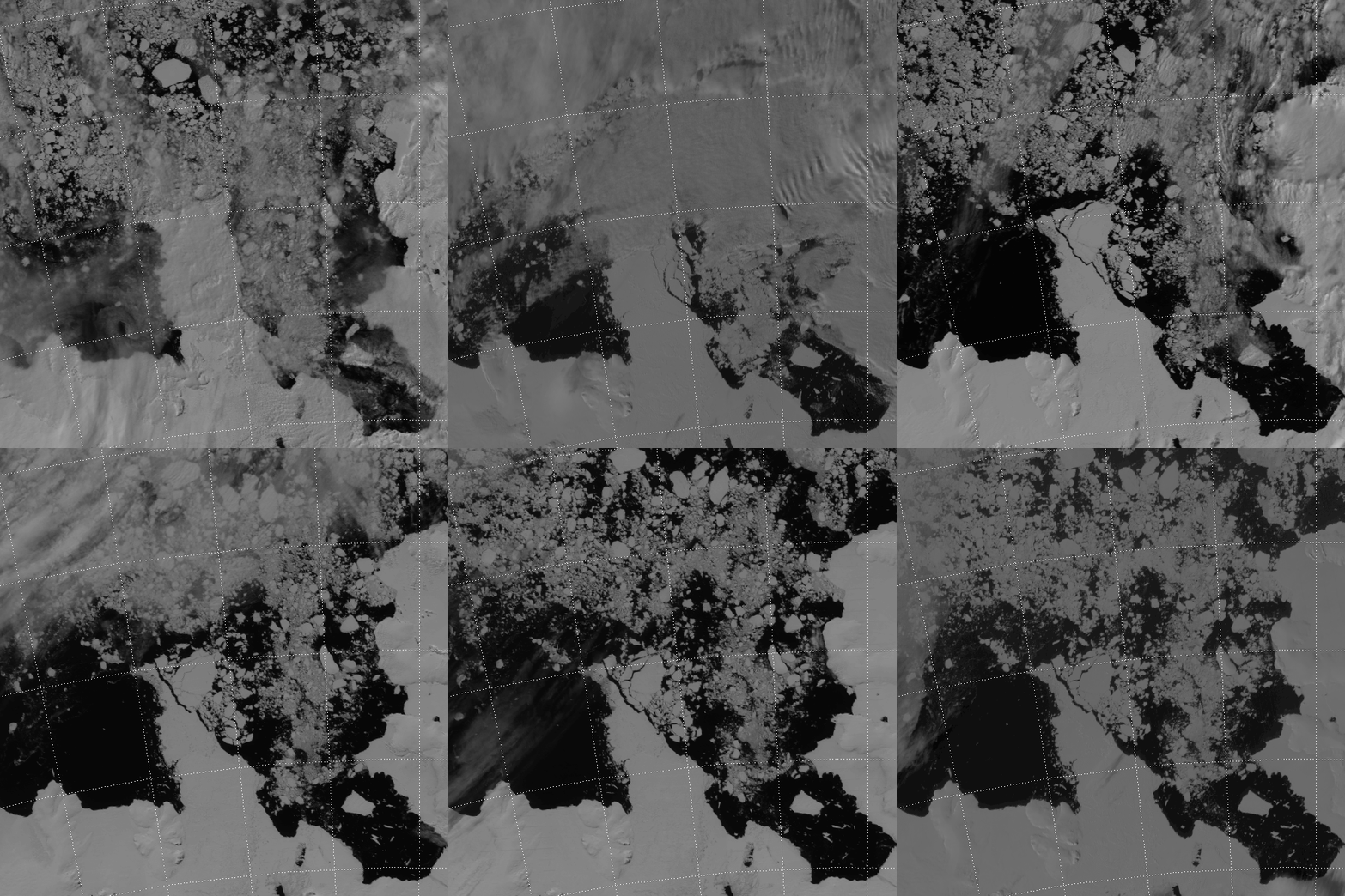
That’s 50 days of relatively cloud-free VIIRS NCC images (7 November – 26 December 2013), compressed down to 29 seconds. Go ahead, watch the video more than once. Each viewing uncovers additional details. Notice how B-31 doesn’t move much after 10 December. Notice how ice blocks the entrance to Pine Island Bay at the beginning of the loop, then clears out by the end of the loop. Notice all the icebergs near the shore that are pushed or pulled or blown out to sea from about 20 December through the end of the loop. Notice that B-31 isn’t even the biggest chunk of ice out there. Notice the large ice sheet on the west side of Pine Island Bay that breaks up right at the end of the loop. In fact, here’s another zoomed-in animated GIF to make sure you notice it:

Animation of VIIRS NCC images from 20-26 December 2013
Animation of VIIRS NCC images from 20-26 December 2013.

The area of ice that breaks off of that ice sheet is much larger than B-31! In fact, I would estimate it to be roughly the size of the state of Rhode Island. B-31 has been described as a city-sized iceberg, but this is a state-sized amount of ice breaking off of an ice sheet on Antarctica.

Being able to track these icebergs both day and night is very important. On 24 December 2013, a Russian icebreaker ship got stuck in the ice surrounding Antarctica and it took two weeks to free the ship. That was after a helicopter rescue and help from the Chinese and Australians.

Santa Claus and the Olympic Flame

In the lead up to the 2014 Winter Olympics, the Olympic Torch was sent on a grueling journey across Russia and beyond – including a trip to the North Pole and to Outer Space. (Obviously, the torch won’t be lit when it is in space. You don’t want to burn up all the oxygen on the International Space Station – the astronauts need that to breathe. It also wouldn’t burn during the space walk, since there is no air out there.) An offshoot of the flame did make it to the North Pole, though, which is the first time that has ever happened. One could argue that it wasn’t really the true Olympic Flame, since the original flame burned out during a jog around the Kremlin in Moscow:

http://www.youtube.com/watch?v=f5M5lBpHahY

But, I’m sure the backup cigarette lighter is a valid substitute for having to jog all the way back to Athens, Greece to get the high priestess of the Temple of Hera to invoke the power of the sun to relight it. (We poke fun in good nature, knowing full well that it could happen to any of us – any of us lucky enough to carry the torch.)

Now, back to the Olympic Flame’s trip to the North Pole. Under the cover of clouds, the nuclear-powered icebreaker, 50 Years of Victory (50 лет Победы in Russian), carried the flame to the furthest north it could go. Once there, the torchbearers gave Santa Claus quite the light show. Check out the videos and photos of the trip – it was pretty impressive. Santa was grateful for the presentation. It was his last opportunity to take a break before finishing his Christmas preparations.

So, what does this have to do with a blog about a weather satellite? VIIRS saw the Olympic Flame and the Star Wars-like light show put on at the North Pole.

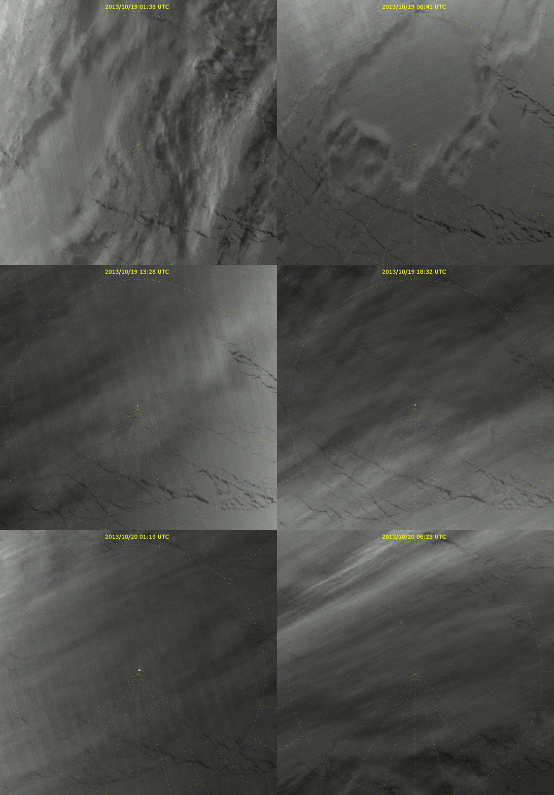
According to those news articles, the ship arrived at the North Pole on 19 October 2013. Below is an animation images from the Day/Night Band for every VIIRS overpass from 01:38 UTC on 19 October to 06:23 UTC on 20 October 2013.

Animation of VIIRS Day/Night Band images from 19-20 October 2013
Animation of VIIRS Day/Night Band images from 19-20 October 2013. The North Pole is located at the center of the image. Light from the ship carrying the 2014 Winter Olympic torch is visible.

The yellow dotted lines are latitude and longitude lines. The longitude lines converge on the North Pole. Initially, there is an opaque cloud layer that obscures the view of the 50 Years of Victory, but by the 08:23 UTC 19 October 2013 frame, the light from the ship is clearly visible. In the last two frames, the icebreaker can be seen heading back to Russia, which is off the top of the image. (Canada and the United States are below the bottom edge of the image.)

Keep in mind, since we are past the Autumnal Equinox, it is always night at the North Pole. That’s why we can see the ship’s lights. (It would be too bright to see the ship if it were daylight.) That also means that Santa has to finish making presents for everyone in the dark.

And, sorry kids. The Day/Night Band does not have high-enough resolution to be able to see Santa’s house. But, it does have high-enough resolution to see an icebreaker ship at work.


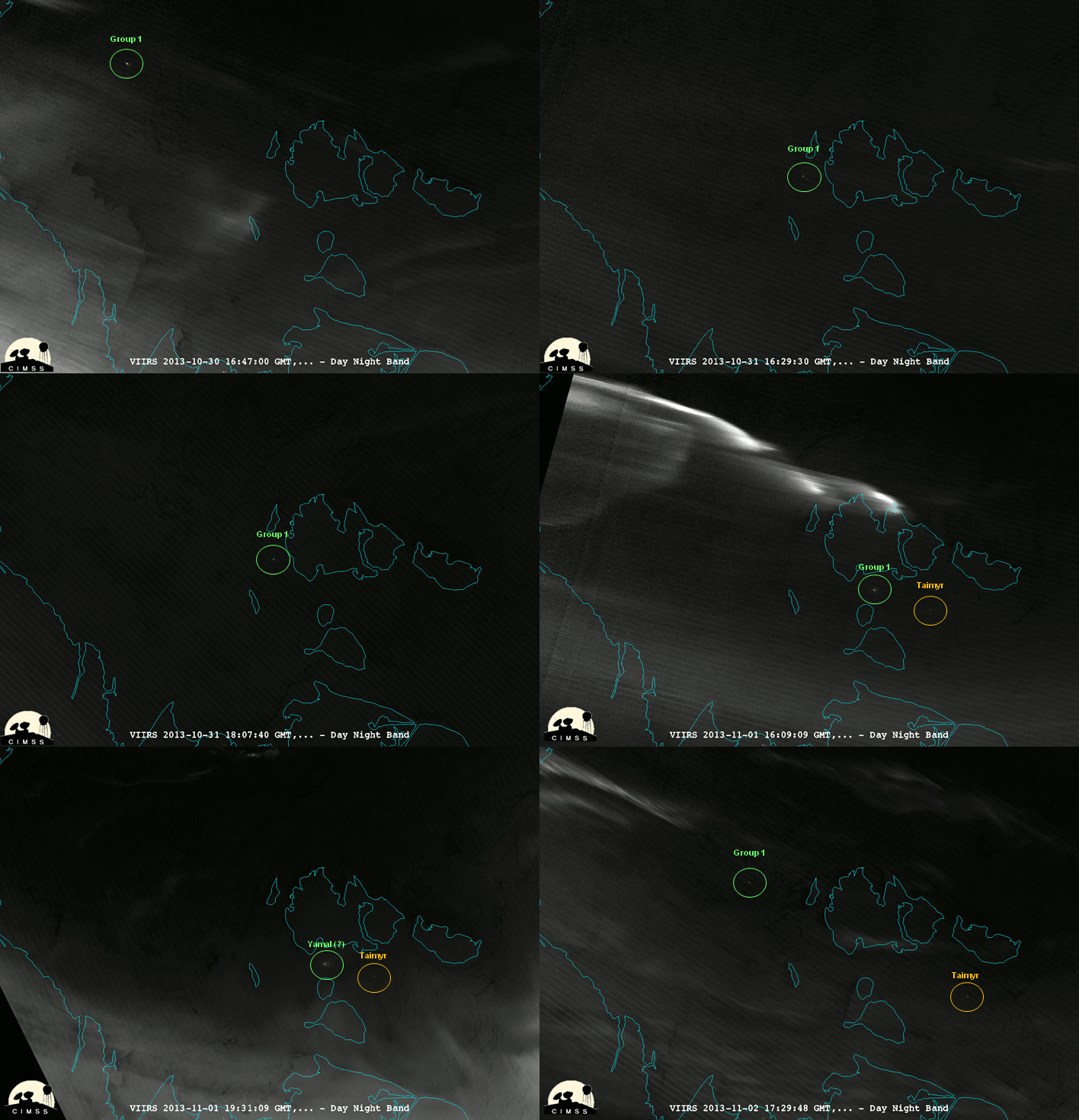
UPDATE/ASIDE: William Straka III (U. of Wisconsin/CIMSS) has done some investigating of ships at night in the Arctic using the Day/Night Band, and has shared these images (converted to a single animation):

Animation of selected VIIRS Day/Night Band images from 30 October to 2 November 2013
Animation of selected VIIRS Day/Night Band images from 30 October to 2 November 2013. Images courtesy William Straka III (CIMSS).

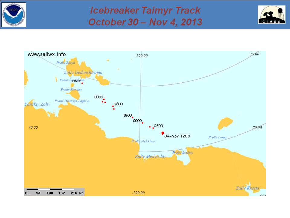
This animation covers several days (30 October to 2 November 2013) where a couple of icebreaker ships are visible. Using the website sailwx.info, he was able to identify one of the ships as the icebreaker Taimyr (Таймыр). Here’s a plot of the ship’s track over this period:

Plot of the track of the Russian icebreaker Taimyr, 30 October to 4 November 2013
Plot of the track of the Russian icebreaker Taimyr, 30 October to 4 November 2013. Image courtesy sailwx.info and William Straka III (CIMSS).

The other ship (or ships, since there seem to be two areas of light in some of the images) are unidentified. He was able to deduce the following:

One of the ships in “Group 1” is an icebreaker. (It has to be, because there is ice covering the ocean in this region.) That icebreaker cannot be the 50 Years of Victory (50 лет Победы), since it had returned to port following its trip to the North Pole. Tracking information from sailwx.info also shows that it was not the Vaygach (Вайгач). News reports show that the Rossiya (Россия) was retired from service in May 2013. The only other nuclear-powered icebreakers in the Russian fleet are the Yamal (Яма́л) and the Sovetskiy Soyuz (Советский Союз). (Of course, there is the possibility that the icebreaker isn’t nuclear-powered, which increases the number of possibilities.)

In case you’re interested, this scene takes place near the New Siberian Islands. I’m not sure what kind of services they have on the islands but, judging by the images above, they look like a good place to view the aurora!

Auroras, Volcanoes and Bears, Oh My!

It’s amazing what you can see in a single image from the VIIRS Day/Night Band.

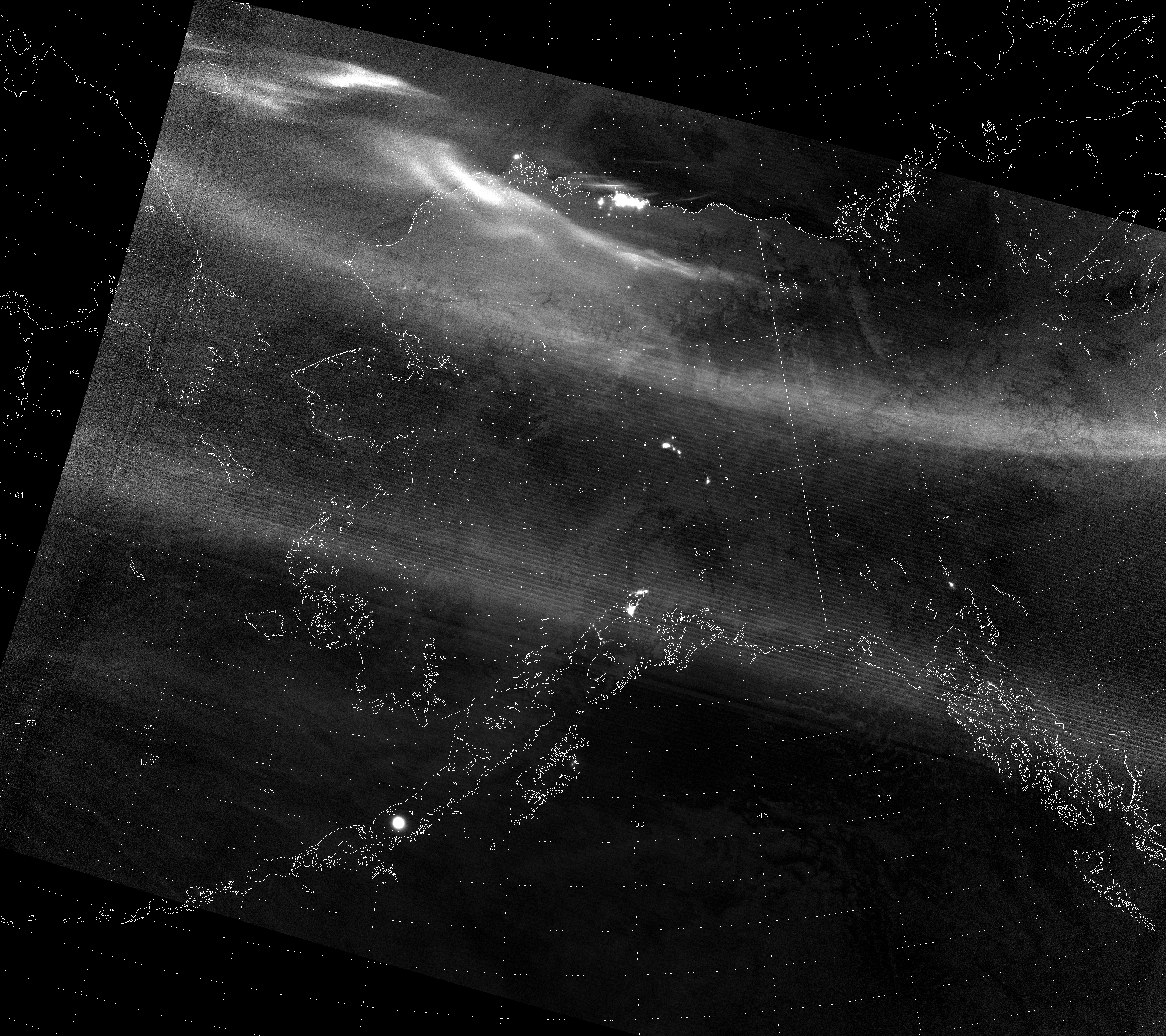
OK, so you can’t actually see any bears with VIIRS (even bears that have fattened up for the winter are less than 375 m across – and certainly less than the 742 m resolution of the Day/Night Band), but you can see auroras and volcanoes. And a lot more! Take a look at this image from the VIIRS Day/Night Band (DNB) taken at 12:19 UTC 7 October 2013:

VIIRS Day/Night Band image, taken 12:19 UTC 7 October 2013

What do you see? Make sure you click on it to see the full resolution image.

Well, there’s a bright arc that stretches from Siberia, over the Brooks Range in northern Alaska and into the Yukon and Northwest Territories of Canada, and there are even brighter arcs north of that (between the Brooks Range and Barrow, even extending over the Arctic Ocean). Those are examples of the aurora borealis (a.k.a. Northern Lights).

As an aside, did you know that VIIRS can provide information about the speed of the aurora? I’ll wait if you want to read that. The aurora in this case is moving more in the along-track direction than the across-track direction, so the method for calculating the speed of the aurora won’t work so well with this aurora. Although, there does seem to be some apparent motion of the auroral element immediately off the coast from Prudhoe Bay. See if you can spot the scan-to-scan “shifts”.

Speaking of Prudhoe Bay, you can also see the tremendous amount of light given off by the oil and gas operations there, making the area look like the largest city in Alaska. (Compare the size of the lit-up area with that of Anchorage, which actually is the largest city in Alaska.) If you know your Alaska and Yukon geography, you should also be able to pick out Barrow, Fairbanks, Delta Junction, Whitehorse, Wasilla, Kodiak and Juneau.

Now, what is that big, circular city over the Alaska Peninsula? (It also looks bigger than Anchorage.) That is the volcano Veniaminof, which was erupting last time we looked at it (at the end of August), and appears to still be going strong as of 7 October 2013 (or it calmed down in the meantime before acting up again, as this article suggests). It’s not that the volcano is actually larger than the city of Anchorage, as it appears. What you are seeing is the light emitted by the liquid-phase rock erupting from the volcano. Rock that is hot enough to be liquid is hot enough to emit radiation in the visible and near-infrared wavelengths the Day/Night Band is sensitive to. This light is illuminating a circular area of the clouds surrounding Veniaminof, and enough of it is reflected or scattered to outer space that VIIRS is able to detect it.

Another question you might ask is, “What is that bright band across the image that parallels the scan lines and passes over both Anchorage and Juneau?” It almost looks like an aurora, but it is in too straight a line. It is another example of “stray light”. Now, if you read the previous post (and remember what it said) you might be confused, because I said that stray light was fixed and shouldn’t be a problem anymore. Well, the stray light correction is not perfect, especially in near-new moon images such as this. For example, say that the stray light correction introduces an error in the radiance on the order of 1 x 10⁻¹⁰ W cm-2. During a full moon, the radiance value observed for a clear background surface pixel would be on the order of 1 x 10⁻⁷ W cm-2, so this error is too small to notice (0.1 % error). During a new moon, the radiance values of a clear background surface are more like 5 x 10⁻¹⁰ W cm-2 (20% error, which is noticeable).

Another thing to consider is that the stray light correction requires post-processing, and is dependent on the moon’s phase and time of year. Since this image was near new moon in October (13% of full on the 7th), it uses data from the previous new moon (in September) to do the stray light correction, since we didn’t have a similar data from October to use. (Of course, we have that data now, but it wasn’t available at the time this image came off the satellite. It will be used on next year’s October data.) Slight differences in the solar-satellite geometry between September and October are the largest source of error in the stray light correction. Since the stray light correction began in late August 2013, once we get to September 2014 the stray light correction ought to perform much better (but it will still be more likely to show errors during a new moon than a full moon).

Speaking of this being near a new moon, how is it possible that you can see clouds and sea ice and snow? It’s true that the aurora does a good job illuminating the surface underneath, but the aurora doesn’t cover everywhere. What about over the ocean? There are no city lights, no erupting volcanoes, and not enough ships in the sea to light up the sky (like there are off the coast of Korea). Where is the light coming from?

It’s actually a phenomenon known as “airglow” (or “nightglow”, since it is easiest to detect at night). The shortened version is that molecules in the upper atmosphere interact with ultraviolet radiation and, as a result, emit photons. This happens around the clock. Airglow is enough to detect a Super Cyclone at night with no moon.  That means, even on the darkest nights, the Day/Night Band is capable of viewing clouds and ice and snow. You don’t even need the moon at all!