Oh, Yakutsk! It has been a long time – 2012, to be exact – since we last spoke about you (on our sister blog). It was a different time back then, with me still referring to the EUMETSAT Natural Color RGB as “pseudo-true color”. (Now, most National Weather Service forecasters know it as the “Day Land Cloud RGB”). VIIRS was a only a baby with less than one year on the job. Back then, the area surrounding the “Coldest City on Earth” was on fire. This time, we return to talk about ice.
You see, rivers near the Coldest City on Earth freeze during the winter, as do most rivers at high latitudes. Places like the Northwest Territories, the Yukon, Alaska and Siberia use this to their advantage. Rivers that are frozen solid can make good roads, a fact that has often been overly dramatized for TV. Transporting heavy equipment may be better done on solid ice in the winter than on squishy, swampy tundra in the summer. But, that comes with a cost: ice roads only work during the winter.
In remote places like these, with few roads, rivers are the lifeblood of transportation – acting as roads during the winter and waterways for boats during the summer. But, what about the transition period that happens each spring and fall? Every year there is a period of time where it is too icy for boats and not icy enough for trucks. Monitoring for the autumn ice-up is an important task. And, perhaps it is more important to monitor for the spring break-up of the ice, since the break up period is often associated with ice jams and flooding.
We’ve covered the autumn ice up before on this blog, but VIIRS recently captured a great view of the spring break up near Yakutsk, that will be our focus today.
We will start with the astonishing video captured by VIIRS’ geostationary cousin, the Advanced Himawari Imager (AHI) on Himawari-8 from 18 May 2018:
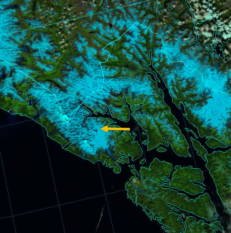
The big river flowing south to north in the center of the frame is the Lena River. (Yakutsk is on that river just south of the easternmost bend.) The second big river along the right side of the frame is the Aldan River, which turns to the west and flows into the Lena in the center of the frame.
Now that you are oriented, take a look at that video again in full screen mode. If you look closely, you will see a snake-like section of ice flowing from the Aldan into the Lena. This is exactly the kind of thing river forecasters are supposed to be watching for during the spring!
Of course, this is a geostationary satellite, which provides good temporal resolution, but not as good spatial resolution. The video is made from 1-km resolution imagery, but we are looking at high latitudes on an oblique angle, so the resolution is more like 3-4 km here. (Note: the scene in the video above is approximately the same latitude as the Yukon River delta, so this acts as a good preview of what GOES-17 and its Advanced Baseline Imager [ABI] will offer.) So, how does this look from the vantage point of VIIRS, which provides similar imagery, but at 375 m resolution? See for yourself:
(You will have to click on the image to get the animation to play.) Animation of VIIRS Natural Color RGB composite of channels I-1, I-2 and I-3 (18 May 2018)
This animation includes both Suomi NPP and NOAA-20 VIIRS. That gives us ~50 min. temporal resolution to go with the sub-kilometer spatial resolution. Eagle-eyed viewers can see how the resolution changes over the course of the animation, as the rivers start out near the left edge of the VIIRS swath (~750 m resolution), then on subsequent orbits, the rivers are near nadir (~375 m resolution) and then on the right edge of the swath (~750 m resolution again). In any case, this is better spatial resolution than AHI can provide (or ABI will provide) at this latitude.
One thing you can do with this animation is calculate how fast the ice was moving. I estimated the leading edge of the big “ice snake” moved about 59 pixels (22.3 km at 375 m resolution) during the 3 hour, 21 minute duration of the animation. That works out to an average speed of 6.7 km/hr (3.6 knots), which doesn’t seem unreasonable. Counting up pixels also indicates our big “ice snake” is at least 65 km long, and the Aldan River is nearly 3 km wide in its lower reaches when it meets the Lena River. That is in the neighborhood of 200 km2 of ice!
That much ice moving at over 3 knots can do a lot of damage. Just look at what the ice on this much smaller river did to this bridge:
Q: When a tree falls in the forest and nobody is around to hear it, does it make a sound?
A: Yes.
That’s an easy question to answer. It’s not a 3000-year-old philosophical conundrum with no answer. Sound is simply a pressure wave moving through some medium (e.g. air, or the ground). A tree falling in the forest will create a pressure wave whether or not there is someone there to listen to it. It pushes against the air, for one. And it smacks into the ground (or other trees), for two. These will happen no matter who is around. As long as that tree doesn’t fall over in the vacuum of space (where there is nothing to transmit the sound waves and nothing to crash into), that tree will make “a sound”. (There are also sounds that humans cannot hear. Think of a dog whistle. Does that sound not exist because a human can’t hear it?)
What if it’s not a tree? What if it’s 120 million metric tons of rock falling onto a glacier? Does that make a sound? To quote a former governor, “You betcha!” It even causes a 2.9 magnitude earthquake!
That’s right! On 28 June 2016, a massive landslide occurred in southeast Alaska. It was picked up on seismometers all over Alaska. And, a pilot who regularly flies over Glacier Bay National Park saw the aftermath:
If you didn’t read the articles from the previous links, here’s one with more (and updated) information. And, according to this last article, rocks were still falling and still making sounds (“like fast flowing streams but ‘crunchier'”) four days later. That pile of fallen rocks is roughly 6.5 miles long and 1 mile wide. And, some of the rock was pushed at least 300 ft (~100 m) uphill on some of the neighboring mountain slopes.
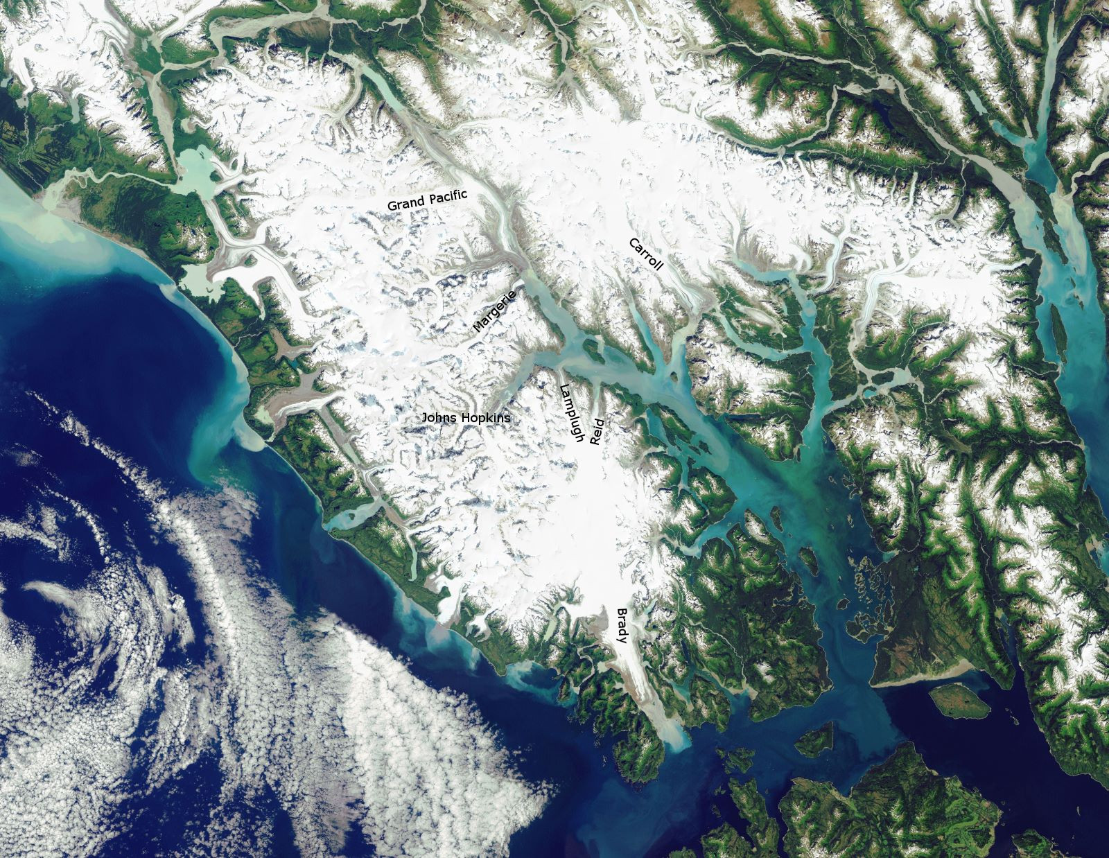
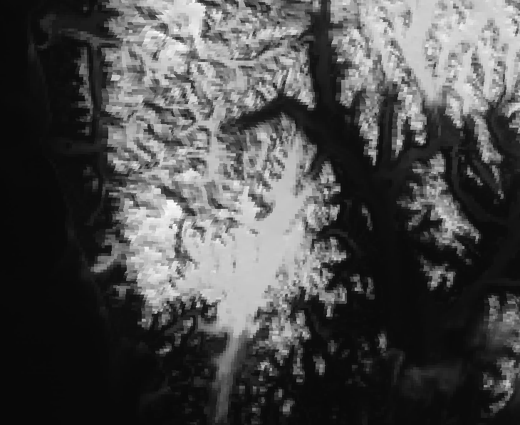
Of course, who needs pilots with video cameras? All we need is a satellite instrument known as VIIRS to see it. (That, and a couple of cloud-free days.) First, lets take a look at an ultra-high-resolution Landsat image (that I stole from the National Park Service website and annotated):
Glacier Bay National Park as viewed by Landsat (courtesy US National Park Service)
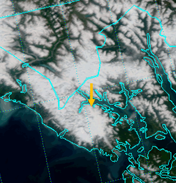
Of course, you’ll want to click on that image to see it at full resolution. The names I’ve added to the image are the names of the major (and a few minor) glaciers in the park. The one to take note of is Lamplugh. Study it’s location, then see if you can find it in this VIIRS True Color image from 9 June 2016:
VIIRS True Color RGB composite image of channels M-3, M-4 and M-5 (20:31 UTC 9 June 2016), zoomed in at 200%.
Anything? No? Well, how about in this image from 7 July 2016:
VIIRS True Color RGB composite of channels M-3, M-4 and M-5 (21:42 UTC 7 July 2016), zoomed in at 200%
I see it! If you don’t, take a look at this animated GIF made from those two images:
Animation of VIIRS True Color images highlighting the Lamplugh Glacier landslide
The arrow is pointing out the location of the landslide. Of course, with True Color images, it can be hard to tell what is cloud and what is snow (or glacier) and with VIIRS you’re limited to 750 m resolution. We can take care of those issues with the high-resolution (375 m) Natural Color images:
Animation of VIIRS Natural Color images of the Lamplugh Glacier landslide
Make sure you click on it to see the full resolution. If you want to really zoom in, here is the high-resolution visible channel (I-1) imagery of the event:
Animation of VIIRS high-resolution visible images of the Lamplugh Glacier landslide
You don’t even need an arrow to point it out. Plus, if you look closely, I think you can even see some of the dust coming from the slide.
That’s what 120 million metric tons of rock falling off the side of a mountain looks like, according to VIIRS!
Minnesota calls itself the “Land of 10,000 Lakes” – they even put it on their license plates. To an Alaskan, it seems funny to brag about that since Alaska has over 3,000,000 lakes. That’s like a Ford Escort bragging to a Bugatti Veyron that it can achieve highway speeds!
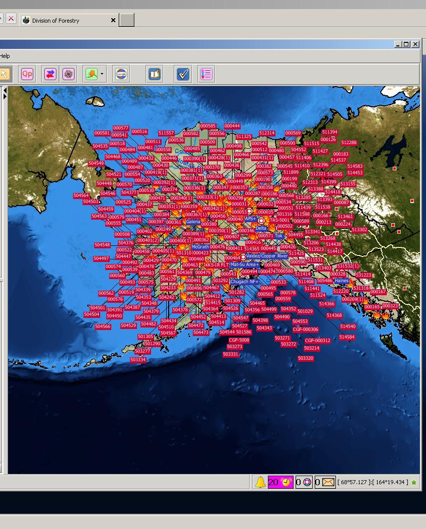
Alaska has Minnesota beat in one other area, and it’s one they’re definitely not putting on their license plates: the number of wildfires. OK, so it may not be 10,000 fires as my title implies, but there sure are a lot:
Map of known wildfires (23 June 2015), courtesy Alaska Interagency Coordination Center
That map shows the number of known wildfires in Alaska on 23 June 2015 and was produced by the Alaska Interagency Coordination Center (AICC). To say that 2015 has been an active fire season in Alaska is an understatement. That would be like saying a Bugatti Veyron is a vehicle capable of achieving highway speeds! (By the way, if anyone in the audience works at Bugatti, and would like to compensate me for this bit of free advertising by, say, giving me a free Veyron, it would be much appreciated.)
Imagine being the person responsible for keeping track of all these fires! (That’s what the good folks at AICC do on a daily basis. There’s also a graduate student at the University of Alaska-Fairbanks working on this very same problem, who has come up with this solution.) This is being called the worst fire season in Alaska since, well, the beginning of recorded history. 2004 was the worst on record, but 2015 is on pace to shatter that. By 26 June 2015, Alaska’s fires had burned over 1.5 Rhode Islands worth of land area (or, alternatively, 0.8 Delawares). By 2 July, the total burned acreage had achieved 3 Rhode Islands (1.6 Delawares; 2/3 of a Connecticut). On 7 July, the total hit 3,000,000 acres (1 Connecticut; 2.5 Delawares; 5 Rhode Islands). (2004 ended at 2 Connecticuts worth of land burned, so there is a chance the pattern could switch and Alaska will get enough rain to fall short of the record, but at this rate, that seems unlikely.)
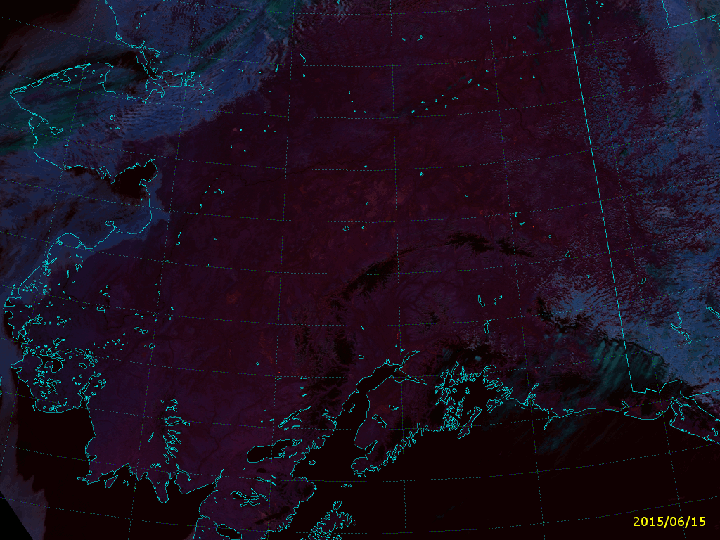
It’s interesting to see how this came to be, given that there were only a couple of fires burning in the middle of June:
VIIRS Fire Temperature RGB composite of channels M-10, M-11 and M-12 (21:28 UTC 15 June 2015)
If you followed this blog last year, you should know about this RGB composite, called “Fire Temperature.” If not, read this and this. Click to the full size image and see if you can see the six obvious fires. (Two are in the Yukon Territory.) Now, count up the number of fires you see in this image from just one week later:
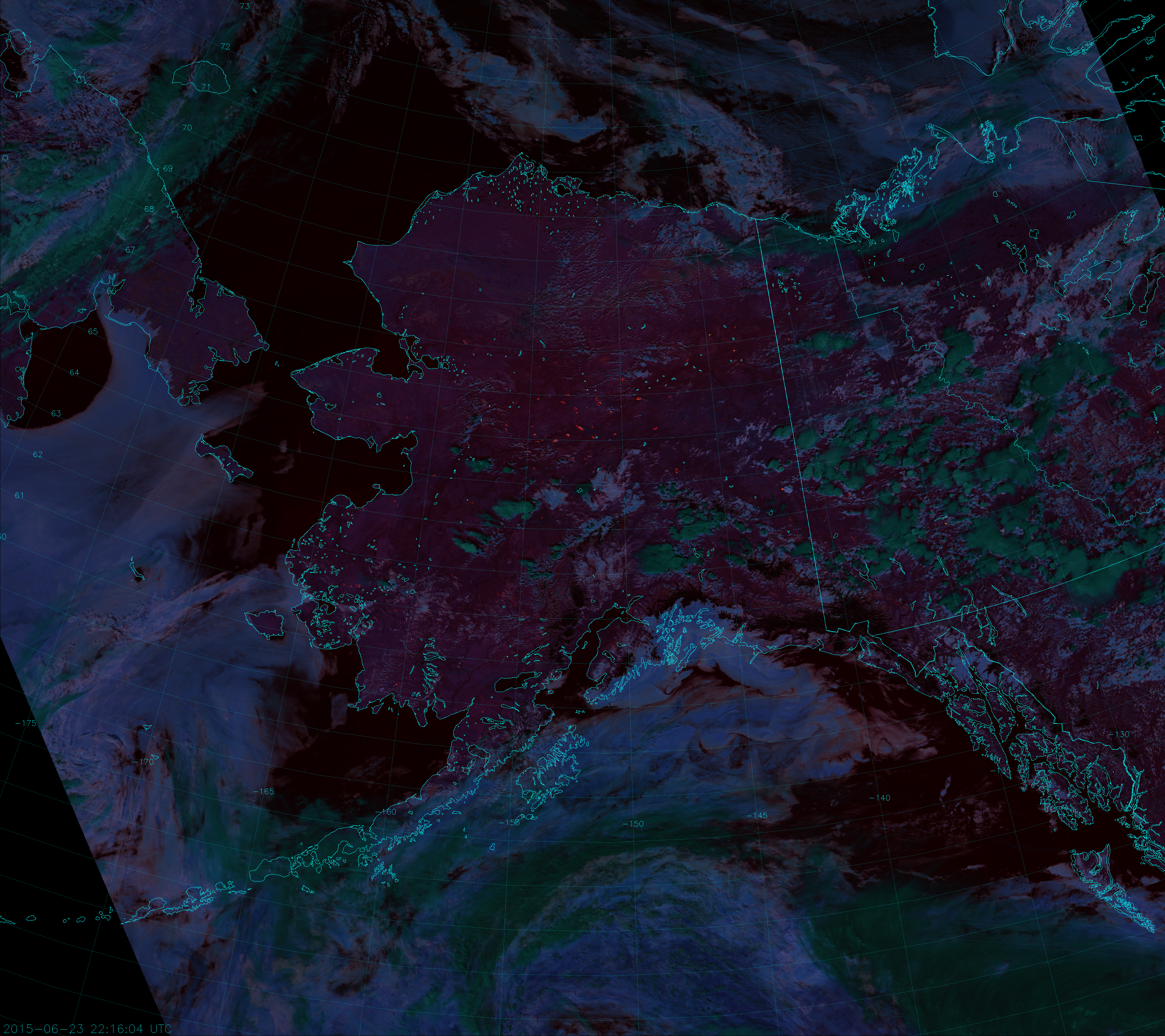
VIIRS Fire Temperature RGB composite of channels M-10, M-11 and M-12 (22:16 UTC 23 June 2015)
Why so many fires all of a sudden? Well, it has been an abnormally dry spring following a winter with much less snow than usual. Plus, there have been a number of dry thunderstorms that produced more lightning than rain. You can see them in the image above as the convective clouds, which appear dark green because they are topped with ice particles. (Ice clouds appear dark green in this composite. Liquid clouds appear more blue.) A number of thunderstorms filled with lightning formed on the 19th of June, and a lot of fires got started shortly after. Here is an animation of Fire Temperature RGB images from 15-25 July (showing only the afternoon VIIRS overpasses):
Animation of VIIRS Fire Temperature RGB images (15-25 June 2015)
It’s difficult to see the storms that led to all these fires, because the storms don’t last long and they typically form and die in between images. Plus, some of the fires may have started from hot embers of other fires that were carried by the wind.
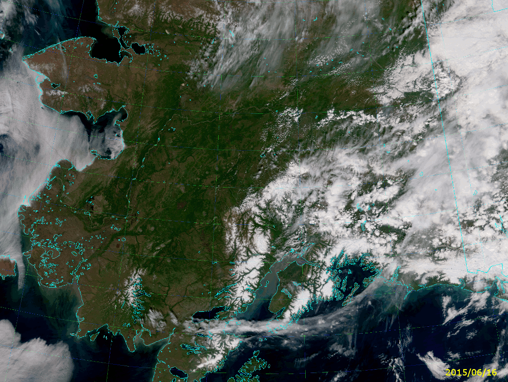
Of course, when there’s smoke there’s fire. I mean – when there’s fire there’s smoke. Lots of it, which you’d never be able to tell from the Fire Temperature RGB. The Fire Temperature RGB uses channels at long enough wavelengths that it sees through the smoke as if it weren’t even there. But, the True Color RGB is very sensitive to smoke. Here’s a similar animation of True Color images:
Animation of VIIRS True Color RGB images (16-25 June 2015)
Look at how quickly the sky fills with smoke from these fires. And also note that the area covered by smoke by the end of the loop (25 June 2015) is too large to be measured in Delawares – units of Californias might be more useful.
The last frame in each animation comes from the VIIRS overpass at 21:30 UTC on 25 June 2015. It’s nice to know that you can still detect fires in the Fire Temperature RGB even with all that smoke around.
Another popular RGB composite to look at is the so-called “Natural Color”. This is the primary RGB composite that can be created from the high-resolution imagery bands I-1, I-2 and I-3. The Natural Color RGB is sort-of in-between wavelengths compared to the Fire Temperature and True Color. The True Color uses visible wavelengths (0.48 µm, 0.55 µm and 0.64 µm), the Fire Temperature uses near- and shortwave infrared wavelengths (1.61 µm, 2.25 µm and 3.7 µm), and the Natural Color spans the two (0.64 µm, 0.87 µm and 1.61 µm). This means the Natural Color is not as sensitive to smoke and not as sensitive to fires – except in the case of very intense fires and very thick smoke plumes.
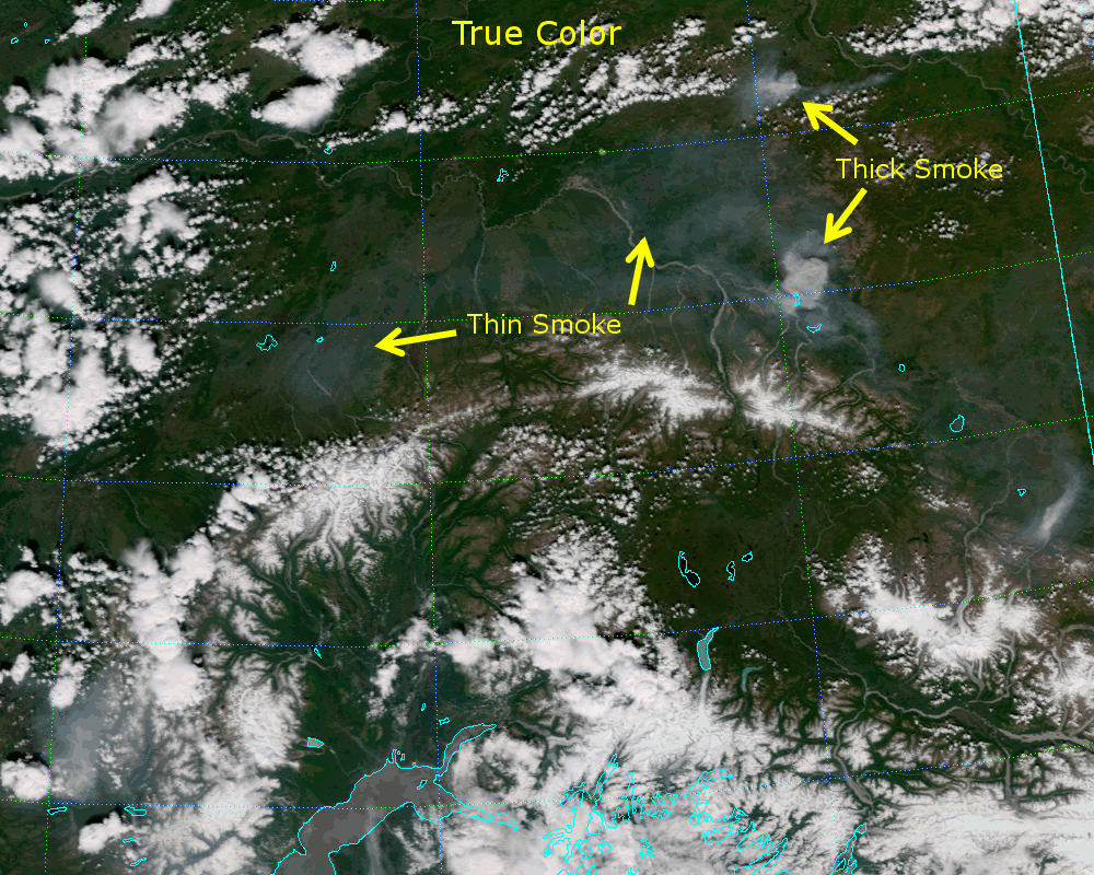
Well, guess what? These fires in Alaska have been intense and have been putting out a lot of smoke, so they do show up. Here’s a comparison between the True Color and Natural Color images from 19 June 2015:
Animation comparing the True Color and Natural Color RGB composites (21:50 UTC 19 June 2015)
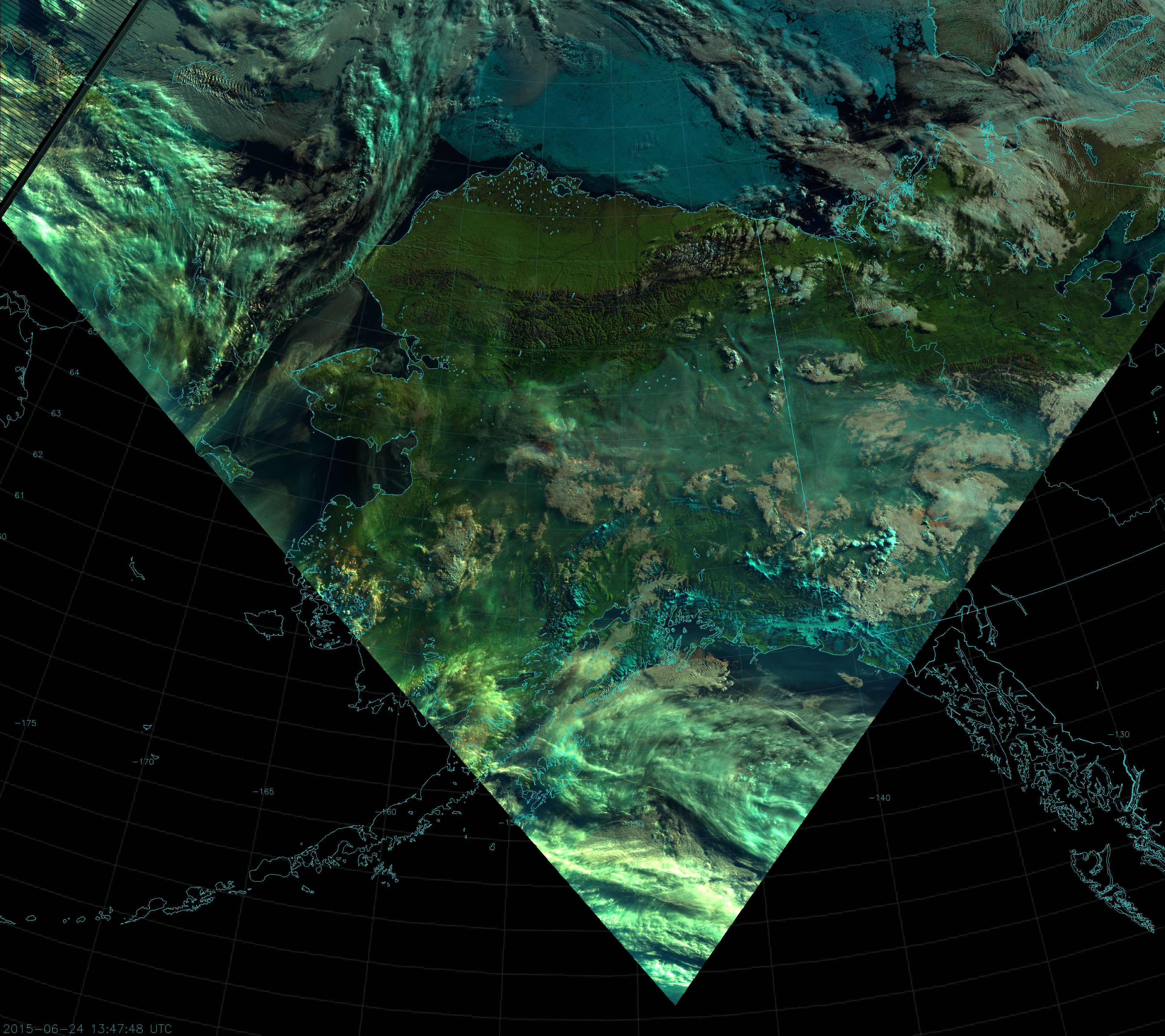
Thin smoke is invisible to the Natural Color, but thick smoke appears blueish (because the blue component at 0.64 µm is the most sensitive to it). As you go from visible wavelengths to near-infrared wavelengths, the smoke’s influence on the radiation transitions from Rayleigh scattering to Mie scattering, and the light is scattered more in the forward direction. This makes the smoke much more visible in the Natural Color composite when the sun is near the horizon, as in this image from 13:47 UTC on 24 June:
VIIRS Natural Color RGB composite of channels I-1, I-2 and I-3 (13:47 UTC 24 June 2015)
Notice the red spot in the clouds at 154 °W, 65 °N? (Click on the image to zoom in.) Here, the smoke plume is optically thick at 0.64 µm (blue component) and 0.87 µm (green component), but transparent at 1.61 µm (red component). It’s like the smoke is casting a shadow in two of the three wavelengths, but is invisible in the other. It’s the combination of large smoke particles and large solar zenith angle creating a variety of Rayleigh and Mie scattering effects leading to this interesting result.
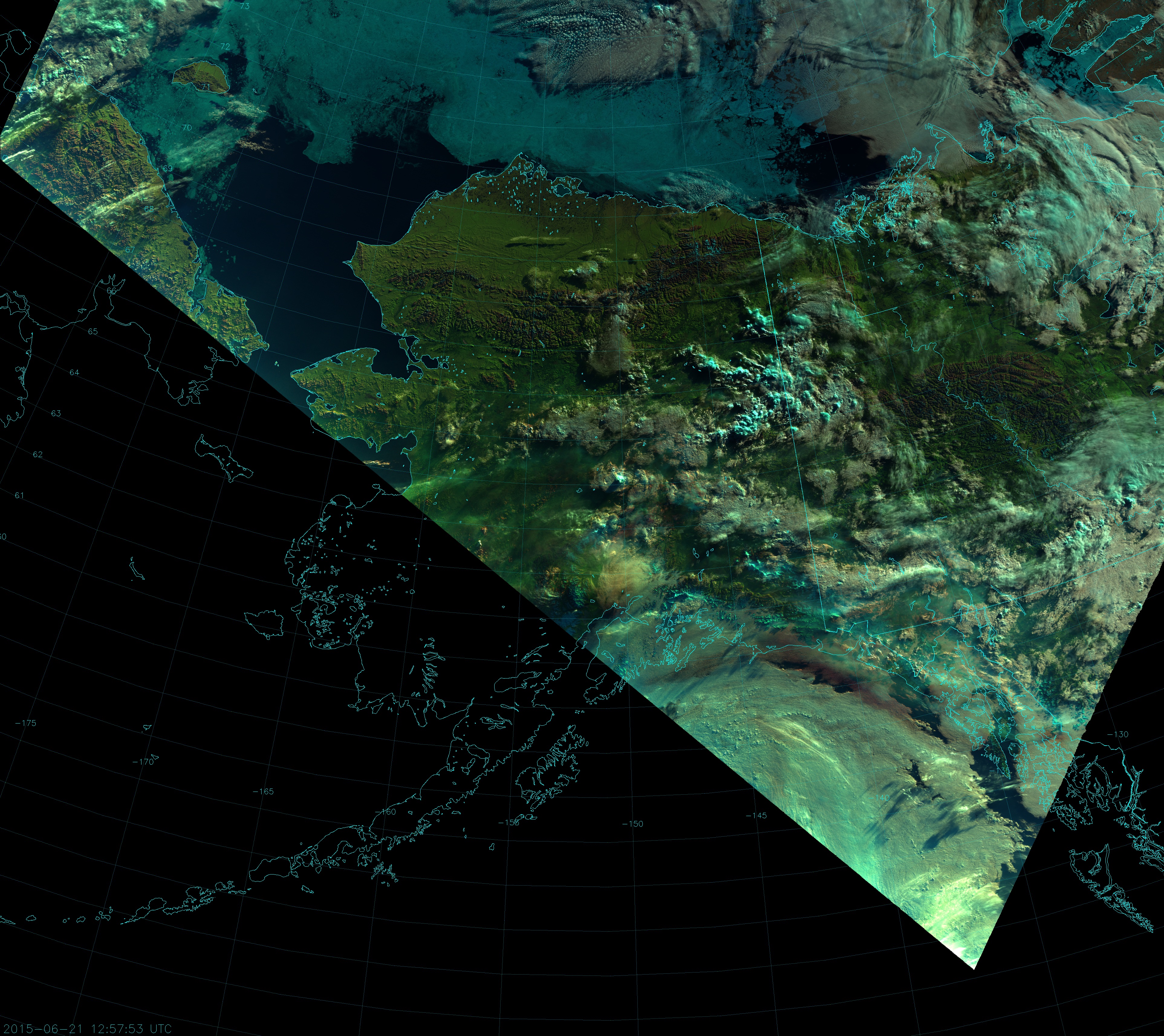
A more dramatic example of this can be seen from the 12:57 UTC overpass on 21 June:
VIIRS Natural Color RGB composite of channels I-1, I-2, and I-3 (12:57 UTC 21 June 2015)
Notice the reddish brown band of clouds just offshore along the coast of southeast Alaska.
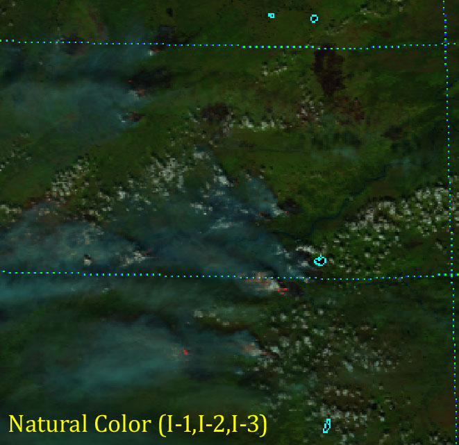
But, that’s not all! Really intense fires may be visible at 1.6 µm, so it’s possible the Natural Color composite can see them. Here’s the Natural Color composite from 22:09 UTC on 4 July zoomed in on an area of intense fires:
VIIRS Natural Color RGB composite of channels I-1, I-2 and I-3 (22:09 UTC 4 July 2015)
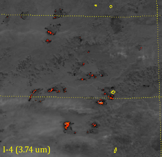
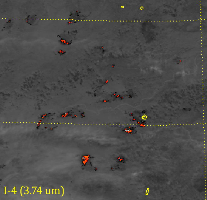
Notice the salmon- and red-colored pixels at the edges of some of the smoke plumes? Those are very intense hot spots showing up at 1.6 µm (I-3). In fact, the fires were so intense that they saturated the sensor at 3.7 µm (I-4) and this lead to “fold-over“:
VIIRS shortwave IR (I-4) image (22:09 UTC 4 July 2015). The color scale highlights pixels with a brightness temperature above 340 K.
Fold-over is when the sensor detects so much radiation above its saturation point, the hardware is “tricked” into thinking the scene is much colder than it is. In the image above, colors indicate pixels with a brightness temperature above 340 K. The scale ranges from red at 340 K to orange to yellow at 390 K. Channel I-4 reaches its saturation point at 368 K. Notice the white and light gray pixels inside the hot spots: the reported brightness temperature in these pixels is ~ 210 K – much colder than everything else around – even the clouds! This is an example of “fold-over”.
The reddish pixels in the Natural Color image match up very closely with the saturated, “fold-over” pixels in I-4:
Animation comparing the Natural Color RGB and I-4 images (22:09 UTC 4 July 2015)
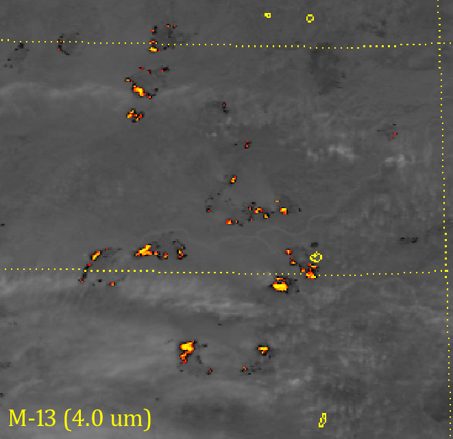
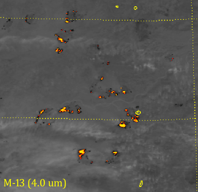
What to do if we have fires saturating our sensor? Use M-13 (4.0 µm), which has a sensor designed to not saturate in these conditions:
VIIRS shortwave IR (M-13) image (22:09 UTC 4 July 2015)
Here, we have reached color table saturation (yellow is as high as it goes), but M-13 did not saturate. In fact, the “fold-over” pixels in I-4 have a brightness temperature above 500 K in M-13. That’s 130-140 K above the saturation point of I-4 (110-120 K above the top of the color table)! The lack of saturation is also why the hot spots appear hotter in M-13, even though it has lower spatial resolution:
Animation comparing VIIRS shortwave IR bands I-4 and M-13 (22:09 UTC 2015)
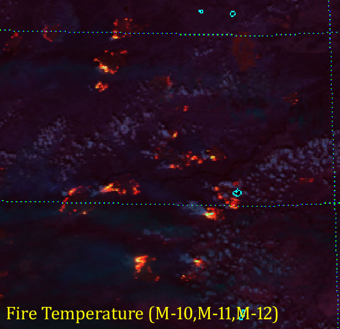
The fact that intense fires show up at 1.6 µm is part of the design of the Fire Temperature RGB. Most fires show up at 3.7 µm (red component). Moderately intense fires are also visible at 2.25 µm (green component) and will appear orange to yellow. Really intense fires, like these, appear at 1.6 µm (blue component) and will appear white (or nearly white):
VIIRS Fire Temperature RGB composite of M-10, M-11, and M-12 (22:09 UTC 4 July 2015)
And, if you’re curious as to how all four of these images compare, here you go:
Animation comparing VIIRS images of intense wildfires (22:09 UTC 4 July 2015)
Shortwave infrared wavelengths are good for detecting fires, visible wavelengths are good for detecting smoke and the Natural Color composite, which uses wavelengths in-between, might just detect both – especially when intense fires exist.
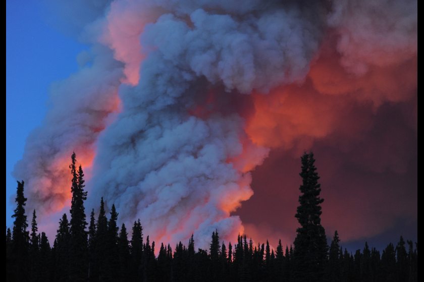
Imagine you’re getting ready for bed. You take one last look out of your bedroom window and you see this:
Photo of the Funny River Fire, taken near 1:00 AM local time (0900 UTC), 21 May 2014. Courtesy Bill Roth/Alaska Dispatch.
Good luck sleeping!
That is the light and smoke from the Funny River Fire, which started on 20 May 2014 and rapidly grew to over 44,000 acres in under 48 hours. Rapidly expanding fires like this one burn through a lot of fuel and can create a lot of smoke. Enough smoke to be seen by radar:
And certainly enough smoke to be seen from space:
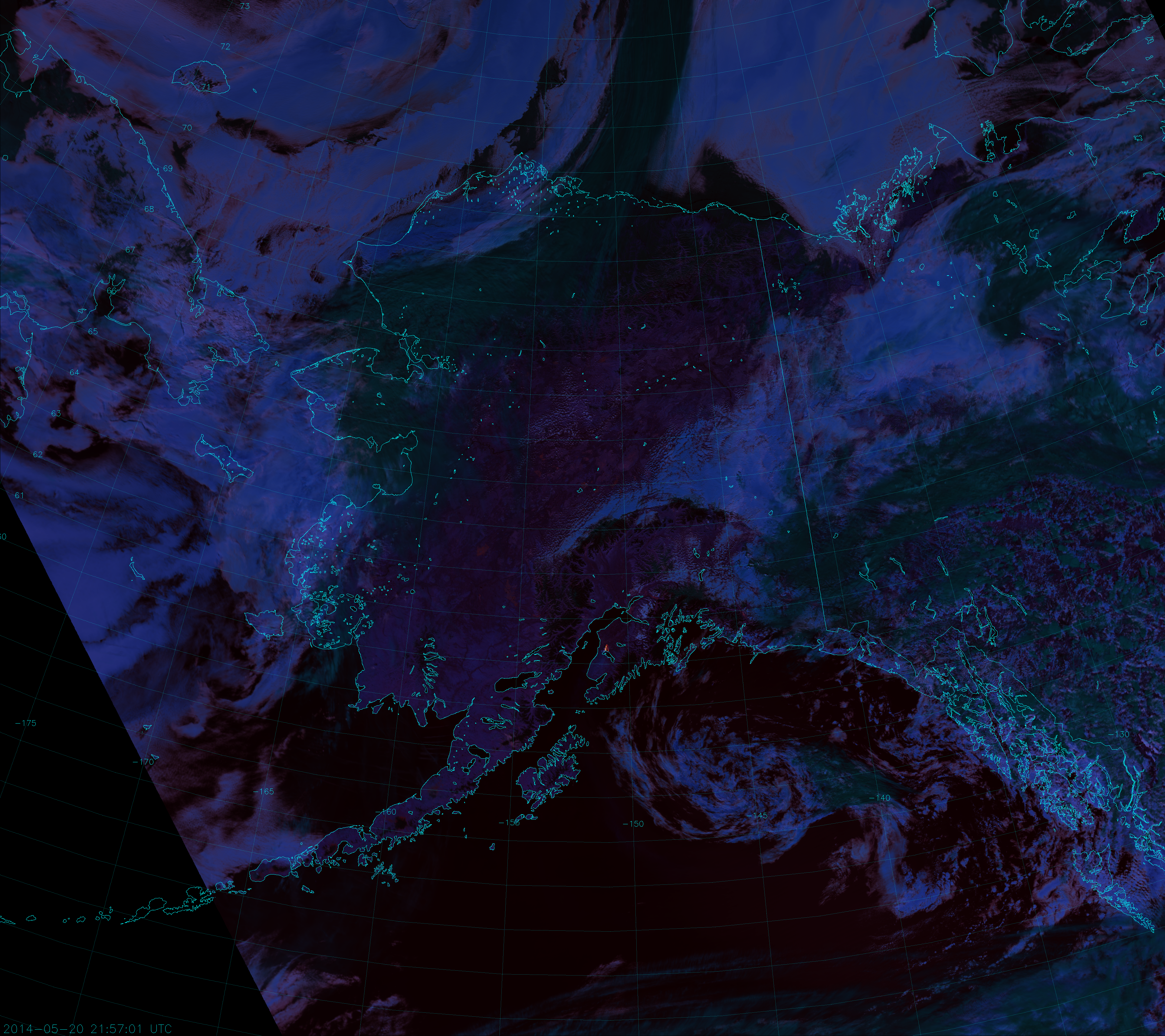
VIIRS “True Color” RGB Composite of channels M-3, M-4 and M-5, taken 21:58 UTC 20 May 2014
Look for the grayish plume arcing from the Kenai Peninsula out over the Gulf of Alaska. That is one impressive smoke plume!
The image above is what we like to call a “True Color” image. It is a combination of the red, green and blue visible-wavelength channels of VIIRS (M-5, 0.67 µm; M-4, 0.55 µm; M-3, 0.48 µm, respectively), so named because it represents the “true” color of objects as the human eye would see them. It is the most commonly used “RGB composite”, which is why a number of people simply refer to it as the “RGB”. To add more confusion, other people call it “Natural Color” because it is only an approximation of the “true” color and has to be corrected for atmospheric effects (i.e. Rayleigh scattering) to look right. However, we want to distinguish this from the EUMETSAT definition of “Natural Color”, which looks like this:
VIIRS “Natural Color” composite of channels I-1, I-2 and I-3, taken 21:58 UTC 20 May 2014
Notice that the smoke plume isn’t as easy to see in the Natural Color image. This is because we are looking at longer wavelengths {1.61 µm (I-3, red component), 0.87 µm (I-2, green component) and 0.64 µm (I-1, blue component)} and smoke scatters less solar radiation back to the satellite as the wavelength increases. This is also why the smoke appears blue – the only channel of the three really able to see the smoke plume is I-1 (the blue component). The fact that we are able to see the smoke at all in the Natural Color image is a testament to just how much smoke there is!
Here’s another Natural Color image from a few orbits before, which happened to be right after sunrise:
VIIRS “Natural Color” composite, taken 13:48 UTC 20 May 2014
The smoke plume is as optically thick as a cloud, and is even casting shadows!
Now, the Funny River Fire is the perfect opportunity to introduce another RGB composite being developed at CIRA for use with VIIRS, which we call the “Fire Temperature RGB”. This RGB composite uses the near-IR and shortwave-IR channels to highlight fires. The blue component is M-10 (1.61 µm), the green component is M-11 (2.25 µm) and the red component is M-12 (3.70 µm). Here’s what the Fire Temperature RGB looks like for the 21:58 UTC overpass:
VIIRS “Fire Temperature” composite of channels M-10, M-11 and M-12, taken 21:58 UTC 20 May 2014
This is yet another example of just how large a fire this is!
The Fire Temperature RGB provides information on how hot (or how “active”) the fire is. This is due to the fact that fires generally show up best around 4 µm. At shorter wavelengths, the amount of background solar radiation increases, so fires need to be hotter to be visible. This means that relatively cool or small fires will only show up in M-12 and appear red. Hotter fires will show up in M-11 and M-12 and appear yellow. The hottest, most active fires will be detected in all three channels and show up white. Also, there’s very little sensitivity to smoke, as you can see, so the imagery provides useful information even with such a thick smoke plume. Due to radiative differences between liquid droplets and ice particles, ice clouds tend to appear dark green, while liquid clouds appear more blue.
At night, M-11 doesn’t produce valid data (although there is a push from several user groups to change that), but M-10 and M-12 still provide valuable information. In fact, the only thing you can see at night in M-10 are fires and gas flares. Even without M-11 at night, we can use the Fire Temperature RGB to monitor the fire around the clock (whenever VIIRS is overhead) and here’s an animation to prove it:
Animation of VIIRS Fire Temperature RGB images of the Funny River Fire (2014).
In the first frame, the fire is obscured by clouds (we still can’t see through those) but, after that, you can see the fire was pushed to the shores of Tustumena Lake. With nowhere else to go, the fire expanded east and west. The fire slowly loses intensity until the last two frames, when activity picks up on the north side. (Although, clouds block the view of the east flank of the fire at that time, so we can’t say how active it is there.) Also notice on the second and third nights (11:00 to 13:00 UTC) that the fire appears less intense. This is probably due to the combination of reduced fire activity at night and the presence of clouds that are not visible at night in this RGB composite.
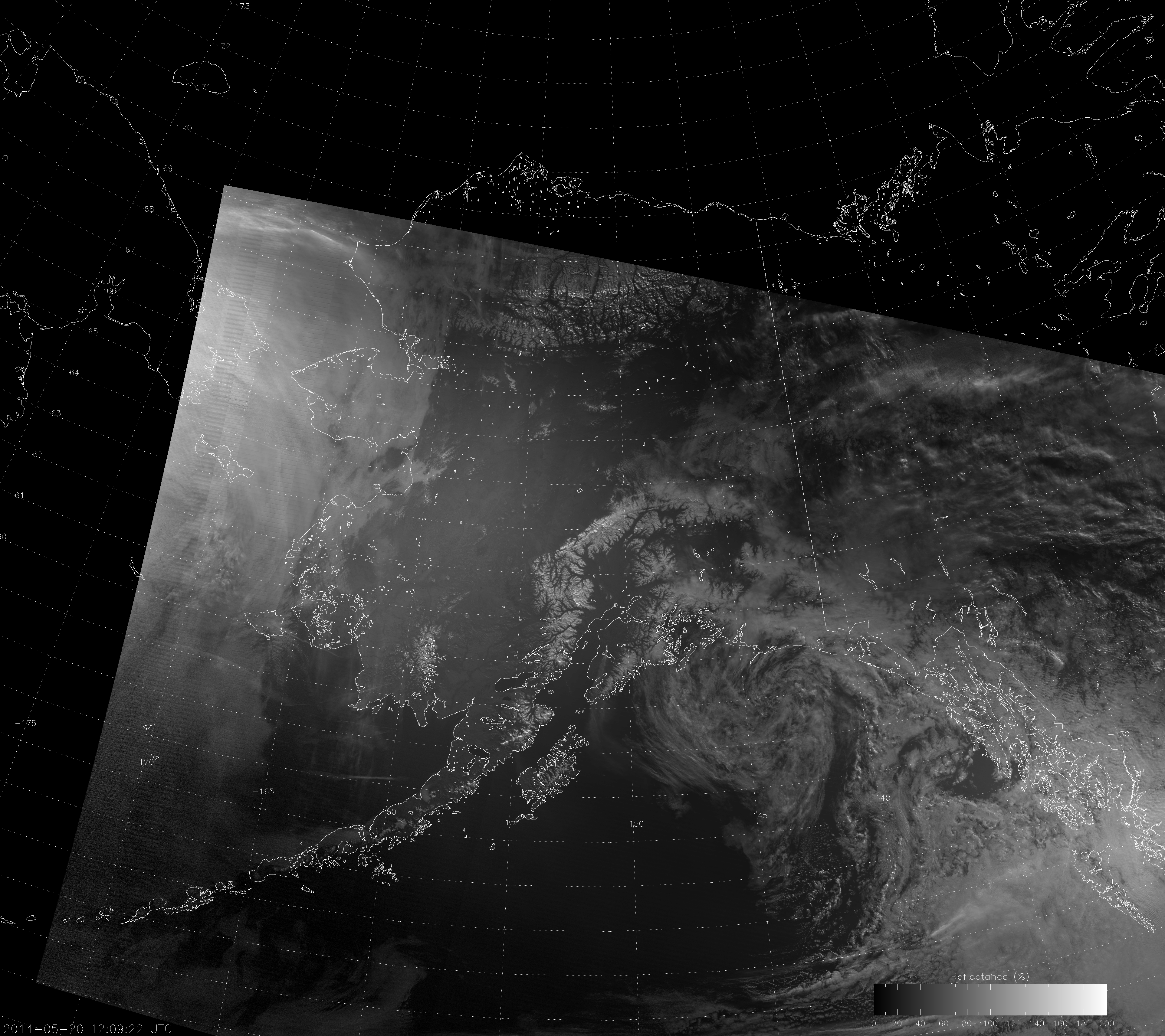
Here’s what the Funny River Fire looked like in the high-resolution fire detection channel (I-4, 3.74 µm) for the same times:
VIIRS channel I-4 images of the Funny River Fire (2014)
For this image, cooler pixels appear light, while warmer pixels appear dark. Pixels with a brightness temperature above 340 K have been colored. This channel by itself shows the clouds over the fire at night, but it can be ambiguous during the day because liquid clouds are highly reflective at this wavelength, so they also look warm.
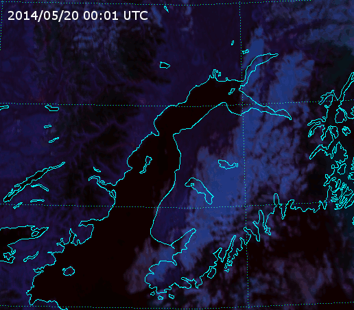
It has already been demonstrated that the Day/Night Band is capable of detecting fires at night (click here and here for examples). So, why not just use it here? I tell you why: the day/night terminator is already encroaching on the nighttime overpasses. This makes it difficult to see fires, since the light from the fire is competing with light from the sun. This was a particularly intense fire on the first night though, so the Day/Night Band was able to see it (as evidenced by this Near Constant Contrast [NCC] image):
VIIRS NCC image, taken 12:09 UTC 20 May 2014
As you can see, the NCC product shows both the fire and the smoke plume. Notice also that you can’t see any city lights, even though it’s still nighttime over the fire because there is enough twilight to drown out the signal. That makes fire detection with the Day/Night Band tricky when the terminator is so close. It’s only because the Funny River Fire was so intense that we are able to see it. Of course, since it was so intense, we are able to see the smoke easily even if we can’t see the light from the fire.