
Minnesota calls itself the “Land of 10,000 Lakes” – they even put it on their license plates. To an Alaskan, it seems funny to brag about that since Alaska has over 3,000,000 lakes. That’s like a Ford Escort bragging to a Bugatti Veyron that it can achieve highway speeds!
Alaska has Minnesota beat in one other area, and it’s one they’re definitely not putting on their license plates: the number of wildfires. OK, so it may not be 10,000 fires as my title implies, but there sure are a lot:
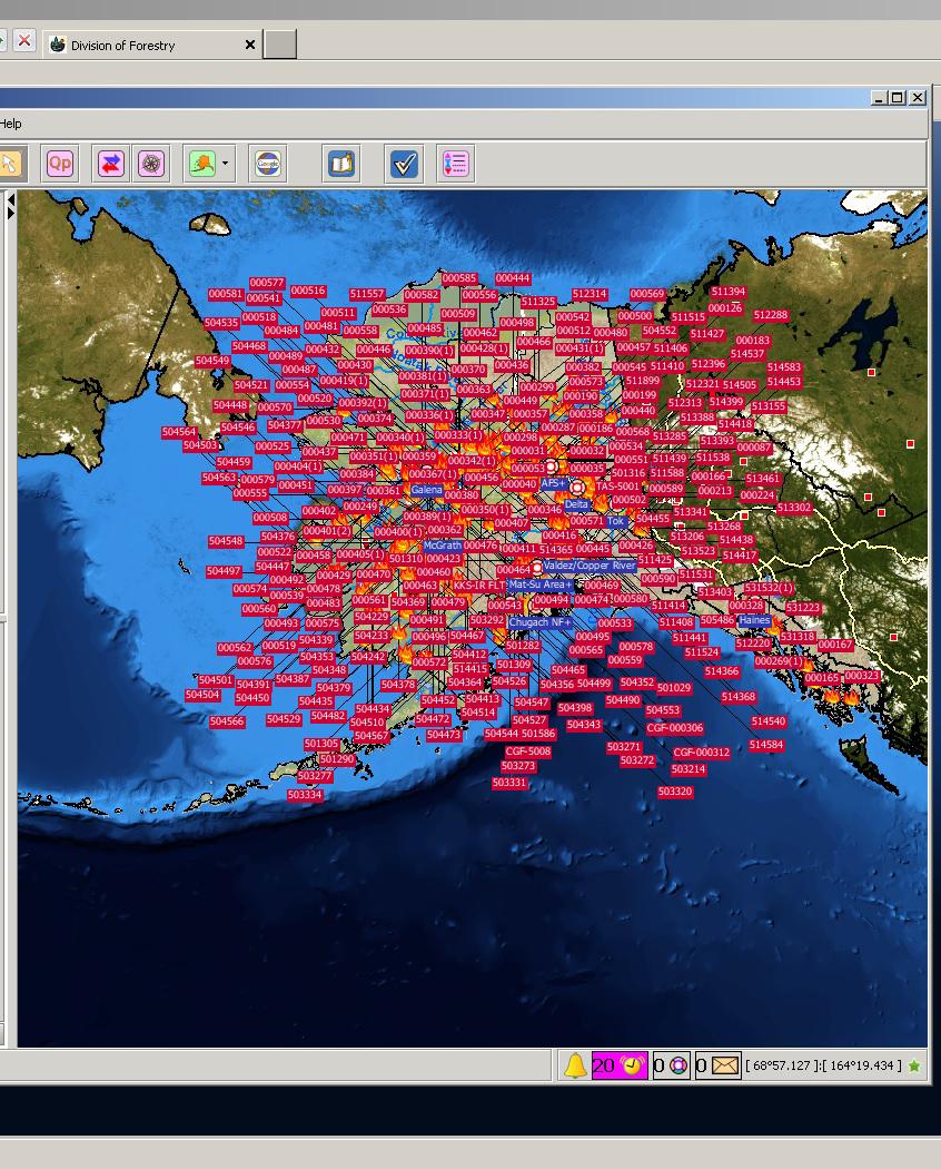
That map shows the number of known wildfires in Alaska on 23 June 2015 and was produced by the Alaska Interagency Coordination Center (AICC). To say that 2015 has been an active fire season in Alaska is an understatement. That would be like saying a Bugatti Veyron is a vehicle capable of achieving highway speeds! (By the way, if anyone in the audience works at Bugatti, and would like to compensate me for this bit of free advertising by, say, giving me a free Veyron, it would be much appreciated.)
Imagine being the person responsible for keeping track of all these fires! (That’s what the good folks at AICC do on a daily basis. There’s also a graduate student at the University of Alaska-Fairbanks working on this very same problem, who has come up with this solution.) This is being called the worst fire season in Alaska since, well, the beginning of recorded history. 2004 was the worst on record, but 2015 is on pace to shatter that. By 26 June 2015, Alaska’s fires had burned over 1.5 Rhode Islands worth of land area (or, alternatively, 0.8 Delawares). By 2 July, the total burned acreage had achieved 3 Rhode Islands (1.6 Delawares; 2/3 of a Connecticut). On 7 July, the total hit 3,000,000 acres (1 Connecticut; 2.5 Delawares; 5 Rhode Islands). (2004 ended at 2 Connecticuts worth of land burned, so there is a chance the pattern could switch and Alaska will get enough rain to fall short of the record, but at this rate, that seems unlikely.)
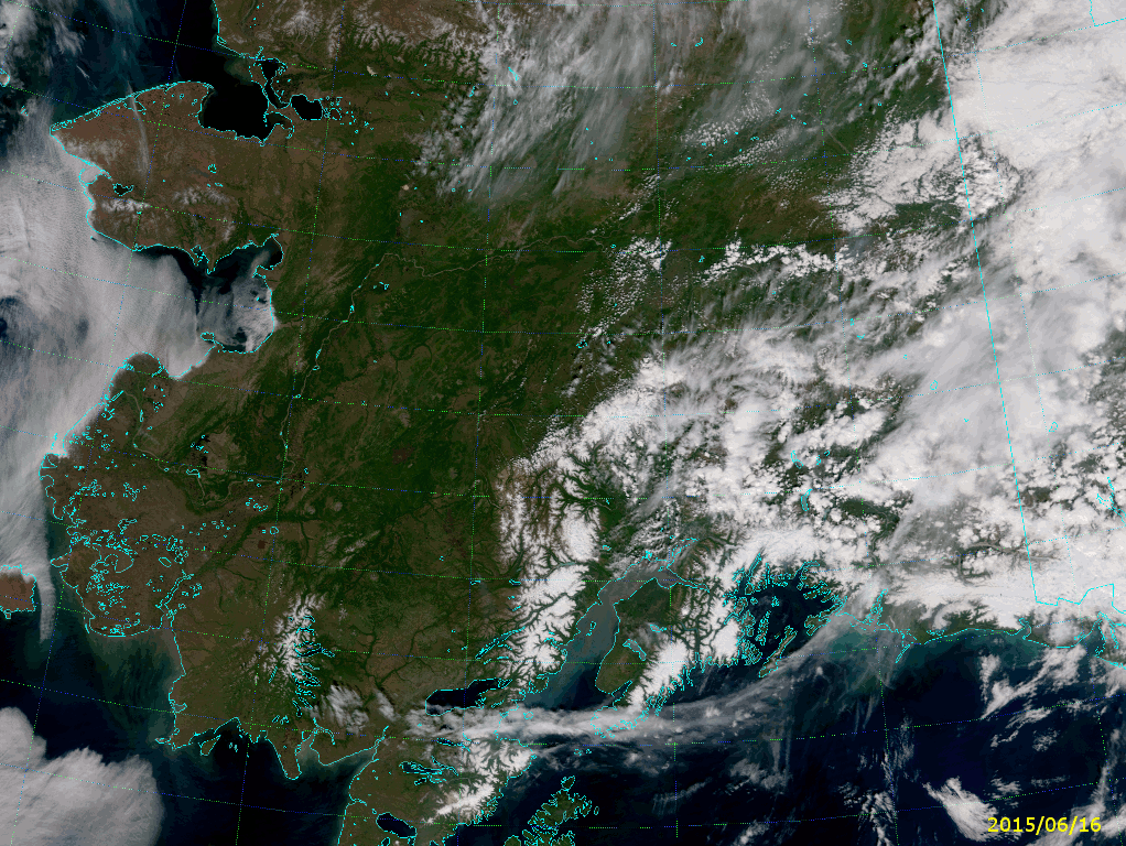
It’s interesting to see how this came to be, given that there were only a couple of fires burning in the middle of June:
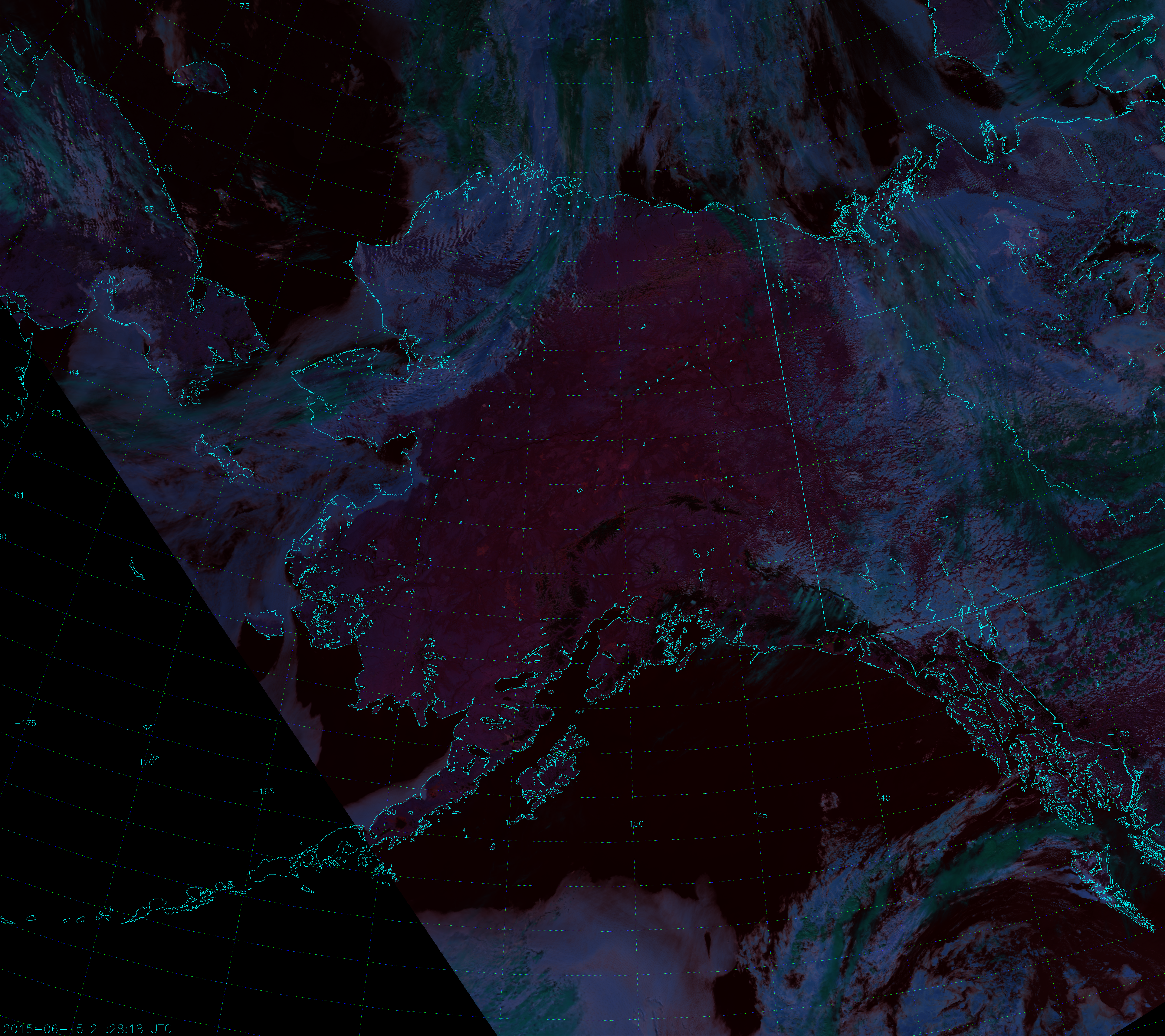
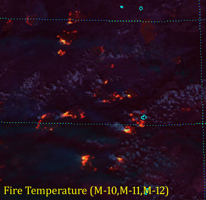
If you followed this blog last year, you should know about this RGB composite, called “Fire Temperature.” If not, read this blog post and this other blog post. Click to the full size image and see if you can see the six obvious fires. (Two are in the Yukon Territory.) Now, count up the number of fires you see in this image from just one week later:
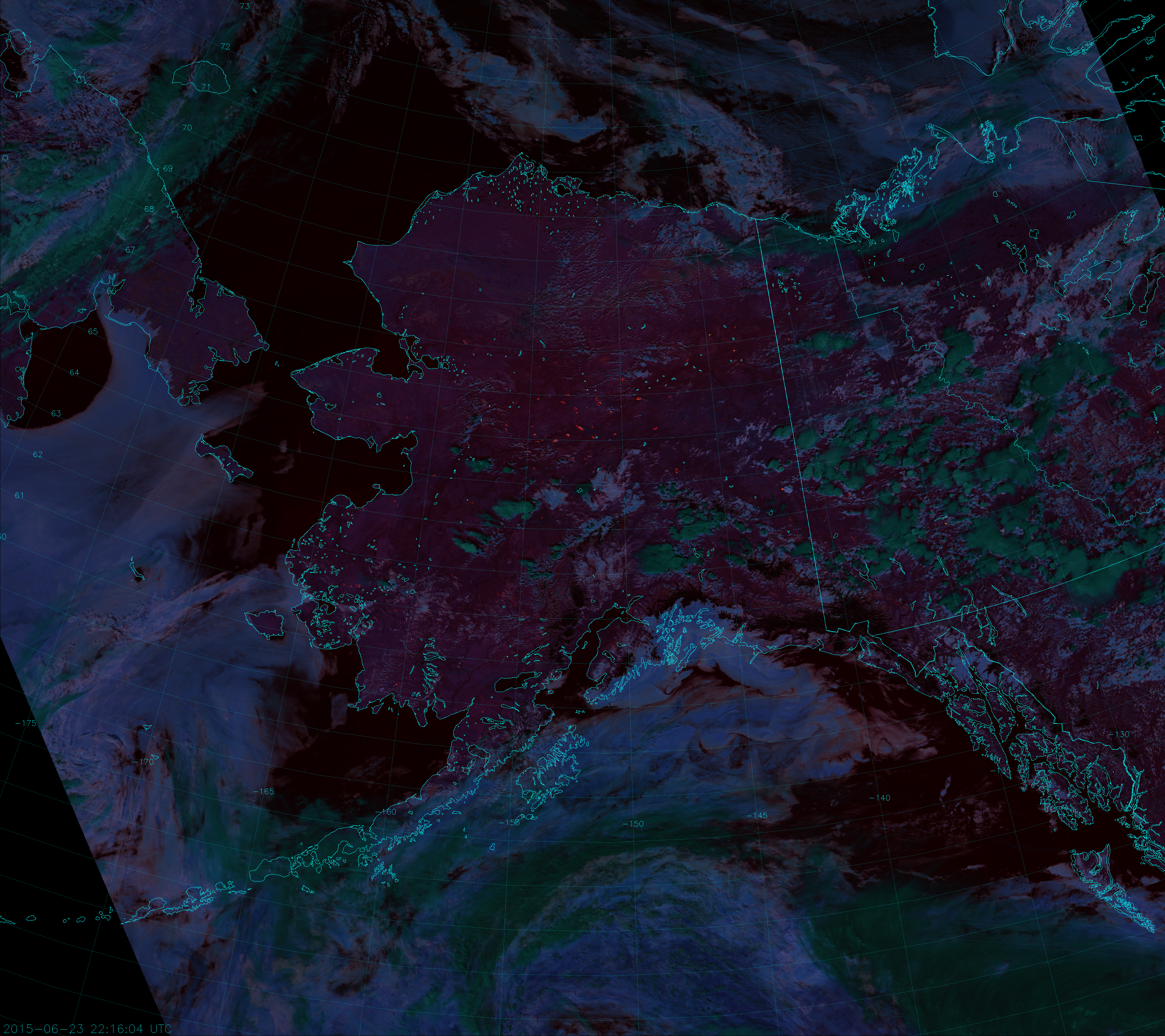
Why so many fires all of a sudden? Well, it has been an abnormally dry spring following a winter with much less snow than usual. Plus, there have been a number of dry thunderstorms that produced more lightning than rain. You can see them in the image above as the convective clouds, which appear dark green because they are topped with ice particles. (Ice clouds appear dark green in this composite. Liquid clouds appear more blue.) A number of thunderstorms filled with lightning formed on the 19th of June, and a lot of fires got started shortly after. Here is an animation of Fire Temperature RGB images from 15-25 July (showing only the afternoon VIIRS overpasses):
It’s difficult to see the storms that led to all these fires, because the storms don’t last long and they typically form and die in between images. Plus, some of the fires may have started from hot embers of other fires that were carried by the wind.
Of course, when there’s smoke there’s fire. I mean – when there’s fire there’s smoke. Lots of it, which you’d never be able to tell from the Fire Temperature RGB. The Fire Temperature RGB uses channels at long enough wavelengths that it sees through the smoke as if it weren’t even there. But, the True Color RGB is very sensitive to smoke. Here’s a similar animation of True Color images:
Look at how quickly the sky fills with smoke from these fires. And also note that the area covered by smoke by the end of the loop (25 June 2015) is too large to be measured in Delawares – units of Californias might be more useful.
The last frame in each animation comes from the VIIRS overpass at 21:30 UTC on 25 June 2015. It’s nice to know that you can still detect fires in the Fire Temperature RGB even with all that smoke around.
Another popular RGB composite to look at is the so-called “Natural Color”. This is the primary RGB composite that can be created from the high-resolution imagery bands I-1, I-2 and I-3. The Natural Color RGB is sort-of in-between wavelengths compared to the Fire Temperature and True Color. The True Color uses visible wavelengths (0.48 µm, 0.55 µm and 0.64 µm), the Fire Temperature uses near- and shortwave infrared wavelengths (1.61 µm, 2.25 µm and 3.7 µm), and the Natural Color spans the two (0.64 µm, 0.87 µm and 1.61 µm). This means the Natural Color is not as sensitive to smoke and not as sensitive to fires – except in the case of very intense fires and very thick smoke plumes.
Well, guess what? These fires in Alaska have been intense and have been putting out a lot of smoke, so they do show up. Here’s a comparison between the True Color and Natural Color images from 19 June 2015:
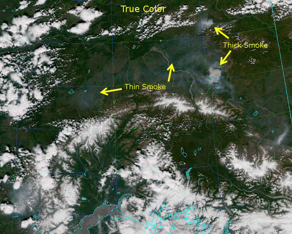
Thin smoke is invisible to the Natural Color, but thick smoke appears blueish (because the blue component at 0.64 µm is the most sensitive to it). As you go from visible wavelengths to near-infrared wavelengths, the smoke’s influence on the radiation transitions from Rayleigh scattering to Mie scattering, and the light is scattered more in the forward direction. This makes the smoke much more visible in the Natural Color composite when the sun is near the horizon, as in this image from 13:47 UTC on 24 June:
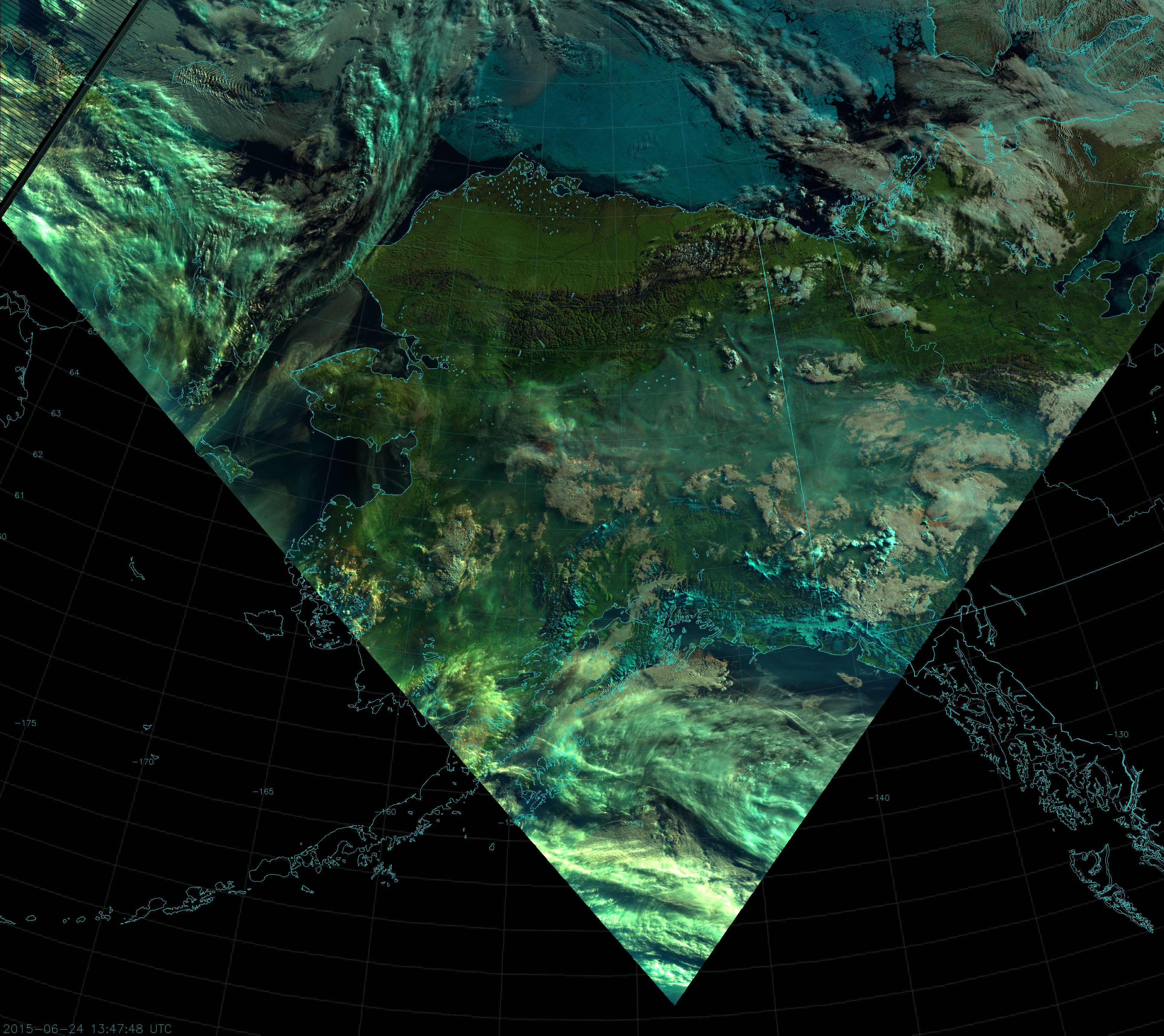
Notice the red spot in the clouds at 154 °W, 65 °N? (Click on the image to zoom in.) Here, the smoke plume is optically thick at 0.64 µm (blue component) and 0.87 µm (green component), but transparent at 1.61 µm (red component). It’s like the smoke is casting a shadow in two of the three wavelengths, but is invisible in the other. It’s the combination of large smoke particles and large solar zenith angle creating a variety of Rayleigh and Mie scattering effects leading to this interesting result.
A more dramatic example of this can be seen from the 12:57 UTC overpass on 21 June:
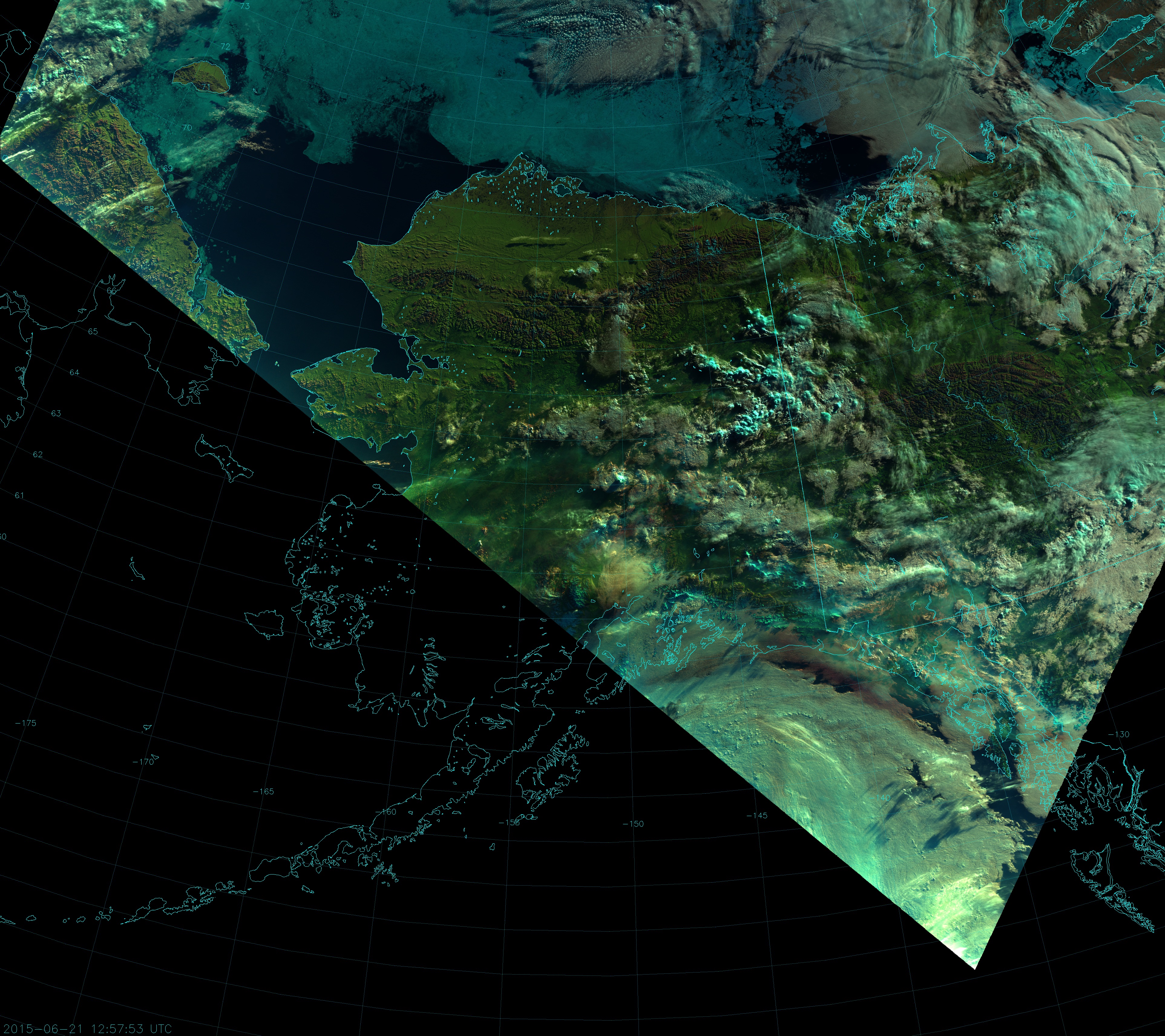
Notice the reddish brown band of clouds just offshore along the coast of southeast Alaska.
But, that’s not all! Really intense fires may be visible at 1.6 µm, so it’s possible the Natural Color composite can see them. Here’s the Natural Color composite from 22:09 UTC on 4 July zoomed in on an area of intense fires:
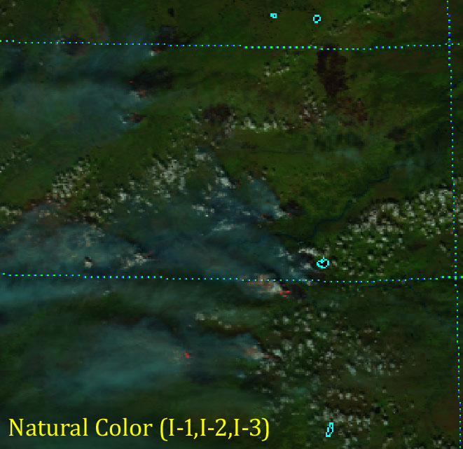
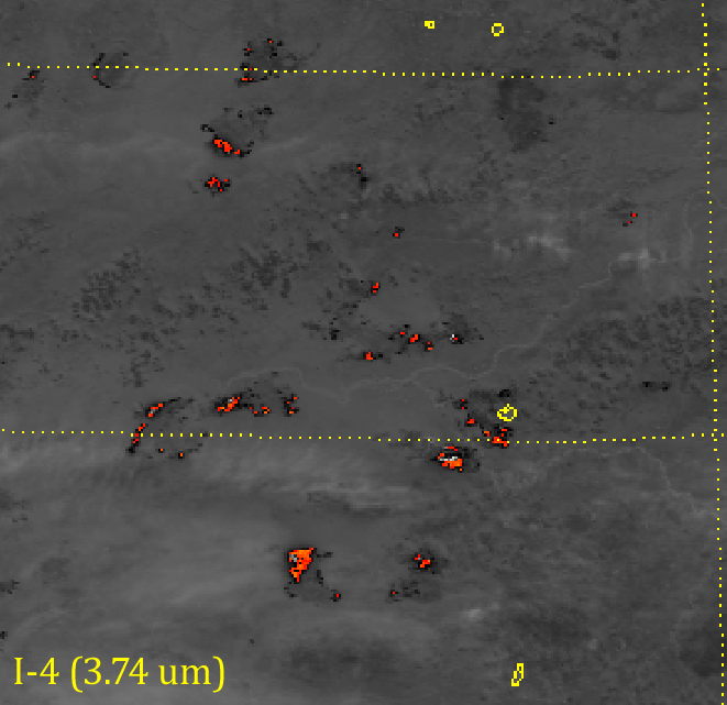
Notice the salmon- and red-colored pixels at the edges of some of the smoke plumes? Those are very intense hot spots showing up at 1.6 µm (I-3). In fact, the fires were so intense that they saturated the sensor at 3.7 µm (I-4) and this lead to “fold-over“:
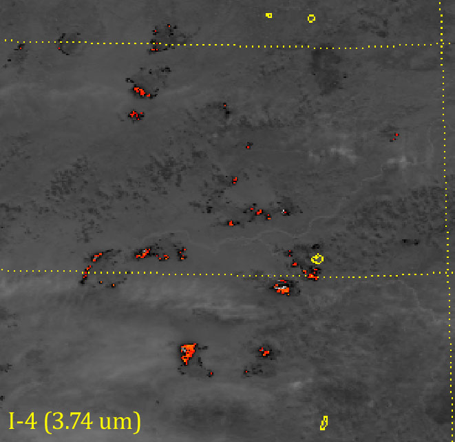
Fold-over is when the sensor detects so much radiation above its saturation point, the hardware is “tricked” into thinking the scene is much colder than it is. In the image above, colors indicate pixels with a brightness temperature above 340 K. The scale ranges from red at 340 K to orange to yellow at 390 K. Channel I-4 reaches its saturation point at 368 K. Notice the white and light gray pixels inside the hot spots: the reported brightness temperature in these pixels is ~ 210 K – much colder than everything else around – even the clouds! This is an example of “fold-over”.
The reddish pixels in the Natural Color image match up very closely with the saturated, “fold-over” pixels in I-4:

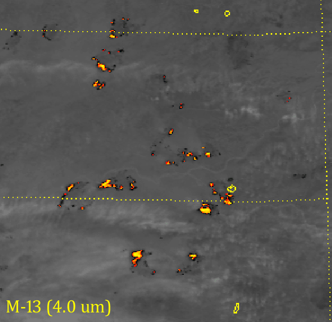
What to do if we have fires saturating our sensor? Use M-13 (4.0 µm), which has a sensor designed to not saturate in these conditions:
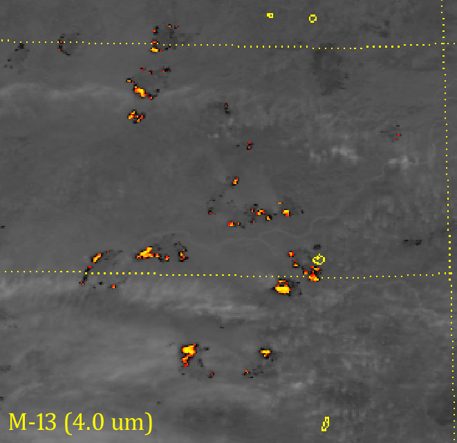
Here, we have reached color table saturation (yellow is as high as it goes), but M-13 did not saturate. In fact, the “fold-over” pixels in I-4 have a brightness temperature above 500 K in M-13. That’s 130-140 K above the saturation point of I-4 (110-120 K above the top of the color table)! The lack of saturation is also why the hot spots appear hotter in M-13, even though it has lower spatial resolution:
The fact that intense fires show up at 1.6 µm is part of the design of the Fire Temperature RGB. Most fires show up at 3.7 µm (red component). Moderately intense fires are also visible at 2.25 µm (green component) and will appear orange to yellow. Really intense fires, like these, appear at 1.6 µm (blue component) and will appear white (or nearly white):
And, if you’re curious as to how all four of these images compare, here you go:
Shortwave infrared wavelengths are good for detecting fires, visible wavelengths are good for detecting smoke and the Natural Color composite, which uses wavelengths in-between, might just detect both – especially when intense fires exist.