I wrote the first post on this blog more than 5.5 years ago. Since then, I have covered a multitude of instances where VIIRS imagery has helped us learn about the world we live on. But, during that time there has been one channel on VIIRS that has never been mentioned. Not once. And, what may be even more surprising is that this channel is not featured on any of the next generation geostationary satellites. It’s not on the GOES-R Program’s ABI, not on Himawari’s AHI, not on the upcoming Meteosat Third Generation FCI. Those with photographic memories will know exactly which channel I’m talking about. The rest of you will just have to guess, or go back through the archives and use the process of elimination to figure it out.
So, is this channel useless? Why is it on VIIRS, but not ABI? Which one is it? The suspense is killing me! I can’t answer that second question, but I can definitely answer the third and give some insights to #1. (The short answer to #1 is “No” – otherwise we wouldn’t be here.) But, to do this, we have to remember why Lake Mille Lacs disappeared earlier this year. It might also be good to remember our earlier posts on Greenland, because that is the location of our most recent mystery.
We begin with the view of Greenland from GOES-16 back at the end of July 2017:
This video covers the period of time from 0700 UTC 27 July to 2345 UTC 28 July. If you follow this blog, you already know that this the “Natural Color” RGB composite, which in GOES-16 ABI terms is made of bands 2 (0.64 µm), 3 (0.86 µm) and 5 (1.61 µm). Notice the whitish coloration over the central portion of Greenland. This is the feature of interest.
We know from experience (and earlier blog posts) that snow and ice are not very reflective at 1.6 µm, which is why it takes on that cyan appearance in Natural Color imagery. Whitish colors are indicative of liquid clouds. But, the feature of interest doesn’t appear to move over this two day period. (If you look closely, it does appear to shrink a little, though.) It’s hard to believe a cloud could be that stationary over a two day period.
Let’s isolate the 1.6 µm band by itself to see if we can tell what’s going on:
Shortly after the first sunrise, you can see a patch of liquid clouds over the ice that quickly dissipate, leaving our feature of interest exposed. Clouds appear again near the first sunset, and late in the second day (28 July). The feature of interest isn’t as bright as those clouds, but is brighter than the rest of the ice and snow on Greenland.
At shorter wavelengths, nearly all of Greenland is bright, so our feature of interest isn’t as noticeable. Here’s the 0.86 µm band from ABI:
But, it shows up at the two longer shortwave IR bands. Here’s the 2.25 µm band:
The same is true for 3.9 µm, but I won’t waste time showing it.
So, what is going on? What is our feature of interest?
Well, the problem is, Greenland is way off on the limb from the perspective of GOES-16’s current location. Perhaps we need a better view from something that passes directly overhead of Greenland. Hmmm. What could that be?
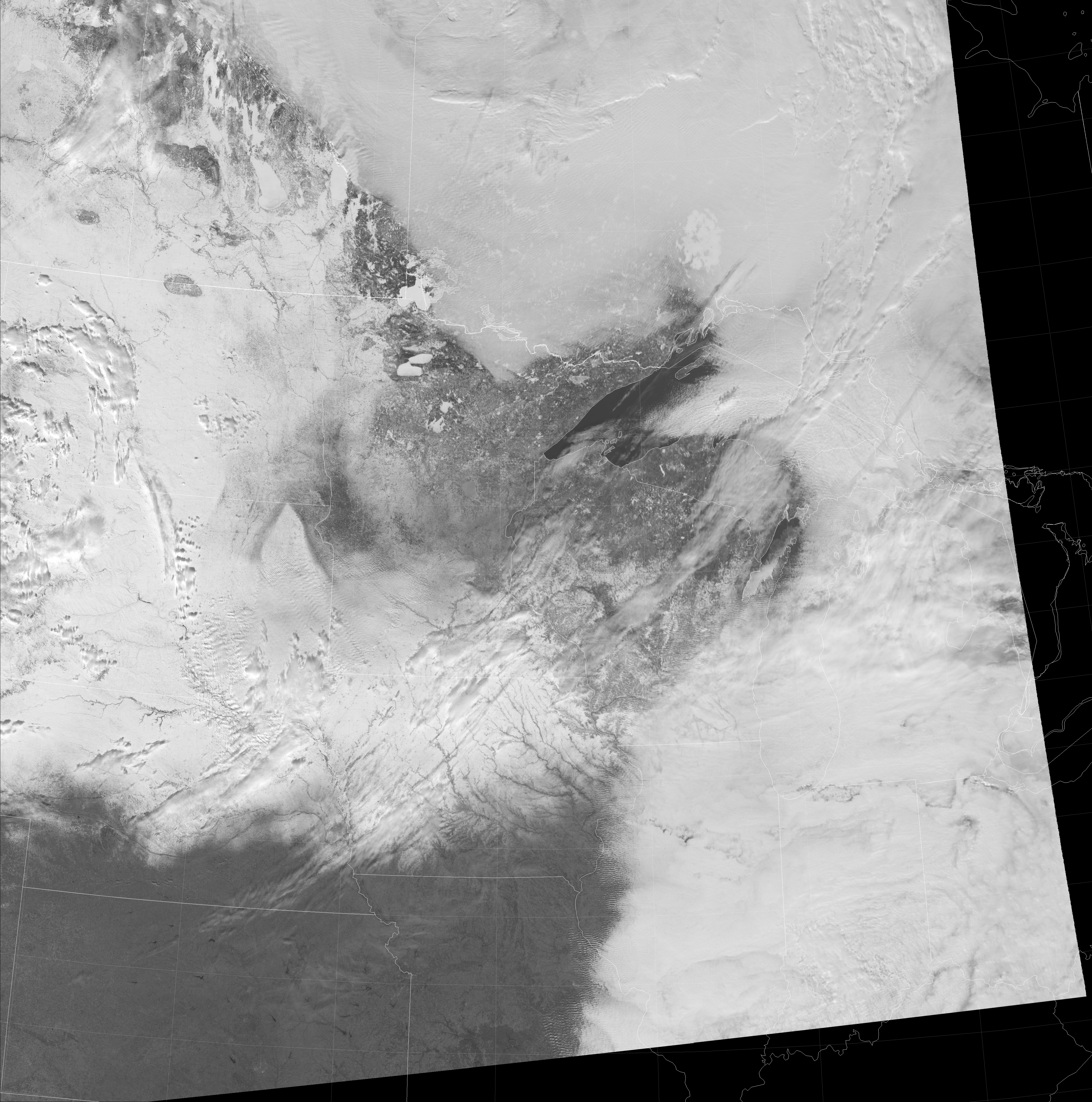
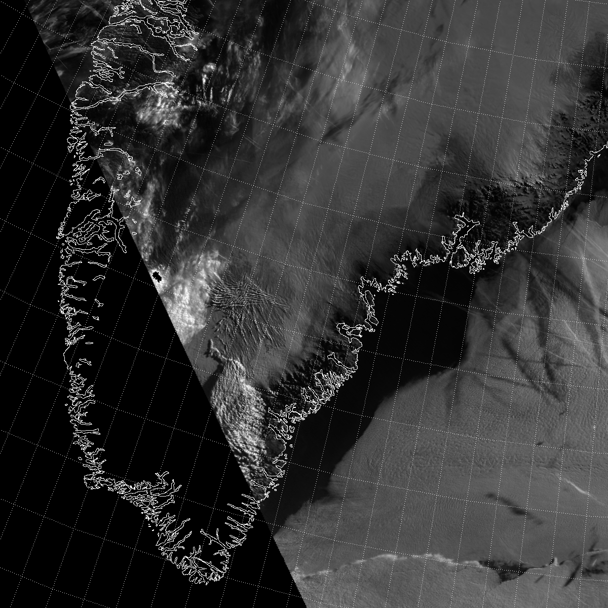
This is a VIIRS blog after all, so I think you know the answer to my rhetorical question. Let’s start with our good old friend, Natural Color, which we should all be familiar with:
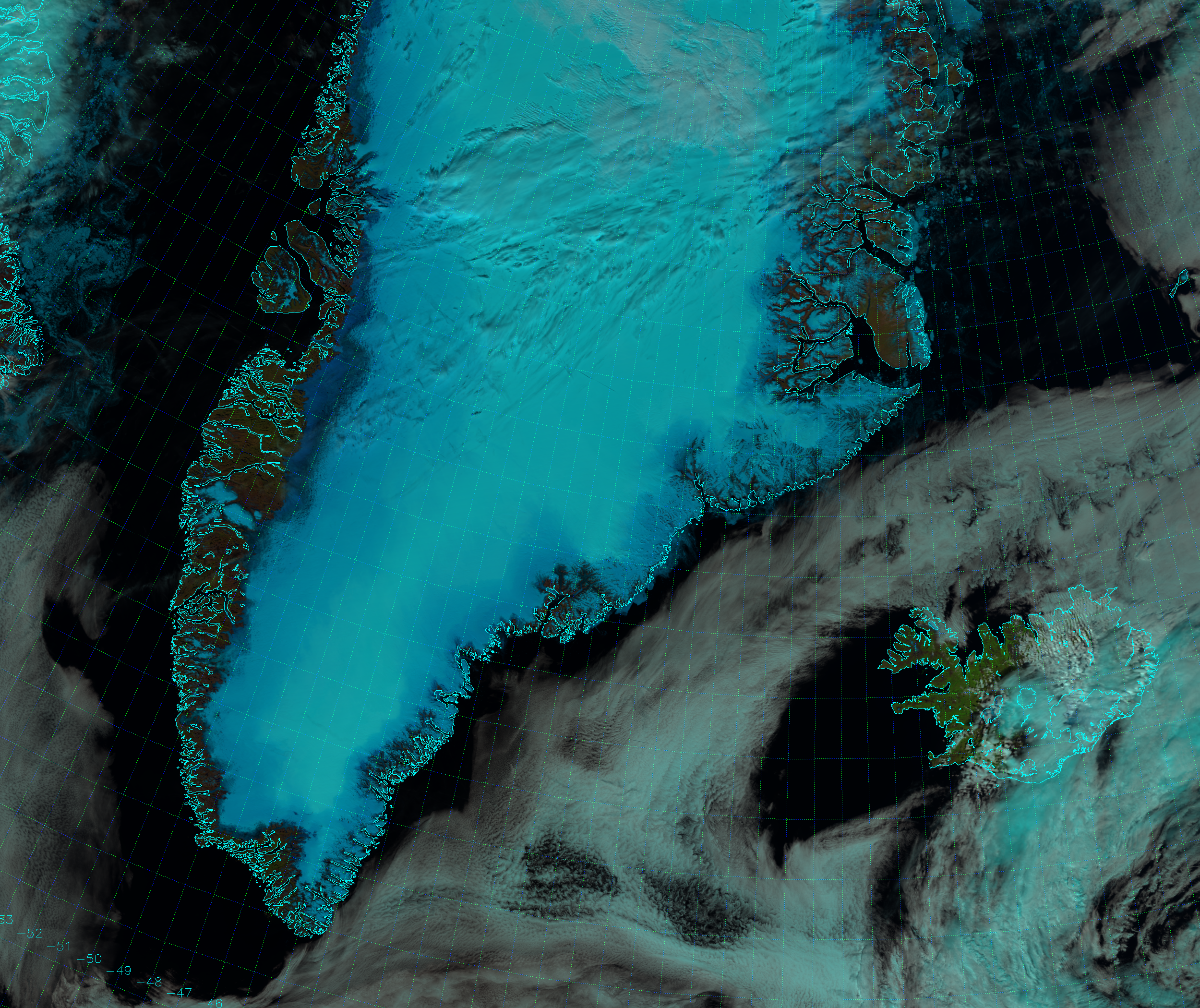
You can tell by the shadows cast where the clouds are, even if they are a similar color to the background of snow and ice on Greenland. But, the feature of interest isn’t very obvious. There appears to be an area of lighter cyan over the central portions of the ice sheet, but it definitely doesn’t look like a cloud. Let’s break it up into single channels, like we did with ABI, starting with M-7 (0.86 µm):
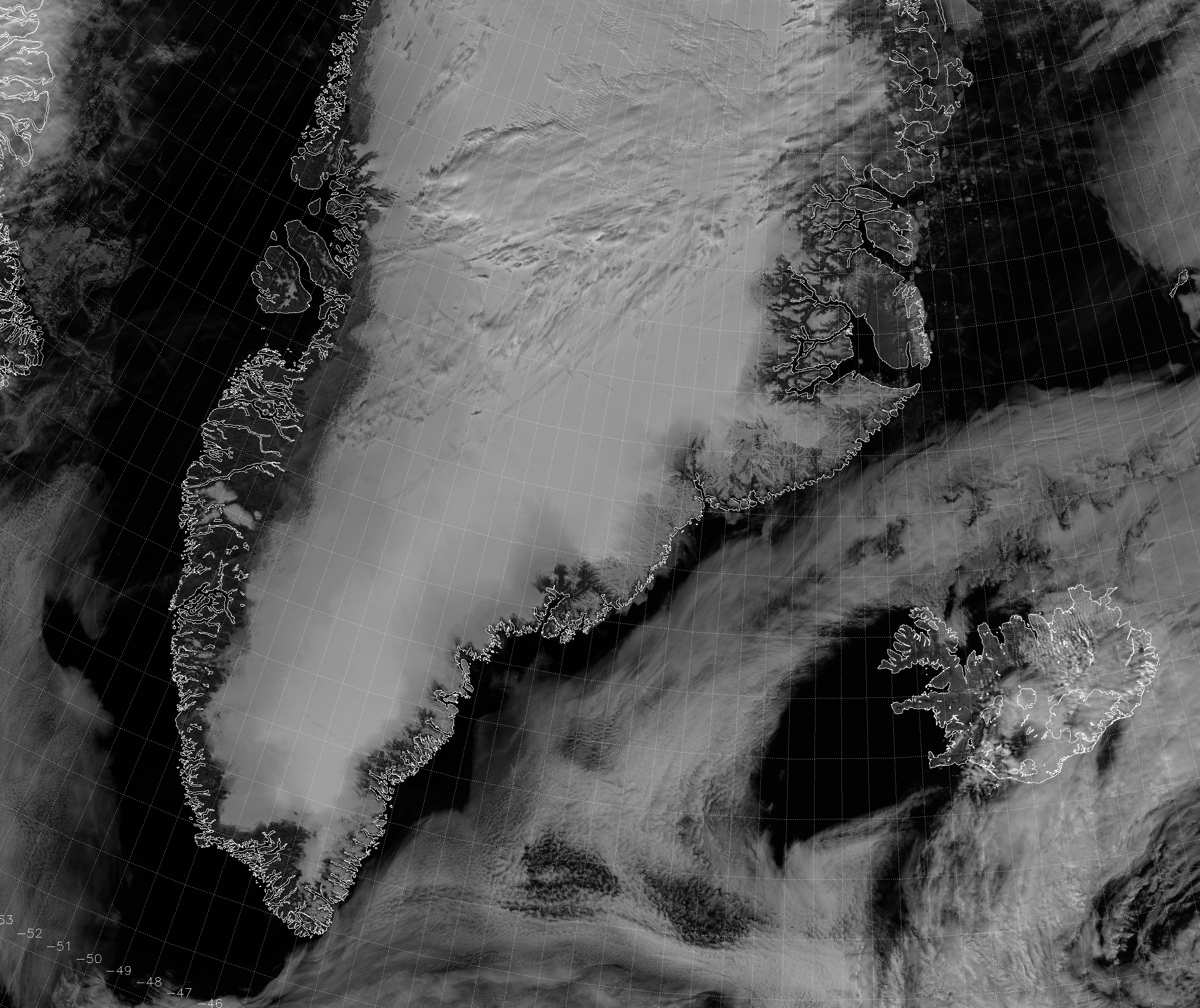
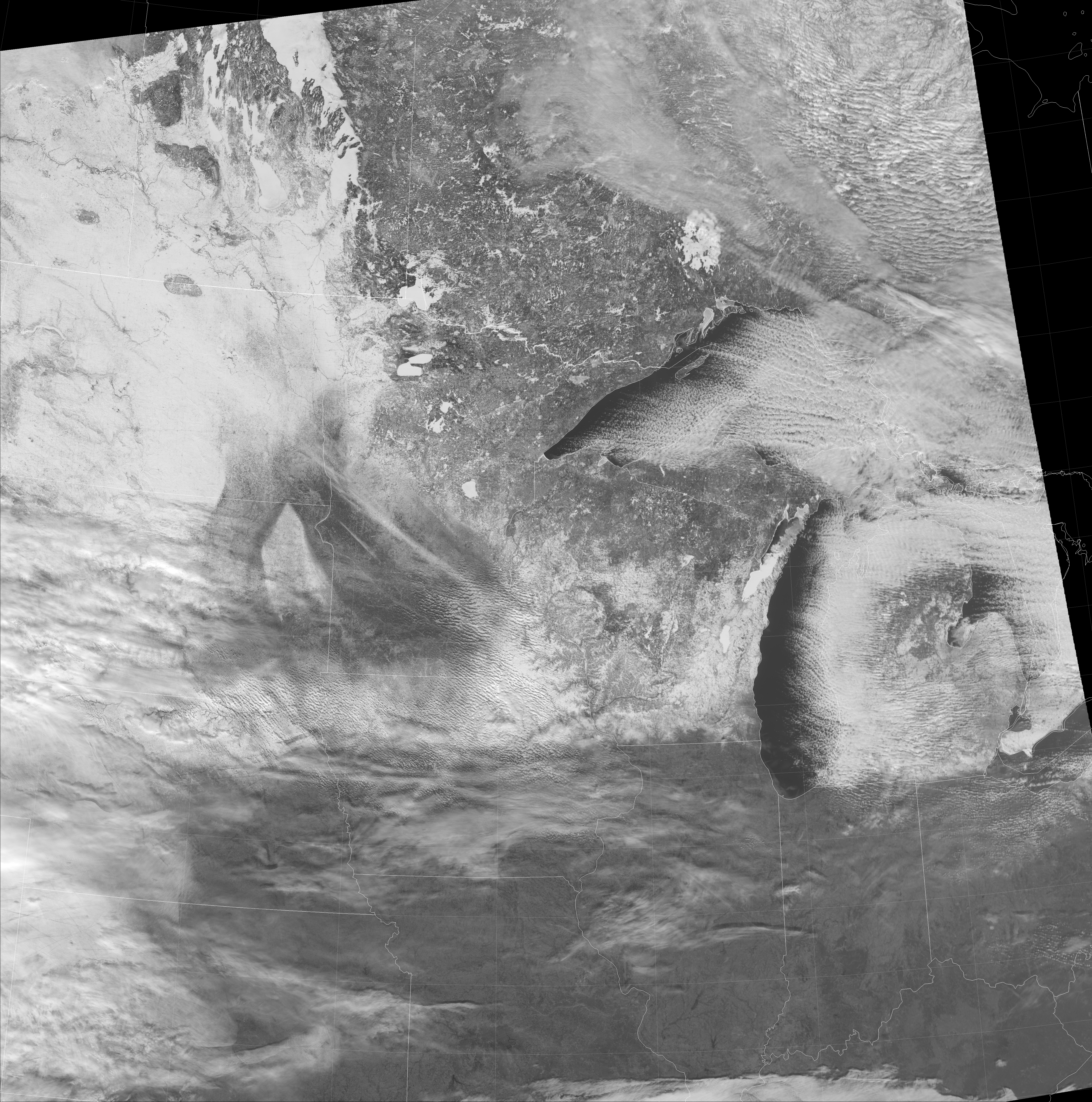
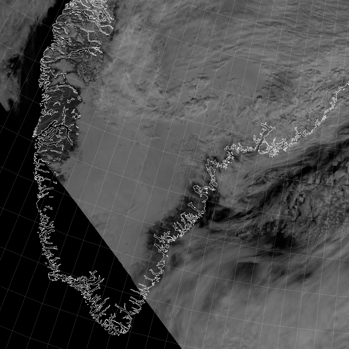
Again, it’s all bright. How about M-10 (1.61 µm)?
Now, Greenland appears all dark. For completeness, let’s look at M-11 (2.25 µm):
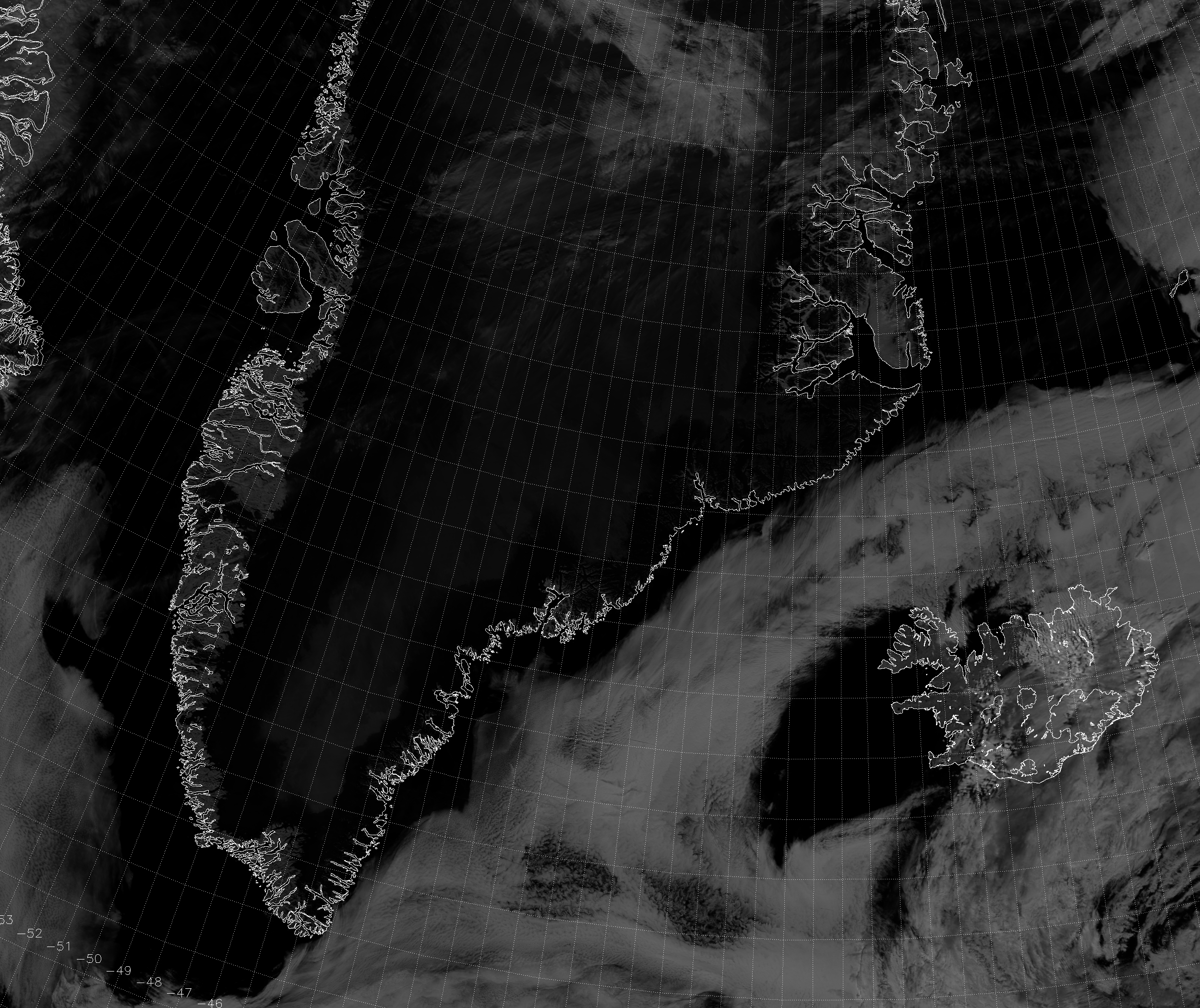
It’s subtle, but you can see a hint of brightening over the south-central portion of the ice sheet. (In case you’re wondering why it looks so much darker in VIIRS than ABI, it’s because our visible and near-IR GOES-16 imagery uses “square root scaling” by default. In image processing terms, it’s the same as a gamma correction of 2. The VIIRS images don’t have that.) Now, for the ace up my sleeve – the one channel that has never appeared before on this blog:

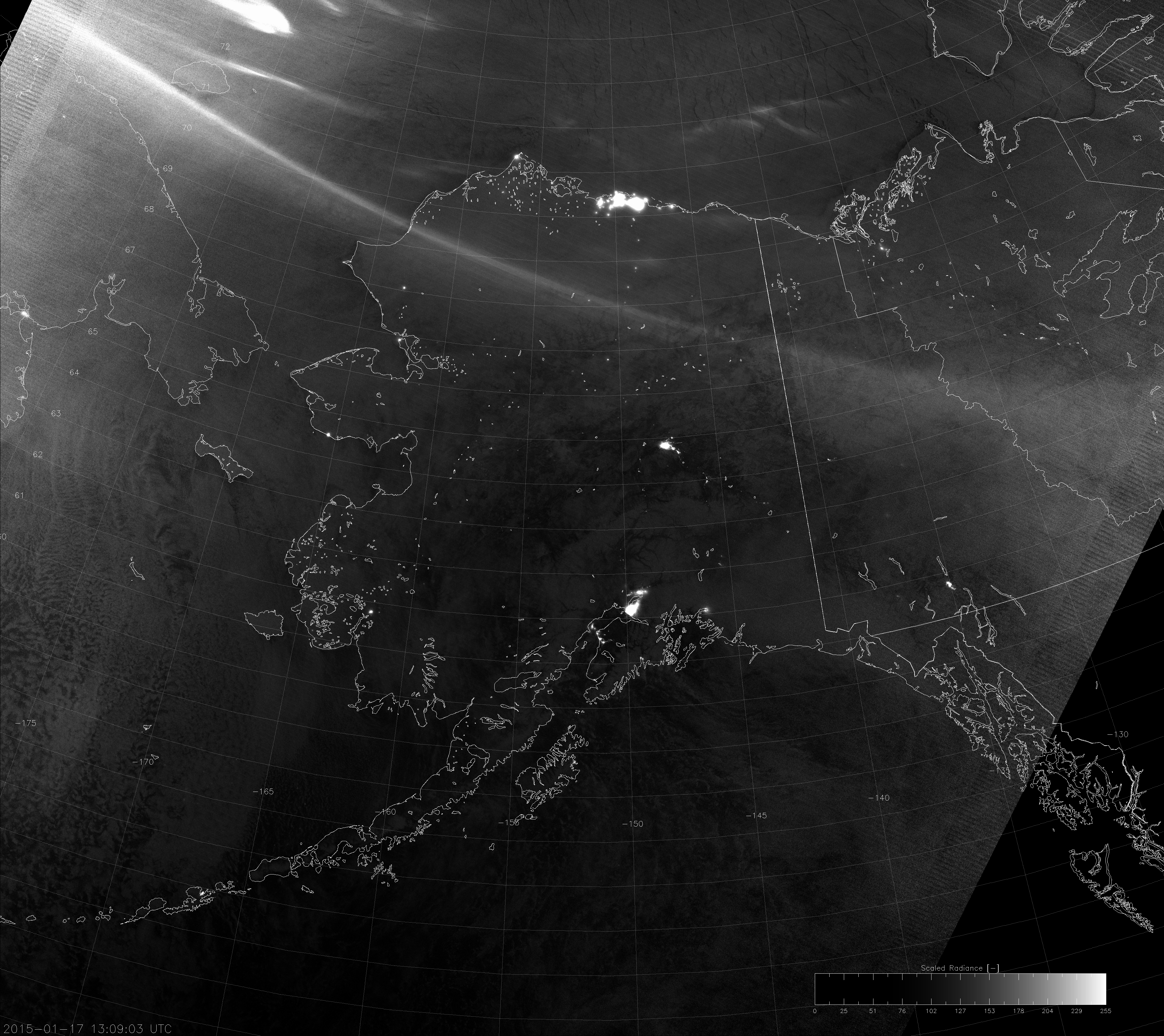
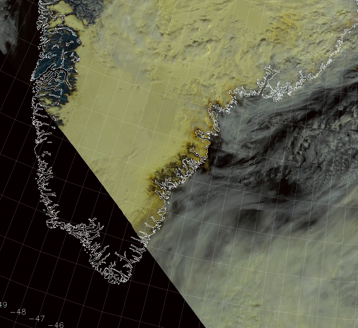
This is M-8, centered at 1.24 µm. Its primary use is listed in the JPSS Program literature as “cloud particle size.” Based on reading the documentation for the cloud products, it appears M-8 is used operationally only as a backup for M-5 (0.67 µm) in the cloud optical thickness and effective particle size retrievals under certain conditions, or when M-5 fails to converge on solution. One of those conditions is the retrieval of cloud properties over snow and ice. As we shall see, however, M-8 is very good at determining the properties of the snow and ice itself.
M-8 shows quite clearly the bright central portion of Greenland (our feature of interest) surrounded by dark at the edges of the ice sheet (even without any gamma correction). Snow-free areas appear brighter than the edge of the ice sheet because, much like M-7/0.86 µm, vegetation is also highly reflective at 1.24 µm.
This example shows what we’ve long known. Snow and ice are highly reflective in the visible (and very near IR) portions of the electromagnetic spectrum. In the short- and mid-wave IR, snow and ice are absorbing and cold. This means they don’t emit or reflect much radiation at these wavelengths. That’s why they appear dark at 1.61 and 2.25 µm. M-8 straddles the boundary of these regions as exemplified by this graph:
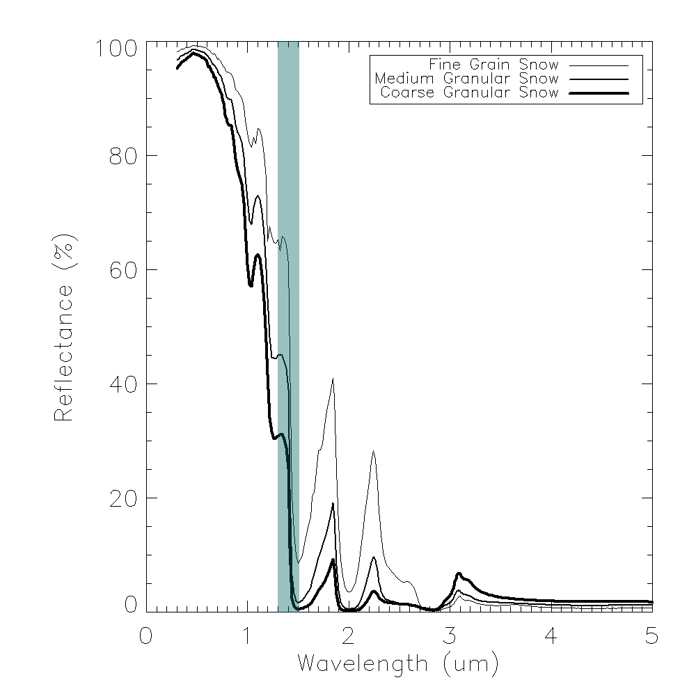
The information in this graph comes from the ASTER Spectral Library created by NASA. Note that the reflectance of snow in M-8 is highly variable and a function of the snow grain size. This may explain why the central portion of Greenland’s ice sheet appears so bright, while the edges are so dark in M-8. Another explanation is that, much like in Minnesota, snow melt causes a drop in reflectance. Slush just isn’t as reflective as fresh snow, and M-8 is highly sensitive to this.
The last week in July was a very warm one for Greenland. The capitol, Nuuk, recorded highs in the 60s (°F), or upper-teens (°C), peaking at 71°F (22°C) on 29 July 2017. Normal for that time of year is 52°F (11°C).
Since Greenland is pretty far north, we can take advantage of the multiple VIIRS overpasses per day and really capture this snowmelt:
This animation, which you may have to click on to get it to play, covers the three day period 27-29 July 2017. Here’s it is obvious what impact the heat wave is having on Greenland’s ice and snow. Our “feature of interest” really shrinks over this period of time.
In early August, the snow and ice start to recover and become more reflective again. Here’s an extended animation that includes the relatively clear days of 17 July, 20 July and the entire period from 30 July to 3 August 2017:
Our “feature of interest” is unmelted snow/ice on Greenland’s ice sheet.
Now, this is the VIIRS Imagery Team Blog. We can do a better job of highlighting this snowmelt by combining it with other channels in an RGB composite. One way is to replace M-7 with M-8 in the Natural Color RGB:

Fresh, fine snow has the cyan color we’re all familiar with, but now coarse snow and melting snow are a deeper, more vivid blue color.
Another option takes a page out of the EUMETSAT Snow playbook. Here’s one with M-8 as the blue component, M-7 as the green component and M-5 as the red component:
Now the fresh, fine snow is pale yellow, while the coarse snow and snowmelt are a darker yellow-orange. The question is: which one do you like better?
So, I have now talked about every band on VIIRS. And, I learned that the last time I looked at melting on Greenland, I should have been looking at M-8 from the very beginning.