
Think of a snowflake. What happens when that snowflake hits the ground? Now, picture other snowflakes – millions of them – all hitting the ground and piling up on top of each other, crushing our first poor snowflake. Skiers love to talk (and dream) about “fresh powder.” But, what happens when the “powder” isn’t so fresh?
Those delicate, little snow crystals we imagine (or look at directly, if we click on links included in the text) undergo a transformation as soon as they hit the ground. Compression from the weight of the snow above, plus the occasional partial thaw and re-freeze cycle (when temperatures are in the right range), breaks up the snow flakes and converts the 6-pointed crystals into more circular grains of snow. As more and more snow accumulates on top, the air in between the individual snowflakes/grains (which is what helps make it a good insulator) gets squeezed out, making the snow more dense. If enough time passes and enough snow accumulates, individual snow grains can fuse together. These bonded snow grains are called “névé.” If this extra-dense snow can survive a whole summer without melting, then a second winter of this compaction and compression will squeeze out more air and fuse more snow grains, creating the more dense “firn.” After 20 or 30 years of this, what once was a collection of fragile snowflakes becomes a nearly solid mass of ice that we call a “glacier.” Glaciers can be made up of grains that are several inches in length.
But, you don’t need to hear me say it (or read me write it), you can watch a short video where a guy in a thick Scottish accent explains it. (Did you notice his first sentence was a lie? Snow is made of frozen water, so glaciers are made of frozen water, since they are made of snow. I think what he means is that glaciers aren’t formed the same way as a hockey rink, but the way he said it is technically incorrect.) At the end of the video, the narrator hints at why we are looking at glaciers today: glaciers have the power to grind down solid rock.
When a glacier forms on a non-level surface, gravity acts on it, pulling it down the slope. This mass of ice and friction from the motion acts like sandpaper on the underlying rock, converting the rock into a fine powder known as “glacial flour” or, simply, “rock flour.” In the spring and summer months, the meltwater from the glacier collects this glacial flour and transports it downstream, where it may be deposited on the river’s banks. During dry periods, it doesn’t take much wind to loft these fine particles of rock into the air, creating a unique type of dust storm that is not uncommon in Alaska. One that can be seen by satellites.
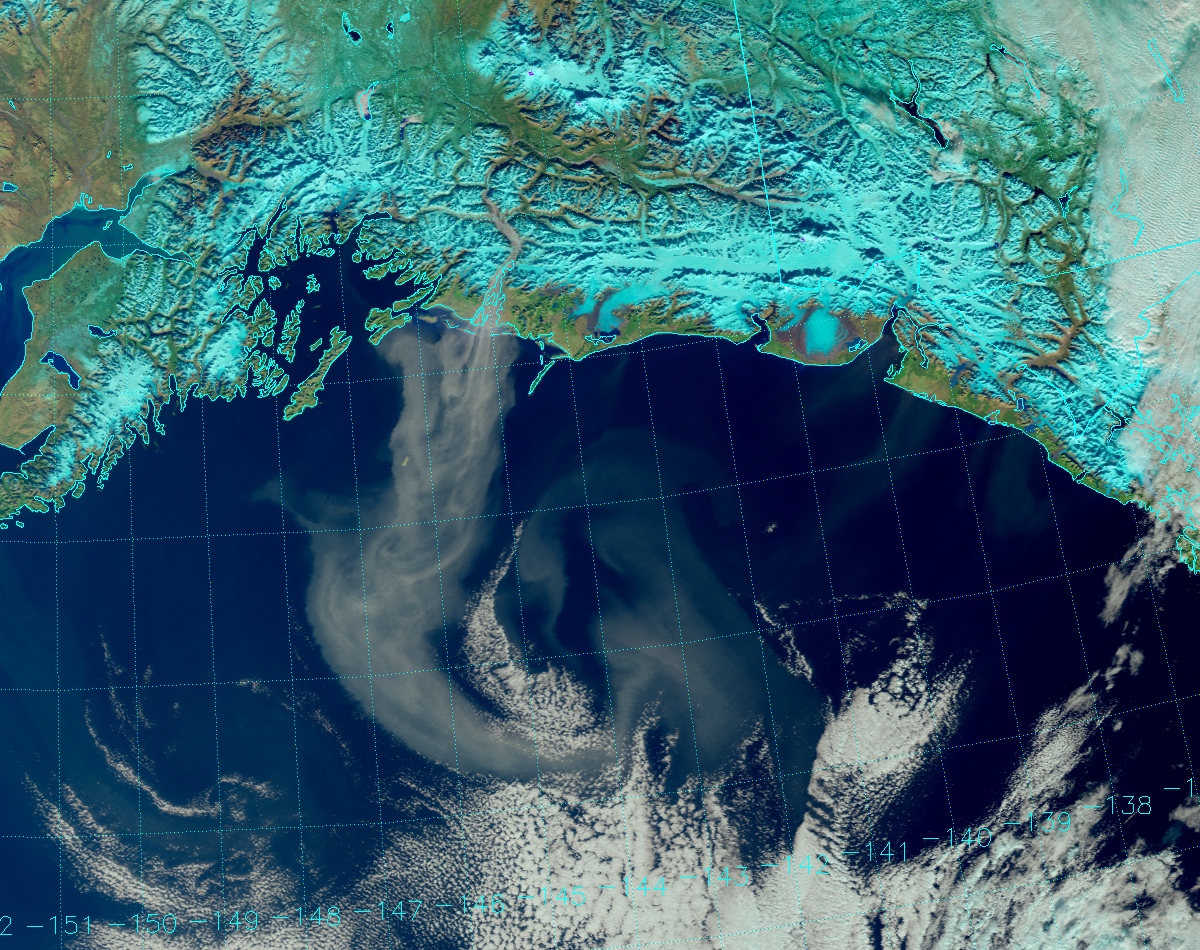
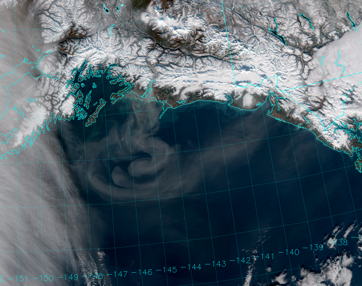
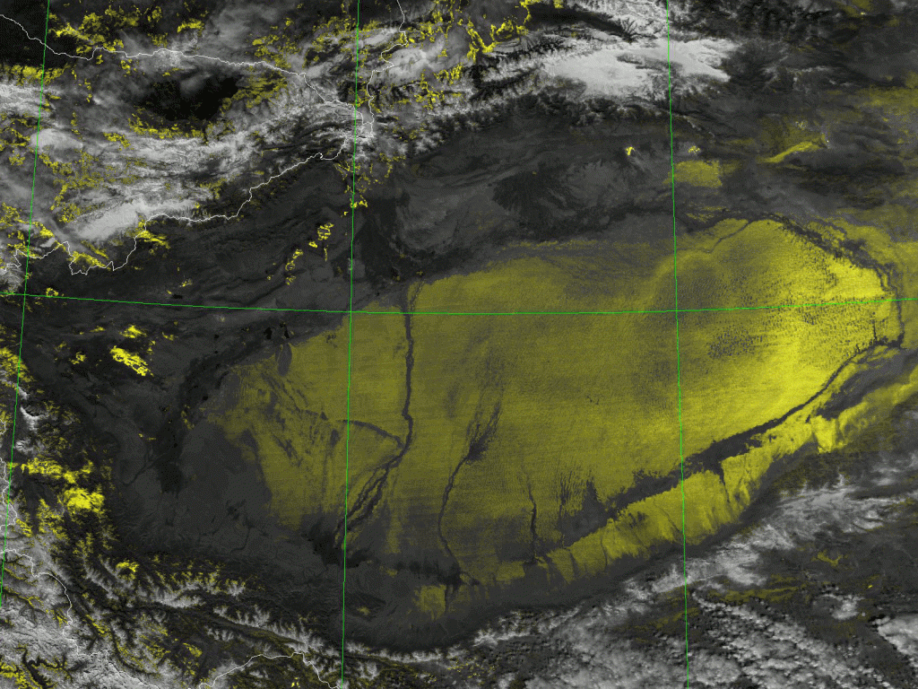
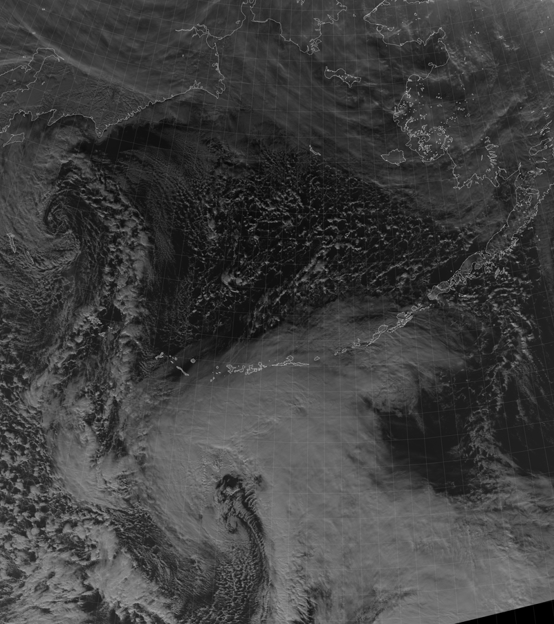
And, wouldn’t you know it, a significant event occurred at the end of October. Take a look at this VIIRS True Color image from 23 October 2016:
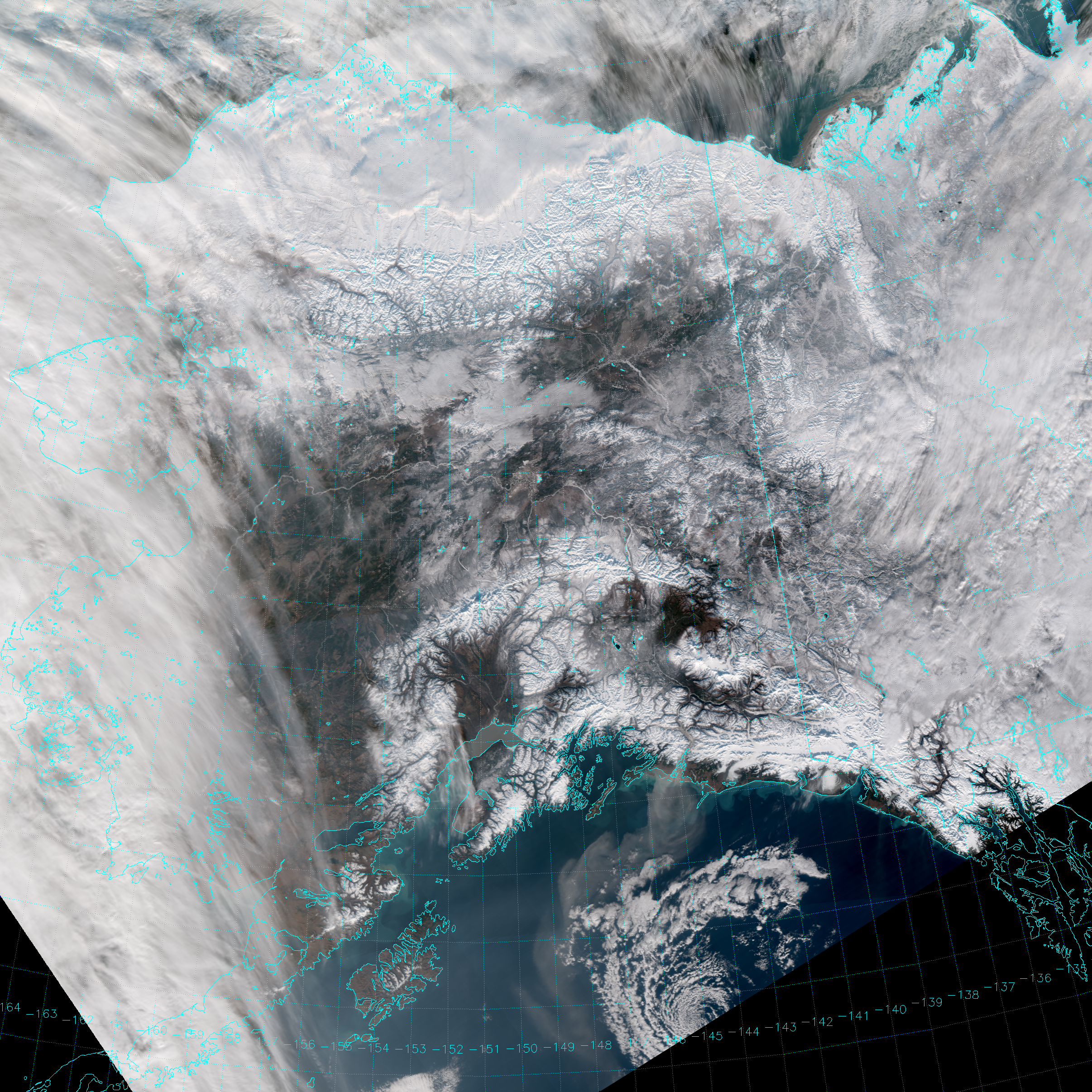
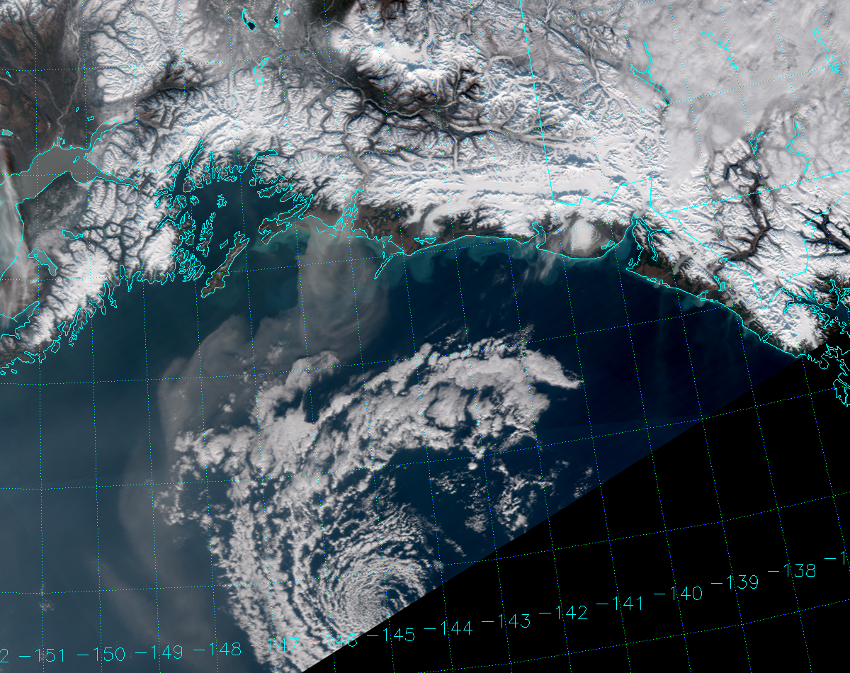
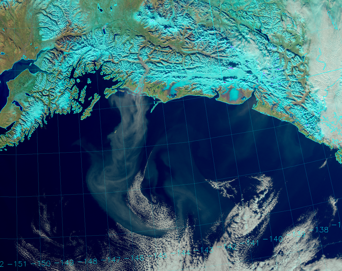
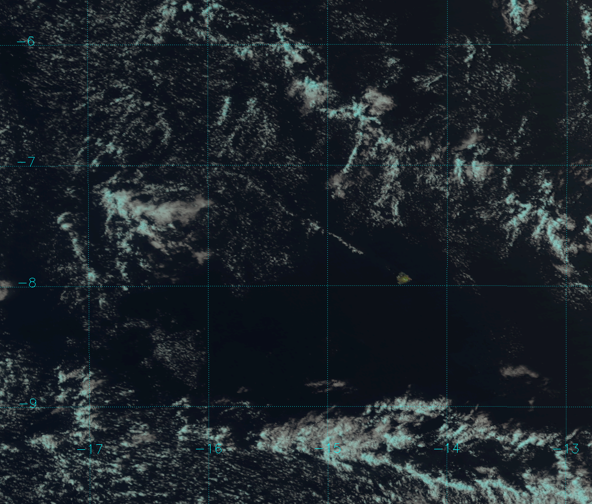
See the big plume of dust over the Gulf of Alaska? Here’s a zoomed in version:
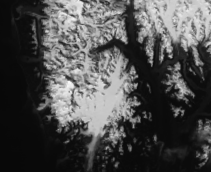
That plume of dust is coming from the Copper River delta. The Copper River is fed by a number of glaciers in Wrangell-St. Elias National Park, plus a few in the Chugach Mountains so it is full of glacial sediment and rock flour (as evidenced by this photo). And, it’s amazingly full of salmon. (How do they see where they’re going when they head back to spawn? And, that water can’t be easy for them to breathe.)
Notice also that we have the perfect set-up for a glacial flour dust event on the Copper River. You can see a low-pressure circulation over the Gulf of Alaska in the above picture, plus we have a cold, Arctic high over the Interior shown in this analysis from the Weather Prediction Center. For those of you familiar with Alaska, note that temperatures were some 30 °F warmer during the last week in October in Cordova (on the coast) than they were in Glennallen (along the river ~150 miles inland). That cold, dense, high-pressure air over the interior of Alaska is going to seek out the warmer, less dense, low-pressure air over the ocean – on the other side of the mountains – and the easiest route to take is the Copper River valley. The air being funneled into that single valley creates high winds, which loft the glacial flour from the river banks into the atmosphere.
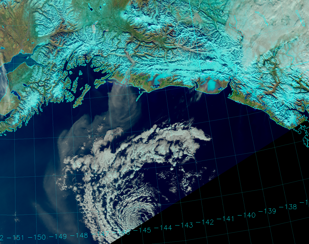
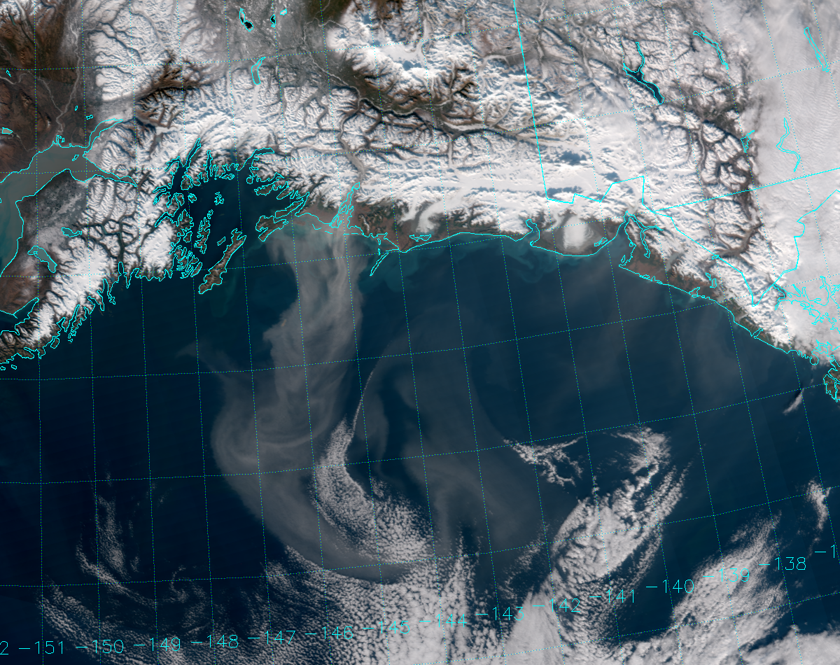
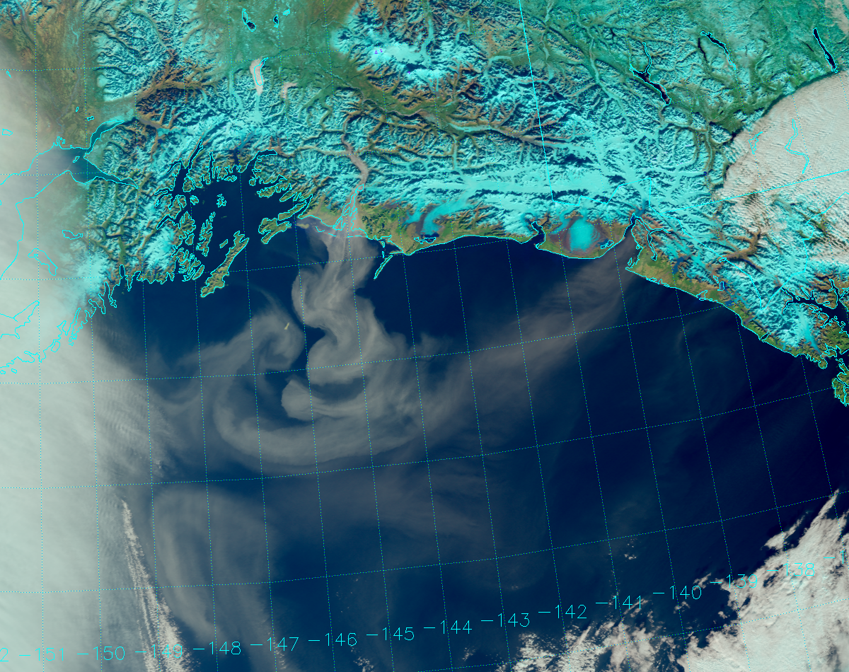
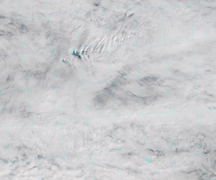
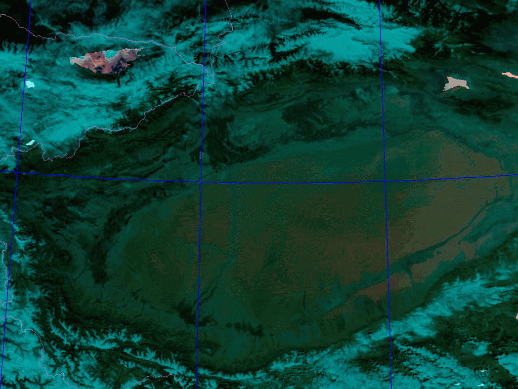
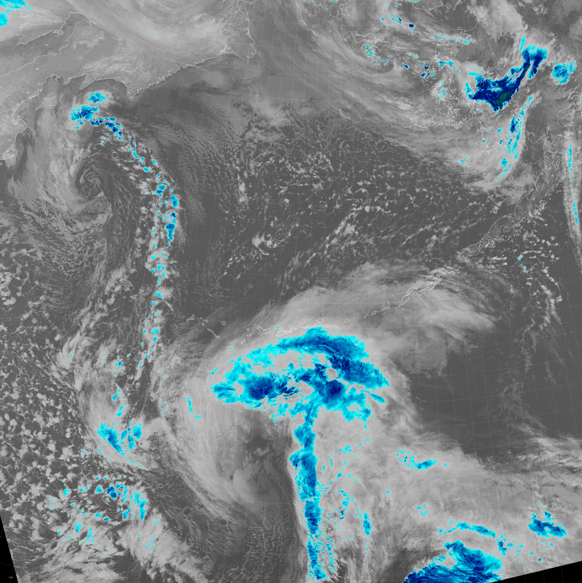
Now, depending on your preferences, you might think that the dust shows up better in the Natural Color RGB composite:
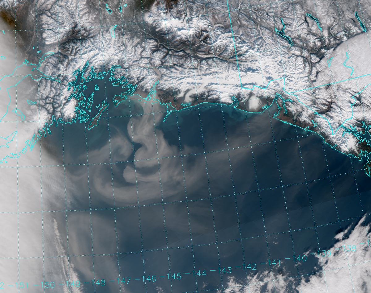
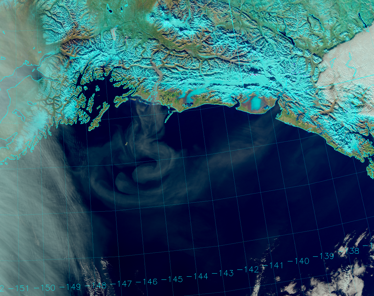
But, everyone should agree that the dust is even easier to see the following day:
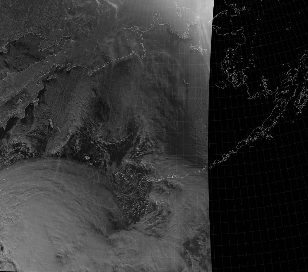
You can also see a few more plumes start to show up to the southeast, closer to Yakutat.
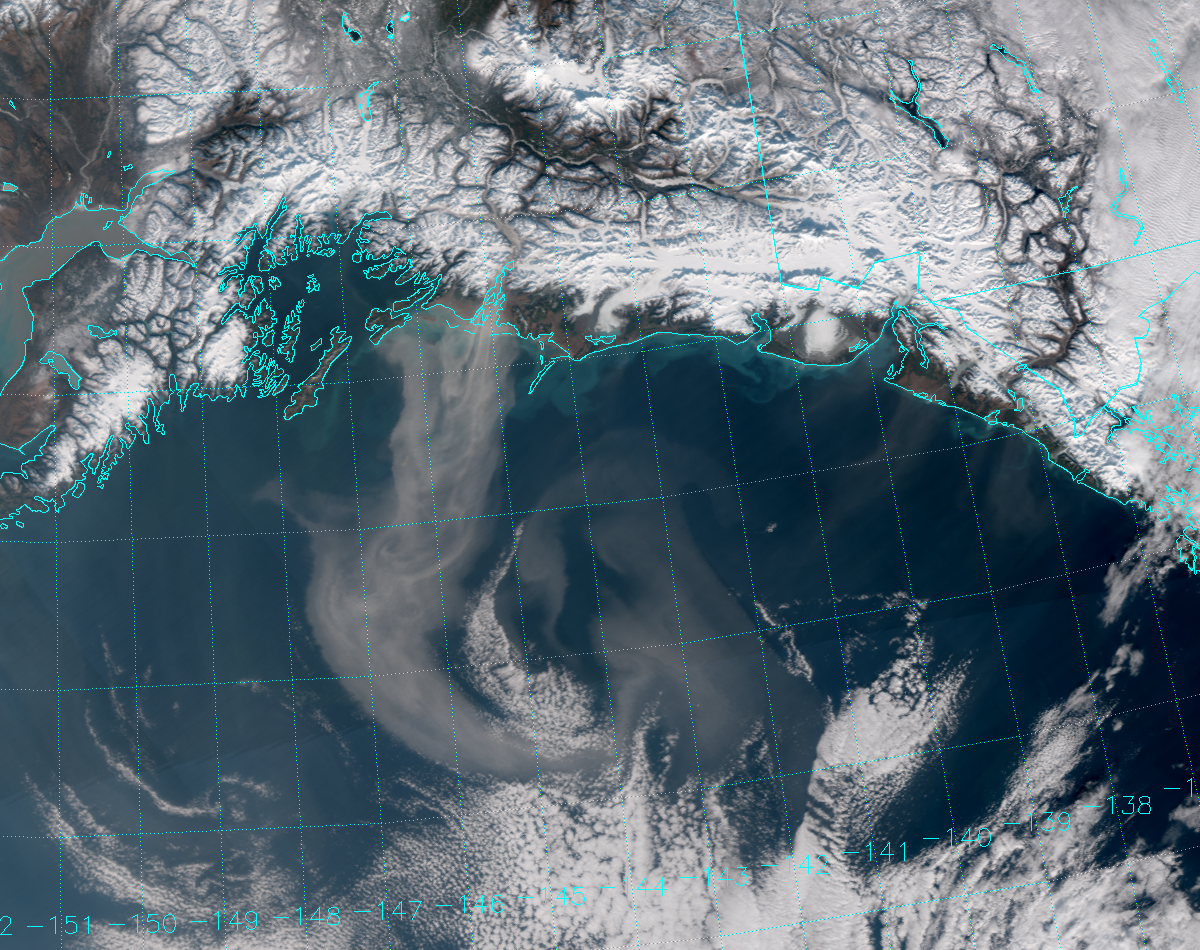
Since Alaska is far enough north, we get more than one daytime overpass every day. Here’s the same scene on the very next orbit, about a 100 minutes later:
Notice that the dust plume appears darker. What is going on? This is a consequence of the fact that glacial flour, like many aerosol particles, has a tendency to preferentially scatter sunlight in the “forward” direction. At the time of the first orbit (21:01 UTC), both the sun and the dust plume are on the left side of the satellite. The sunlight scatters off the dust in the same (2-dimensional) direction it was traveling and hits the VIIRS detectors. In the second orbit (22:42 UTC), the dust plume is now to the right of the satellite, but the sun is to the left. In this case, forward scattering takes the sunlight off to the east, away from the VIIRS detectors. With less backward scattering, the plume appears darker. This has a bigger impact on the Natural Color imagery, because the Natural Color RGB uses longer wavelength channels where forward scattering is more prevalent. Here’s the True Color image from the second orbit:
The plume is a little darker than the first orbit, but not by as much as in the Natural Color imagery. Here are animations to show that:


There are many other interesting details you can see in these animations. For one, you can see turbid waters along the coast in the True Color images that move with the tides and currents. These features are absent in the Natural Color because the ocean is not as reflective at these longer wavelengths. You can also see the shadows cast by the mountains that move with the sun. Some of the mountains seem to change their appearance because VIIRS is viewing them from a different side.
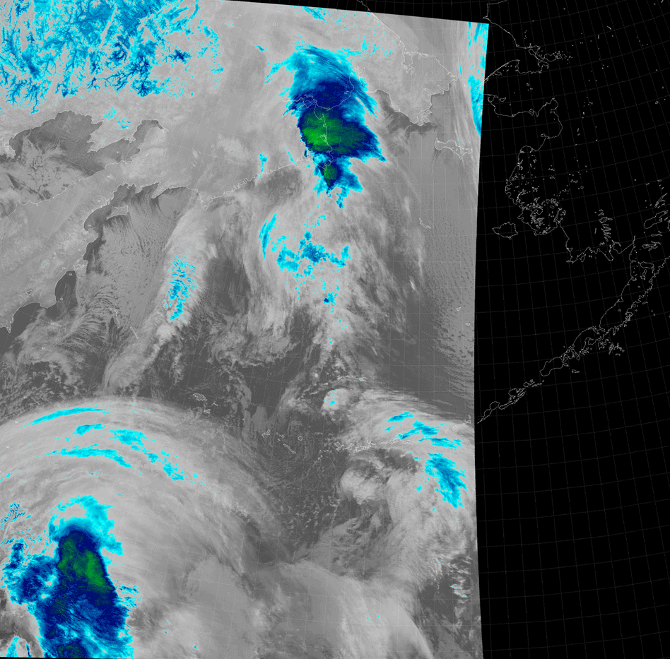
The dust plumes were even more impressive on 25 October 2016, making this a three-day event. The same discussion applies:
Full disclosure, yours truly drove through a glacial flour dust storm along the Delta River on the north side of the Alaska Range back in 2015. Even though it was only about a mile wide, visibility was reduced to only a few hundred yards beyond the hood of my car. It felt as dangerous as driving through any fog. The dust event shown here was not a hazard to drivers, since it was out over the ocean, but it was a hazard to fisherman. Being in a boat near one of these river deltas means dealing with high winds and high waves. To forecasters, these dust plumes provide information about the wind on clear days (when cloud-track wind algorithms are no help), which is useful in a state with very few surface observing sites to take advantage of.
The last remaining issue for the day is one of terminology. You see, “glacial flour dust storm” is a mouthful, and acronyms aren’t always the best solution. (GFDS, anyone?) “Haboob” covers desert dust. “SAL” or “bruma seca” covers Saharan dust specifically. So, what should we call these dust events? Something along the lines of “rock flour”, only more proactive! And, Dusty McDustface is right out!


