
As we begin 2016, struggling to get back into the swing of things at work and vowing not to overeat or over-drink ever again, it’s appropriate to bid farewell to 2015 – not just for all the weird weather events that we covered on this blog over the year, but also for the weird, wacky weather that ruined many people’s holidays. I’m not sure of the exact number, but this article mentions 43 weather-related fatalities in the U.S. in the second half of December. Let’s see, between 23-30 December 2015, there were:
– 77 tornadoes (including 38 on the 23rd and 18 on the 27th);
– Parts of New Mexico and west Texas got over 2 ft (60 cm) of snow from a blizzard that created drifts upwards of 10 ft (3 m) on the 27th;
– Record warmth was observed in the Northeast before and during Christmas and the site of Snowvember went until 18 December before the first measurable snow of the season;
– Chicago received almost 2″ of sleet (48 mm) on the 29th when any accumulation of sleet is quite rare;
– And – what will be our focus here – St. Louis received over 3-months-worth of precipitation in three days (26-28 December), from a storm that flooded a large area of Missouri, Illinois and Arkansas. In fact, the St. Louis area had the wettest December on record, right after having the 7th wettest November on record, which put it over the top for wettest calendar year on record. Current estimates place 31 fatalities at the hands of this flooding, which caused the Mississippi River to reach its highest crest since the Great Flood of 1993.
What kind of satellite imager would VIIRS be if it couldn’t detect massive flooding on the largest river in North America? (Hint: not a very useful one. Or, a less useful one, if you’re not into hyperbole.) Hey, if it works in Paraguay, it works here – or it isn’t science!
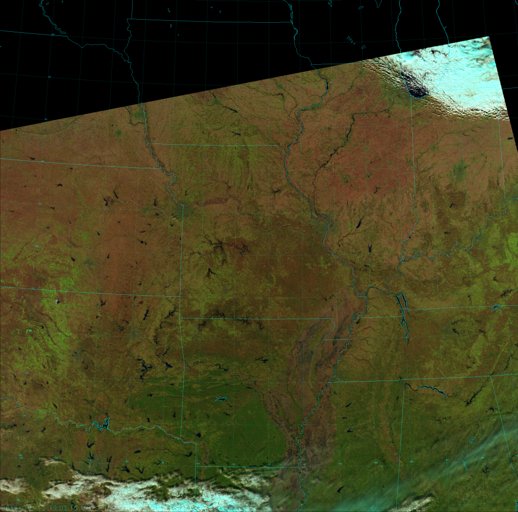
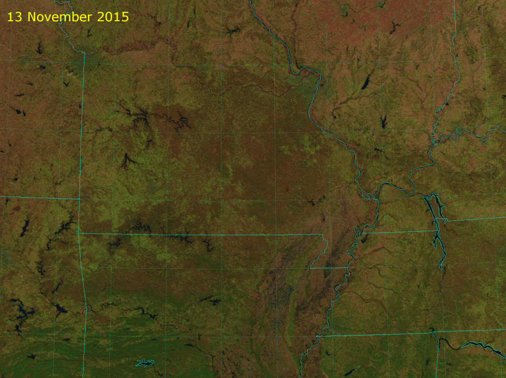
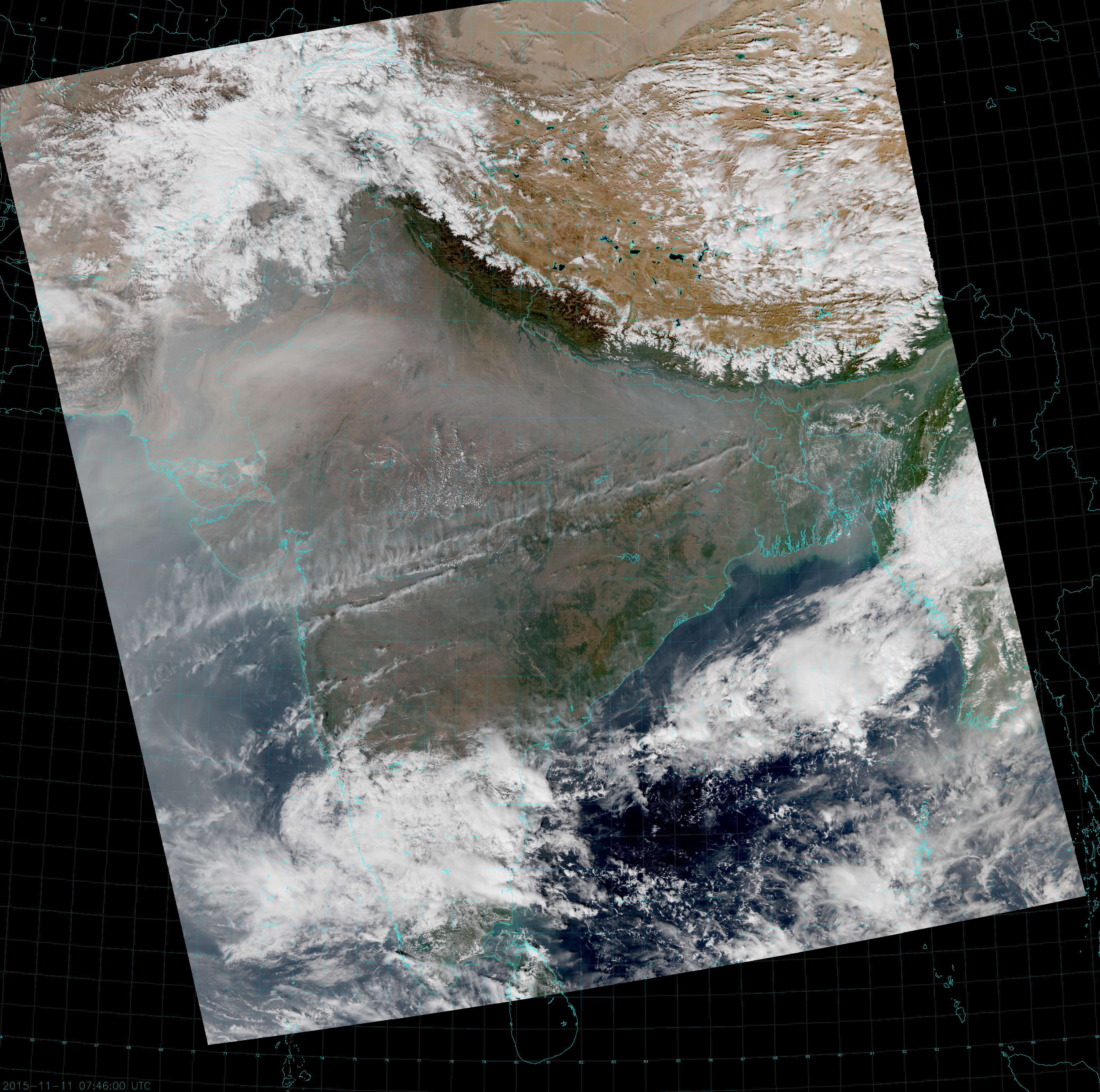
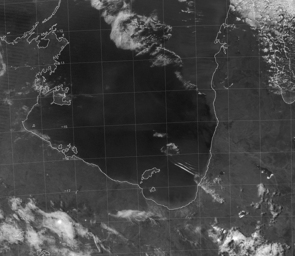
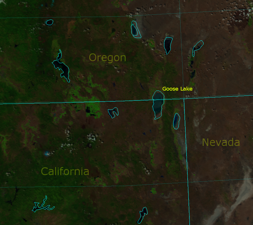
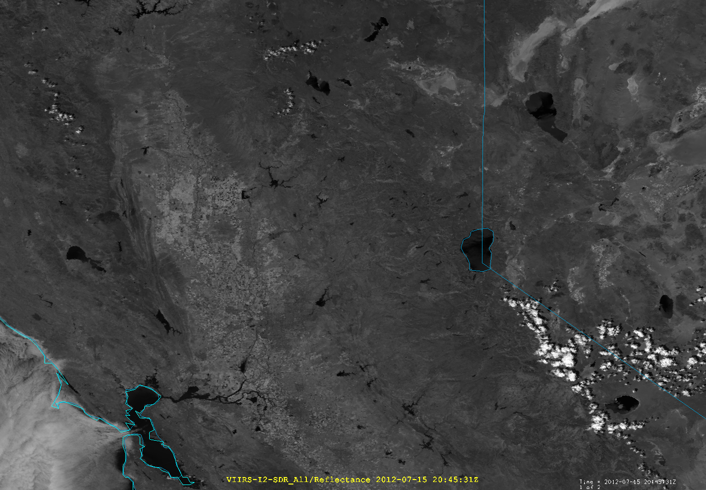
I shouldn’t have to prove that the Natural Color RGB is useful for detecting flooding, so we can go right to the imagery. Here’s what the Midwest looked like on 13 November 2015 – before the flooding began:
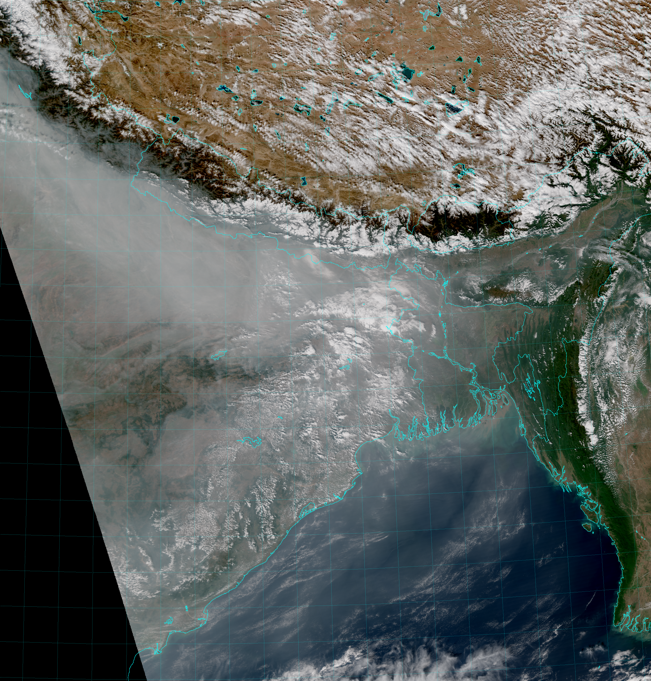
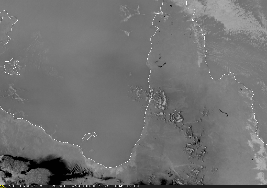
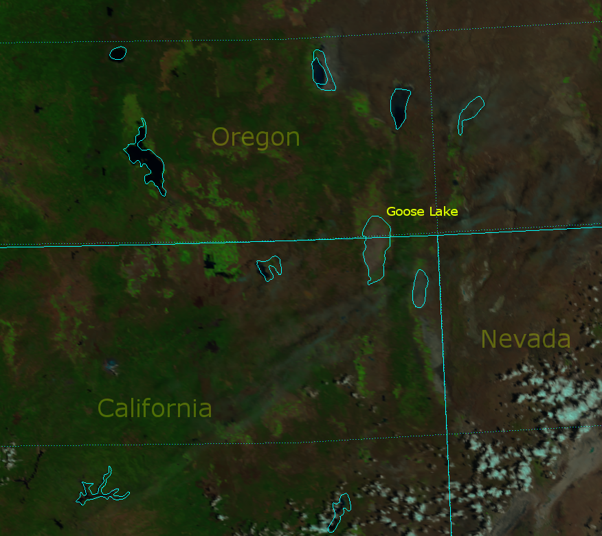
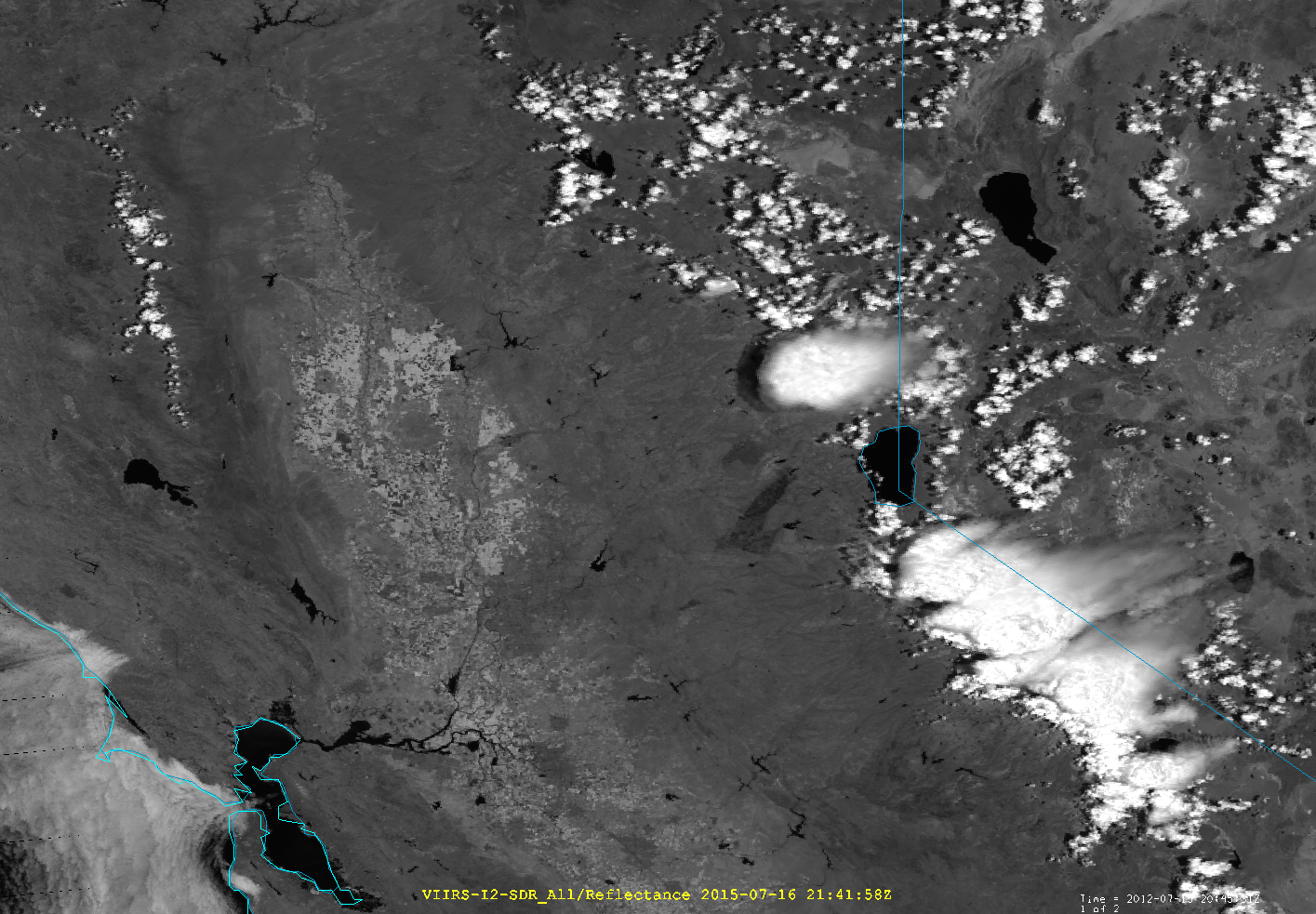
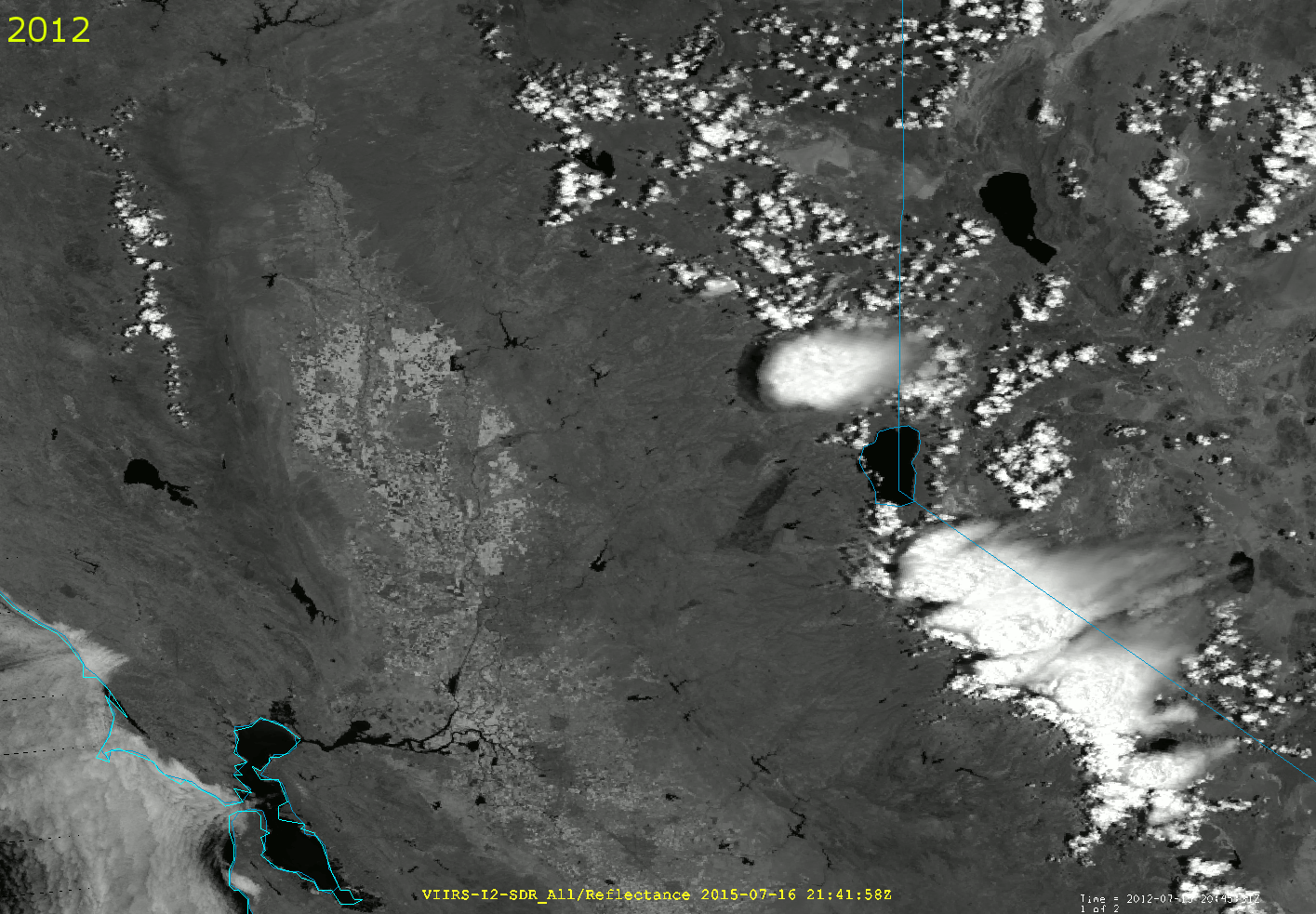
And, here’s what the same area looked like on New Year’s Day:
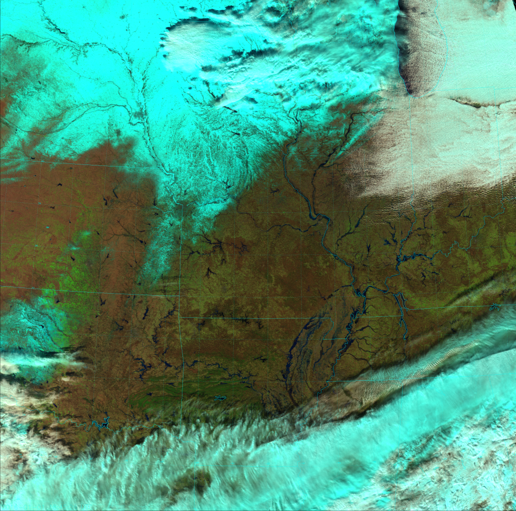
Notice anything different? This is actually the reverse of the last time we played “Spot the Differences” – we’re looking for where water is now that wasn’t there before, instead of searching for bare ground that used to have water on it.
Of course, the first thing to notice is the large area of snow covering Iowa, Nebraska and northwest Missouri that wasn’t there back in November. Next, we have more clouds over the southern and northern parts of the scene. Those are the easy differences to spot. Now look for the Missouri River in eastern Missouri, the Arkansas River in Arkansas, the Illinois River in Illinois, the Indiana River in Indiana… Wait! There is no Indiana River. I fooled you! (Although, there are rivers in Indiana that are flooded.)
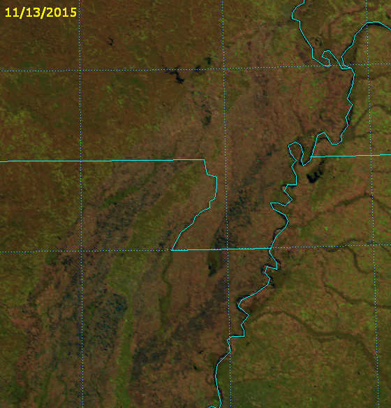
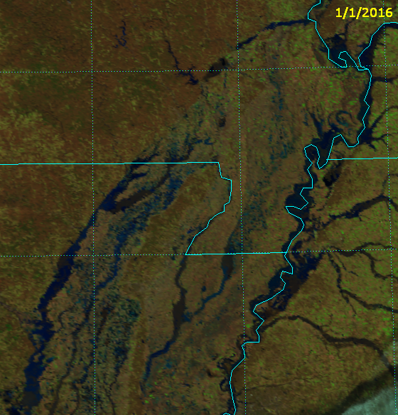
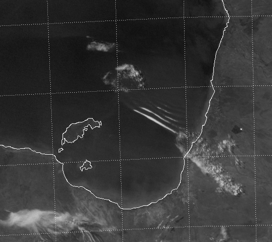
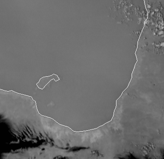
The most significant areas of flooding are in northeast Arkansas and the “Bootheel” of Missouri (which I think looks more like a toe or a claw than a heel), and the Mississippi River along the border of Tennessee shows signs of significant flooding as well. (If only it were the Tennessee River!) Here’s a before and after comparison, zoomed in on that part of the region:
You may have to refresh the page to get this to work right.
There’s a lot more water in the image from 1 January 2016 than there was back in November 2015! Since we are looking at the high-resolution Imagery bands, our quick-and-dirty estimate of water volumes still applies like it did for California’s drought: multiply the number of water-filled pixels by the depth (in feet) of the flooding, and by 100 acres to get the floodwater volume in acre-feet. Then multiply that by 325,852 gallons per acre-foot to get the volume in gallons. Even though this estimate is not exact, you can see how the gallons of floodwater add up. And, if you live in California, you can dream of seeing that much water! If you live in Missouri and can think of an economical way to transport this water to California, you’d be rich.
Now, see how many other areas of flooding you can find when you compare the two images in animation form:
You will have to click on the image to see the animation. You can click on the image again to see it in full resolution (with most web browsers).
One thing you might notice is that some of the floodwaters appear more blue than black. Take a look at the Arkansas River in particular. As we discussed with the Rio Paraná and Rio Paraguay, this is due to the increased sediment that increases the albedo of the water at visible wavelengths. In other places the floodwaters are shallow enough that VIIRS can see the ground underneath – again making the water appear more blue in this RGB composite.
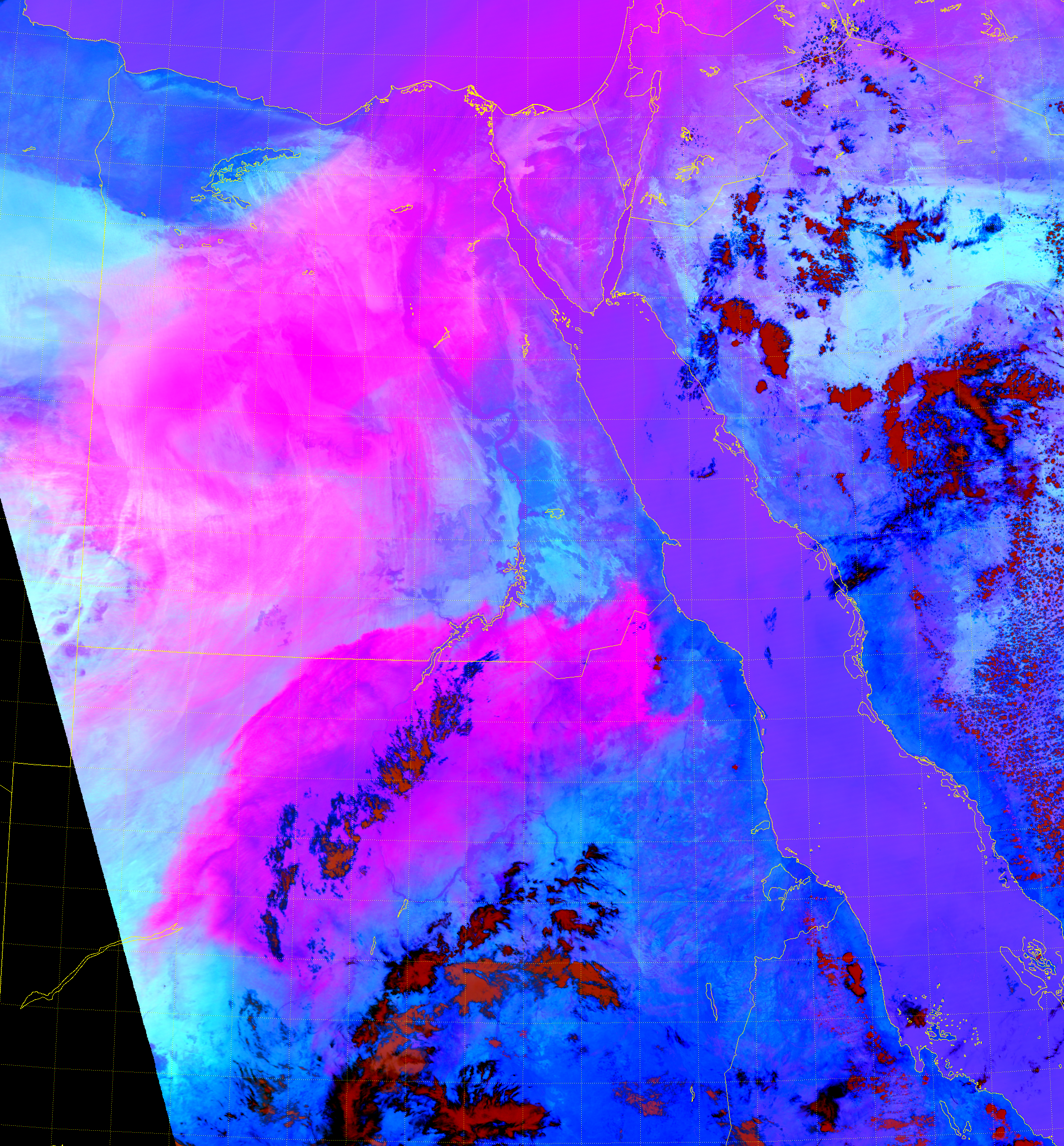
Wouldn’t it be nice to identify areas of flooding without having to play a “Spot the Differences” game? Maybe something that would automatically detect flooded areas? Well, you’re in luck:
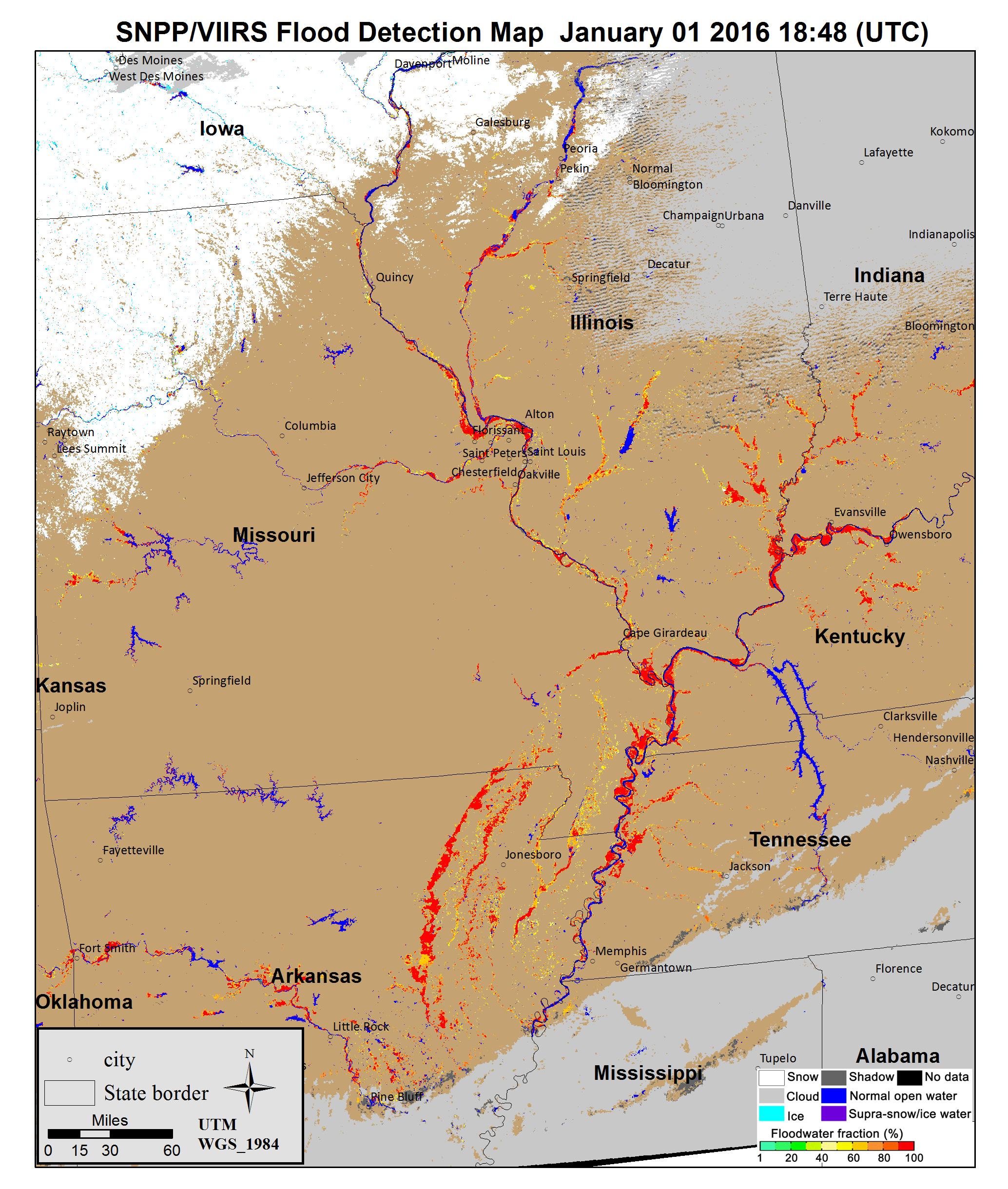
This image is an example of the VIIRS-based flood detection product being developed by the JPSS Program’s River Ice and Flooding Initiative. This initiative is a collaboration between university-based researchers and NOAA forecasters who use products like these to help save lives. Thanks to S. Li for developing the product for and providing the image!
If you want to know what the flooding looks like from the ground, here is a nice video. Or, you can look at some pictures here.
As a final note, the American Meteorological Society is holding its Annual Meeting in New Orleans next week. This event will be held at the Convention Center – right on the bank of the Mississippi River – right at the time the river is forecast to crest from these floodwaters. The world’s largest gathering of weather enthusiasts might be directly impacted by this flood. Let’s hope no one has to swim their way to any poster sessions or keynote speeches! (I don’t think local residents want to deal with any flooding, either.)


