Have you ever slept in a really hot room?
Of course, if you clicked on that link, keep in mind two things: perjury is a crime, and extreme heat is no joke. It is number one on the list of causes of weather-related fatalities. It may not capture the attention of the media like tornadoes, typhoons and tiger sharks but, exposure to extreme heat and extreme cold are routinely found to be the top two killers worldwide. (Well, that depends on the source of your information and how deaths are or are not attributed to weather. Some say extreme droughts and floods kill more.)
And of course, video footage of tornadoes and typhoons is more dramatic than frying an egg on the sidewalk or watching someone sweat inside a car. But, a recent heat wave in India is actually grabbing some attention from the media. Is it because there have been more than 2,200 documented fatalities? Or, the fact that it has been hot enough to make the roads melt?
Take a look at this hi/lo temperature calendar produced by the Weather Underground for Delhi, India during May 2015. If you’re paying attention, you’ll notice that only 4 days during the month had high temperatures less than 100 °F (38 °C). What is more concerning is that 18 out of the 31 days had low temperatures in the 80s. Look at May 18, 25 and 31: the lowest temperature recorded on each of those days was 87 °F (31 °C)! And take a look at the 10-day period in Hyderabad, India (May 20-29): highs near 110 °F everyday, with lows in the mid- to upper-80s.
And, for those of you in Phoenix or Death Valley, it is not a dry heat. According to this website, the automated weather station in Tirumala, Andhra Pradesh state recorded a temperature of 50 °C (122 °F) on May 31st. The day before, the high was 49 °C (120 °F), with a dew point of 24 °C (75 °F), which yields a heat index (or “feels like”) temperature of 59 °C (139 °F)!
Whether you side with Newman or Kramer on wanting to kill yourself after sleeping in a really hot room, with temperatures like this, it might not be your choice. If your body can’t cool down, you’ll be in trouble – especially if you don’t have air conditioning, like a lot of people in India.
You’ve probably guessed by now that VIIRS is capable of telling us something about this heatwave. And, you’re right! (Otherwise I wouldn’t be writing this.)
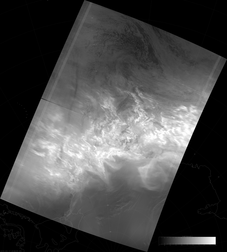
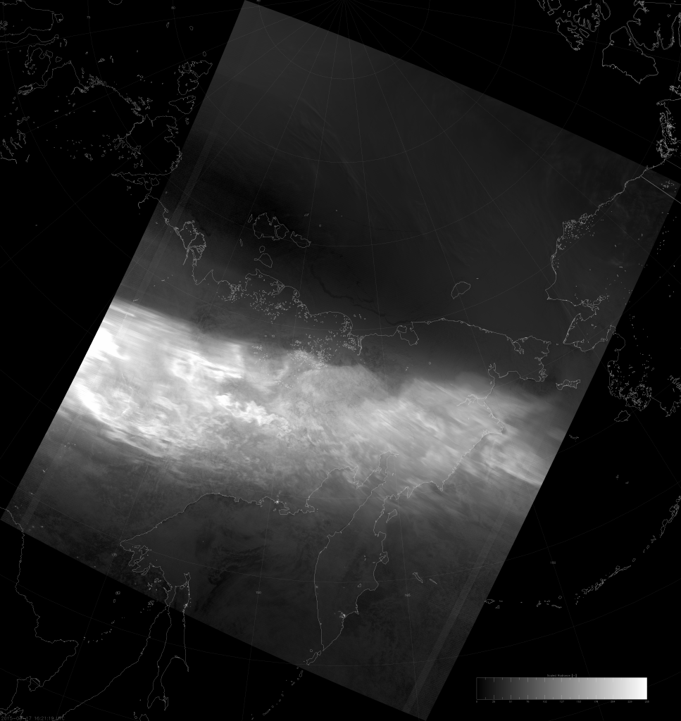
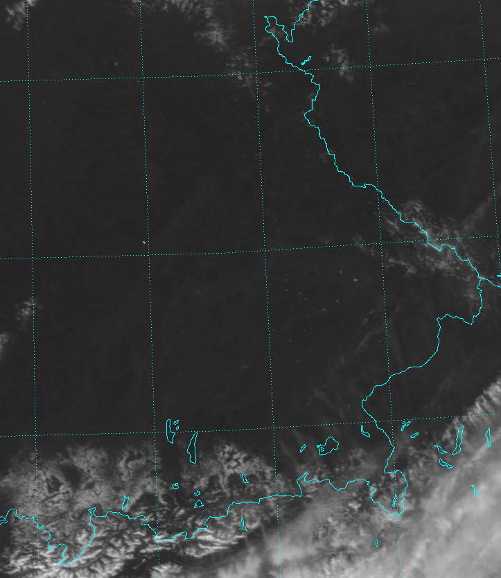
You should all know by now that the amount of radiation in the longwave infrared (IR) “window” (10-11 µm) is a function of the temperature of the object you’re looking at. We often refer to an object’s “brightness temperature,” which is the temperature that a black body would have if it emitted the same amount of radiation. With that in mind, here is the VIIRS longwave IR (M-15) image from 18 May 2015:
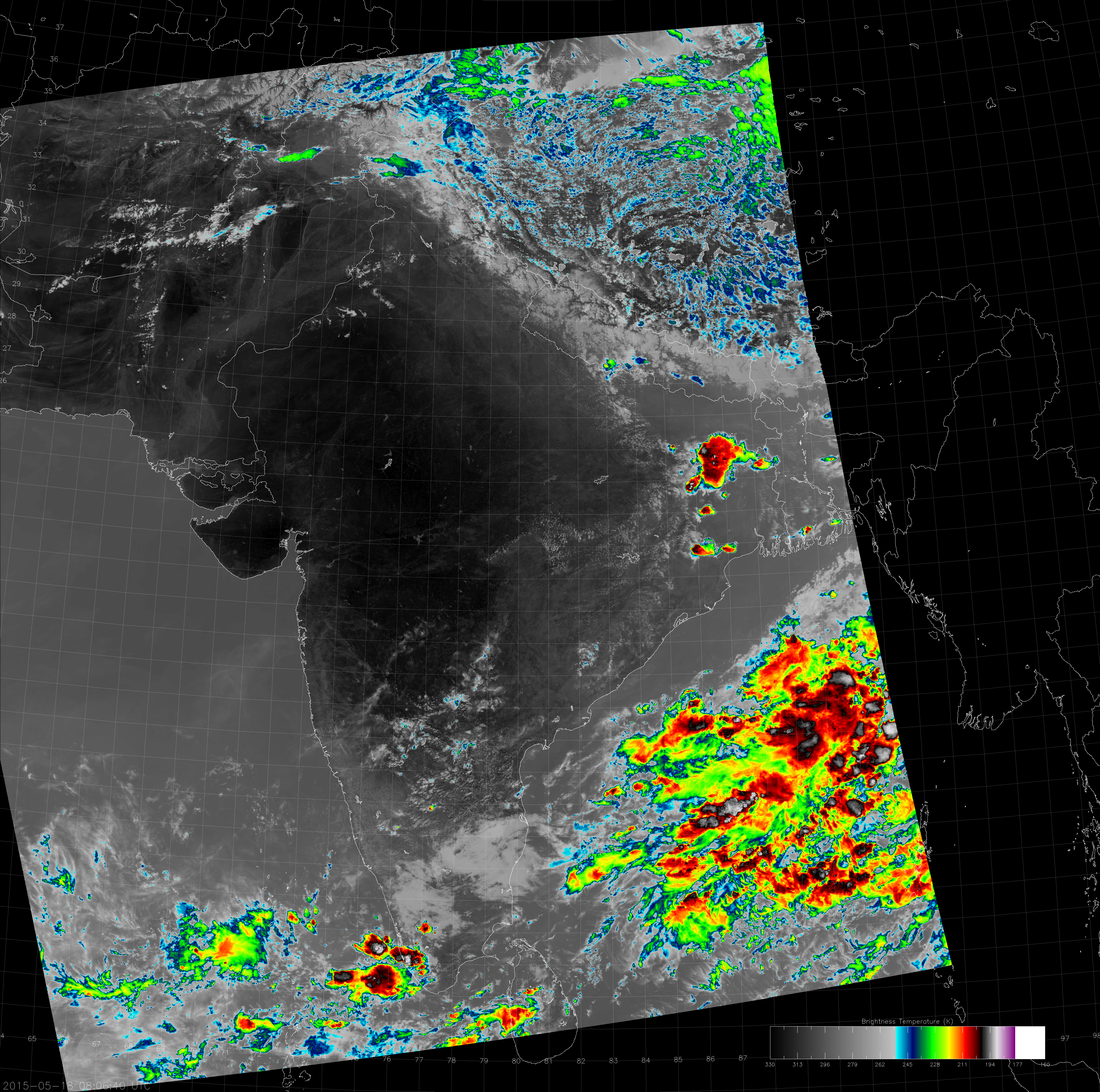
The first thing to notice is: there aren’t many clouds out there to block out the sun. The second thing to notice is: that big, black area in west-central India is where the color-enhancement of the image has lead to “saturation”. The IR color table I like to use saturates at brightness temperatures of 330 K (57 °C), which isn’t usually a problem because most places around the globe don’t get that hot. Some pixels in this image reached 332 K (59 °C/139 °F)! (The detectors of M-15 don’t saturate unless the brightness temperature is higher than 380 K, so this is not a problem with VIIRS.)
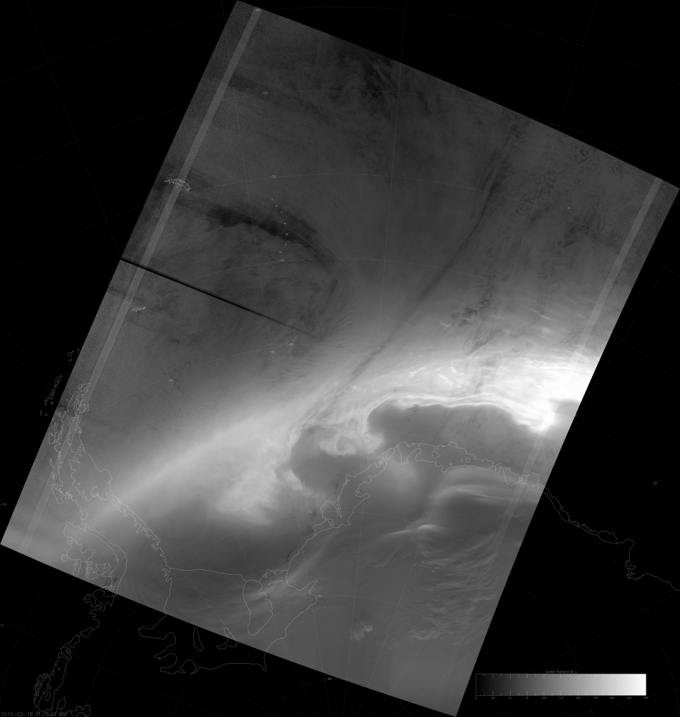
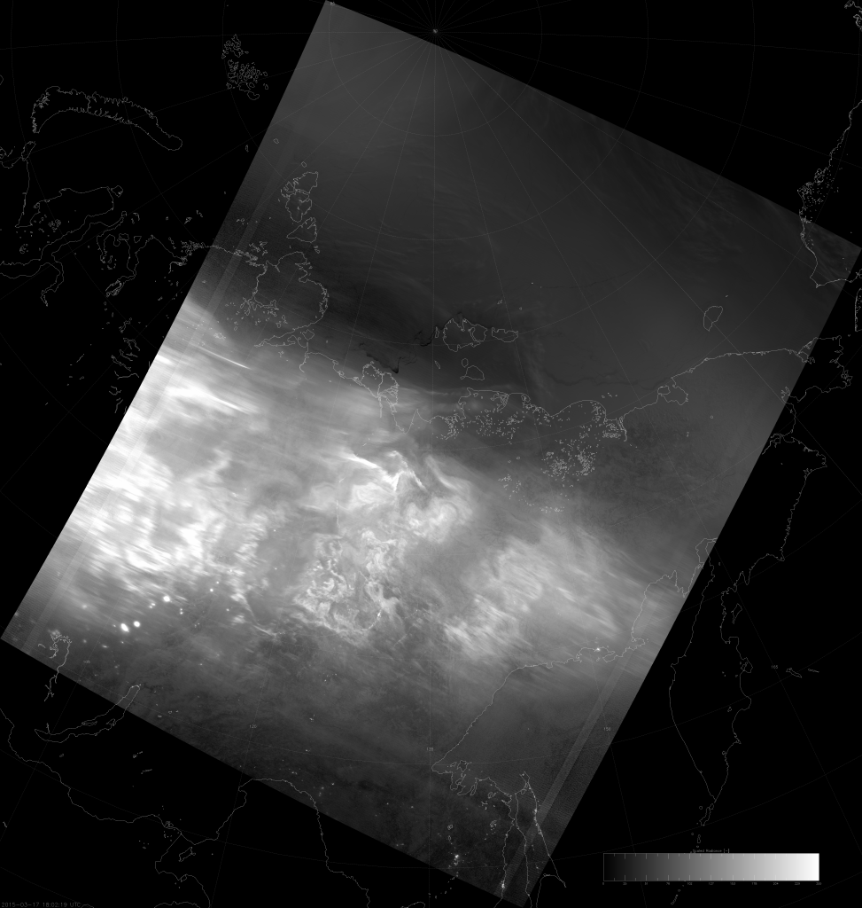
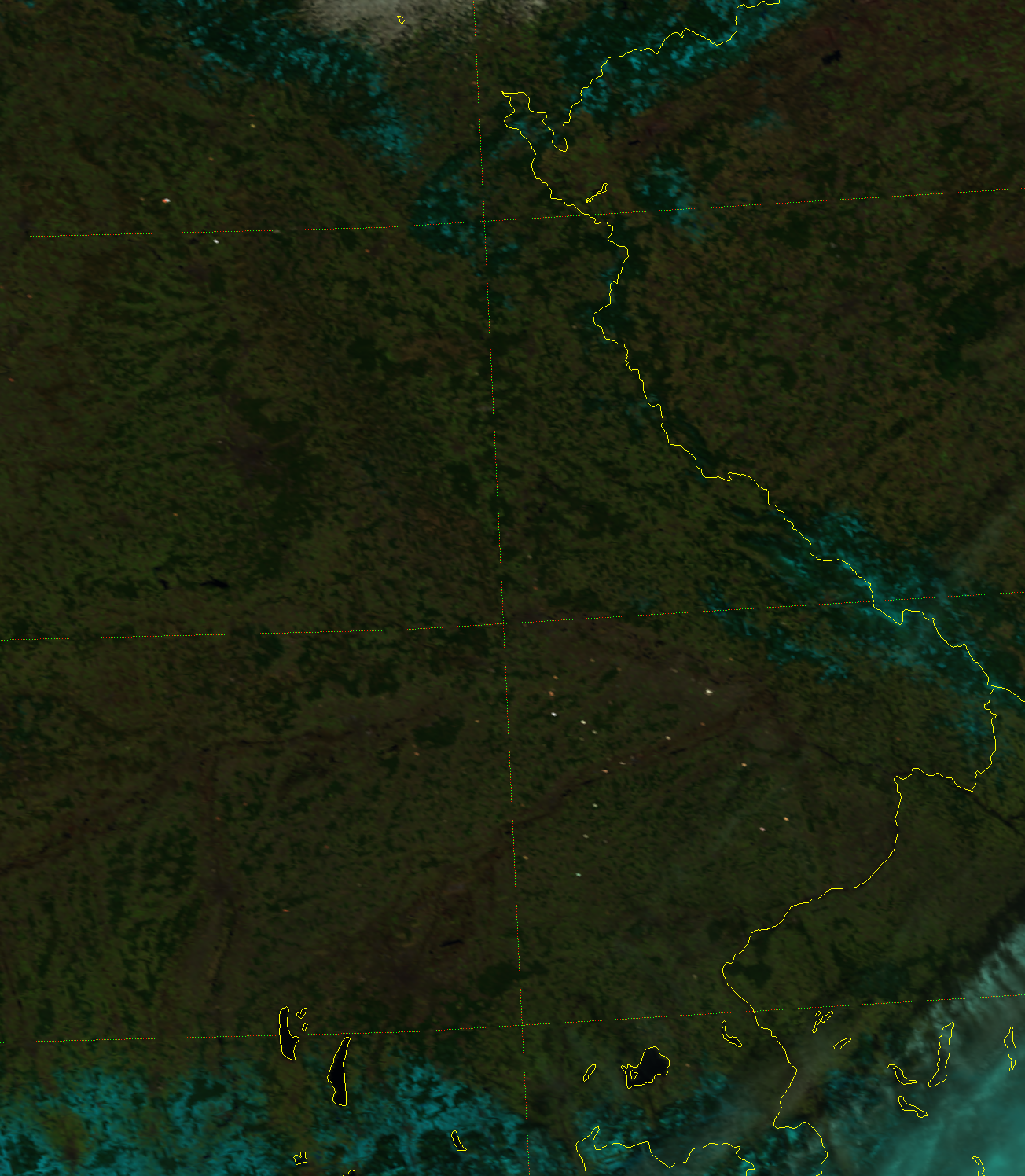
To prove there weren’t many clouds, here’s the True Color RGB (M-3/M-4/M-5):
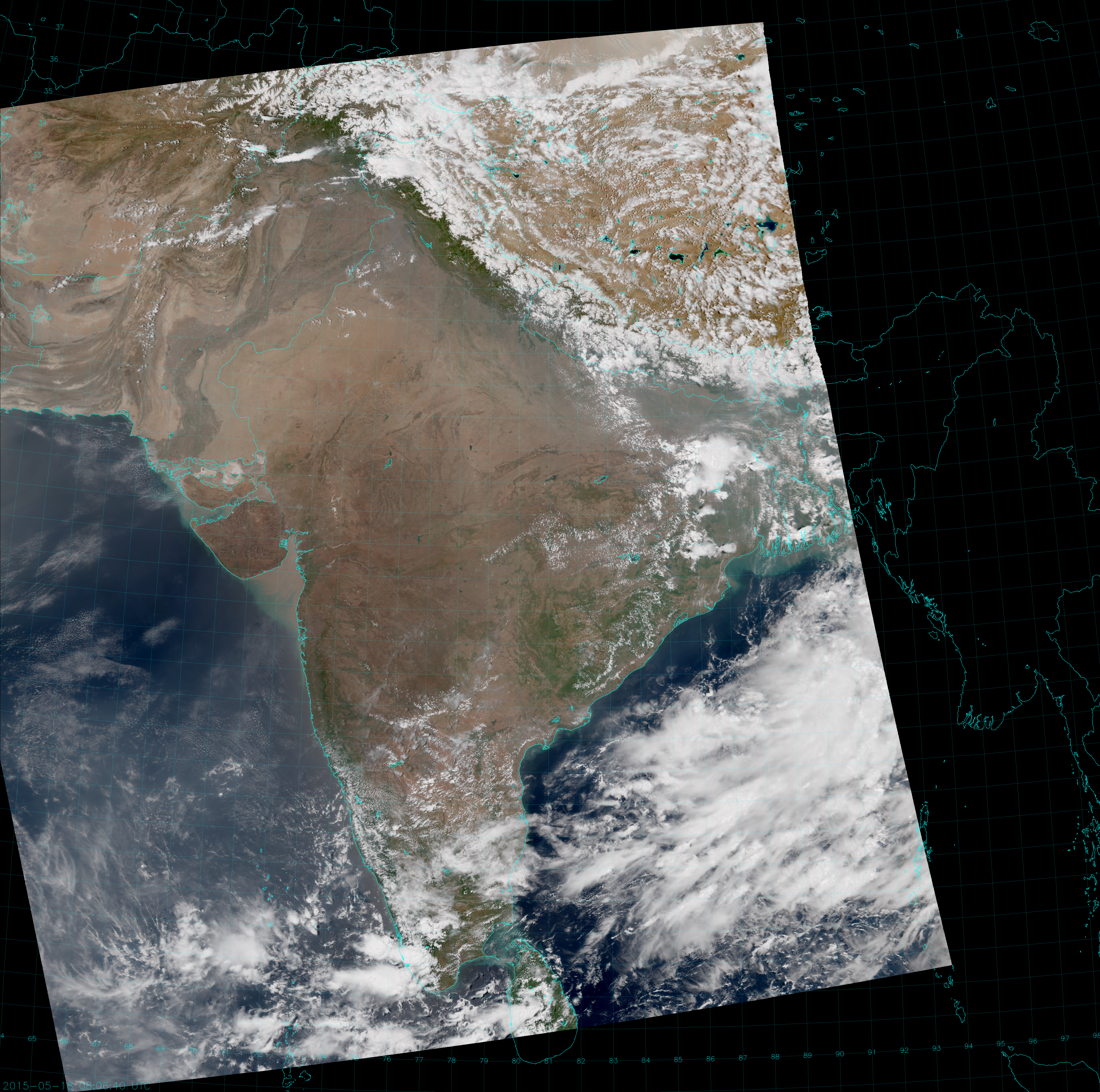
There is some smog and dust, though, if you look close but, it’s not quite the same thing. And wait! The observed temperatures were only 40-45 °C, not 59 °C! What gives?
Aha! You are now aware of the difference between “air temperature” and “skin temperature”. The satellite observes “skin temperature” – the temperature of the surface of the objects it’s looking at*. Thermometers measure the temperature of the air 2 m above the ground (assuming they follow the WMO standards [PDF]). As anyone who has ever tried to fry an egg on the sidewalk knows, the egg would never get cooked if you suspended it in the air 2 m above the ground. The ground heats up a lot more than the air does in this situation. One of the reasons is that the atmosphere doesn’t absorb radiation in this wavelength range*- and, if it did, it wouldn’t be an “atmospheric window”.
(* Not exactly. The atmosphere does have some effects in this wavelength range that have to be removed to get a true skin temperature. These effects increase with wavelength in the 11-12 µm range, which is why you may hear it called a “dirty window”.)
Another thing you should already know (even without cracking a few eggs) is that it’s much more comfortable to walk barefoot on grass in a park, than it is to walk barefoot in the parking lot (especially if it’s hot enough to make the asphalt melt). VIIRS can also tell you this.
Below, we’ve zoomed in on the area around Bombay (Mumbai) and the Gulf of Cambay. This is an image overlay that you might have to refresh your browser to see. Bombay is on the coast near the bottom of the images. As you drag the line back and forth, notice the areas with vegetation in the True Color image have a lower brightness temperature than the areas with bare ground.
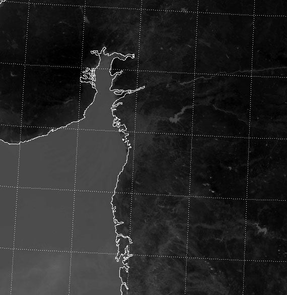
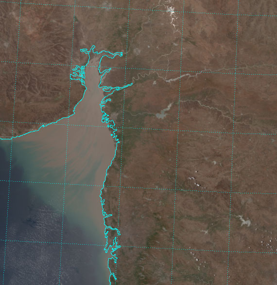
Vegetation has the ability to keep itself cool (in a process similar to sweating), unlike the bare dirt. Of course, there may be some terrain effects and marine effects along the coastline that are keeping those areas cooler. Although, the terrain west of the Gulf is the hottest part of the scene (notice it has very little green vegetation). And, if you think the marine-influenced boundary layer moderates the temperatures, which it does, it greatly adds to the humidity. Bombay’s highs during the month of May were only in the 90s F (33-35 °C), but dew points were also 80-86 °F (27-30 °C). This gives a heat index of anywhere between 110-130 °F (45-54 °C). And, of course, with all that humidity, it never cooled off at night.
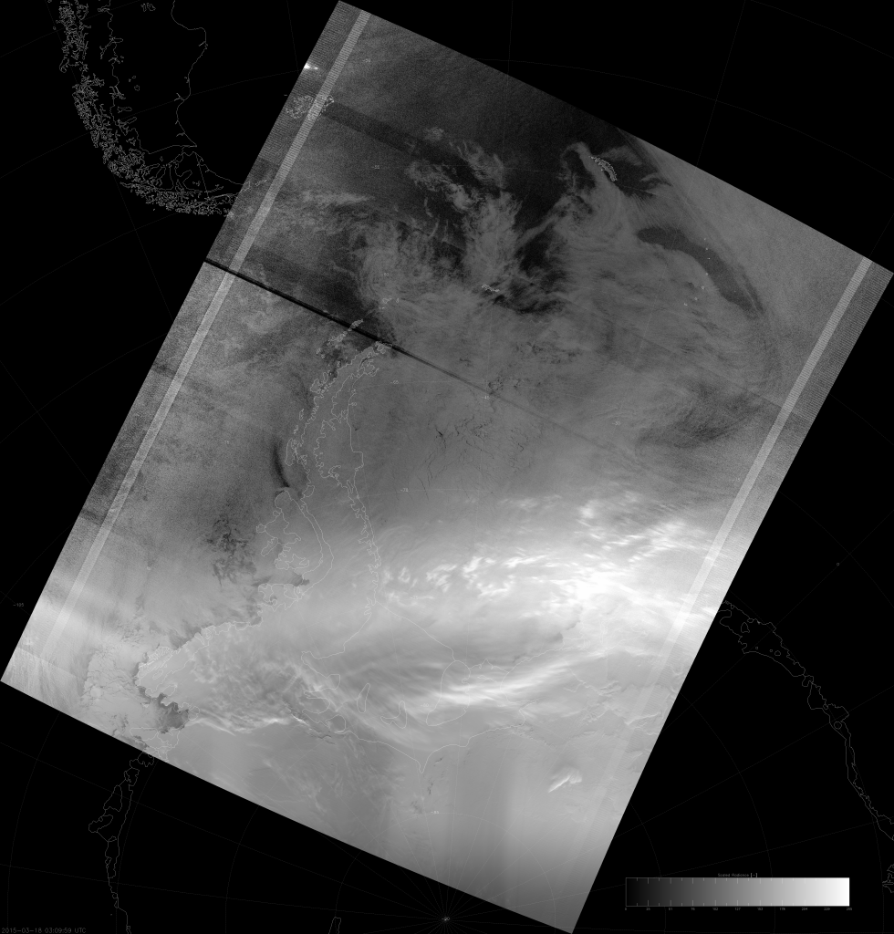
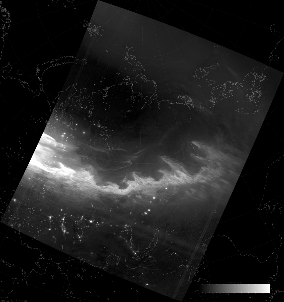
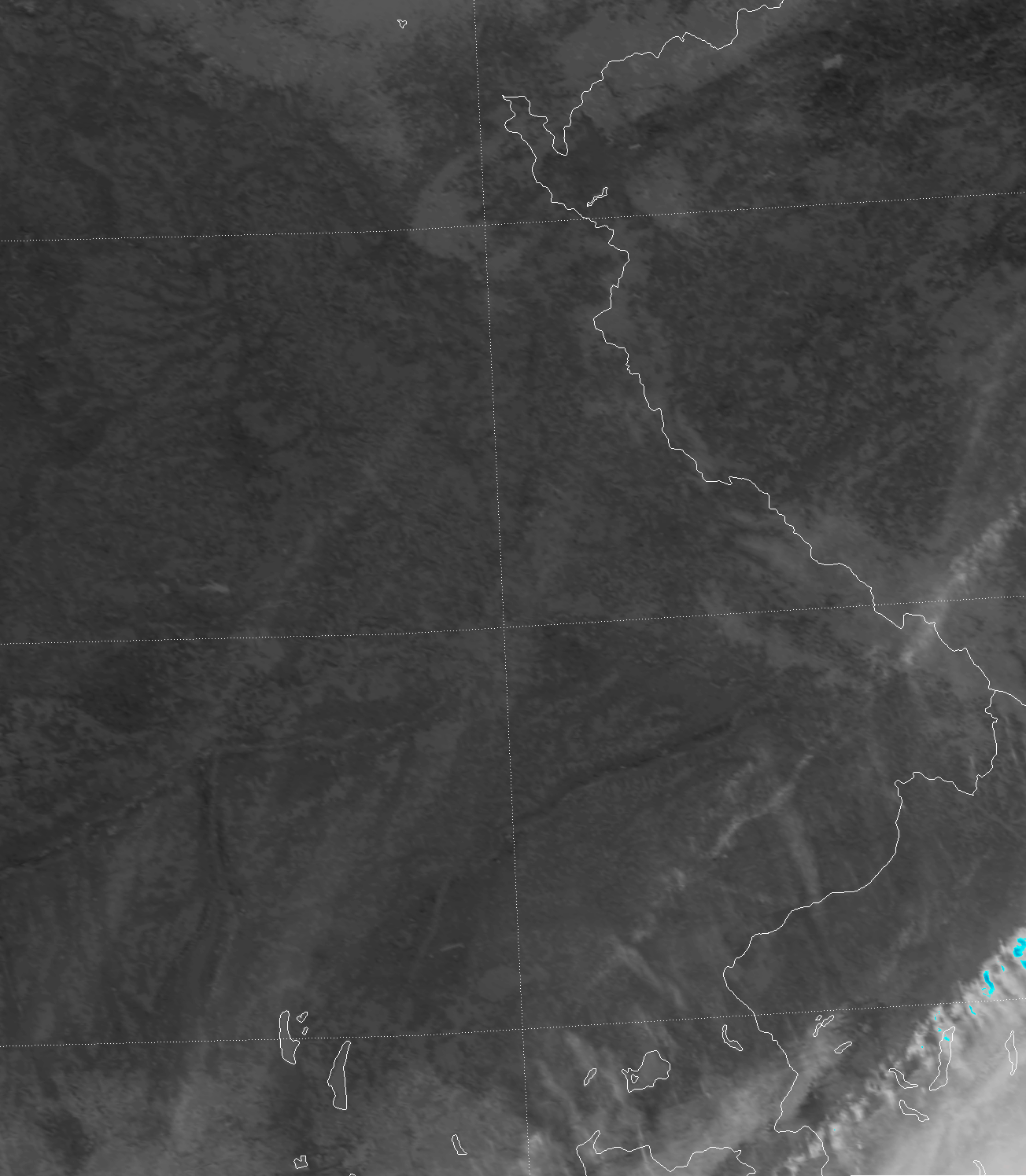
I mentioned smog and dust earlier. Well, the haze, smog and dust were even worse over northwestern India on 20 May 2015:
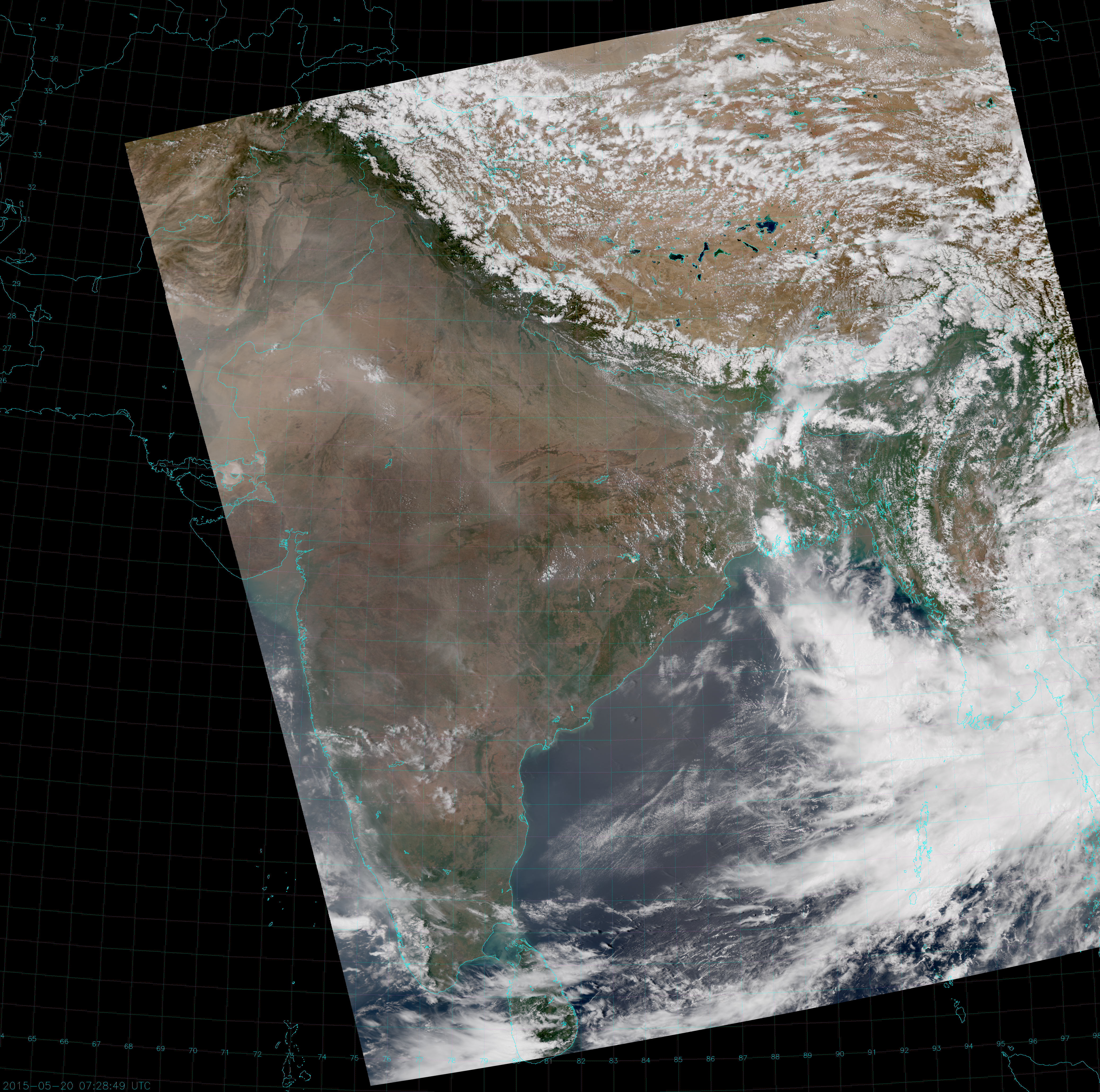
If you click on the image to see it in full resolution, you can see that the smog is trapped by the Himalayas. That means the people of Tibet are not only at more comfortable temperatures, they can also breathe fresh air.
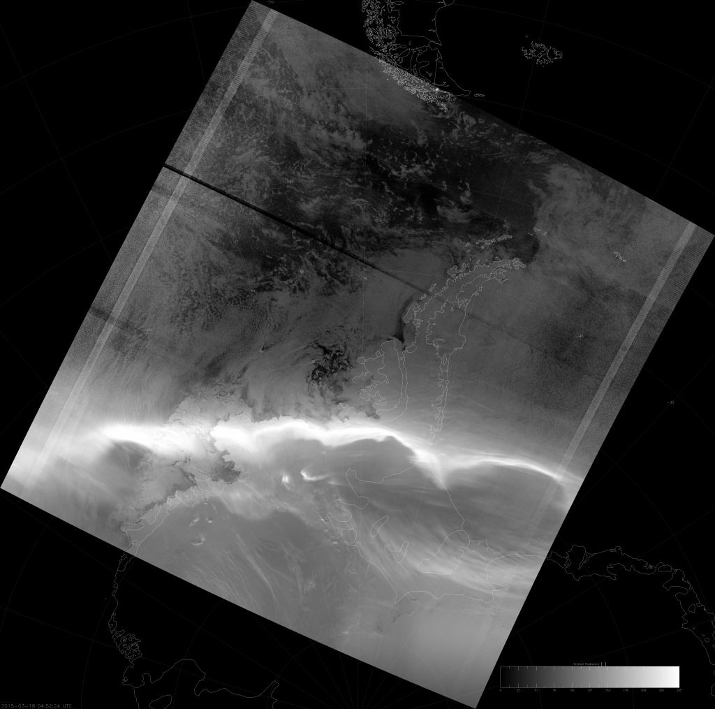
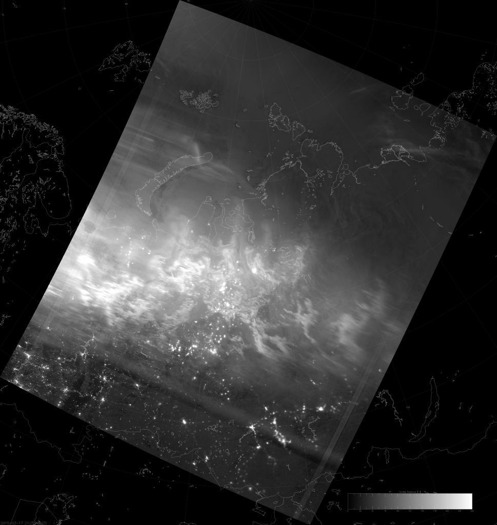
In case you’re wondering, the dust does show up in the IR as well:

Haze, smog, dust, unbearable heat and humidity: it’s no wonder why the people of India pray for the monsoon.