• Wild Week of Wildfires, Part III

    The last two posts covered flooding. Now, a month later, we are back to covering last year’s most common topic: wildfires. This time, we’ll make a game out of it. Keep in mind that, for many operational fire weather forecasters, this isn’t a game – it is information that could prove useful in saving lives or homes from destruction. If you have read the earlier posts on fire detection and haven’t forgotten what you’ve been told (here’s a good one to go back and read), this should be easy for you.

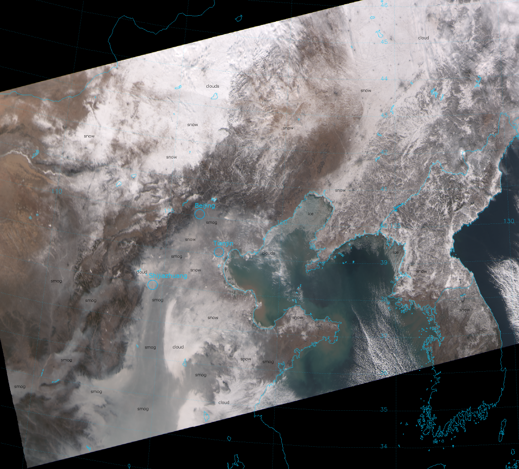
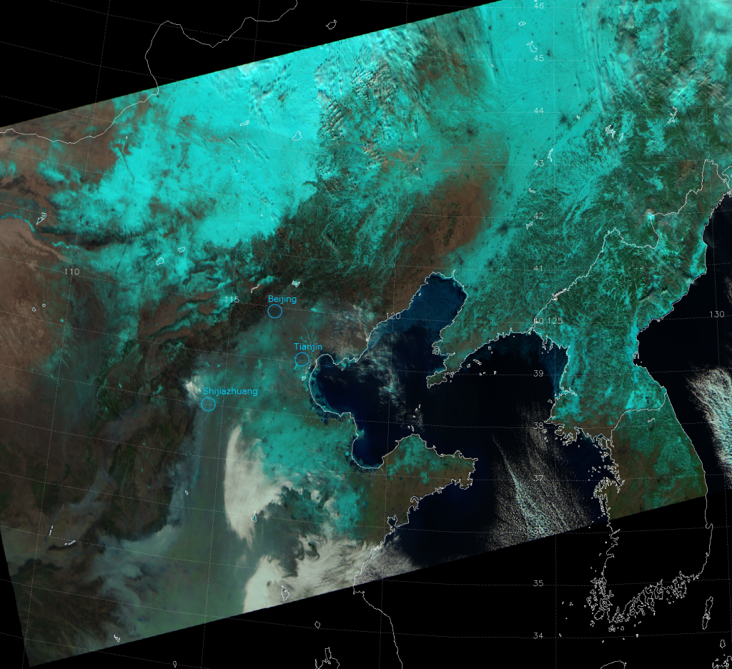
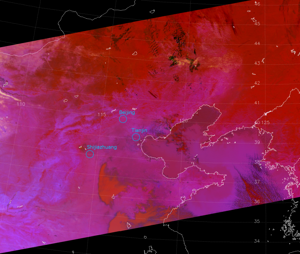
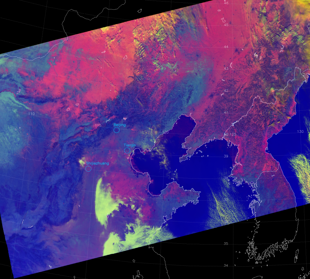
    The following images are the unmapped data from three consecutive VIIRS granules over the Southwest U.S., starting at 20:36 UTC 11 June 2013. The “raw” data has been processed to produce the “True Color”, “Natural Fire Color” and “Fire Temperature” RGB composites. Plus, the brightness temperature data from channel M-13 (4.0 µm) has a color table applied to it to aid in fire detection. Satellite channels near 4 µm are the “industry standard”, so to speak, for detecting fires as they are highly sensitive to sub-pixel heat sources like fires. The “Natural Fire Color” and “Fire Temperature” composites are RGB composites developed just for VIIRS that both had their debut on this very blog.

    The question is: how many fires can you see? Remember, you have to allocate resources (firefighters, helicopters, planes, etc.) based on your assessment. The media is hounding you for all the latest statistics on each blaze and they can’t wait until the 5:00 briefing. They need the scoop now to get higher ratings. Plus, the crew is loading fire retardant on the plane as you read this. Where should the pilot fly to? Everyone is counting on you! (Of course, you would never have just satellite data by itself in a real-life scenario – but, do you want to play this game, or just think of flaws?)

    I’ll give you a hint: You won’t see any fires unless you view each image at full resolution. Click on the image, then on the “3200×2304” link below the banner to see the full resolution version. (You could even open each full resolution image in a new tab, and click between the tabs for easy comparison, assuming you’re not using some archaic version of Internet Explorer or another old browser that doesn’t allow tabs. When you would click on the “3200×2304” link, instead right-click and select “Open in New Tab”. Another option would be to save the images and open them in an image viewing software program that will allow you to zoom in more than 100% but, that is starting to sound like a lot of work and I’m not sure I want to play this game anymore. It’s too complicated. By the way, if that’s the way you feel, don’t become the manager of a fire incident team.)

    I’ll give you another hint: Many of the hot spots that indicate fires are only 1-2 pixels in size. Be prepared to look for needles in the haystack, and make sure you have your reading glasses on, if you need them.

    VIIRS "True Color" composite of channels M-03, M-04 and M-05, taken at 20:36 UTC 11 June 2013
    VIIRS "Natural Fire Color" composite of channels M-05, M-07 and M-11, taken 20:36 UTC 11 June 2013
    VIIRS "Fire Temperature" composite of channels M-10, M-11 and M-12, taken 20:36 UTC 11 June 2013
    VIIRS channel M-13 image, taken 20:36 UTC 11 June 2013

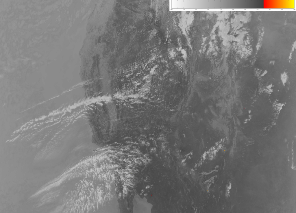
    So, did you see them all? You should have identified 12 fires. Did you find less than 12? Some of them are hard (or impossible) to see in some of the images. Did you find more than 12? The color scale used on the M-13 image led to false alarms, so you can be forgiven if that’s what caused you count too many.

    This example shows some of the complicating factors when trying to identify fires from satellites. It also shows why fire managers never rely on satellite data alone. Now, having said that, VIIRS can and does provide useful information on fires.

    First, here’s the answer (link goes to PDF) from the National Interagency Fire Center. They identified 15 active “large incident” fires on 12 June 2013. (They update their maps once per day, so all the fires that started on 11 June make it on the 12 June map.) But, there are differences between their map and what VIIRS saw.

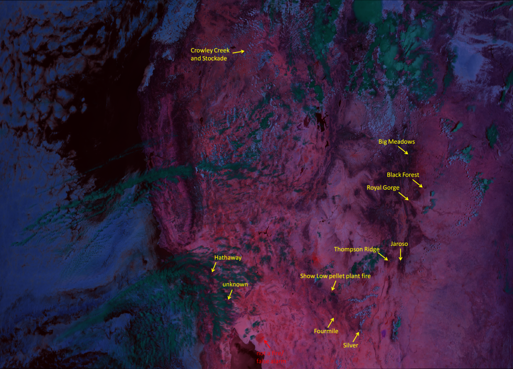
    First, the Mail Trail fire (#5 in the PDF) is outside the domain of these three VIIRS granules, so you couldn’t have found that in these images. Fires #3, 4 and 7 (Healy, Porcupine and Ferguson) are obscured by clouds, and/or were mostly contained, transitioning from active to inactive. The Tres Lagunas Fire (#13) started back in May and is undergoing mop up activities. The hot spots from that fire (if there are any left) aren’t visible in the images, but the burn scar is. That leaves the Stockade (#1), Crowley Creek (#2), Hathaway (#6), Fourmile (#8), Silver (#9), Thompson Ridge (#10), Jaroso (#11), Big Meadows (#12), Royal Gorge (#14), and Black Forest (#15) – 10 fires which are all visible in the VIIRS images. Plus, VIIRS saw two more fires that are not included on that list: one in southern California (near the Salton Sea) that I couldn’t find any information on, plus a pellet plant fire in Show Low, Arizona. (Small fires in towns are usually outside the scope of the National Interagency Fire Center, so they don’t bother to list those.)

    I would argue that the “Fire Temperature” composite worked the best at identifying each of these fires, but all 4 images have their uses. Here’s the Fire Temperature RGB image with the visible fires identified:

    VIIRS "Fire Temperature" composite of channels M-10, M-11 and M-12, taken 20:36 UTC 11 June 2013

    Answer honestly. Which fires did you see, and which fires did you miss?

    The Fire Temperature RGB takes advantage of the VIIRS channels in the portion of the electromagnetic spectrum ranging from the near-infrared (NIR) to the shortwave infrared (SWIR). The blue component is M-10 (1.61 µm), the green component is M-11 (2.25 µm) and the red component is M-12 (3.7 µm). As wavelength increases over this range, the contribution of the Earth’s emission sources increases and the contribution from the sun decreases. As a result, only the hottest hot spots show up in M-10, as they have to be seen over the large signal of radiation from the sun reflecting off the Earth’s surface. In M-12 (as in M-13), hot spots from fires produce more radiation at that wavelength than the amount of reflected solar radiation. M-11 is somewhere in the middle. That means relatively cool (e.g. smoldering) or small fires only show up in M-12, which makes those pixels appear red. Pixels containing fires hot enough or large enough to show up in M-11 will take on an orange to yellow color. Pixels containing fires hot enough or large enough to show up in all three channels will appear white.

    You have to be careful, though, as some pixels in the Fire Temperature RGB appear red, even though there aren’t any fires in them. A few of these pixels show up red in the M-13 image, and are labelled as “not a fire/false alarm”:

    VIIRS M-13 image, taken 20:36 UTC 11 June 2013

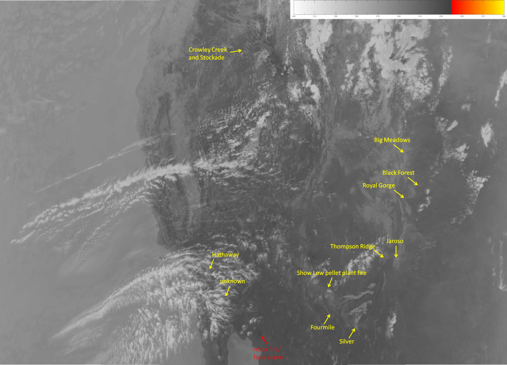
    According to the color table used, any pixel with a brightness temperature above 340 K (67 °C) will be colored, with colors ranging from red to orange to pale yellow as temperature increases. Now, look at that area in the True Color image (or on Google Maps):

    VIIRS "True Color" composite of channels M-03, M-04 and M-05, taken 20:36 UTC 11 June 2013

    That area is very dark – almost black – volcanic rock with very little vegetation that has been baking in the sun all day. It has managed to acquire a brightness temperature that is higher than some of the active fire pixels. The Crowley Creek fire doesn’t show up as red in the M-13 image (the Stockade fire is the one with the yellow and orange pixels) and the Fourmile fire is barely visible. (It has two pixels warmer than 340 K, even though 10 pixels appear red in the Fire Temperature RGB). The color scale in the M-13 image could be applied to a different temperature range, but you’ll always have that trade-off: have the colors start at too high a temperature, and you’ll miss some fires; have the colors start at too low a temperature, and you’ll increase the false alarms.

    The True Color image should have helped you identify 5 of the fires. The smoke plumes that show up are a dead giveaway. I’m talking about the Big Meadows, Royal Gorge, Jaroso, Thompson Ridge and Silver fires, of course. There may be smoke with the Hathaway fire, but it would be mixed in with the cirrus clouds and hard to see. Not all fires produce a lot of smoke, though. Having information on the ones that do aids in issuing air quality alerts, among other benefits.

    Lastly, the Natural Fire Color image highlights most (but not all) of the fires. Look for the red pixels:

    VIIRS "Natural Fire Color" composite of channels M-05, M-07 and M-11, taken 20:36 UTC 11 June 2013

    The Natural Fire Color doesn’t show active hot spots at Crowley Creek, and the Hathaway and Fourmile fires are difficult to see, because they aren’t quite hot enough. (Generally speaking, any fire that shows up red in the Fire Temperature RGB is too cold to show up as red in the Natural Fire Color.) But, this composite has the advantage of showing burn scars in addition to the active fires. Burn scars appear dark brown. The Fourmile and Crowley Creek burn scars are visible. Plus, burn scars from last year’s fires still show up: The Whitewater-Baldy, High Park and Waldo Canyon scars are identified. The Tres Lagunas was mentioned above, and it’s burn scar is visible. If you look closely, I’m sure you could find more burn scars from last year’s long fire season.

    Here are all four images, zoomed in on each fire at 800%, combined into an animation to highlight how each fire appears in each image:

    Animation of M-13, True Color, Natural Fire Color and Fire Temperature imagery zoomed in each fire (20:36 UTC 11 June 2013)

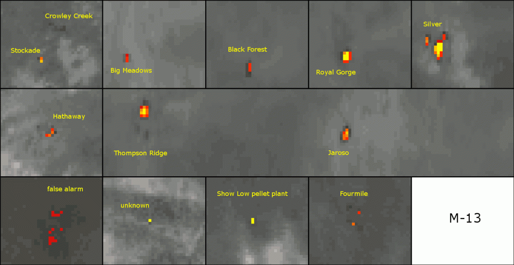
    For some reason, you have to click to the full resolution version of the image before the animation will display.

    Hopefully, this exercise is useful in demonstrating the complications that arise when trying to detect fires from satellites in space, as well as the strengths and weaknesses of some of the various methods VIIRS has at it’s disposal to aid the fire weather community.

  • Record Russian Spring Snowmelt

    It seems that last year’s posts were all about fires. Fires in Colorado (multiple fires, in fact), the Canary Islands, Siberia, Australia – there was even that 40-year-old pit of burning natural gas that has been called the “Gates of Hell“. (It’s still burning, by the way.) Maybe this year’s theme will be all about flooding. We just looked at flooding in the U.S. Midwest. And now, we return back to Russia – the western part this time – where massive flooding has occurred this spring.

    Moscow had 65 cm of snow on the ground on 1 April 2013. (That’s roughly 26 inches for any American readers.) That’s the most snow they’ve ever had on the ground that late in the spring, and it was all thanks to record snowfall during the month of March. This article from 26 March 2013 says they got 70 cm (28 inches) in a two day period, and forecasters were predicting another 8-10 cm by the end of the month.

    What happens when record amounts of snow melt? It causes flooding. In this case, flooding that makes the Illinois River look like a creek you can hop across. The watershed of the Volga River has been hit especially hard. Here’s a picture that our resident Russian, Galina C., tells me is from near the city of Ryazan, so I assume it is the Oka River. (Refer back to the Volga River map I linked to.) There are more pictures here.

    To bring this all together with VIIRS, here is what VIIRS saw on 28 March 2012, right after the region got 70 cm of snow:

    False color RGB composite of VIIRS channels I-01, I-02 and I-03, taken 10:38 UTC 28 March 2013
    False color RGB composite of VIIRS channels I-01, I-02 and I-03, taken 10:38 UTC 28 March 2013

    Again, to see the full resolution image, click on it and then click on the “1793×2036 ” link below the banner. This is the false color combination that EUMETSAT refers to as “Natural Color“, where snow and ice appear cyan and liquid clouds appear white. The whole scene is snow, except for a few small clouds north of Moscow and anywhere there are trees sticking out above the snow, which appear green.

    Notice that you can’t see any rivers. They’re all frozen over and covered with snow.

    Here’s what VIIRS saw (same false color combination) a month later (29 April 2013):

    False color composite of VIIRS channels I-01, I-02 and I-03, taken 10:39 UTC 29 April 2013
    False color composite of VIIRS channels I-01, I-02 and I-03, taken 10:39 UTC 29 April 2013

    All the snow is gone. Plus, look at all the rivers you can see. The problem is that you shouldn’t normally be able to see all of these rivers. The flooding makes them visible.

    What I think is more impressive is seeing a time-lapse loop of VIIRS images over this period:

    Animation of false color composites of VIIRS channels I-01, I-02 and I-03 from 28 March 2013 to 2 May 2013.
    Animation of false color composites of VIIRS channels I-01, I-02 and I-03 from 28 March 2013 to 2 May 2013.

    Make sure you look at it in full resolution mode. Note that the time period between frames in the animation varies. Some days it was too cloudy to see anything, one or two days had missing data, etc., so this isn’t always one image per day.

    The city of Ryazan is identified in the animation (remember the photo linked to earlier). To put it into perspective, check out the Google Maps satellite view of the city. The Oka River is normally ~200 m wide near the city. In the last two frames of the animation, the Oka River is over 10 km wide at its widest point near Ryazan! The same goes for a lot of the rivers visible at the end of the loop – rivers that are normally a few tens or hundreds of meters wide are up to a few kilometers wide.

    The city of Tambov at 52°43′N, 41°26′E, which is outside of the domain of the animation, but in the southeastern portion of the larger static images, experienced its worst flooding in 130 years in early April. (That corner of the domain was the first to experience snowmelt.) One of the contributing factors at Tambov, according to that article, was that the ground below the snow was still frozen. The snowmelt occurred before the ground thawed. This meant that the meltwater couldn’t be absorbed into the ground – it simply collected in the low-lying areas or ran off into the rivers, which quickly filled as you can see.

    Our resident Russian was also able to grab this plot of the Oka River stage at Novinky, just upstream of where the Oka empties into the Volga. The information comes from this website. This plot covers the time period from 7 April to 7 May 2013.

    River stage of the Oka River at Novinky, Russia for April 2013
    River stage of the Oka River at Novinky, Russia for April 2013. Data comes from gis.waterinfo.ru, with help from Galina Chirokova (CIRA).

    The Oka River looks like it peaked at about 2.5 m above normal. (8 ft. for you Americans.)

    All that water is going to end up in the Caspian Sea, whose water level is largely based on inflow from the Volga River’s watershed. Variations of sea level in the Caspian have been +/-3 m over the last century and, with this influx of snowmelt, it is sure to go up.

  • Land of Lincoln Underwater

    The week beginning on 14 April 2013 was a big week for weather across the United States. There were 30 reports of tornadoes. (Make sure you click on each link, and look at the filtered reports.) And, when our home base of Fort Collins, Colorado was in the middle of being buried under two feet of snow, large parts of the Midwest received 4-7 inches of rainfall. This is a lot of rain for an area with saturated ground caused by recent snowmelt. Unsurprisingly, it caused a lot of flooding – including a sinkhole in a Chicago neighborhood.

    Now, we know VIIRS is good at detecting snow. But, flooding is a bit trickier, particularly river flooding. First, flooding usually occurs when it’s cloudy. (Not always, of course, since you can have flooding from snowmelt or heavy rains that occurred upstream or caused by ice jams when it isn’t cloudy. And, as we saw with Hurricane Isaac, flooding may linger long after the clouds are gone.) Second, flooding can have a huge impact over a small area that your satellite might not have the resolution to detect.

    Well, I’m here to report that VIIRS has the resolution to detect the flooding that occurred over Illinois last week. And the flooding lasted until well after the clouds cleared. Take a look at the image below from 21 April 2013, where the flooding is visible:

    VIIRS false color composite of channels I-01, I-02 and I-03, taken 18:13 UTC 21 April 2013
    VIIRS false color composite of channels I-01, I-02 and I-03, taken 18:13 UTC 21 April 2013

    This is a “Natural Color” RGB composite of the high-resolution channels I-01 (0.64 µm, blue), I-02 (0.87 µm, green) and I-03 (1.61 µm, red). If you click on the image, then on the “3124×2152” link below the banner, you will see the full resolution image. If you’re wondering where the flooding is, notice the rivers I have labelled in the image. Now try to spot those rivers in this image from two weeks earlier (5 April 2013):

    VIIRS false color composite of channels I-01, I-02 and I-03, taken 18:13 UTC 5 April 2013.
    VIIRS false color composite of channels I-01, I-02 and I-03, taken 18:13 UTC 5 April 2013.

    Those rivers are a lot more difficult to see. The Illinois, Sangamon, and Mississippi rivers are the only rivers easily visible in the before image. A lot more show up after the heavy rains because they grew beyond their banks and became big enough for VIIRS to see. You might also notice that the vegetation has become much greener over this two week period. To make it easier to compare, here are those images cropped and centered on the swollen rivers, side-by-side:

    False-color RGB composites of VIIRS channels I-01, I-02 and I-03, taken on 5 April 2013 and 21 April 2013
    False-color RGB composites of VIIRS channels I-01, I-02 and I-03, taken on 5 April 2013 (left) and 21 April 2013 (right)

    There are a couple of important things to note about these images that are related to how VIIRS and its satellite (Suomi-NPP) work. One is that Suomi-NPP has an orbit with a 16-day repeat cycle. Every 16 days it should (if it’s in its proper orbit) pass over the same spot on the Earth at the same time of day. The images above were taken 16 days apart, and as you can see in the captions, were taken at the same time of day. The only difference in the area included in the images is the result of the start time of the data granules being 13 seconds off. This means that VIIRS is viewing all the same spots at the same viewing angles.

    This leads to point #2: the VIIRS instrument has a constant angular resolution (recall that it uses a constantly rotating mirror to detect radiation across the swath) which, when projected onto the surface of the Earth, means that it does not have a constant spatial resolution. (See slide 12 of this presentation.) The spatial resolution of the high resolution channels shown here is ~375 m at nadir, and it degrades to ~750 m resolution at the edge of the swath. In the images above, the center of the VIIRS swath (nadir) is near the right edge of the data plotted. The left edge of the data plotted is about 80% of the distance from nadir to the edge of the swath. The loss in resolution over this distance may be enough to prevent VIIRS from detecting all the flooding that is occurring. But, the important thing is that we are viewing all these rivers at the same angles and the same resolution. This gives the best comparison between the before and after images.

    A few more things to notice in the above images: there is snow in the northern part of Michigan’s Lower Peninsula, with ice on Green Bay and Lake Winnebago (all of which are easier to see in the image from 5 April 2013). Does anyone living there still remember last year’s record heat wave?  Many places in this region had already had a number of +80 and +90 °F days, but it seems like a distant memory now. This year, winter doesn’t want to end.

    One last thing for today: If you focus on Michigan again you might notice another area of flooding. This one is large enough it wouldn’t be impacted by any resolution degradation (even though it is near the center of the swath where you wouldn’t be worried about that anyway). I’ve zoomed in on the area here:

    False-color composites of VIIRS channels I-01, I-02 and I-03 from 5 April 2013 and 21 April 2013
    False-color composites of VIIRS channels I-01, I-02 and I-03 from 5 April 2013 (left) and 21 April 2013 (right)

    This is along the Shiawassee River near the Shiawassee National Wildlife Refuge, a few miles southwest of Saginaw. This area of flooding is confirmed by these aerial photographs taken on 22 April 2013.

  • Drought in the Land of the Long, White Cloud

    Science fiction fanatics know it as “Middle-earth“.  Abel Tasman, the Dutch explorer who became the first European to sail there, called it “Staten Landt“, which was later changed to Nieuw Zeeland, Nova Zeelandia, and, finally, New Zealand. The native Maori people call it “Aotearoa“, which loosely translates to “the land of the long, white cloud”.

    A group of volcanic islands southeast of Australia, New Zealand is known for the Southern Alps, the locations where they filmed the Lord of the Rings trilogy and rugby, although I’m sure there’s more to the country than that. Residents of New Zealand refer to themselves as “kiwis”, although it is not clear if they prefer to be thought of as birds or fruit.

    Being an island nation in the mid-latitudes with 17 peaks above 10,000 ft (3,000 m), you might expect there would be no shortage of moisture and uplift to form clouds and precipitation. There are sea breezes, mountain/valley circulations, orographic uplift of prevailing winds, periodic mid-latitude cyclones and the occasional tropical storm to get things started. But, that’s not the case this year.

    The North Island is currently experiencing its worst drought in over 30 years. Many places have experienced less than half of normal precipitation this summer, according to NIWA (their version of NOAA). These are places that normally receive 40-80 inches of precipitation per year. (Remember, summer just ended down there and that 500 mm is roughly 20 inches.)

    Wellington, the nation’s capital, has begun rationing water for the first time in recorded history (which covers about 170 years). The chair of the Wellington region’s committee in charge of the water supply was quoted as saying, “People should shower with a friend, if that’s an option . . . or put a brick in the toilet. If you know anyone who’s particularly adept at rain dances, then encourage them to get out there and do what they do.”

    One of the previous links mentioned that the drought is so bad, it can be seen from space. They didn’t provide evidence to back up that claim, so I guess I have to do it. Here’s what VIIRS saw on 28 January 2013 (before the North Island went 4-6 weeks without any significant precipitation):

    "True Color" RGB composite of VIIRS channels M-03, M-04 and M-05, taken 01:49 UTC 28 January 2013
    "True Color" RGB composite of VIIRS channels M-03, M-04 and M-05, taken 01:49 UTC 28 January 2013

    And here is what VIIRS saw on 21 March 2013 (after 4-6 weeks without significant precipitation):

    "True Color" RGB composite of VIIRS channels M-03, M-04, and M-05, taken 02:15 UTC 21 March 2012
    "True Color" RGB composite of VIIRS channels M-03, M-04, and M-05, taken 02:15 UTC 21 March 2012

    The two images above are “true color” composites. If you look closely at the two images, you might notice significantly less green vegetation in the 21 March 2013 image, particularly in box that covers 39° to 40° S latitude and 174° to 176° E longitude. (Remember, you can see the full-resolution image by clicking on it, and then on the “1434×2120” link below the banner.)

    Not convincing? Maybe it shows up a bit better in the “natural color” composite, which has a strong vegetation signal. Here are those images:

    False color composite of VIIRS channels M-05, M-07 and M-10, taken 01:49 UTC 28 January 2013
    False color composite of VIIRS channels M-05, M-07 and M-10, taken 01:49 UTC 28 January 2013

    .

    False color composite of VIIRS channels M-05, M-07 and M-10, taken 02:15 UTC 21 March 2012
    False color composite of VIIRS channels M-05, M-07 and M-10, taken 02:15 UTC 21 March 2012

    And just to be clear, here are the images zoomed in on the west side of the North Island, where the drought has hit the hardest:

    Drought impact on vegetation in the North Island of New Zealand between 28 January and 21 March 2013
    Drought impact on vegetation in the North Island of New Zealand between 28 January (left) and 21 March 2013 (right)

    In the image on the left, from 28 January, light green areas represent grassland/pasture (backed up by this land use map) and dark green areas represent forests. In the image on the right, from 21 March, the grassy areas have turned brown while the forests have remained green. Six weeks with almost no rain will do that to grass.

    While the “true color” and “natural color” RGB composites are only qualitative (and require viewers to be able to distinguish sometimes subtle changes in the amount of green in the images), there are ways to quantify the “greenness” of vegetation from satellite. The most widely used method is the Normalized Difference Vegetation Index (NDVI for short). The NDVI has been calculated for more than 40 years with Landsat and AVHRR. We can do the same calculation with VIIRS. That’s what is shown below.

    VIIRS NDVI images of New Zealand from 28 January and 21 March 2013
    VIIRS NDVI images of New Zealand from 28 January (left) and 21 March 2013 (right)

    On this color scale, red and yellow colors indicate high values of NDVI (or very green vegetation). Green and blue colors indicate low values of NDVI (sparse, dead or brown vegetation). Notice how most of the North Island has gone from yellow or red in January (on the left) to blue or green in March (on the right). NDVI values have decreased by 20-30% over this period.

    I guess if there is one benefit of the drought, it’s that it has been clear enough over New Zealand for satellites to see it. In fact, January and February have broken records for the amount of sunshine in many parts of the country. The land of the long, white cloud hasn’t been living up to its name.

  • Chinese Super-Smog

    No, not a Super-Smörg, super smog. Smog that is so thick, you can taste it. The smog in many parts of eastern China has been so bad this winter, it is literally “off-the-charts“. Based on our Environmental Protection Agency‘s not-very-intuitive Air Quality Index (see pages 13-16, in particular) any value above 300 is hazardous to everyone’s health. The scale doesn’t even go above 500 because the expectation is that the air could never get that polluted. Applying this scale to the air in Beijing, the local U.S. Embassy reported an Air Quality Index value of 755 on 13 January 2013. Visibility has been reduced to 100 m at times. This video (from 31 January 2013) gives a vivid description of the problems of the smog:

    If that wasn’t bad enough, here’s video from NBC News where Brian Williams reveals a factory was on fire for three hours before anyone noticed because the smog was so thick!

    Did you happen to notice in the beginning of the NBC video that the “air pollution is so bad that the thick smog can now be seen from space”? Of course, the satellite image shown in that clip came from MODIS. (It must have friends in high places. That, or people get the MODIS images out on their blogs less than two weeks after the event occurred, unlike this blog.) Needless to say, VIIRS has seen the smog, too, and it is terrible.

    For comparison purposes, here’s what a clean air day looks like over eastern China:

    VIIRS "true color" RGB composite of channels M-03, M-04 and M-05, taken 05:21 UTC 28 September 2012
    VIIRS "true color" RGB composite of channels M-03, M-04 and M-05, taken 05:21 UTC 28 September 2012

    This is a “true color” composite taken 05:21 UTC 28 September 2012. (As always, click on the image, then on the “2040×1552” link below the banner to see the full resolution image.) There appears to be some air pollution in that image (look near 33° N latitude between 112° and 116° E longitude), but it’s not that noticeable.

    Here’s what it looks like when Beijing is reporting record levels of air pollution (04:56 UTC 14 January 2013):

    VIIRS true color RGB composite of channels M-03, M-04 and M-05, taken 04:56 UTC 14 January 2013
    VIIRS true color RGB composite of channels M-03, M-04 and M-05, taken 04:56 UTC 14 January 2013

    You may have heard of a “brown cloud of pollution“. Here the clouds actually appear brown thanks to all that pollution. Notice the area around Shijiazhuang – the most polluted city in China – and how brown those clouds are in comparison to the clouds on the left and right edges of the image. Then look south from Shijiazhuang to where everything south and west of the cloud bank has a dull gray color. That is all smog! It’s enough to make anyone with a respiratory condition want to cough up a lung just from seeing this.

    Now, this is a complicated scene with clouds, snow, ice and smog. So, to clear things up (in a manner of speaking), here is the same image with everything labelled:

    VIIRS true color RGB composite of channels M-03, M-04, and M-05, taken 04:56 UTC 14 January 2013
    VIIRS true color RGB composite of channels M-03, M-04, and M-05, taken 04:56 UTC 14 January 2013

    The gray smog can be seen around Beijing as well, but it pales in comparison to the rest of eastern China. Think about that! Replay the videos above and consider that might not have even been the worst smog in China at the time!

    Too bad there are a lot of clouds over the area. What does it look like on a “clearer” day? (“Clearer”, of course, refers to the amount of clouds, not air pollution.) It looks worse! The image below was taken at 04:32 UTC on 26 January 2013:

    VIIRS true color RGB composite of VIIRS channels M-03, M-04, and M-05, taken 04:32 UTC 26 January 2013
    VIIRS true color RGB composite of VIIRS channels M-03, M-04, and M-05, taken 04:32 UTC 26 January 2013

    The area covered by smog rivals the area of South Korea, which is visible on the right side of the image. (One of the reports I linked to above put the figure at 1/7th of the land area of China covered by smog around this time, which is actually a lot bigger than South Korea!) I’m just counting the smog in the image that is thick enough to completely obscure the surface. There is likely smog that isn’t as obvious (and isn’t labelled) in that image. The snow between Shijiazhuang, Tianjin and Beijing is covered by smog that isn’t quite thick enough to totally obscure it. And the large area of snow south of Tianjin is likely covered with smog. (It sure is a lot dirtier in appearance than the snow near the top of the image.)

    If you don’t believe my labels, the “pseudo-true color” or “natural color” RGB composite clearly identifies the low clouds (which usually appear a dirty, off-white color even without smog), ice clouds (pale cyan) and snow (vivid cyan):

    VIIRS false color RGB composite of channels M-05, M-07 and M-10 (a.k.a. "natural color"), taken 04:32 UTC 26 January 2013
    VIIRS false color RGB composite of channels M-05, M-07 and M-10 (a.k.a. "natural color"), taken 04:32 UTC 26 January 2013

    Notice the smog in this image. It is an unholy grayish-greenish color with a value near 70-105-93 in R-G-B color space. The “natural color” composite is made from channels M-05 (0.67 µm, blue), M-07 (0.87 µm, green) and M-10 (1.61 µm, red), which are longer wavelengths than their “true color” counterparts. Longer wavelengths mean reduced scattering by atmospheric aerosols, so the higher green value may be due to the strong surface vegetation signal in M-07 being able to penetrate through the smog. (Either that or the smog is composed of some chemical compound that has a higher reflectivity value in M-07 than in the other two channels.)

    I’ve looked at the EUMETSAT Dust, Daytime Microphysics and Nighttime Microphysics/Fog RGBs, which you might think would show super-thick smog and they don’t. At least, it’s not obvious.

    The EUMESAT Dust RGB applied to VIIRS, valid 04:32 UTC 26 January 2013
    The EUMESAT Dust RGB applied to VIIRS, valid 04:32 UTC 26 January 2013

    The Dust RGB above uses M-14 (8.55 µm), M-15 (10.7 µm) and M-16 (12.0 µm) and requires there to be a large temperature contrast between the dust (cool) and the background surface (hot). Smog almost always occurs when there is a temperature inversion (the air at the ground is colder than the air above) so the necessary temperature contrast won’t exist.

    The Daytime Microphysics RGB shows the smoggy areas are a slightly different color than other cloud-free surfaces, but that color can be confused with other non-smoggy surfaces. The clouds really stand out, though:

    The EUMETSAT Daytime Microphysics RGB applied to VIIRS, valid 04:32 UTC 26 January 2013
    The EUMETSAT Daytime Microphysics RGB applied to VIIRS, valid 04:32 UTC 26 January 2013

    Perhaps, with a different scaling, the smog might stand out more.

    The Nighttime Microphysics RGB from the night before (18:50 UTC 25 January 2013) is interesting. Notice the cloud identified by the letter “B” and the non-cloud next to it, “A”:

    The EUMETSAT Nighttime Microphysics/Fog RGB applied to VIIRS, valid 18:50 UTC 25 January 2013
    The EUMETSAT Nighttime Microphysics/Fog RGB applied to VIIRS, valid 18:50 UTC 25 January 2013

    Now compare this with the Day/Night Band image from the same time:

    VIIRS Day/Night Band image of eastern China, taken 18:50 UTC 25 January 2013
    VIIRS Day/Night Band image of eastern China, taken 18:50 UTC 25 January 2013

    This was a day before full moon. Thanks to the moon, clouds, snow and smog are visible in addition to the city lights. Points “A” and “B” have nearly identical brightness in the Day/Night Band, but only “B” shows up as a cloud in the Nighttime Microphysics RGB. These lighter areas around “A” and “B” are partially obscuring city lights, indicating “B” is a cloud, while “A” is smog. (If either was snow, you’d be able to see the city lights more clearly. See the lighter area northwest of Beijing, which is snow.)

    Nothing sees super-smog like the true color composite, but the Day/Night Band will see it as long as there is enough moonlight. Smog as optically thick as a cloud… *hacking cough* … Yuck!