• Pumice Rafts: The Floating Rocks of the Sea

    False color RGB composite of VIIRS channels I-01, I-02 and I-03, taken 01:39 UTC 26 July 2012

    Do rocks float? The answer to that is “Depends on which rocks you’re talking about.”

    We just looked at what happens in the atmosphere when a volcano like Copahue erupts. We also looked at the impact the 1912 eruption of Novarupta still has today. And, before VIIRS was launched into space, there was Eyjafjallajökull – the Icelandic volcano that nobody could pronounce. (Think “Eye-a-Fiat-la-yo-could” [click here to hear audio of some guy saying it properly].) These are examples of what geologists would refer to as an “explosive eruption”. Not all volcanoes blow ash into the atmosphere. Think of Kilauea in Hawaii – this is an example of an “effusive eruption” where lava oozes or bubbles up out of the ground in a rather non-violent manner. These are the most common volcanic eruptions on land that everyone should already be familiar with.

    But, what happens when the volcano is underwater? You get what a group of New Zealand geologists are calling “Tangaroan” (named after the Maori god of the sea, Tangaroa). This article explains it in more detail, but the short version is this: at the bottom of the ocean, there is immense pressure from the weight of the water above the volcano that prevents an eruption from being truly “explosive”, yet the eruptions are often more violent than an effusive eruption. The magma, filled with gas, erupts into the ocean where the outer edges are instantly cooled and solidified. (The water is cold at the bottom of the ocean.) This traps all the gas inside and you get a rock that’s filled with millions of tiny air bubbles, which is called pumice. This new rock can be so light, it floats to the surface.

    What does this have to do with VIIRS or a blog about imagery from weather satellites? Large underwater volcanic eruptions can create large quantities of pumice that float to the surface of the ocean and create what are called pumice rafts. VIIRS has seen these pumice rafts.

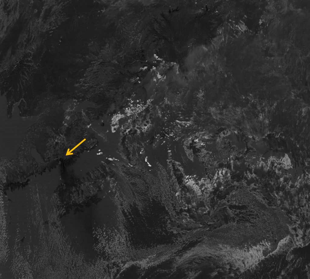
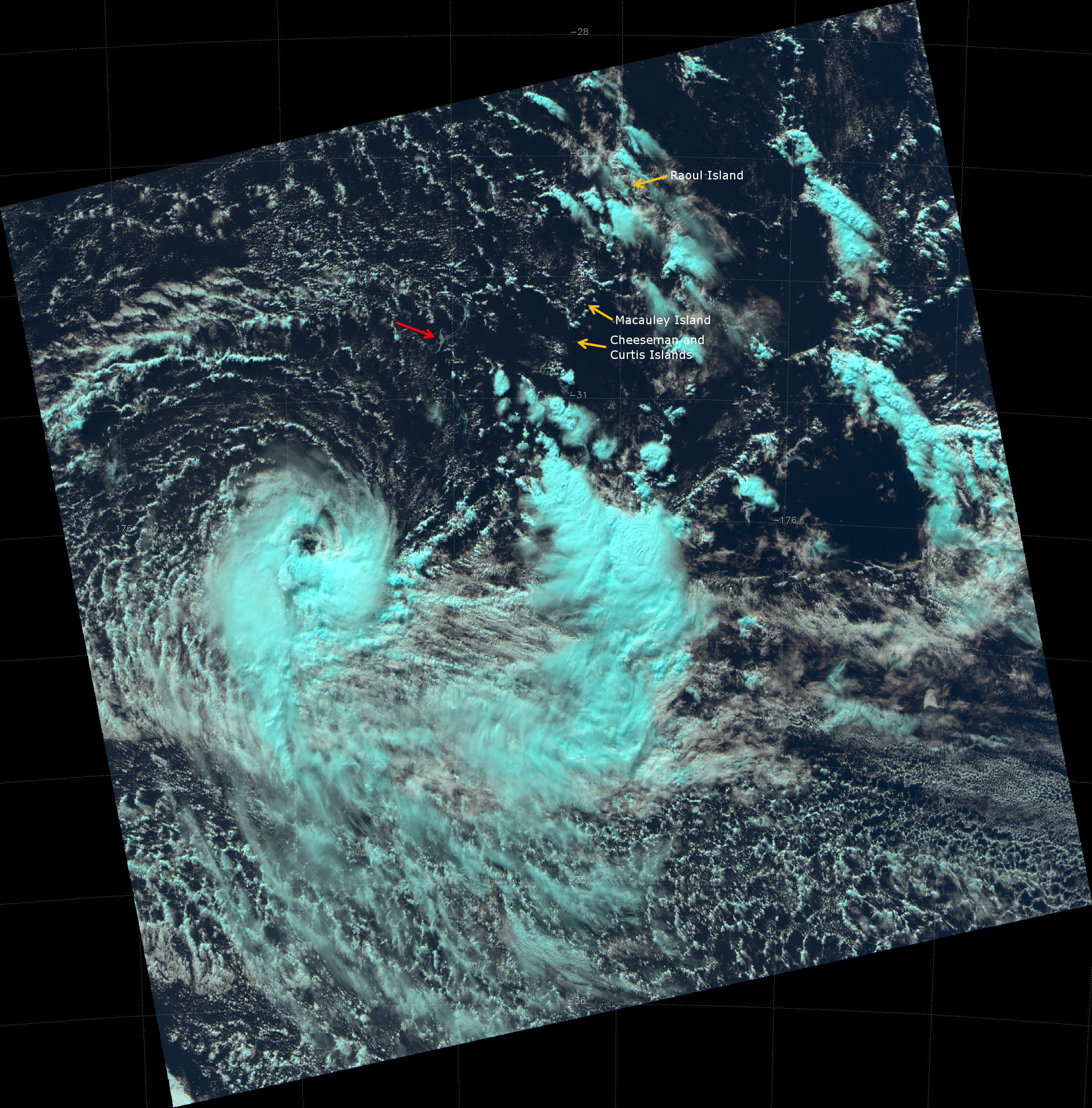
    Here is a “natural color” or “pseudo-true color” RGB composite of VIIRS channels I-01 (0.64 µm, blue), I-02 (0.865 µm, green) and I-03 (1.61 µm, red), taken at 01:40 UTC 27 August 2012. Notice anything unusual in the water?

    False color RGB composite of VIIRS channels I-01, I-02 and I-03, taken 01:40 UTC 27 August 2012

    As always, click on the image, then on the “2798×2840” link below the banner to see the full resolution image. All those pale blue-gray swirls in the ocean surrounding Raoul Island and Macauley Island are the pumice rafts. They almost look like someone sprayed “Silly String” in the ocean.

    To get a sense of the scale of these rafts, the latitude lines plotted on the image are ~111 km apart. Some of these rafts are 1-2 km wide in places. In this image you can see pumice rafts stretching from about 27.5 °S to 31.5 °S latitude and from about 175 °W to 178 °E longitude. That is a lot of floating rocks!

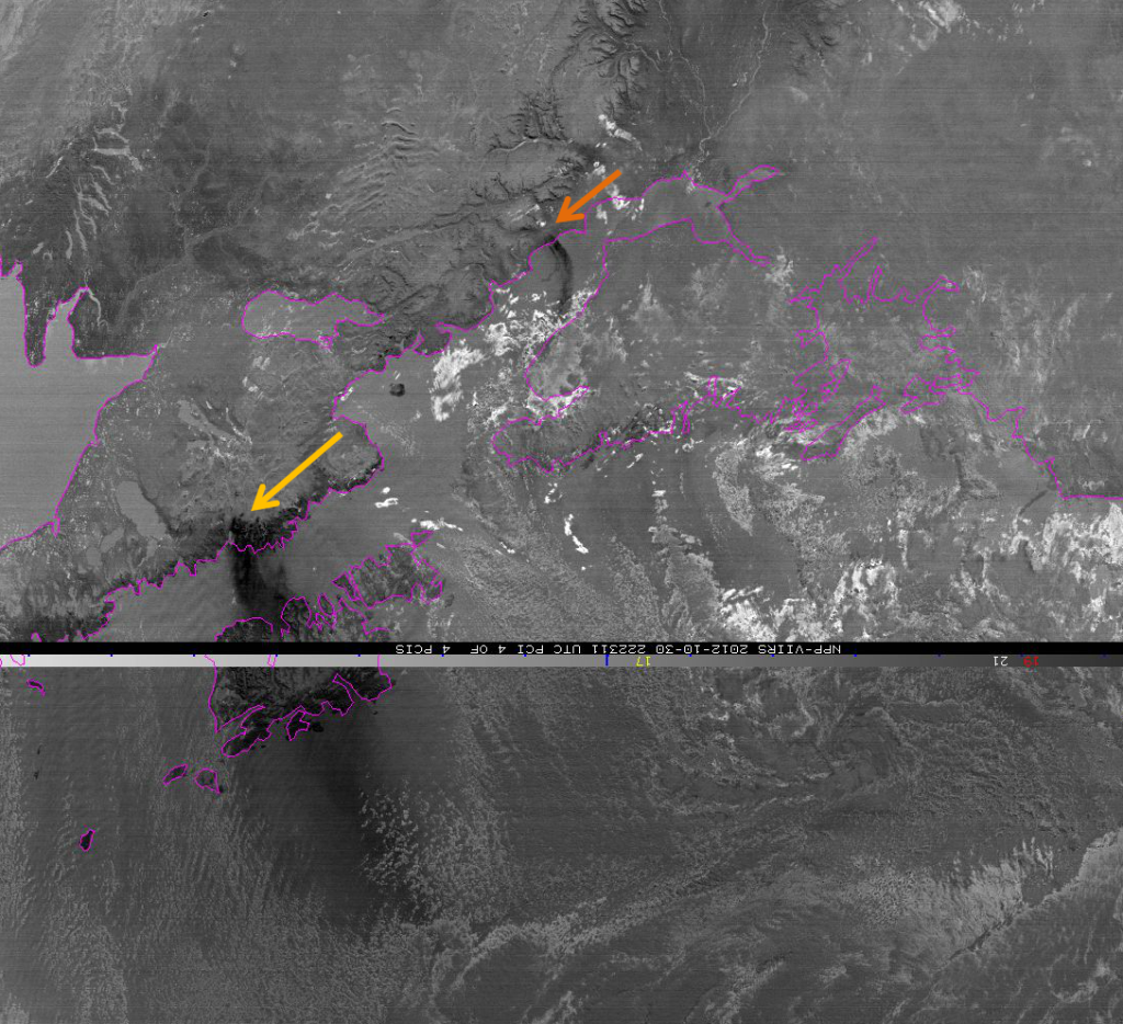
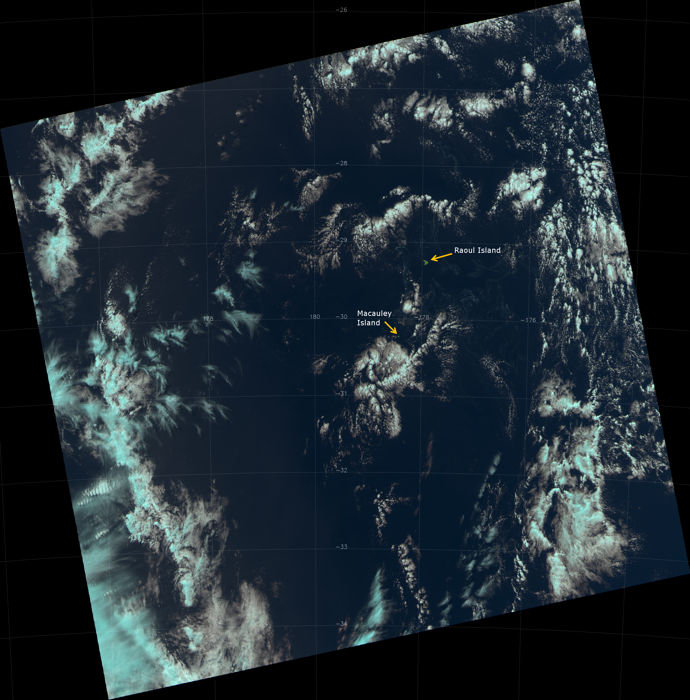
    Here is a zoomed version of the previous image:

    False color RGB composite of VIIRS channels I-01, I-02 and I-03, taken 01:40 UTC 27 August 2012

    The main concentration of floating pumice is in the box the covers the area from 29 °S to 30 °S latitude and from about 176 °W to 178 °E longitude, although there is plenty of pumice south of that box – it’s just a little harder to see.

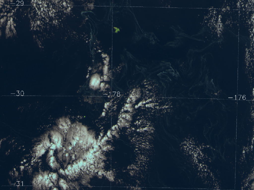
    As an aside, Raoul and Macauley islands are part of the Kermadec Islands of New Zealand. If you’re interested, the New Zealand government is always looking for volunteers to spend six months on Raoul Island pulling weeds and keeping invasive species off the island. (There, that saves me from doing a Remote Island post to cover this.)

    These pumice rafts have been traced back to the eruption of the Havre Seamount (an underwater volcano) on 18 July 2012. This new eruption is part of the “Ring of Fire” in the southwestern part of the Pacific Ocean, roughly 1,000 kilometers northeast of New Zealand. If you believe the Wikipedia article linked to first in this paragraph, the eruption was unknown until an aircraft passenger took pictures of the pumice raft from her plane on 31 July 2012. I have been able to track this pumice back to 26 July 2012. Before that, it is too cloudy, making it difficult to see anything. (Apparently, MODIS saw it on 19 July 2012.)

    The red arrow points to the pumice raft. There’s a nice looking cyclone southwest of the pumice, but I’m not sure if it was given a name. If you zoom in, you can see Cheeseman Island and Curtis Island off to the east of the raft. These islands were obscured by clouds on the 27 August 2012 overpass. Cheeseman Island is only 7.6 ha (19 acres) and Curtis Island is 40 ha (99 acres), yet VIIRS has the resolution to see them!

    In an effort to highlight these pumice rafts, a PCI analysis was performed on the five VIIRS high-resolution imagery (I-band) channels. PCI analysis uses principal components to identify the major modes of variability within the data. Analysis of the 5 VIIRS I-bands resulted in 5 PCIs or component images. Of those components, PCI-2, 3, and 5 appeared to show the pumice rafts. A particular RGB combination of those three components (red = PCI-5, green = PCI-2 and blue = PCI-3) resulted in the pumice appearing red on a green-blue ocean. Clouds are white, then cyan and then red for colder cloud-top temperatures. (Certain pepper-like black pixels are out of range in the PCI analysis.) The three principal components that highlight the pumice rafts are shown in the figure below, along with the resulting RGB composite. Unfortunately, these images were made using McIDAS-X, which has a habit of plotting VIIRS data upside-down. Therefore, north in each image is at the bottom.

    PCI Analysis of the 5 VIIRS I-band channels from 01:40 UTC 27 August 2012

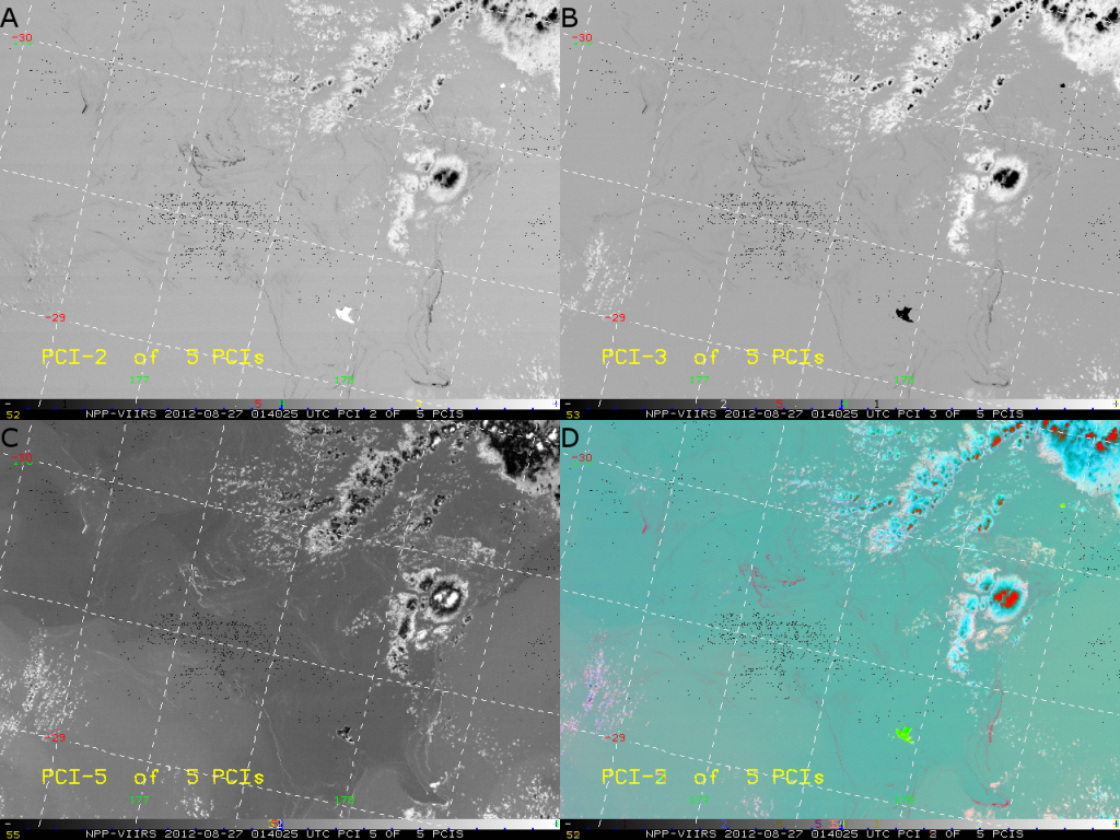
    This in an image you’ll want to zoom in on to see the details as you consider the information in the previous paragraph. There are two main results of this PCI analysis: it can be used to highlight pumice rafts (although they have the same color as cold cloud tops) and the temperature information from channel I-5 (11.5 µm), which shows up in PCI-5, indicates that the pumice has a tendency to collect along gradients in sea surface temperature.

    Being able to track the pumice rafts is important for geology, biology and oceanography. They can act as a tracer for following ocean currents. Some of them crack and fill with water, causing them to sink to the bottom, depositing the newly formed rock in other parts of the sea floor. The nature of the pumice gives clues about what happens in underwater volcanoes, a process that is not well known at this point. And, as these floating pieces of pumice are carried around, organisms like algae, coral, and barnacles will attach to them and grow, eventually settling in far away places. Studying these rafts may shed new light on how life can spread across the oceans.

    So, yes – rocks can float. And they can be seen by a weather satellite with 375 m resolution.

  • Copahue, the Stinky Volcano

    On the border between Chile and Argentina sits the volcano Copahue. (If you say it out loud, it is pronounced “CO-pa-hway”.) In the local Mapuche language, copahue means “sulfur water”.  This name was given to the volcano as the most active crater contains a highly acidic lake full of sulfur.  An eruption in 1992 filled the area with “a strong sulfur smell.” Later eruptions have involved “pyroclastic sulfur” (molten hot sulfur ash) and highly acidic mudflows. That doesn’t sound very pleasant.

    Right before Christmas, Copahue was at it again. It erupted on 22 December 2012, sending a cloud of sulfur ash into the atmosphere, and MODIS got there first. VIIRS got there 4 hours later and took this image:

    VIIRS "true color" RGB composite of channels M-03, M-04 and M-05, taken 18:38 UTC 22 December 2012
    VIIRS "true color" RGB composite of channels M-03, M-04 and M-05, taken 18:38 UTC 22 December 2012

    This is a “true color” image just like the MODIS one in the link. Make sure you click on the image, then on the “3200×2304” link below the banner to see it in full resolution. Then see if you can spot the volcanic ash cloud from Copahue. I’ll give you a hint: it’s the only cloud that appears brownish-gray.

    If you still can’t see it, here’s a zoomed-in image with a yellow arrow to help you out:

    VIIRS "true color" RGB composite of the Copahue volcano, taken 18:38 UTC 22 December 2012
    VIIRS "true color" RGB composite of the Copahue volcano, taken 18:38 UTC 22 December 2012

    Now compare the ash cloud in the VIIRS image with the ash cloud in the MODIS image from 4 hours earlier. (This is easier to do if you can locate in the VIIRS image the lakes marked as “Embalse los Barreales” in the MODIS image.) There’s a lot less ash in the VIIRS image, right?

    Not so fast. As the ash dispersed, the plume thinned out, making it harder to see against the brown background surface. But, that doesn’t mean that it’s not there. Here’s the “split window difference” image from VIIRS at the same time:

    VIIRS "split window difference" image (M-15 - M-16) taken 18:38 UTC 22 December 2012
    VIIRS "split window difference" image (M-15 – M-16) taken 18:38 UTC 22 December 2012

    That whole black plume is volcanic ash detected by the split window difference. The yellow arrow points to Copahue and the ash plume that is visible in the true color image. The red arrow points to the ash plume that is not visible in the true color image, yet is detected by this simple channel difference (M-15 minus M-16). A victory for the split window technique!

    It was also a victory for the EUMETSAT Dust RGB, which didn’t work for the 100-year-old ash cloud over Alaska. Here’s what that RGB composite looks like when applied to VIIRS:

    EUMETSAT's Dust RGB composite applied to VIIRS from 18:38 UTC 22 December 2012
    EUMETSAT's Dust RGB composite applied to VIIRS from 18:38 UTC 22 December 2012

    It is interesting that the ash plume right over Copahue is tough to detect in this RGB composite because it is red, just like a lot of the other clouds. As the plume thins out away from the volcano, its color changes to a variety of pastels of pink and blue, and even appears to extend out over the Atlantic Ocean. Where clouds and ash coexist near the coast of Argentina, pixels show up orange and yellow and green (click to the high-resolution image to see that).

    Why does the plume appear to extend into the Atlantic Ocean in the EUMETSAT Dust RGB, and not in the split window difference? It is due to the fact that the Dust RGB uses channel M-14 (8.55 µm), which is sensitive to absorption by sulfur dioxide (SO2) gas. The split window difference is better at detecting sulfuric ash particles, which may have mostly settled out of the atmosphere before reaching the Atlantic coast. There are likely still some ash particles in the plume, though – just not enough to show up easily in the split window difference. Detection of SO2 gas plumes has been used to infer the presence of volcanic ash.

    Being able to see the location of the volcanic ash very important to pilots. Aircraft engines don’t work that well when they are sucking in particles of liquified sulfur and other abrasive and corrosive materials spit out by stinky volcanoes like Copahue.

  • End of Autumn in the Alps

    Much of the United States has had a below-average amount of snow this fall (and below-average precipitation for the whole year). Look at how little snow cover there was in the month of November. Parts of Europe, however, have seen snow. It’s nice to know that it’s falling somewhere. But, can you tell where?

    Here is a visible image (0.6 µm) from Meteosat-9, taken 12 December 2012 (at 12:00 UTC):

    Meteosat-9 visible image of central Europe, taken 12:00 UTC 12 December 2012
    Meteosat-9 visible image of central Europe, taken 12:00 UTC 12 December 2012. Image courtesy EUMETSAT.

    And here’s the infrared image (10.8 µm) from the same time:

    Meteosat-9 IR-window image of central Europe, taken 12:00 UTC 12 December 2012
    Meteosat-9 IR-window image of central Europe, taken 12:00 UTC 12 December 2012. Image courtesy EUMETSAT.

    These are images provided by EUMETSAT. Can you tell where the snow is? Or what is snow and what is cloud?

    Here’s a much higher resolution image from VIIRS (zoomed in the Alps), taken only 3 minutes later:

    VIIRS visible image of central Europe, taken 12:03 UTC 12 December 2012
    VIIRS visible image (channel I-01) of central Europe, taken 12:03 UTC 12 December 2012

    Now is it easy to differentiate clouds from snow? Just changing the resolution doesn’t help that much.

    This has long been a problem for satellites operating in visible to infrared wavelengths. Visible-wavelength channels detect clouds based on the fact that they are highly reflective (just like snow). Infrared (IR) channels are sensitive to the temperature of the objects they’re looking at, and detect clouds because they are usually cold (just like snow). So, it can be difficult to distinguish between the two. If you had a time lapse loop of images, you’d most likely see the clouds move, while the snow stays put (or disappears because it is melting). But, what if you only had one image? What if the clouds were anchored to the terrain and didn’t move? How would you detect snow in these cases?

    EUMETSAT has developed several RGB composites to help identify snow. The Daytime Microphysics RGB (link goes to PowerPoint file) looks like this:

    Meteosat-9 "Daytime Microphysics" RGB composite of central Europe, taken 12:00 UTC 12 December 2012
    Meteosat-9 “Daytime Microphysics” RGB composite of central Europe, taken 12:00 UTC 12 December 2012. Image courtesy EUMETSAT.

    Snow is hot pink (magenta), which shows up pretty well. Clouds are a multitude of colors based on type, particle size, optical thickness, and phase. That whole PowerPoint file linked above is designed to help you understand all the different colors.

    The Daytime Microphysics RGB uses a reflectivity calculation for the 3.9 µm channel (the green channel of the RGB). Without bothering to do that calculation, I’ve replaced the reflectivity at 3.9 µm with the reflectivity at 2.25 µm (M-11) when applying this RGB product to VIIRS, and produced a similar result:

    VIIRS "Daytime Microphysics" RGB composite of the Alps, taken 12:03 UTC 12 December 2012
    VIIRS “Daytime Microphysics” RGB composite of the Alps, taken 12:03 UTC 12 December 2012

    Except for the wavelength difference of the green channel (and minor differences between the VIIRS channels and Meteosat channels), everything else is kept the same as the official product definition. Once again, the snow is pink, in sharp contrast to the clouds and the snow-free surfaces. We won’t bother to show the Nighttime Microphysics/Fog RGB (link goes to PowerPoint file) since this is a daytime scene.

    EUMETSAT has also developed a Snow RGB (link goes to PowerPoint file):

    Meteosat-9 "Snow" RGB composite of central Europe, taken 12:00 UTC 12 December 2012
    Meteosat-9 “Snow” RGB composite of central Europe, taken 12:00 UTC 12 December 2012. Image courtesy EUMETSAT.

    This also uses the reflectivity calculated for the 3.9 µm channel. Plus, it uses a gamma correction for the blue and green channels. Is it just me, or does snow show up better in the Daytime Microphysics RGB?

    If you switch out the 3.9 µm for the 2.25 µm channel again and skip the gamma correction when creating this RGB composite for VIIRS, the snow stands out a lot more:

    VIIRS "Snow" RGB (with modifications as explained in the text), taken 12:03 UTC 12 December 2012
    VIIRS “Snow” RGB (with modifications as explained in the text), taken 12:03 UTC 12 December 2012

    Now you have snow ranging from pink to red with gray land areas, black water and pale blue to light pink clouds. This combination of channels makes snow identification easier than the official “Snow RGB”, I think.

    All of this is well and good but, for my money, nothing beats what EUMETSAT calls the “natural color” RGB. I have referred to it as the “pseudo-true color“. Here’s the low-resolution EUMETSAT image:

    Meteosat-9 "Natural Color" RGB of central Europe, taken 12:00 UTC 12 December 2012. Image courtesy EUMETSAT.
    Meteosat-9 “Natural Color” RGB of central Europe, taken 12:00 UTC 12 December 2012. Image courtesy EUMETSAT.

    And the higher resolution VIIRS image:

    VIIRS "Natural Color" RGB of central Europe, taken 12:03 UTC 12 December 2012
    VIIRS “Natural Color” RGB composite of channels M-5, M-7 and M-10, taken 12:03 UTC 12 December 2012

    The VIIRS image above uses the moderate resolution channels M-5, M-7 and M-10, although this RGB composite can be made with the high-resolution imagery channels I-01, I-02 and I-03, which basically have the same wavelengths and twice the horizontal resolution. Below is the highest resolution offered by VIIRS (cropped down slightly to reduce memory usage when plotting the data):

    VIIRS "Natural Color" RGB composite of channels I-01, I-02 and I-03, taken 12:03 UTC 12 December 2012
    VIIRS “Natural Color” RGB composite of channels I-01, I-02 and I-03, taken 12:03 UTC 12 December 2012

    Make sure to click on the image and then on the “2594×1955” link below the banner to see the image in full resolution.

    This RGB composite is easier on the eyes and easier to understand. Snow has high reflectivity in M-5 (I-01) and M-7 (I-02) but low reflectivity in M-10 (I-03) so, when combined in the RGB image, it shows up as cyan. Liquid clouds have high reflectivity in all three channels so it shows up as white (or dirty, off-white). The only source of contention is that ice clouds, if they’re thick enough, will also show up as cyan.

    Except for the cyan snow and ice, the “natural color” RGB is otherwise similar to a “true color” image. Vegetation shows up green, unlike the other RGB composites where it has been gray or purple or a very yellowish green. That makes it more intuitive for the average viewer. You don’t need to read an entire guide book to understand all the colors that you’re seeing.

    Compare all of these RGB composites against the single channel images at the top of the page. They all make it easier to distinguish clouds from snow, although some work better than others. Now compare the VIIRS images with the Meteosat images. Which ones look better?

    (To be fair, it’s not all Meteosat’s fault. The images provided by EUMETSAT are low-resolution JPG files [which is a lossy-compression format]. The VIIRS images shown here are loss-less PNG files, which are much larger files to have to store and they require more bandwidth to display.)

    As a bonus (consider it your Christmas bonus), here are a few more high-resolution “natural color” images of snow and low clouds over the Alps. These are kept at a 4:3 width-to-height ratio and a 16:9 ratio, so they make ideal desktop wallpapers.

    VIIRS "natural color" composite of channels I-01, I-02 and I-03, taken 12:29 UTC 14 November 2012
    VIIRS “natural color” composite of channels I-01, I-02 and I-03, taken 12:29 UTC 14 November 2012. This is an ideal desktop wallpaper for 4:3 ratio monitors.

    That was the 4:3 ratio image. Here’s the 16:9 ratio image:

    VIIRS "natural color" composite of channels I-01, I-02 and I-03, taken 12:29 UTC 14 November 2012
    VIIRS “natural color” composite of channels I-01, I-02 and I-03, taken 12:29 UTC 14 November 2012. This is an ideal desktop wallpaper for 16:9 ratio monitors.

    Enjoy the snow (or be glad you don’t have to drive in it)!

  • The Case of the 100-year-old Ash Cloud

    Lost in all the commotion caused by Hurricane Sandy, a curious event occurred on the other side of the country on 30 October 2012. A cloud of ash obscured the skies of Kodiak Island, Alaska, diverting flights in the region and forcing the people of Kodiak to stay inside or wear masks. Alaska has quite a few volcanoes, so this may not be a big thing to them except, this was no ordinary volcanic eruption: it was the leftovers of a volcanic eruption from 100 years ago!

    The volcano that came to be known as Novarupta erupted on 6 June 1912. It was one of the largest volcanic eruptions of recorded history. It was 10 times more powerful than Mt. St. Helens with 100 times more ash. The explosion was heard more than 1100 km (700 miles) away in Juneau. The force of the eruption caused nearby Mt. Katmai to collapse on itself (10 km away). It formed the Valley of Ten Thousand Smokes and, most importantly for us, covered the surrounding land with 150 m (500 ft) of ash.

    This pile of ash – still there today – can be lifted by a stiff breeze (or, more appropriately, “strong breeze” or higher on the Beaufort wind scale), and blown pretty high off the ground (4000 ft according to the news report). This isn’t the first time this has happened. MODIS observed the same thing back in 2003.

    So, what did VIIRS see? Here’s the “true color” image, the RGB composite of channels M-03 (0.488 µm, blue), M-04 (0.555 µm, green) and M-05 (0.672 µm, red):

    VIIRS "true color" RGB composite of channels M-03, M-04 and M-05, taken 22:23 UTC 30 October 2012
    VIIRS "true color" RGB composite of channels M-03, M-04 and M-05, taken 22:23 UTC 30 October 2012

    Be sure (as with all the images) to click on the image, then on the link below the banner to see it at full resolution. (The link contains the dimensions of the full size image.)

    The ash cloud (blowing right over the center of Kodiak Island) is not as obvious in this image as it was in the MODIS image in the link above, although it is visible. To be fair, the plume was much more optically thick in 2003, and there were fewer clouds and less snow to confuse it with.

    Here is the false color (“pseudo-true color” or “natural color”) image, the RGB composite of channels M-05 (0.672 µm, blue), M-07 (0.865 µm, green) and M-10 (1.61 µm, red):

    VIIRS false color RGB composite of channels M05, M-07 and M-10, taken 22:23 UTC 30 October 2012
    VIIRS false color RGB composite of channels M05, M-07 and M-10, taken 22:23 UTC 30 October 2012

    Hmmm. Once again, the ash plume is visible but not particularly noticeable. Is there a way to highlight the ash plume to make it easier to see?

    EUMETSAT (the European Organisation for the Exploitation of Meteorological Satellites) has defined an RGB composite for detecting dust. Their product, which was developed primarily to detect dust storms over the Saharan desert, uses channels that are present (or similar to ones that are present) on VIIRS. This means we can apply the dust product for VIIRS as the difference between M-16 and M-15 (red), the difference between M-15 and M-14 (green) and M-15 by itself (blue), all in units of brightness temperature. If you do that, and use the same color scaling they use, you get this image:

    The EUMETSAT Dust RGB composite applied to VIIRS for 22:23 UTC 30 October 2012
    The EUMETSAT Dust RGB composite applied to VIIRS for 22:23 UTC 30 October 2012

    The arrow points to the source region of the ash plume. In this RGB composite, dust shows up as hot pink (magenta), but it’s barely visible here. The reason is that this dust product is primarily useful where there is a large temperature contrast between the dust plume and the background surface, which we don’t have here.

    A more common way to detect volcanic ash is to use the “split-window difference”. The “split-window difference” is the difference in brightness temperature between a 10.7-11.0 µm channel and a 12.0 µm channel. This difference is useful because volcanic ash has a difference of opposite sign to most everything else. Here’s what the split window difference (M-15 – M-16) looks like for this case:

    VIIRS "Split-window difference" image from 22:23 UTC 30 October 2012
    VIIRS "Split-window difference" image from 22:23 UTC 30 October 2012

    This image has been scaled so that the colors range from -1 K (black) to +7 K (white). The ash plume stands out a bit more here by being much darker than the background. The only problem is, it isn’t perfect. Large amounts of water vapor, optically thick clouds, desert surfaces and boundary layer temperature inversions can all produce a negative difference (just like volcanic ash does).

    These problems can be overcome to a certain extent by combining the “split-window difference” with a Principal Component Image (PCI) analysis technique. (This technique is too complicated to describe here but, if you have access to AMS journals, check out these journal papers.) Now, the ash plume is the only thing that’s black:

    VIIRS PCI analysis image from 22:23 UTC 30 October 2012
    VIIRS PCI split window analysis image from 22:23 UTC 30 October 2012. Image courtesy Don Hillger. Upside-down text courtesy McIDAS-X.

    Notice the smaller plume identified by the orange arrow. This plume is not easy to identify in any of the previous images. The PCI technique works well. But, we’re not going to stop there.

    Remember the dust plumes off the Cape Verde islands? They produced a strong signal in the difference between M-12 (3.7 µm) and M-15 (10.7 µm) due to solar reflection. Does a 100-year-old ash plume produce a similarly strong signal? See for yourself:

    VIIRS channel difference image between M-12 and M-15 from 22:23 UTC 30 October 2012
    VIIRS channel difference image between M-12 and M-15 from 22:23 UTC 30 October 2012

    It does produce a signal, but it’s not as bright as the surrounding clouds. The color scale here ranges from -2 K (black) to +90 K (white).

    M-06 (0.746 µm) is highly sensitive to anything that reflects solar radiation in the atmosphere or on the surface, which we learned from Hurricane Isaac. Here’s what the M-06 image looks like:

    VIIRS channel M-06 image, taken 22:23 UTC 30 October 2012
    VIIRS channel M-06 image, taken 22:23 UTC 30 October 2012

    “Big deal,” you say. “None of those are better than the PCI analysis.” That may be true, but watch what happens when we combine M-06, the M-12 – M-15 image and the split-window difference image in a single RGB composite:

    VIIRS RGB composite of M06 (blue), M12 - M15 (green) and M15 - M16 (red), taken 22:23 UTC 30 October 2012
    VIIRS RGB composite of M06 (blue), M12 – M15 (green) and M15 – M16 (red), taken 22:23 UTC 30 October 2012

    In this composite, blue values represent the M-06 reflectance scaled from 0 to 1.6, green values represent the brightness temperature difference between M-12 and M-15 scaled from -2 K to +90 K, and red values represent the brightness temperature difference between M-15 and M-16 scaled from -1 K to +7 K.

    From a theoretical perspective, this RGB composite does exactly what you want: make the thing you’re trying to detect the only thing that is a certain color. For example, the ash plumes are the only things in this image that are green. From a practical perspective, however, this RGB composite doesn’t work so well. It only works because the ash plume is over water (otherwise M-06 wouldn’t be very useful). It only works during the day, where M-06 is available and the difference between M-12 and M-15 is significant (no solar component to M-12 at night).

    Plus, the rainbow of colors is difficult to make sense of: green ash; clouds ranging from light blue to purple to orange (a function of optical thickness, particle size, and phase); bright purple snow; dark purple vegetation; maroon water. It’s not exactly pleasing to the eye. In contrast, the PCI analysis technique that uses the split-window difference works day and night, over ocean and over land. And it isn’t confusing to look at. Maybe we should have stopped when we got to the PCI technique. But then, we wouldn’t have learned anything new.

  • Remote Islands, part III: Îles Kerguelen and Heard Island


    At 10 o’clock the Captain was walking on deck and saw what he supposed to be an immense iceberg. … the atmosphere was hazy, and then a heavy snow squall came up which shut it out entirely from our view. Not long after the sun shone again, and I went up again and with the glass, tried to get an outline of it to sketch its form. The sun seemed so dazzling on the water, and the tops of the apparent icebergs covered with snow; the outline was very indistinct. We were all the time nearing the object and on looking again the Captain pronounced it to be land. The Island is not laid down on the chart, neither is it in the Epitome, so we are perhaps the discoverers, … I think it must be a twin to Desolation Island, it is certainly a frigid looking place.

    VIIRS false color composite of channels I-01, I-02 and I-03, taken 09:16 UTC 27 October 2012

    The text above was the journal entry of Isabel Heard, wife of the American Captain John Heard, on 25 November 1853. The couple was en route from Boston, Massachusetts to Melbourne, Australia (a long time to spend in a boat) and the land they spotted became known as Heard Island. It should be noted that “Desolation Island” refers to Îles Kerguelen, which has its own unique story of discovery.

    Kerguelen Island was discovered in 1772 by Yves-Joseph de Kerguelen de Trémarec, a French navigator commissioned by King Louis XV to discover the unknown continent in the Southern Hemisphere that he believed to be necessary to balance the globe. (Look at a globe or map of the world and notice that most of the land area is in the Northern Hemisphere.) Kerguelen himself never set foot on the island, but he told his king the island was inhabited and full of forests, fruits and untold riches. He called it “La France Australe” (Southern France). Captain Cook actually did land on the island a few years later and named it Desolation Island because it had none of that stuff, and King Louis XV imprisoned Kerguelen after his lie was discovered. Oops.

    Îles Kerguelen, made up of the main island (Kerguelen to us, La Grande Terre to the French) and the many small surrounding islands are part of the French Southern and Antarctic Lands (Terres Australes et Antarctiques Françaises or TAAF). Heard Island is part of the Australian territory of Heard Island and McDonald Islands (HIMI).

    These islands are in the “Roaring Forties” and “Furious Fifties”, the region of the Southern Ocean (southern Indian Ocean in this case) between 40 °S and 60 °S latitude. Get out your globe or world map once again and notice that there is very little land in this latitude range. This region is where strong, persistent westerly winds circle the globe. With no land in the way, there isn’t much to disturb this flow. The high winds almost always from the same direction create huge waves of 10 m (33 ft) or more. (Now imagine being John or Isabel Heard. Well, actually, if you suffer from sea-sickness you probably shouldn’t imagine it.) The cold winds flow over the relatively warmer waters of the ocean, forming persistent cloudiness. If you zoom in on the image above (click on the image, then on the “1893×1452” link below the banner for full resolution) you can see quite a bit of structure in the resulting “cloud streets“.

    The persistent cloudiness makes Kerguelen and Heard Island a rare sight from any satellite. We can see them here because the flow is stable and the islands are producing the equivalent of a “rain shadow” on the clouds. (It’s tempting to call it a “cloud shadow” but, since clouds actually do cast shadows, it would just confuse people.) If we zoom in on Kerguelen, this shows up more clearly:

    VIIRS false-color RGB composite of channels I-01, I-02 and I-03 taken 09:16 UTC 27 October 2012

    Notice how all the clouds are piling up on the west (windward) side of Kerguelen, where the highest mountains, are located. (These mountains are covered with snow and glaciers, as the cyan color indicates.) Could that be the equivalent of a bow shock near 68 °E longitude where there is an apparent crack in the clouds? On the leeward side of the island, downwind of the mountains, the air is descending, which prevents clouds from forming. Kerguelen created a hole in the clouds by disrupting the flow.

    Now, let’s zoom in on Heard Island:

    VIIRS false-color RGB composite of channels I-01, I-02 and I-03 taken 09:16 UTC 27 October 2012

    In addition to creating a hole in the clouds, Heard Island is creating all sorts of waves in the atmosphere. The ones you probably noticed first look like the wake created by a boat (and have the same basic cause). But, why do they start well out ahead of the island where the yellow arrow is pointing? Because those first waves are actually caused by the McDonald Islands (discovered by Capt. William McDonald in 1854). Even though the highest point on McDonald Island is only 186 m above mean sea level (610 ft), it’s enough to disrupt the flow.

    The highest point on Heard Island is Mawson Peak at 2745 m (9006 ft), which is actually the highest elevation in Australia. It is part of Big Ben, an active volcano that last erupted in 2008. This peak is creating a series of lenticular clouds in the above image. A patch of cirrus clouds also exists downwind of Heard Island (the more cyan colored clouds), although it is not clear if these clouds were formed by the waves caused by Heard Island.

    If you’re interested in visiting either of these islands, here are some other interesting facts: Kerguelen has a year-round population of ~100, almost all scientists. It has a permanent weather station and office maintained by Météo-France (France’s version of the National Weather Service), and the French version of NASA (CNES) has a station for launching rockets and monitoring satellites. Heard Island has no permanent residents. Every few years a scientific expedition sets out for the island to study the geology, biology, weather and climate of the island. The next one is planned for 2014 and is being called an “open source expedition”. There may still be time to join in if you’re looking for an adventure!