• Greenland Eddies and Swirls

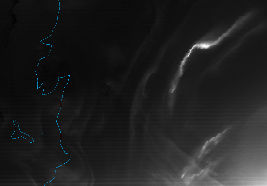
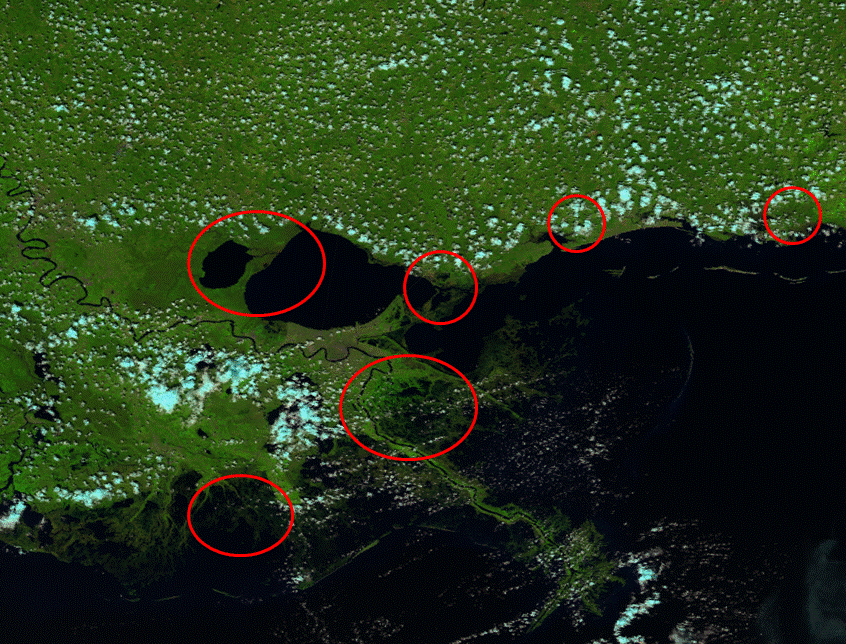
    Last time we visited Greenland, it was because VIIRS saw evidence of the rapid ice melt event in July 2012. We return to Greenland because of this visible image VIIRS captured on 18 October 2012:

    VIIRS channel I-01 image taken 12:43 UTC 18 October 2012
    VIIRS channel I-01 image taken 12:43 UTC 18 October 2012

    This image was taken by the high-resolution visible channel, I-01 (0.64 µm), and was cropped down to reduce the file size. Greenland is in the upper-left corner of the image. The northwest corner of Iceland is visible in the lower-left corner of the image.

    So, what’s with all the swirls off the coast of Greenland? Are they clouds swirled around by winds? Or some kind of sea serpent – perhaps a leviathan or a kraken? (Based on the descriptions, they would be big enough for VIIRS to see them.)

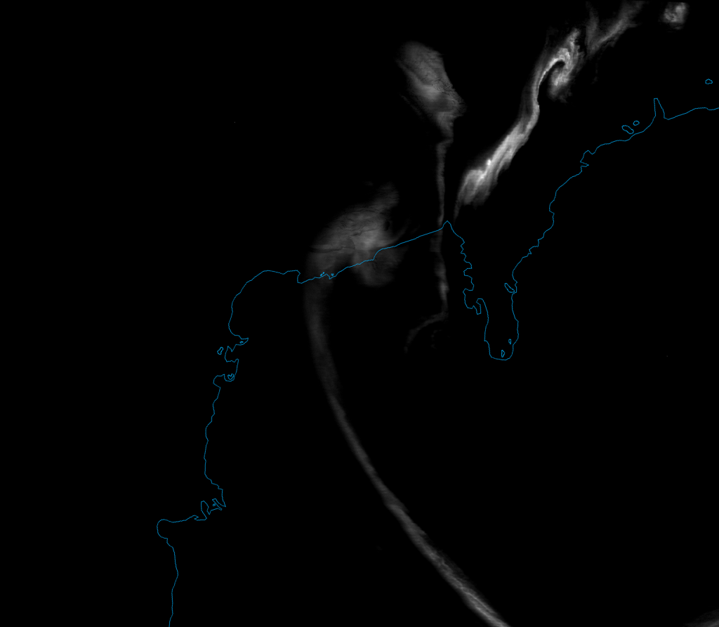
    Sadly, for all you science fiction and fantasy fanatics, those swirls are just icebergs breaking up as they enter warmer water, the chunks of ice caught up in eddies in the East Greenland Current. This is easier to see when you look at the “true color” image below:

    VIIRS "true color" RGB composite of channels M-3, M-4 and M-5, taken 12:43 UTC 18 October 2012
    VIIRS "true color" RGB composite of channels M-3, M-4 and M-5, taken 12:43 UTC 18 October 2012

    Make sure to click on the image, then on the “3200×1536” link below the banner to see the image at full resolution. Since the true color RGB composite is made from moderate resolution channels M-03 (0.488 µm, blue), M-04 (0.555 µm, green) and M-05 (0.672 µm, red), we can include more of the swath before we get into file size issues. That allows us to see the extent of the ice break-up along the Greenland coast.

    There is a lot to notice in the true color image. The large icebergs at the top of the image breakup into smaller and smaller icebergs as they float down the east coast of Greenland, until they finally melt. These visible “swirls” (or “eddies” in oceanography terms) extend from 75 °N latitude down to 68 °N latitude where the ice disappears (melts).

    The upper-right corner with missing data is on the night side of the “terminator” (the line separating night from day), where we lose the amount of visible radiation needed for these channels to detect stuff. (The Day/Night Band would still collect data, however, as it is much more sensitive to the low levels of visible radiation observed at night.)  See how the ice and the high clouds appear to get a bit more pink as you move from west (left) to east (right)? It’s the same reason cirrus clouds often look pink at sunset. The sun is setting on the North Atlantic and more of the blue radiation from the sun is scattered by the atmosphere than red radiation. The red radiation that’s left is then reflected off the clouds (and ice and snow) toward the satellite.

    Just to prove that the swirls are indeed ice and not clouds, here’s the “pseudo-true color” (a.k.a. “natural color”) RGB composite made from channels M-05 (0.672 µm, blue), M-07 (0.865 µm, green) and M-10 (1.61 µm, red):

    VIIRS natural color image of channels M-05, M-07 and M-10, taken 12:43 UTC 18 October 2012
    VIIRS natural color image of channels M-05, M-07 and M-10, taken 12:43 UTC 18 October 2012

    The deep blue color of the swirls in this RGB composite is indicative of ice, not clouds. These channels are not impacted by atmospheric scattering at any sun angle, though, so there is no change in the color of the clouds as you approach the terminator.

    You may have also noticed the cloud streets downwind of the icebergs off the coast of Greenland. These clouds are formed in the same way as lake-effect clouds are in the Great Lakes. Cold, arctic air flowing south over the icebergs meets the relatively warm water of the open ocean. The moisture evaporating from the warmer waters condenses in the cold air and forms clouds.

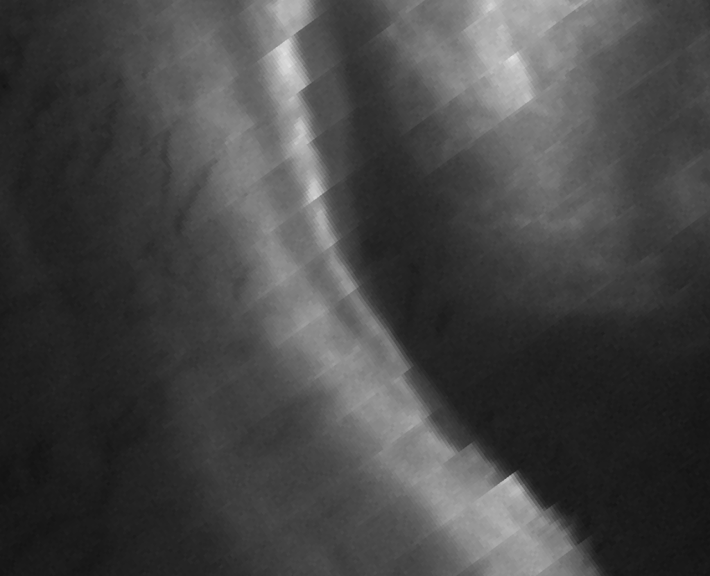
    How much warmer is that water? Here’s the high-resolution infrared (IR) image (I-05, 11.45 µm):

    VIIRS channel I-05 image, taken 12:43 UTC 18 October 2012
    VIIRS channel I-05 image, taken 12:43 UTC 18 October 2012

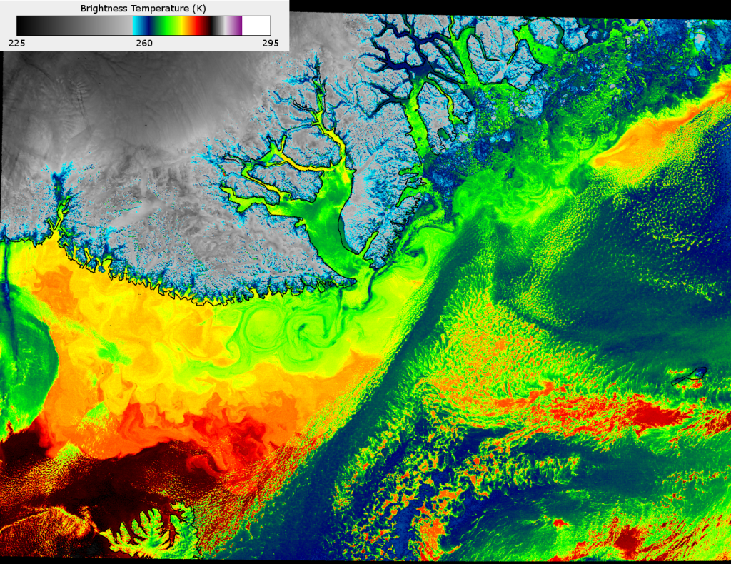
    At ~375 m resolution at nadir, this is the highest resolution available in the IR on a non-classified satellite today. Look at all the structure in the cloud-free areas of the ocean! Lots of little eddies show up in the IR that are invisible in the visible and near-IR channels shown previously. The only eddies visible in the true color and natural color images are the ones that had ice floating in them. Here we see they extend much further south than the ice.

    The ice-free water that is not obscured by clouds is 10-15 K warmer than where the icebergs are found. The eddies are caused by the clash between the southward flowing, cold Eastern Greenland Current and the northbound, warm North Atlantic Drift (the tail end of the Gulf Stream), which are important in the global transport of energy. They are not ship-sinking whirlpools caused by any krakens in the area – at least VIIRS didn’t observe any.


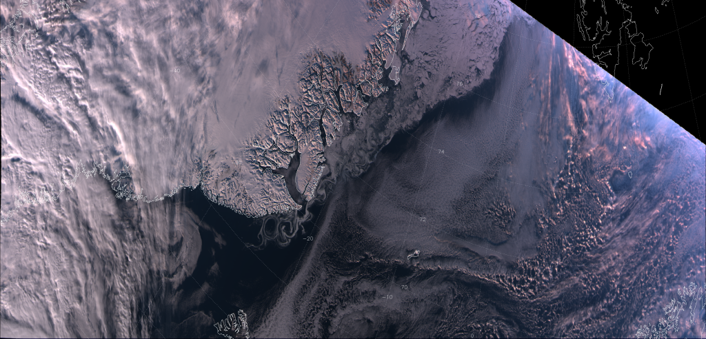
    UPDATE (February 2013): Below is another image of the eddies and swirls off the eastern coast of Greenland. This “natural color” image was taken 13:34 UTC 15 February 2013:

    VIIRS false color RGB composite of channels M-05, M-07 and M-10, taken 13:34 UTC 15 February 2013
    VIIRS false color RGB composite of channels M-05, M-07 and M-10, taken 13:34 UTC 15 February 2013. Image courtesy Don Hillger.

    Since it is winter, the ice extends further south along the coast before it melts. Once again, there is a lot of structure visible in the edge of the ice, where the East Greenland Current and North Atlantic Drift interact. Another thing to notice is the shadows. At the top of the image just right of center is Scoresby Sound, which is completely frozen over. Given that the sun is pretty low in the sky over Greenland in the winter (if it rises at all, since most of Greenland is north of the Arctic Circle), the mountains south of the Sound cast some pretty long shadows on the ice. It’s possible to use the length of the shadows with the solar zenith angle to estimate the height of those mountains (although there are more accurate ways to determine a mountain’s elevation from satellite). VIIRS provides impressive detail, even from the moderate resolution bands.

  • Aurora Australis from the Day-Night Band

    How fast does an aurora move? I “googled” it, and got answers ranging from “fast” to “very fast”. Not very scientific. It also doesn’t help that the majority of aurora videos on the Internet are time-lapse footage, and there’s no way to know how fast the footage has been sped up. Although, I did find this video that claims to be real-time footage:

    When the camera is still, you could try to calculate the speed of some of the aurora elements if you knew where the cameraman was, what stars were in the view (and how far apart they are), and how high up (or how far away) the aurora was at that time. All information that I don’t have.

    What if I said we could estimate the speed of the aurora by examining VIIRS Day/Night Band (DNB) images?

    Here’s a DNB image of the aurora australis (a.k.a. Southern Lights) over Antarctica, taken on 1 October 2012:

    VIIRS DNB image of the aurora australis, taken 00:22 UTC 1 October 2012
    VIIRS DNB image of the aurora australis, taken 00:22 UTC 1 October 2012

    Compare this image with the images of the aurora borealis shown back in March 2012. Something doesn’t look right. Far from looking like smooth curtains of light, the aurora (particularly the brightest one) has a jagged appearance, like a set of steps. (This is easier to notice if you click on the image to see it in higher resolution.) This is because the aurora wouldn’t stay still, and we can use this information to estimate the speed it was moving.

    The stripes that you see in the image are a caused by the 16 detectors that comprise the DNB which, for various reasons, don’t have exactly the same sensitivity to light. (This condition is given a super-scientific name: “striping”.) The DNB senses light from the Earth by having a constantly rotating mirror reflect light onto these detectors. One rotation of the mirror (particularly the part that occurs within the field of view of the sensor) comprises one scan. Each detector comprises one row of pixels in each scan, each with 742 m x 742 m resolution at nadir. There are 48 scans in one “granule” (the amount of data transmitted in one data file), and it takes ~84 seconds to collect the data that make up one granule. That means it takes ~1.75 seconds per scan.

    If you watch that video again, you’ll notice that the aurora can move quite a bit in 2 seconds. Now, let’s zoom in much more closely on one of the aurora elements:

    Zoomed-in VIIRS DNB image of an aurora, taken 00:22 UTC 1 October 2012
    Zoomed-in VIIRS DNB image of an aurora, taken 00:22 UTC 1 October 2012

    This image has been rotated relative to the original image, in case you were wondering why it doesn’t seem to match up with the first image. The brightest pixels are where the brightest aurora elements were located. The “steps” (or “shifts” as they are typically called) occur every 16 pixels, which mark out the end of one scan and the beginning of the next.  If you count the number of pixels that the brightest aurora elements shifted from one scan to the next, it varies from about 6 to 10 pixels. Assuming a constant resolution of 742 m per pixel along the scan (which isn’t exactly true, the resolution degrades a little bit as you get closer to the edge of the scan but not by much), that means this particular aurora element moved somewhere between ~4.5 and ~7.5 km in ~1.75 seconds from one scan to the next. Doing the math (don’t forget to carry the 1), that comes out to somewhere between 9000 and 15,000 km h-1 (rounded to account for possible sources of error), which I guess counts as “very fast”. But, it’s not as fast as the coronal mass ejections that create auroras. They have an average speed of 489 km s-1 (1,760,000 km h-1)!

    So, what looks like an oddity in the VIIRS image, actually contains some interesting scientific information about the speed of an “active aurora“.

    But, we’re not done yet. Let’s get back to the striping. Along with “stray light”, it’s one of the few remaining issues in VIIRS imagery. Stray light, which you can see evidence of in the lower right corner of first aurora image, is a particular problem in the DNB. It occurs when sunlight is reflected onto the detectors when the satellite is on the nighttime side of the Earth, but close to the edge of the day/night “terminator“. Our colleagues at Northrup Grumman have been working on a correction to stray light that also reduces the striping. This correction allows for much better viewing of auroras, which have a tendency to occur right where stray light is an issue.

    Here is an image of another aurora over Antarctica, taken on 15 September 2012, corrected for stray light and striping:

    VIIRS DNB image of the aurora australis over Antarctica, taken 18:56 UTC 15 September 2012
    VIIRS DNB image of the aurora australis over Antarctica, taken 18:56 UTC 15 September 2012. The data used in this image was corrected for stray light and striping by Stephanie Weiss (Northrup Grumman).

    This was the night of a new moon, so the only light in the scene (once the stray light is taken out) is the aurora. (OK, there may be some “air glow” and starlight. But, it doesn’t show up on this brightness scale.)

    This aurora was a lot less “active” so it looks more like smooth curtains of light. Although, when you zoom in on the brightest swirl in the upper right corner, you can see it did move 3-5 pixels between scans:

    VIIRS DNB image of the aurora australis, taken 18:56 UTC 15 September 2012
    VIIRS DNB image of the aurora australis over Antarctica, taken 18:56 UTC 15 September 2012. This image has been zoomed in and rotated relative to the previous image of the same aurora. The data used in this image was corrected for stray light and striping by Stephanie Weiss (Northrup Grumman).

    This translates to 4000 to 8000 km h-1, which still counts as “fast” even if it doesn’t count as “very fast”. See, Google was right! Auroras do move anywhere from “fast” to “very fast”. But, now we at least have an estimate to quantify that speed.

    And, in case you were wondering, these estimates of the speed of auroras are consistent with earlier observations. According to the book Aurora and Airglow by B. McCormac (1967), the typical speed of auroras is between 0 and 3 km s-1  (up to 10,800 km h-1). So, it appears that VIIRS does give a reasonable estimate about the speed of an aurora. We just happened to catch one “typical” aurora and one “faster than typical” aurora.

  • The Outback on Fire

    I’m not talking about a Subaru. I’m talking about the vast expanse of sparsely-populated Australia. We’ve already seen fires in the United States, Russia and the Canary Islands. Well, they have been happening down under, too. (Is there any part of this planet not currently experiencing a drought?)

    Despite the risk of getting fire fatigue (“Another post about fires?” *yawn*), we’re going to look at these fires for two reasons. First, it gives me a chance to show off the “fire tornado” video clip that has been making the rounds on the Internet:

    Second, VIIRS saw the fire that produced the “fire tornado” (and a whole bunch of other fires) and it gives me a chance to show off the newly christened “Fire Temperature RGB”.

    First, let’s look at the boring (yet still valuable) way of detecting fires: identifying hot spots in a 3.9 µm image. Here’s what VIIRS channel M-13 (4.0 µm) saw over Australia on 19 September 2012:

    VIIRS channel M-13 image of central Australia, taken 04:34 UTC 19 September 2012
    VIIRS channel M-13 image of central Australia, taken 04:34 UTC 19 September 2012

    Pixels hotter than 350 K show up as black in this image. Given this information, how many fires can you see? (Hint: click on the image, then on the “3200×1536” link below the banner to see the image at full resolution. And, no, wise guy – you don’t count all the black pixels outside the boundaries of the data.)

    Here’s the “pseudo-true color” RGB composite (this time made of M-05 [0.67 µm, blue], M-07 [0.87 µm, green], and M-10 [1.61 µm, red]):

    False-color RGB composite of VIIRS channels M-05, M-07 and M-10, taken 04:34 UTC 19 September 2012
    False-color RGB composite of VIIRS channels M-05, M-07 and M-10, taken 04:34 UTC 19 September 2012

    With this RGB composite, really hot fires show up as bright red pixels. More hot spots are visible in the M-13 image than the “pseudo-true color” image because M-13 is much more sensitive to the heat from fires than M-05, M-07 and M-10 are. M-10 only picks up the signal from the hottest (or biggest) fires. M-05 and M-07 don’t pick up the heat signal at all, because the radiation from the sun, reflected off the Earth’s surface, drowns it out (which is precisely why the hot spots look red). M-13 is also better at detecting fires because it works at night, unlike these three channels.

    You can make the hot spots from the smaller/less hot (lower brightness temperature) fires more visible by replacing M-10 with M-11 (2.25 µm) as the red channel in the RGB composite. M-11 is more sensitive to hot spots than M-10. If you do that, you get this image:

    False-color RGB composite of VIIRS channels M-05, M-07 and M-11, taken 04:34 UTC 19 September 2012
    False-color RGB composite of VIIRS channels M-05, M-07 and M-11, taken 04:34 UTC 19 September 2012

    Since the previous RGB composite is often referred to as “natural color”, maybe this one should be called the “natural fire color” RGB composite. Now, most of the hot spots (not just the hottest ones) show up as red.

    It should be noted that the fire complex in the grid box bounded by the 24 °S and 26 °S latitude and 128 °E and 132 °E longitude lines is where the video of the fire tornado came from. That fire is currently burning close to Uluru (a.k.a. Ayers Rock), the site where the creator beings live, according to local legend. According to an Uluru-Kata Tjuta National Park newsletter from back in July, prescribed burns were taking place in and around the park, although it’s not clear if the fires seen by VIIRS now (in September) are part of the prescribed burns.

    EUMETSAT recently held a workshop on RGB satellite products, where a new RGB composite was proposed for VIIRS: the “Fire Temperature RGB”, made from M-10 (1.61 µm, blue), M-11 (2.25 µm, green) and M-12 (3.70 µm, red). Here’s what that looks like:

    False-color RGB composite of VIIRS channels M-10, M-11 and M-12, taken 04:34 UTC 19 September 2012
    False-color RGB composite of VIIRS channels M-10, M-11 and M-12, taken 04:34 UTC 19 September 2012

    In this composite, hot spots from fires show up as yellow, orange, bright red or white, depending on how hot they are. Liquid clouds show up as light blue. Ice clouds, which are missing from this scene, typically show up as dark green. The background surface shows up as a shade of purple. Burn scars, which show up as dark brown in the “natural color” and “natural fire color” composites, show up as more of a maroon color in the “fire temperature” composite. Coincidently, maroon is the “official color” of Queensland, although it looks like most of the maroon burn scars show up in the Northern Territory.

    To easily compare the different views of the fires (and make it obvious to everyone what the fires look like), here’s an animation, zoomed in on the lower left corner of each of the images above:

    Animated loop of images of the fires in Australia as seen by VIIRS, 04:34 UTC 19 September 2012
    Animated loop of images of the fires in Australia as seen by VIIRS, 04:34 UTC 19 September 2012

    The yellow highlighted areas are where the active fires are.

    Now that you’ve seen several different ways of displaying fire hot spots with VIIRS, which one do you like best?

  • VIIRS Captures a Glimpse of Hell

    VIIRS has seen Hell and, luckily, it did not get scared. No, I’m not talking about Hell, Michigan, which is actually a nice place (and not as scary as their website would indicate). I’m talking about the Gates of Hell (or Door to Hell, depending on who you talk to) in Turkmenistan. You can see a single video of it here and, if that isn’t enough to get a sense of it, someone compiled a list of 296 videos of the Gates of Hell near Derweze/Darvaza, Turkmenistan.

    Turkmenistan doesn’t have much – 80% of it is the Karakum Desert – but it does have a lot of oil and natural gas deposits. Back in 1971, the Soviet Union wanted to take advantage of these deposits, so they began drilling a gas well near the town of Derweze. Unfortunately, the drilling opened up a sinkhole that ate the drilling rig and caused the natural gas to leak out in large quantities. Oh, no! What to do now? Light it on fire!

    The team of geologists thought that the best way to prevent the town from being suffocated by the toxic fumes was to ignite the gas, let it burn itself out in a few days, and return to see what the damage was. Guess what? That fire is still burning today – 41 years later!

    This constantly burning crater is only 230 ft (70 m) across. So it may come as a surprise (to some people, at least) that VIIRS has no trouble seeing it. The highest-resolution channels on VIIRS have a spatial resolution of ~375 m at nadir. The fiery pit is so visible, the Day/Night Band (DNB), with ~740 m resolution, makes the Gates of Hell look like the biggest town in central Turkmenistan:

    VIIRS Day/Night Band image of Turkmenistan, taken 22:26 UTC 13 September 2012
    VIIRS Day/Night Band image of Turkmenistan, taken 22:26 UTC 13 September 2012

    The red arrow points out the light source that is the Gates of Hell. One other thing to note from this image is all the lights in the Caspian Sea. Those are oil rigs, with the largest light source (the one closest to the center of the Caspian Sea) being the floating/sinking city of Neft Daşları (a.k.a Oily Rocks), which sounds like a pretty interesting/sad/weird place to work.

    In case you think the lights are coming from the town of Derweze and not the actual Gates of Hell, here’s a zoomed in image from the DNB along with the M-12 (3.7 µm) brightness temperatures:

    VIIRS Day/Night Band image of the Derweze "Gates of Hell", Turkmenistan, taken 22:26 UTC 13 September 2012
    VIIRS Day/Night Band image of the Derweze "Gates of Hell", Turkmenistan, taken 22:26 UTC 13 September 2012
    VIIRS channel I-04 image of the Derweze "Gates of Hell", Turkmenistan, taken 22:26 UTC 13 September 2012
    VIIRS channel M-12 image of the Derweze "Gates of Hell", Turkmenistan, taken 22:26 UTC 13 September 2012. The color scale ranges from 210 K (white) to 300 K (black).

    The Gates of Hell is the only light source that also shows up as a 345 K hot spot in channel M-12. Since this is a nighttime image, the signal in M-12 comes only from emission from the Earth (and clouds, etc.) without any contribution from solar reflection (as there would be during the day). What you see in the M-12 image is the temperature of the objects in the scene, just like a typical infrared (IR) satellite image, except with higher sensitivity to sub-pixel heat sources. The clouds show up as cold (bright, in this color table) above the warmer (darker) land surface. Sarygamysh Lake (and a few other smaller lakes) show up as really warm (dark) because the desert floor at night cools off much more than the water does.

    The moon here was only ~10% full, so there wasn’t enough light reflecting off the few clouds in the scene for the DNB to detect them. In fact, with so little moonlight, everything is dark in the DNB. Everything, that is, except for the towns, villages and flaming craters of burning methane.

  • Hurricane Isaac: Before, During and After

    While Hurricane Isaac (then a tropical storm) did not destroy Tampa, Florida as many people feared, it certainly left its mark on the Gulf Coast. With many locations from Florida to Louisiana receiving more than 12″ of rain, and levees unable to keep out the storm surge, flooding was (and still is) a major problem. Look at these aerial photos of Isaac’s aftermath in Louisiana. The Visible Infrared Imaging Radiometer Suite (VIIRS) aboard Suomi NPP saw that flooding, also.

    But first, let’s look at the high resolution infrared (IR) window channel (I-05, 11.45 µm) which, at ~375 m resolution, is the highest-resolution IR window channel on a public weather satellite in space today. This image was taken when Isaac was still a tropical storm in the middle of the Gulf of Mexico:

    VIIRS I-05 image of Tropical Storm Isaac, taken 18:50 UTC 27 August 2012
    VIIRS I-05 image of Tropical Storm Isaac, taken 18:50 UTC 27 August 2012

    This image uses a new (to this blog, anyway) color scale, developed by our colleagues at CIMSS, that really highlights the structure of the clouds at the top of Isaac. The color scale is included in the image. For comparison, here’s the GOES Imager IR window channel (channel 4, 10.7 µm) image from roughly the same time:

    GOES-13 Imager channel 4 image of Tropical Storm Isaac, taken 18:45 UTC 27 August 2012
    GOES-13 Imager channel 4 image of Tropical Storm Isaac, taken 18:45 UTC 27 August 2012

    GOES has ~4 km resolution in its IR channels. VIIRS provides amazing details of the structure of tropical cyclones that you just can’t get with current geostationary satellites.

    The real story from Isaac, however, is the flooding. It’s hard to capture flooding from a visible and infrared imaging instrument, since flooding usually occurs when it’s cloudy. Clouds block the view of the surface when looking at visible and infrared wavelengths. But, large quantities of water that fail to evaporate or drain into the local rivers after a period of several days can be seen after the skies clear. That’s what happened with Isaac.

    Here are before-Isaac and after-Isaac images of the southern tip of the Florida Peninsula. These are false color (“pseudo-true color”) composites of VIIRS channels I-01, I-02 and I-03. These images were taken on the afternoon overpasses of 23 August and 29 August 2012. Many cities on the east coast of Florida got 10-16 inches of rain (250-400 mm for those of you outside the U.S.). See if you can pick out the flooding.

    False color RGB composite of VIIRS channels I-01, I-02 and I-03 taken before and after Tropical Storm Isaac (2012)
    False color RGB composite of VIIRS channels I-01, I-02 and I-03 taken before and after Tropical Storm Isaac (2012)

    If you have been following this blog, you know that, in the “pseudo-true color” RGB composite, water shows up very dark – in most cases, almost black. That’s not always true, of course. You can see sun glint (particularly in the “before” image) that makes water a lighter color and shallow water (where visible radiation [i.e. channel I-01] is able to penetrate to the bottom) shows up as a vivid blue.

    Now, notice the Everglades. Many areas of the Everglades, particularly on the east side, appear darker in the “after” image, because those swampy areas have a lot more water in them. Water has a lower reflectivity than vegetation or bare ground at these wavelengths.

    The effect of water on the land surface shows up even better in the moderate resolution channel M-06 (0.75 µm). M-06 is a channel not shown before because it is perhaps the worst channel for producing interesting images. M-06 was designed to aid in ocean color retrievals and/or other uses that require atmospheric correction. The M-06 detectors saturate at a low radiance, so any radiation at 0.75 µm that reflects off of clouds, aerosols or the land surface easily show up. About the only things that have low reflectivity in M-06 are atmospheric gases and water surfaces without sun glint. Ocean color retrievals need a very clean atmosphere with no aerosols or clouds and no sun glint to work correctly. You also need to be able to identify what is or is not water, which is what makes M-06 useful for identifying flooding.

    Here are the similar before-Isaac and after-Isaac images of Florida from M-06:

    VIIRS channel M-06 images of southern Florida taken before and after Tropical Storm Isaac (2012)
    VIIRS channel M-06 images of southern Florida taken before and after Tropical Storm Isaac (2012)

    Both the land and optically thick clouds saturate M-06, so this channel is useless at identifying clouds over land (except you can see some cloud shadows). Sun glint is saturating the pixels over the Gulf of Mexico in the “before” image, while it is mostly to the east of Florida in the Atlantic Ocean in the “after” image. In the “after image”, reflective cirrus clouds over the Gulf of Mexico show up that are not as easily visible in the RGB composite. Of primary importance here, however, is the dark appearance of the Everglades in the “after” image. All that flood water reduced the reflectivity of the land surface, making it appear darker. That means, if you know where the clouds (and, hence, the cloud shadows) are, it may be possible to use M-06 to identify large flooded areas.

    Louisiana and the coast of Mississippi were the hardest hit by Isaac, and the flooding is easily visible here, too. In fact, the massive flooding is easier to see in the RGB composite in this region. Compare the “before” and “after” images, taken on 26 August 2012 and 1 September 2012:

    False color RGB composites of VIIRS channels I-01, I-02 and I-03 of southeast Louisiana
    False color RGB composites of VIIRS channels I-01, I-02 and I-03 of southeast Louisiana

    To make it easier to see, here’s a quick animation of the before and after images. Watch the highlighted areas.

    Animated GIF of false color RGB composites taken from VIIRS before and after Hurricane Isaac
    Animated GIF of false color RGB composites taken from VIIRS before and after Hurricane Isaac

    After the passage of Hurricane Isaac, Lake Maurepas and Lake Pontchartrain almost appear to merge into one big lake! Other flooding is visible near Slidell, Bay St. Louis, Pascagoula Bay, and the heavily hit parishes of Plaquemines, St. Bernard, Lafourche and Terrebonne.

    Thin cirrus clouds are visible in the “after” image, which limit the ability of M-06 to detect some of the flooding, but M-06 is still able to see the large areas of flooding highlighted in the animation above. M-06 also detects reflection off of the Twin Spans as well as the Lake Pontchartrain Causeway. And this is at ~750 m resolution!

    VIIRS channel M-06 images of southeastern Louisiana taken before and after Hurricane Isaac (2012)
    VIIRS channel M-06 images of southeastern Louisiana taken before and after Hurricane Isaac (2012)

    So, don’t try to do ocean color retrievals in pixels obscured by big bridges.