A winter storm moved through the Northeast U.S. over the weekend of 19-20 January 2019. This Nor’easter was a tricky one to forecast. Temperatures near the coast were expected to be near (or above) freezing. Temperatures inland were expected to be much colder. Liquid-equivalent precipitation, at least according to the GFS, was predicted to be in the 1-3 inch (25-75 mm) range the day before. This could easily convert to 1-2 feet (30-60 cm) of snow. The question on everyone’s mind: who gets the rain, who gets the snow, and who gets the “wintry mix”? The fates of ~40 million people hang in the balance. This is one of the situations that meteorologists live for!
The difference between 71°F and 74°F is virtually meaningless. The difference between 31°F and 34°F (with heavy precipitation, at least) is the difference between closing schools or staying open. It’s the difference between bringing out the plows or keeping them in the garage; paying overtime for power crews to keep the electricity flowing or just another work day; shutting down public transportation or life as usual.
Of course, the obvious follow-up question is: what is the “wintry mix” going to be? Rain mixed with snow? Sleet? Freezing rain? It doesn’t take much to change from one to the other, but there can be a big difference on the resulting impacts based on what ultimately falls from the sky.
So, what happened? Here’s an article that does a good job of explaining it. And, here are PDF files of the storm reports from National Weather Service Forecast Offices in Albany, Boston (actually in Norton, MA) and New York City (actually in Upton, NY). The synopsis: some places received ~1.5 inches (~38 mm) of rain, some places received ~11 inches (~30 cm) of snow and some places were coated in up to 0.6 inches (15 mm) of ice.
Of particular relevance here are the locations that received the ice. If you took the locations listed in the storm reports that had more than 0.1 inches (2.5 mm) of ice (at least the ones in Connecticut) and plotted them on a map, they match up quite well with this map of power outages that came from the article I linked to:
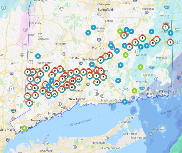
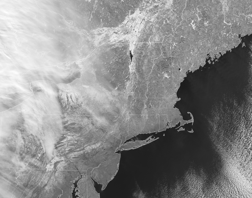
Now, compare that map with this VIIRS image from 22 January 2019 (after the clouds cleared out):
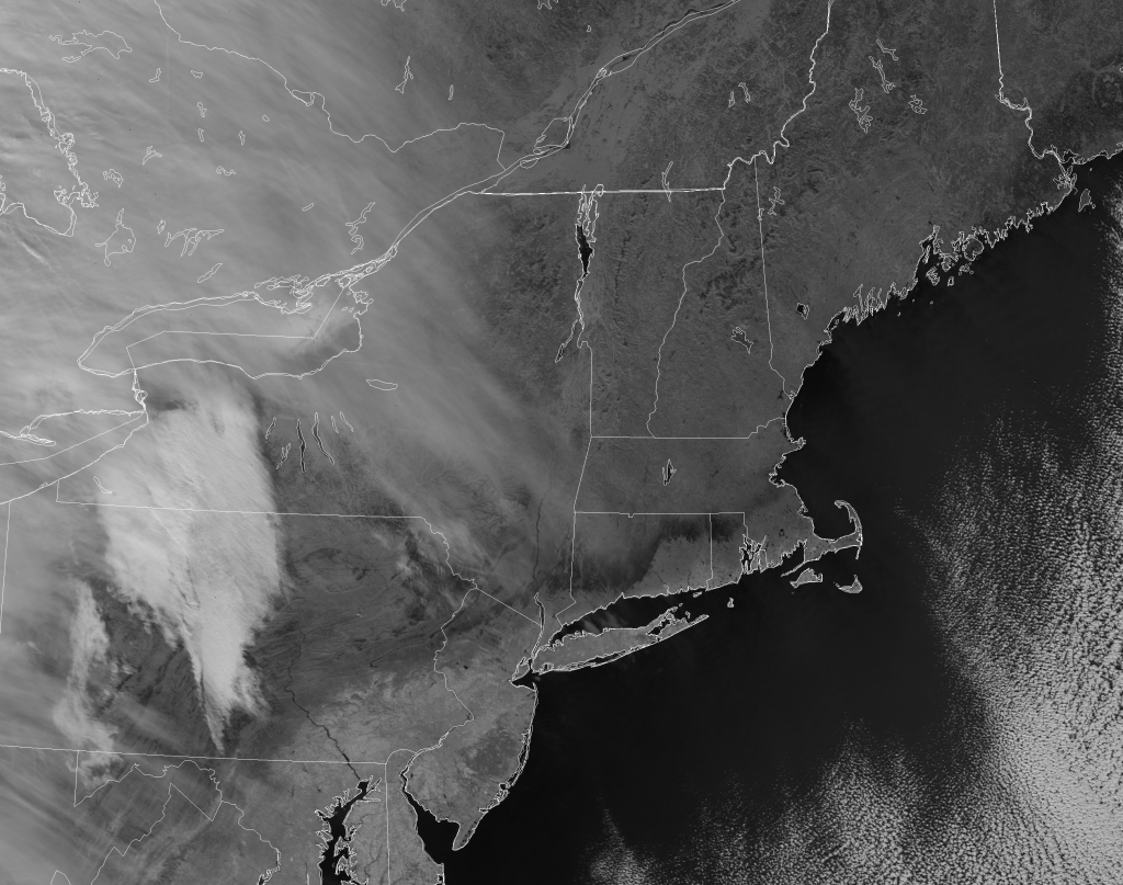
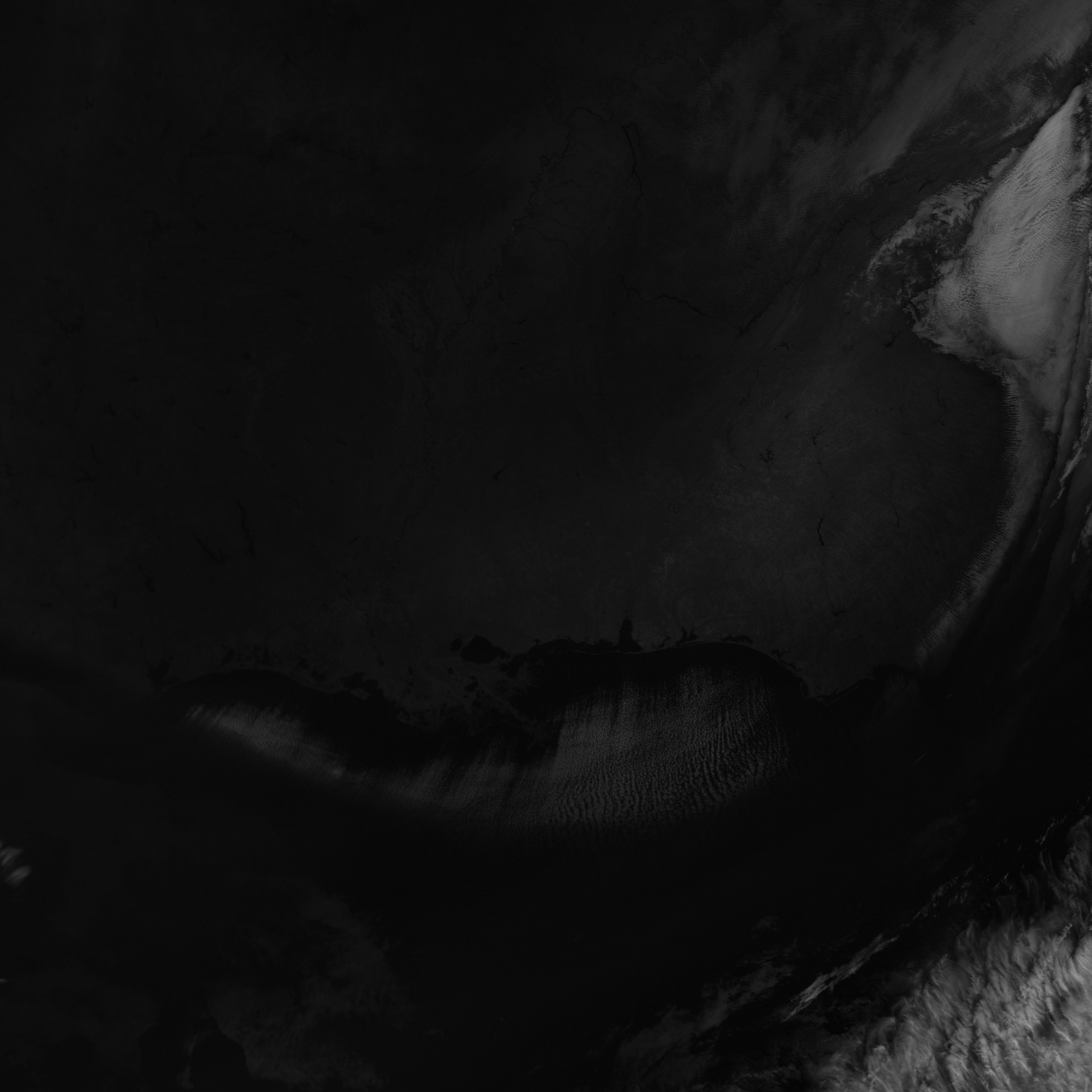
As always, you can click on the image to bring up the full resolution version. This is the high-resolution imagery band, I-3, centered at 1.6 µm from NOAA-20. Notice that very dark band stretching from northern New Jersey into northern Rhode Island? That’s where the greatest accumulation of ice was. Notice how well it matches up with the known power outages across Connecticut!
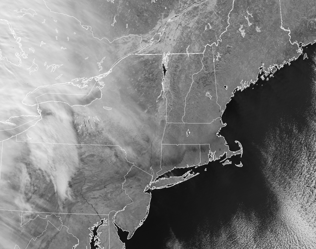
The ice-covered region appears dark at 1.6 µm because ice is very absorbing at this wavelength and, hence, it’s not very reflective. And, since it is cold, it doesn’t emit radiation at this wavelength either (at least, not in any significant amount). This is especially true for pure ice, as was observed here (particularly the second image), since there aren’t any impurities in the ice to reflect radiation back to the satellite. The absorbing nature of snow and ice compared with the reflective nature of liquid clouds is what earned this channel the nickname “Snow/Ice Band” (PDF).
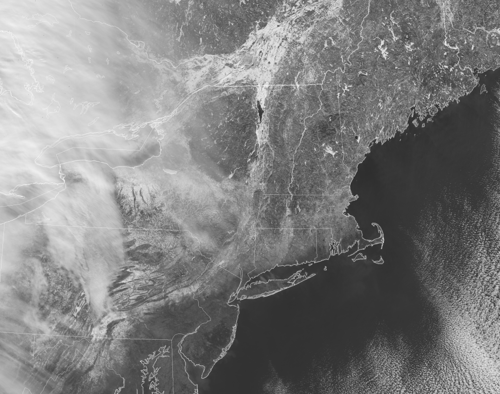
At shorter wavelengths (less than ~ 1 µm), ice and snow are reflective. (Note how a coating of ice makes everything sparkle in the sunlight.) This makes it nearly impossible to tell where the ice accumulation was in True Color images:

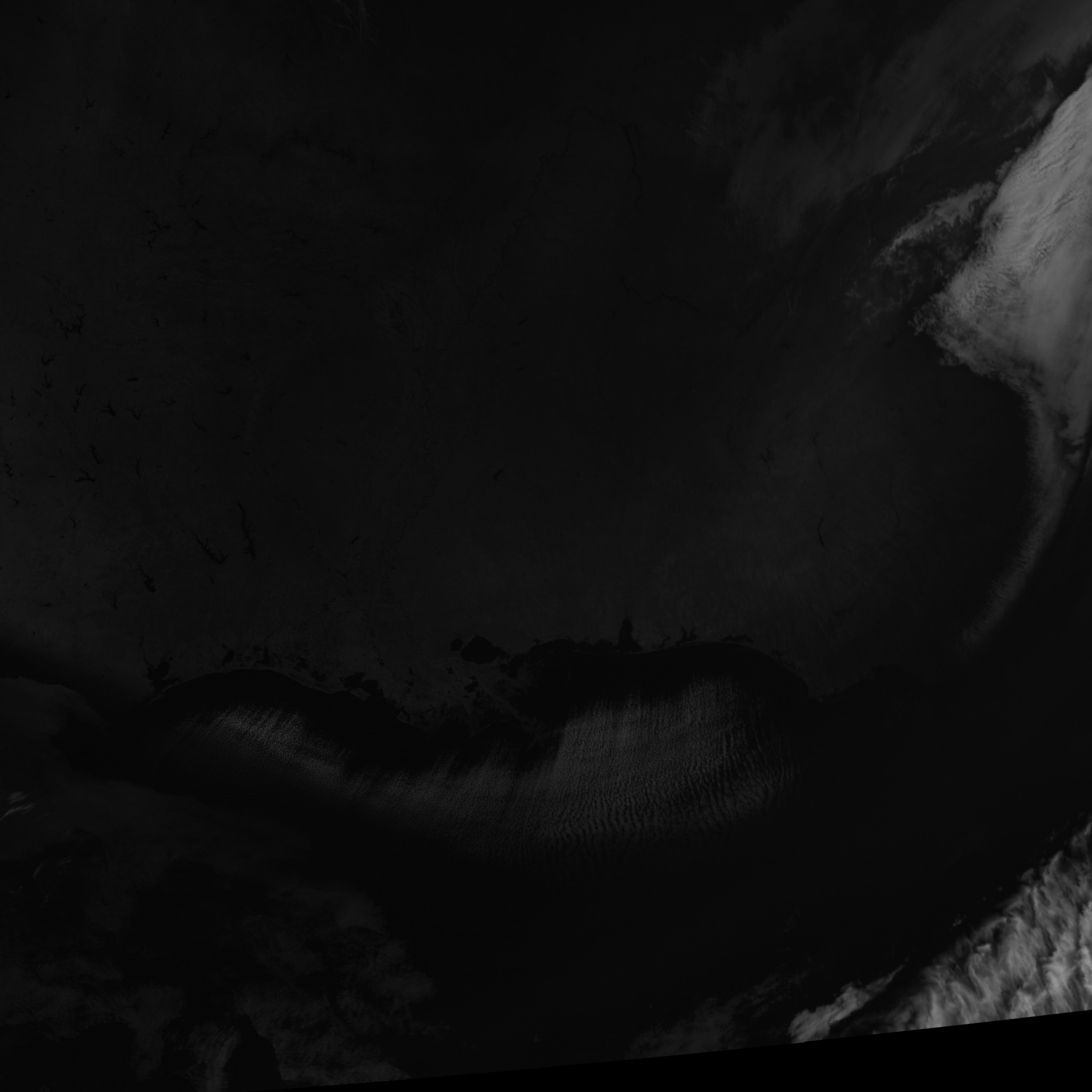
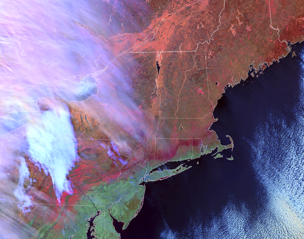
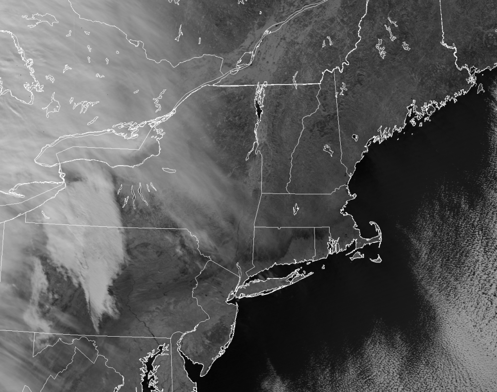
The Natural Color RGB (which the National Weather Service forecasters know as the Day Land Cloud RGB (PDF file)) includes the 1.6 µm band, which is what makes it useful for discriminating clouds from snow and ice. And, as expected, the region of ice accumulation does show up (although it is tempered by the highly reflective nature of snow and ice in the visible and “veggie” bands that make up the other components of the RGB):

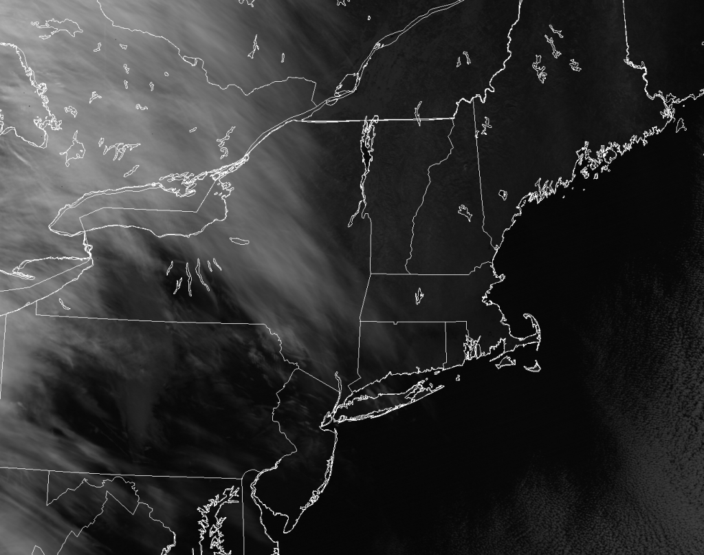
Another RGB composite popular with forecasters is the Day Snow/Fog RGB (PDF file), where blue is related to the brightness temperature difference between 10.7 µm and 3.9 µm, green is the 1.6 µm reflectance, and red is the reflectance at 0.86 µm (the “veggie” band). This shows the region of ice even more clearly than the Natural Color RGB:
Breaking things up into the individual components, we can see how the ice transitions from being reflective in the visible and near-infrared (near-IR) to absorbing in the shortwave-IR:
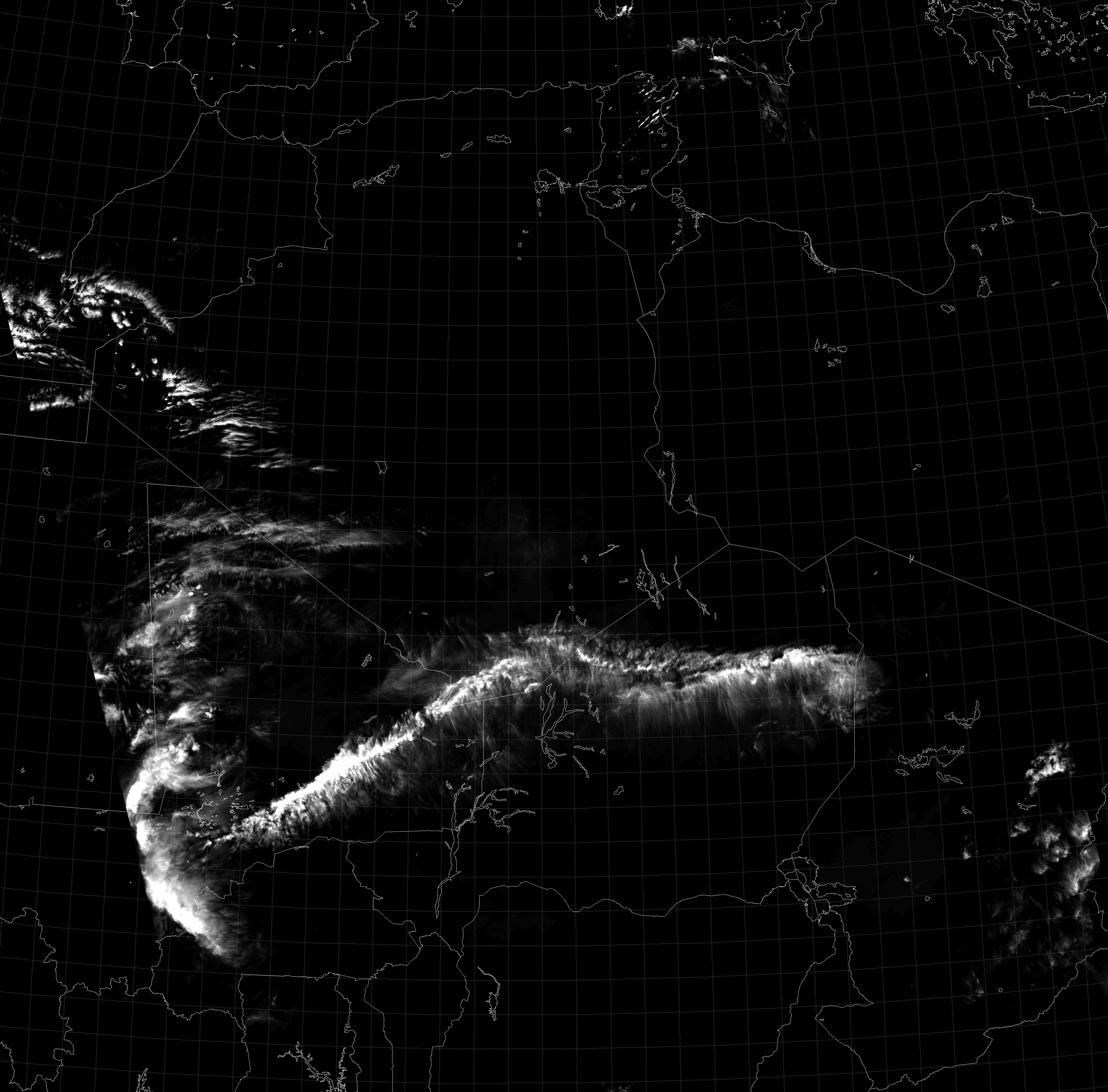
Of course, the 1.6 µm image was already shown, so I didn’t bother to repeat it. If you squint, you can even see a hint of the ice signature at 1.38 µm, the “Cirrus Band“, where most of the surface signal is blocked by water vapor absorption in the atmosphere:
If the ice had accumulated in southern New Jersey or Pennsylvania, though, it would not have shown up in this channel, since the air was too moist at this time to see all the way down to the surface. But, you can compare this image with the previous images to see why they call it the “cirrus band”, since the cirrus does show up much more clearly here.
So, mark this down as another use for VIIRS: detecting areas impacted by ice storms. And remember, even though ice storms may have a certain beauty, they are also dangerous. And, not just for the obvious reasons. This storm in particular came complete with ice missiles. So, for the love of everyone else on the road, scrape your car clean of ice before risking your life out there!