• Rare Super Typhoon in the Pacific Ocean

    If you pay attention to tropical cyclones, that headline may be confusing. Unlike the Super Cyclone in the Indian Ocean we just looked at, Super Typhoons are not rare in the Pacific Ocean. There have been 5 of them this year. What is rare is a typhoon that is estimated to be one of the strongest storms ever recorded in human history. I am, of course, speaking about Typhoon Haiyan, which the Philippines will forever remember as Yolanda.

    Animation of visible images from MTSAT of Super Typhoon Haiyan from 7 November 2013

    If you don’t pay that much attention to tropical cyclones, you should be asking, “How do we know it is one of the most intense tropical cyclones ever in recorded human history?” You may also be asking, “Why does it have two names?” And, “What is the difference between a typhoon and a hurricane and a tropical cyclone?”

    I’ll answer those in reverse order. Typhoons, hurricanes and tropical cyclones are different names given to the same physical phenomenon. If it occurs in the Atlantic Ocean or the Pacific Ocean north of the Equator and east of the International Date Line, it is called a “hurricane”, a name that was derived from Huracan, the Mayan god of wind and storms. If it occurs in the Pacific Ocean north of the Equator and west of the International Date Line, it is called a “typhoon”, which may come from the Chinese “daaih-fùng” (big wind), Greek “typhōn” (wind storm) or Persian “ṭūfān” (a hurricane-like storm). Anywhere else and it is a “cyclone” – a term for rotating winds, which ultimately comes from the Greek “kyklos” (circle).

    Why does it have two names (Haiyan and Yolanda)? Different parts of the world use different naming conventions. When it comes to typhoons, the United States uses the naming convention of the Japan Meteorological Agency and the World Meteorological Organization. The Philippines come up with their own name list. That’s why we know it as Haiyan, while Filipinos know it as Yolanda.

    Now, was this really the most intense tropical cyclone in all of recorded human history? That question is more difficult to answer. It depends on how you define “intensity”. Is it the lowest atmospheric pressure at the Earth’s surface? Is it the highest 1-minute, 5-minute or 10-minute average wind speed at the Earth’s surface? Is it based on structural damage? Deaths?

    The last two, damage and deaths, are better measures of the storm’s impact, rather than its physical strength. So, we’re going to focus on how one would measure the physical strength of the storm.

    Barometers, used to measure pressure, have been around for about 400 yearsAnemometers, which measure wind speed, have been around in their modern form for about 160 years. (It is also possible to estimate wind speeds from Doppler radar, technology that has been around since World War II, although these estimates are not as accurate as anemometers.) The primary issue is getting these instruments inside a super typhoon (and not having them be destroyed in the process).

    It is possible to attach an anemometer and a barometer to an airplane, then fly the plane into the storm to measure the wind and pressure (which is done for almost every hurricane on a path to hit the United States), but not every country is wealthy enough to afford their own research aircraft. Plus, it’s tough to find anyone crazy enough to fly into a storm as strong as Haiyan. Here is a story of why “hurricane hunting” isn’t always a good idea.

    Weather satellites, which have been around for 50 years, can view these storms from afar (with no risk of being damaged by them) and are the primary way to determine wind speeds and pressures (particularly when the storm is out over the ocean, where there aren’t many barometers and anemometers). The method to determine the strength of a storm from satellite is called the “Dvorak Technique”, developed by Vernon Dvorak in the 1970s, and discussed in detail here. Basically, the algorithm takes the current appearance of the storm in visible and infrared wavelengths (how symmetric it is about the eye, what is the brightness temperature in the warmest pixel in the eye, what is the brightness temperature of the coldest ring of clouds around the eye, and so on), along with the recent history of the storm’s appearance and relates that to a storm’s central pressure and maximum sustained wind speed based on an empirical relationship. For those storms that have been viewed by both satellite and aircraft, the Dvorak Technique has been shown to be pretty accurate: over 50% of storms have wind speed errors less than 5 knots, and overall root-mean-square errors of 11 knots.

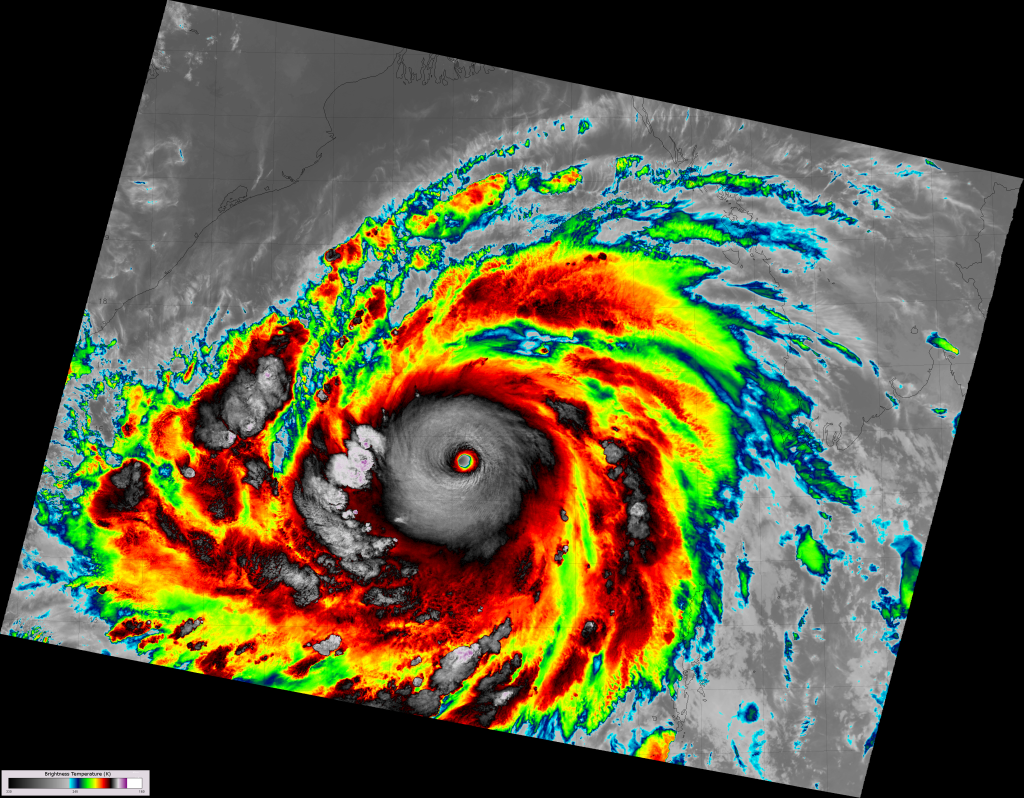
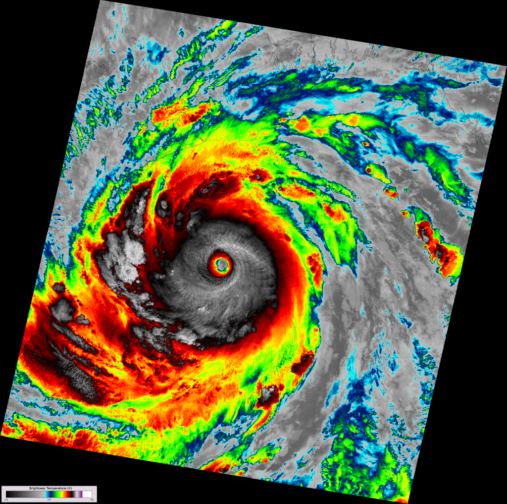
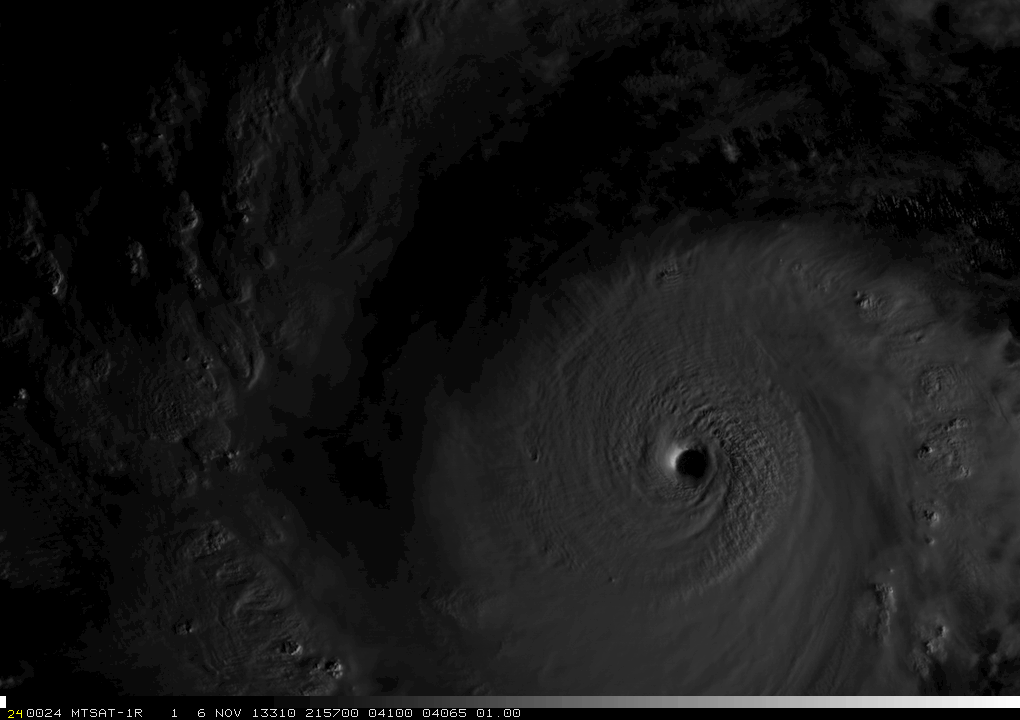
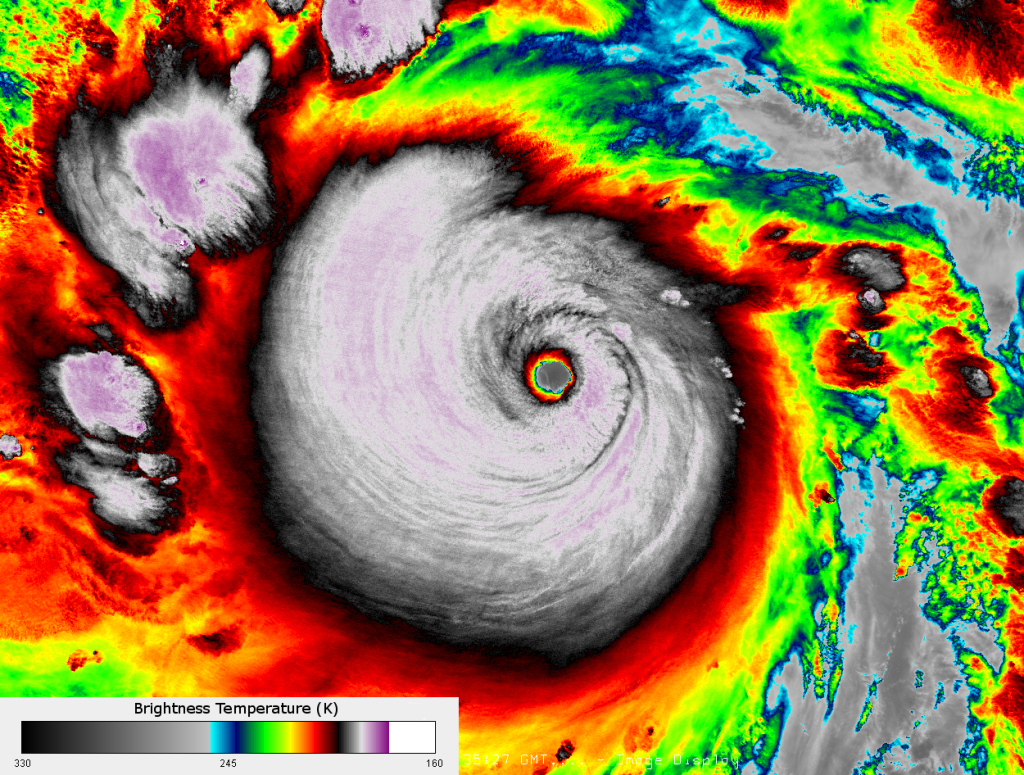
    The image loop from MTSAT above, and the VIIRS images below of Haiyan (Yolanda) highlight the relevant points the Dvorak Technique keys on when determining its intensity: a well defined eye with warm infrared brightness temperatures (up to +23 °C), a ring of cold clouds surrounding the eye (the purple color corresponds to temperatures less than -80 °C), and it’s hard to find a storm more symmetric than this one.

    VIIRS infrared (I-5) image of Typhoon Haiyan (Yolanda), taken 16:39 UTC 6 November 2013
    VIIRS infrared (I-5) image of Super Typhoon Haiyan (Yolanda) taken 16:16 UTC 7 November 2013

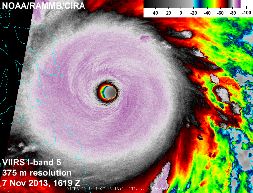
    As a quick aside about the power of VIIRS, Haiyan was right at the edge of the scan when the image above was taken. Look at the impressive detail even at the edge of scan! See if you can beat that, MODIS!

    Using Dvorak’s method, Haiyan (Yolanda) achieved the maximum possible value on the “T-number” scale: 8.0. That puts the maximum sustained winds above 170 knots (315 km h-1 or 195 mph!) and the sea-level pressure below 900 mb (hPa), according to the scale. You can’t get any stronger than that because the data used to develop the empirical relationship doesn’t contain any storms stronger than that. We’ve reached signal saturation on the Dvorak “T-number” scale. (And the Saffir-Simpson scale, and the Beaufort scale.) All we can say is Haiyan right up there with the strongest tropical cyclones ever observed. We can also say that Haiyan was the only storm to make landfall as an 8.0 on the “T-number” scale. But, beyond that, we would need actual in situ observations to know just how strong Haiyan (Yolanda) really was.

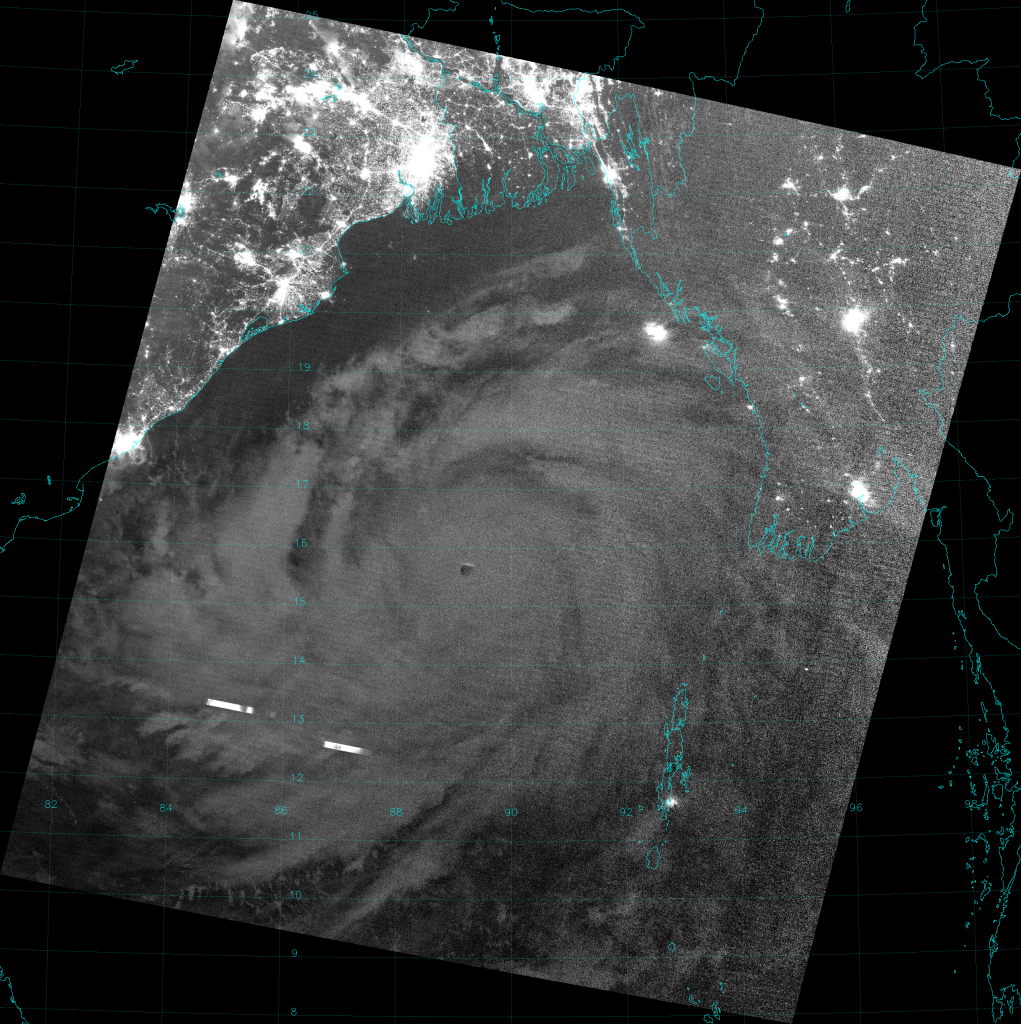
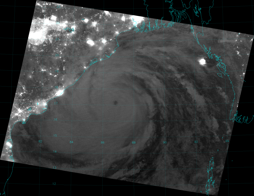
    As expected, one of the strongest typhoons ever to make landfall caused some power outages. The Day/Night Band on VIIRS captures it well:

    VIIRS Day/Night Band image of the central Philippines, taken 16:50 UTC 31 October 2013 VIIRS Day/Night Band image of the central Philippines, taken 17:02 UTC 10 November 2013

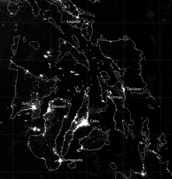
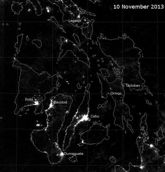
    Did you notice the vertical bar in the above image that you can click on? Slide it left to right to see the differences in the amount of city lights (and nocturnal fishing activities) before and after Haiyan (Yolanda) made landfall. Tacloban was, of course, one of the hardest hit heavily populated areas. As you can see from radar, it took a direct hit from the eyewall.

    With winds estimated at 195 mph, Haiyan (Yolanda) was like an EF-4 tornado. A 30-mile wide EF-4 tornado that lasted for several hours.

    UPDATE: I have been notified that the above sliding bar trick in the Day/Night Band images above doesn’t work in all browsers (or for all operating systems). If that’s the case for you, click on the image below, then on the “1000×1000” link below the banner to see the high resolution animation.

    VIIRS Day/Night Band images highlighting power outages caused by Typhoon Haiyan (Yolanda) 2013

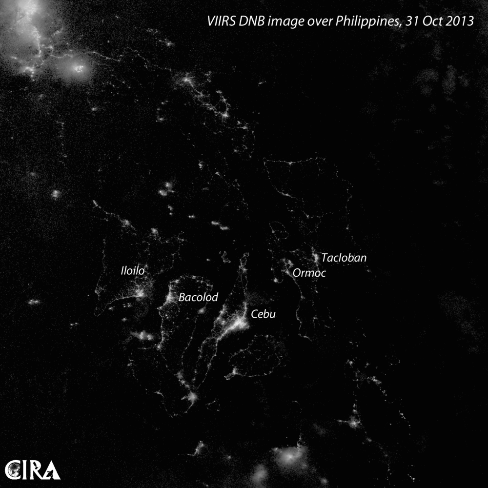
    The first two images in the animation show the Day/Night Band images from the nighttime overpasses on 31 October and 9 November 2013. The last two frames (one with the map plotted and one without) highlight the differences in these images by creating an RGB composite of the before and after images. Power outages show up as red in this composite. Areas that have kept their power show up a golden color. Areas with light after the storm, but not before the storm, show up green. In this case, green areas highlight where boats were after the storm, and where clouds scattered the city lights over a larger area than they appeared to be before the storm, when there were no clouds overhead. It’s another way to look at power outages in the Day/Night Band.

  • Rare Super Cyclone in the Indian Ocean

    The Indian Ocean has just had its first Super Cyclone since 2007. The name of it is “Phailin” and I bet you just pronounced it incorrectly (unless you speak Thai). It’s closer to “PIE-leen” than it is to “FAY-lin”. The name was derived from the Thai word for sapphire. (If you go to Google Translate and translate “sapphire” into Thai, you can click on the “audio” icon {that looks like a speaker} in the lower right corner of the text box to hear a robotic voice pronounce it. You can also click on the fourth suggested translation below the text box and try to pronounce that as well.)

    If you’re tired of reading about flooding in this blog, you’re probably going to want to avoid reading about Phailin. It already dumped up to 735 mm (28.9 inches) of rain on the Andaman Islands in a 72-hour period. Aside from the heavy rains, Phailin is a text-book example of “rapid intensification”, as official estimates of the storm’s intensity grew from 35 kt (65 km h-1 or 40 mph) when the storm was first named, to 135 kt (250 km h-1 or 155 mph!) just 48 hours later. Here’s a loop of what that rapid intensification looks like from the geostationary satellite, Meteosat-7. (Those are the Andaman Islands where the cyclone first forms.)

    VIIRS being on a polar-orbiting satellite, it’s not possible to get an image of the cyclone every 30 minutes like you can with Meteosat-7. VIIRS only views a cyclone like Phailin twice per day. But, VIIRS can do things that Meteosat-7 can’t. The first is produce infrared (IR) imagery at 375 m resolution. (Meteosat-7 has 5 km resolution.) The image below is from the high resolution IR band, taken at 20:04 UTC 10 October 2013:

    VIIRS high-resolution IR image of Super Cyclone Phailin, taken 20:04 UTC 10 October 2013

    Look at the structure of the clouds surrounding the eye. (You’re definitely going to want to see it at full resolution by clicking on the image, then on the “3875×3019” link below the banner.) VIIRS is detecting wave features in the eyewall that other current IR sensors aren’t able to detect because they don’t have the resolution. The coldest cloud tops are found in the rainband to the west of the eyewall (look for that purple color) and are 179 K (-94 °C). That’s pretty cold!

    Also notice the brightness temperature gradient on the west side of the eye is a lot sharper than on the east side of the eye. This is because the satellite is west of eye (the nadir line is along the left edge of the plotted data), looking down on the storm at an angle, revealing details about the side of the eyewall on the east side. Look down on the inside of a cardboard tube or a piece of pipe at an angle to replicate the effect. (Actually, the eye wall of a tropical cyclone slopes away from the center, so it’s more like funnel than a tube. If you go looking for a cardboard tube or a piece of pipe to look at, the results will be inaccurate. Grab a funnel instead.)

    Another advantage of VIIRS is the Day/Night Band, a broadband visible channel that is sensitive to the low levels of light that occur at night. There is no geostationary satellite in space with this capability. The image below was taken from the Day/Night Band at the same time as the IR image above:

    VIIRS Day/Night Band image of Super Cyclone Phailin, taken 20:04 UTC 10 October 2013

    The Day/Night Band shows the eye clearly. Plus, being able to see the city lights gives an idea of the amount of people and infrastructure that are in the storm’s path.

    Now, hold on a minute. 10 October 2013 was one day before first quarter moon, which means the moon was below the horizon when this image was taken. (Generally speaking, the moon is only up for nighttime VIIRS overpasses that occur from two days after first quarter to two days after last quarter.) If you want get more specific, India is one of the few places with a half-hour offset from most time zones (UTC +5:30), which means this image was taken at a local time of 1:34 AM 11 October 2013. Local moonrise time for the eastern coast of India for that date was 11:33 AM (10 hours later), while the moonset occurred 3.5 hours earlier (10:02 PM). This means you should be asking the obvious question: if there was no moonlight (and obviously no sunlight either, since this a nighttime image), why is VIIRS able to see the cyclone?

    Was it the scattering of city lights off the clouds that allows you to see the clouds at night, like in this photo? No, because this cyclone is way out over the ocean, in the middle of the Bay of Bengal. Due to the curvature of the Earth, city lights won’t illuminate any clouds more than a few tens of kilometers away. The center of this storm is about 600 km away from any city lights and is still visible. At the most, only the very edges of the storm near cities would be illuminated if this were the case.

    I can see at least two lightning strikes in the image, so is it lightning illuminating the cloud from the inside? No, it’s not that either. See how streaky the lightning appears? The whole storm would look like a series streaks, some brighter than others, depending on how close they were to the tops of the clouds (and how close the lightning was to the position of the VIIRS sensor’s field of view during each scan). The top of the storm is much too uniform in brightness for it to be caused by lightning.

    So, if you’re so smart, what is the explanation, Mr. Smartypants? I’m glad you asked. It is a phenomenon called “airglow” (or sometimes “nightglow” when it occurs at night). You can read more about it here from UniverseToday.com and here from Atoptics.co.uk. The basic idea is that gas molecules in the upper atmosphere interact with ultraviolet (UV) radiation and emit light. Some of these light emissions head down toward the earth’s surface, are reflected back to space by the clouds, and detected by the satellite.

    Really? Some tiny amount of gas molecules way up in the atmosphere emit a very faint light due to excitation by UV radiation, and you’re telling me VIIRS can see it? But, it’s nighttime! There’s no UV radiation at night! How do you explain that? The UV radiation breaks up the molecules into individual atoms during the day. At night, the atoms recombine back into molecules. That’s when they emit the light. Look, it’s in a peer-reviewed scientific journal if you don’t believe me. (A shortened press release about it is here.) Thanks to airglow (and the sensitivity of the Day/Night Band), VIIRS can see visible-wavelength images of storms at night even when there is no moon!

    Getting back to the Super Cyclone, here’s what Phailin looked like in the high-resolution IR channel the next night (19:45 UTC 11 October 2012), right around the time where it reached its maximum intensity:

    VIIRS channel I-05 image of Super Cyclone Phailin, taken 19:45 UTC 11 October 2013

    Here, the cyclone is much closer to nadir (the nadir line passes through the center of the image), so you’re more-or-less looking straight down into the eye on this orbit. The corresponding Day/Night Band image is below:

    VIIRS Day/Night Band image of Super Cyclone Phailin, taken 19:45 UTC 11 October 2013

    Once again, the cyclone is illuminated by airglow. (Some of the outer rainbands are also being lit up by city lights, which are visible through the clouds.) The only question is, what is that bright thing off the coast of Burma (Myanmar) that shows up in both Day/Night Band images? It looks like a huge, floating city. According to Google Maps, there’s nothing there. That is one question I don’t have the answer to (*see Update #2*).

    Any other questions about cyclones in India? Check out this FAQ guide put out by the India Meteorological Department.

    With a peak intensity estimate at 140 kts (259 km h-1 or 161 mph), Phailin was one of the strongest cyclones ever in the Indian Ocean. (Only 2007’s Gonu – 145 kt – was stronger. Several other storms have been estimated at 140 kt.) The last time a cyclone of Phailin’s intensity hit India, over 10,000 people died. Credit must be given to the Indian government, who successfully evacuated 900,000 people from the coast (the article refers to 9.1 lakhs; one lakh is 100,000), and so far, only about 25 people have been confirmed dead. In fact, fewer people were killed by this cyclone than were killed by a panicked stampede outside a temple in central India the same weekend.


    UPDATE #1 (15 October 2013): The Day/Night Band also captured the power outages caused by Phailin. Here is a side-by-side comparison of Day/Night Band images along the coast of the state of Odisha (also called Orissa), which took a direct hit from the cyclone – a zoomed in and labelled version of the 10 October image above (two days before landfall) against a similar image from 14 October 2013 (two days after landfall):

    VIIRS Day/Night Band images from before and after Super Cyclone Phailin made landfall along the east coast of India.

    Notice the lack of lights in and around the small city of Berhampur. That’s roughly where Phailin made landfall. Also, notice the difference in appearance of the metropolitan area of Calcutta. It almost appears as if the city was cut in two as a result of electricity being out in large parts of the city.


    UPDATE #2 (15 October 2013): Thanks to Renate B., we’ve figured out the bright lights over the Bay of Bengal near the coast of Myanmar (Burma) are due to offshore oil and gas operations. Take a look at the map on this website. See the yellow box marked “A1 & A3”? That is a hotly contested area for gas and oil drilling, right where the bright lights are. It is claimed by Burma (Myanmar) and India, China and South Korea are all invested in it. China has built a pipeline out to the site that cuts right through Myanmar (Burma) that some of the locals are not happy about.


    UPDATE #3 (16 October 2013): It was pointed out to me that the maximum IR brightness temperature in the eye of the cyclone in the 20:04 UTC 10 October 2013 image was 297.5 K (24.4 °C), which is pretty warm for a hurricane/cyclone/typhoon eye. It is rare for the observed IR brightness temperature inside the eye to exceed 25-26 °C. Of course, the upper limit is the sea surface temperature, which is rarely above 31-33 °C. And the satellite’s spatial resolution affects the observed brightness temperature, along with a number of other factors.

    A warm eye is related to a lack of clouds in (or covering up) the eye, the eye being large enough to see all the way to the surface at the viewing angle of satellite, the satellite having high enough spatial resolution to identify pixels that don’t contain cloud, and the underlying sea surface temperature. Powerful, slow moving storms may churn the waters enough to mix cooler water from the thermocline up into the surface layer, reducing the sea surface temperature. Heavy rains and cloud cover from the storm may also lower the sea surface temperature. Phailin was generally over 28-29 °C water, and was apparently moving fast enough (or the warm water was deep enough) to not mix too much cool water from below (a process called upwelling).

    It may or may not have any practical implications, but the high resolution IR imagery VIIRS is able to produce may break some records on warmest brightness temperature ever observed in a tropical cyclone eye.

  • A Year in a Week – VIIRS Captures Colorado Flooding

    A year’s worth of precipitation fell on parts of Colorado in one week’s time (9 September to 17 September 2013). As Colorado State Climatologist Nolan Doesken said, “Whenever you get your annual precip in a few days time, you’re in trouble.” So it is that this blog returns to flooding once again. Flooding that hit real close to home.

    If you have an hour and a half available, you might want to watch this video with preliminary results and discussion about what happened given by scientists from the Colorado State University (CSU) Department of Atmospheric Science and CIRA (including Nolan Doesken and fellow JPSS Imagery Team member Dan Lindsey). If you don’t have an hour and a half, here’s an article with a good background on the events as they happened in Boulder (although if you’re a slow reader, it may not save you much time since it’s pretty comprehensive). A less comprehensive, 4-page summary of the event was put together by the University of Colorado-Boulder, the Colorado Climate Center (at CSU) and NOAA’s Earth System Research Laboratory (ESRL) which may be found here (PDF document).

    The Colorado Climate Center and the Department of Atmospheric Science at CSU have put together this website to document the flood event. If you haven’t seen enough pictures of the flooding on the news or elsewhere on the internet, these two pages here from Boston.com and here from Discovery.com give a good idea of the damage that resulted. By the end of September, 8 people were confirmed dead in Colorado as a result of the flooding.

    Just to make sure that all of you have seen this, here are the precipitation totals (in inches) from various National Weather Service (NWS) Cooperative Observers, trained weather spotters, automated rain guages and CoCoRaHS members for the 7-day period ending on the 16 September 2013, put together by the Denver/Boulder NWS Forecast Office:

    Preliminary rainfall totals over Northern Colorado, 9-16 September 2013

    Remember to multiply those numbers by 25.4 if you’re used to using millimeters as the standard measure of rain. Also, keep in mind that this part of the world averages somewhere between 12 and 20 inches of precipitation per year.

    From a satellite perspective, there really isn’t much (that isn’t classified) that can beat Digital Globe, a private company that specializes in high-resolution satellite imagery. Here’s what you can see with 0.5 m resolution. (Oh, how meteorologists would love to have data and forecast models on that kind of resolution – even if we’d all be drowning in yottabytes of data!)

    In contrast, the high resolution imagery channels on VIIRS have ~350 m resolution, which is not enough to see each individual puddle, but it is enough to capture the flooding that occurred on the South Platte River subsequent to the 5-18 inches of rain that fell along the Front Range mountains.

    Here’s what the “Natural Color” RGB composite of channels I-01 (0.64 µm, blue), I-02 (0.87 µm, green) and I-03 (1.61 µm, red) looked like before the flooding occurred:

    VIIRS false-color RGB composite of channels I-01, I-02 and I-03, taken 19:49 UTC 7 September 2013

    Click on the image, then on the “1172×866” link below the banner to see the full resolution version. Note that you can’t actually see the South Platte River before the flooding occurred, but you can see the dark olive color of the river valley (caused by the mixture of trees, other ground vegetation and rich soils along the river) and the swath of light green irrigated farmland on either side of the river.

    The week that the flooding occurred, it was very cloudy (duh!), so VIIRS wasn’t able to see much. But, on the 14th (which people around here refer to as “that Saturday” because each day that week brought specific memories to those that lived through it) the clouds briefly broke enough for VIIRS to see that the South Platte River valley had begun to flood:

    VIIRS false-color RGB composite of channels I-01, I-02 and I-03, taken 19:17 UTC 14 September 2013

    Look for the dark, bluish-greenish color (scientific term) extending as far east as the yellow arrow. That arrow is pointing to the leading edge of the flood water, which was near the town of Weldona at this time. Places upriver from there all the way to the north side of Denver were experiencing significant (even record breaking) flooding.

    Three days later (17 September 2013, about one week after the flooding began) it was a really clear day over Colorado, which made it easy to see that the flooding made it past Fort Morgan and Sterling out to little Sedgwick:

    VIIRS false-color RGB composite of channels I-01, I-02 and I-03, taken 20:01 UTC 17 September 2013

    Two weeks after the flood began, flood waters made the South Platte River visible all the way to (and past) North Platte, Nebraska, another site of record flooding roughly 250 miles away from where the heavy rains occurred!

    VIIRS false-color RGB composite of channels I-01, I-02 and I-03, taken 19:30 UTC 24 September 2013

    Here’s a short animation of this sequence of images:

    Animation of VIIRS false-color composites of channels I-01, I-02 and I-03 from 7-24 September 2013

    You have to click on the image, then on the “1172×866” link to see the images loop.

    It should also be said that this event didn’t just affect Colorado. Parts of New Mexico reported over 12 inches of rain and at least 1 death. Cheyenne, Wyoming just recorded the second wettest month on record (dating back to the late 1800s). And, as mentioned above, the flooding made it down the Platte River all the way to central Nebraska. And, as a piece of good news, this flood water is being used to refill the Ogallala Aquifer, which has been low due to long-term, drier-than-normal conditions.

    Events like this generally bring more questions than answers: Was it a “100-year flood” or a “1000-year flood”? Could the forecasts have been better? If the forecasts were better, would anyone have believed them? How do you prepare for unprecedented events?

  • Record Russian Rain Runoff Responsible for Rapid River Rise

    Sorry, I couldn’t help myself with that title.  Last time we looked at flooding in Russia, it was in the western parts – generally near Moscow and primarily along the Oka River – and caused by rapid melting of record spring snowfall. This time, flooding is occurring in Russia’s Far East, primarily along the Amur River, caused by heavy rainfall related to monsoon wind patterns in the region – record levels of flooding not seen before in the 160 years Russians have settled in the area.

    Unfortunately, this natural disaster is affecting more than just Russia. In China, many people are dead or missing as the result of flooding. (The figure of “hundreds dead or missing” includes flooding caused by typhoons Utor and Trami in southeastern China, flash flooding in western China, and the subject of today’s post: river flooding in northeastern China and far east Russia.) The Chinese provinces of Liaoning, Jilin and Heilongjiang have been hit particularly hard with persistent, heavy rains since late July, as have areas just across the border in Amur Oblast, Khabarovsk Krai and the Jewish Autonomous Oblast in Russia.

    A few more facts: Heilongjiang is the Chinese name for the Amur River. It translates to English as “Black Dragon”. The Mongols called it Kharamuren (“Black Water”), which, I assume, the early Russian settlers shortened to Amur. It is the longest undammed river in the Eastern Hemisphere and the home to the endangered Amur leopard and Amur tiger. Since 1850, the Amur River has been the longest piece of the border between China and Russia. Now, in 2013, the Amur River has reached the highest levels ever recorded.

    Backing up a bit, here’s what the area looked like according to “Natural Color” or “pseudo-true color” VIIRS imagery back in the middle of July:

    VIIRS false-color RGB composite of channels I-01, I-02 and I-03, taken 03:27 UTC 14 July 2013
    VIIRS false-color RGB composite of channels I-01, I-02 and I-03, taken 03:27 UTC 14 July 2013

    As always, click on the image, then on the “2368×1536” link below the banner to see the full resolution version. Here’s what the same area looked like about a month later:

    VIIRS false color RGB composite of channels I-01, I-02 and I-03, taken 03:14 UTC 21 August 2013
    VIIRS false color RGB composite of channels I-01, I-02 and I-03, taken 03:14 UTC 21 August 2013

    Notice anything different? The Amur River has overflowed its floodplain and is over 10 km (6 miles) wide in some places. Just downriver (northeast) from Khabarovsk, the flooded area is up to 30 km (18 miles) wide!

    Pay attention to Khabarovsk. Back in 1897, the Amur River crested there with a stage of 6.42 m (about 21 feet in American units), which was the previous high water mark. On 22 August 2013, the river stage reached 7.05 m (23 feet) and was expected to keep rising to 7.8 m (25.6 feet) by the end of August. The map below (in Russian) shows the local river levels on 22 August 2013. It came from this website.

    Amur River levels at various locations in Khabarovsk Krai, Russia on 22 August 2013.
    Amur River levels at various locations in Khabarovsk Krai, Russia on 22 August 2013.

    Note that Khabarovsk in Cyrillic is Хабаровск (the black dot in the lower left), and Amur is Амур. The blue numbers represent the river stage in cm. Red numbers indicate the change in water level (in cm) over the last 24 hours. The colored dots indicate how high the river level is above flood stage according to the color scale (also in cm). The river at Khabarovsk is more than 4 meters (13 feet) above flood stage.

    Not impressed by comparing a “before” and “after” image? Here’s an animation over that time period (14 July to 21 August 2013), with images from really cloudy days removed:

    Animation of VIIRS false-color composites of channels I-01, I-02 and I-03
    Animation of VIIRS false-color composites of channels I-01, I-02 and I-03. Click on the image, then on the “1184×768” link below the banner to view the animation.

    You have to click through to the full resolution version before the loop will play. In order to not make the world’s largest animated GIF, the I-band images in the loop have been reduced in resolution by a factor of 2, making them the same resolution as if I had used M-5, M-7 and M-10 to make this “Natural Color” composite.

    The Day/Night Band is not known for its ability to detect flooding at night, but it also saw how large the Amur River has become:

    VIIRS Day/Night Band image, taken 17:27 UTC 20 August 2013
    VIIRS Day/Night Band image, taken 17:27 UTC 20 August 2013

    This image was taken on 20 August 2013, which just so happens to be the night of a full moon. The swollen rivers are clearly visible thanks to the moonlight (and general lack of clouds).

    Khabarovsk is a city of over 500,000 people and would require a major evacuation effort if the river reached the expected 7.8 m level. Over 20,000 people have already been evacuated in Russia alone (and over a million people in China) according to this report. Oh, and at least two bears.

    This heavy rain and flooding makes it all the more surprising that, a little further north and west in Russia, there have been numerous, massive wildfires. Check out this “True Color” image from VIIRS, taken on 16 August 2013:

    VIIRS"True Color" composite of channels M-3, M-4 and M-5, taken 03:12 UTC 16 August 2013.
    VIIRS”True Color” composite of channels M-3, M-4 and M-5, taken 03:12 UTC 16 August 2013.

    See the supersized swirling Siberian smoke spreading… OK, I’ll quit with the alliteration. Here’s the smoke plume on the very next overpass (about 90 minutes later) seen on a larger scale:

    VIIRS "True Color" composite of channels M-3, M-4 and M-5, taken 04:52 UTC 16 August 2013.
    VIIRS “True Color” composite of channels M-3, M-4 and M-5, taken 04:52 UTC 16 August 2013.

    A strong ridge of high pressure with its clockwise flow is trapping the smoke over the region. In this image you can see quite a few of the smoke sources where the fires are still actively burning. Look in the latitude/longitude box bounded by 98 °E to 105 °E and 59 °N to 61 °N. By the way, that’s Lake Baikal on the bottom of the image, just left of center.

    A quick back-of-the-envelope calculation indicates that the area covered by smoke is roughly 500,000 km2. (Of course it is complicated by the fact that the smoke is mixing in with the clouds, so it is hard to define a true boundary for the smoke on the north and west sides.) That puts it in the size range of Turkmenistan, Spain and Thailand. If that’s not a good reference for you, how’s this? The smoke covers an area larger than California and smaller than Texas.

    These fires have burned for more than a month. This article from NASA includes a MODIS image from 25 July 2013 containing massive smoke plumes and shows that areas of central Russia (particularly north of the Arctic Circle) have had a record heatwave this summer. And here are a few more images of the smoke from MODIS over the past few weeks.

    Heatwaves and fires and floods? Russia is all over the map. Literally. I mean, look at a map of Asia – Russia is all over that place. It even spreads into Europe!

  • Abafado Bruma Seca

    Hopefully, Google Translate didn’t steer me wrong on the meaning of “abafado”. “Bruma seca” is a term used by Portuguese and Spanish speakers that literally translates to “dry mist”. It is typically used to refer to thick haze or the brownish air caused by dust and, more specifically, to the Saharan Air Layer (scroll down a bit on this Weather Underground blog post for nice description of what that is).

    We’re speaking Portuguese today because we are re-visiting Cape Verde, an island nation where people speak Portuguese. (Actually, many people speak a creole version called Kriolu kabuverdianu that has Western African elements added to the Portuguese.) Last time we visited Cape Verde, the islands were creating interesting waves and plumes in the atmosphere. This time, Cape Verde is buried under a plume – a plume of Saharan air that is so thick, you can barely see the islands:

    VIIRS "True Color" RGB composite of channels M-03, M-04 and M-05, taken 15:07 UTC 30 July 2013

    I had to plot the map boundaries on the image just to see where the islands are. Otherwise, they would be lost in a sea of brown dust. Also, without the map, it’s difficult to find the shoreline of western Africa because the dust looks just like the Sahara Desert where it came from.

    This image is (and the images to follow are) a “True Color” RGB composite. (As always, click on the picture, then on the “2442×1920” link below the banner to see the full resolution image.) Unlike many previous true color images shown on this blog, these have been “Rayleigh corrected.” This means the impact of Rayleigh scattering by the molecules in the atmosphere has been removed. The reason for doing this is that it makes the surface easier to see and it better represents what people normally see when looking out of the window on an airplane. Dust particles, on the other hand, are Mie scatterers at visible wavelengths (refer back to that last link) so they still show up. In fact, this is one of the strengths of the True Color composite: it is quite sensitive to particulate matter in the atmosphere like smoke, smog, haze and dust.

    The image above was taken on 30 July 2013, one day after the dust really started to be pushed off the African coast. It is not clear if the people of Cape Verde were forced indoors by this dust since I wasn’t able to find any news reports on it. The western edge of the dust plume (between 28° and 29° W longitude) almost looks like it is casting a shadow, which would indicate the dust is lofted pretty high in the troposphere in this image.

    This dust plume pushed across the Atlantic Ocean over the following days. VIIRS passed over Cape Verde on 31 July 2013 (14:48 UTC) and captured this image:

    VIIRS "True Color" RGB composite of channels M-03, M-04 and M-05, taken 14:48 UTC 31 July 2013

    Here, the dust plume extends from one side of the swath to the other – over 3000 km. On the very next orbit (16:29 UTC 31 July 2013), the plume can be seen on four consecutive data granules, extending almost to the middle of the swath. (The satellite covers a distance of over 2000 km over four granules.)

    VIIRS "True Color" RGB composite of channels M-03, M-04 and M-05, taken 16:29 UTC 31 July 2013

    Hold on. What’s that strip of white-colored stuff extending north-northwest from 50° W longitude label? Some kind of white dust? That happens to be in a straight line? Nope. It’s what is called “sun glint” and it’s the same basic phenomenon as the glare you see looking out over a body of water without polarized sunglasses.  The dust is all the brown stuff on the right side of the image. That’s South America and the Lesser Antilles on the left side of the image.

    If you click to the full resolution version of the image above, you may find that the image doesn’t seem very big considering it is made of four granules. (Its pixel size is 1600×1536. In contrast, the image above that is only two granules, yet is 3200×1536 in size.) That’s because I had to reduce the resolution of the data in order to plot it all without running out of memory on my computer. VIIRS has twice the resolution of what is shown in the latter image. (And this high resolution requires a lot of computing power to display!)

    On 1 August 2013, the plume pushed even closer to the Lesser Antilles (although they are off the left side of this image).

    VIIRS "True Color" composite of channels M-03, M-4 and M-05, taken 16:10 UTC 1 August 2013

    Again, the resolution has been degraded by a factor of two. It is interesting to note that one granule covers an area of the Earth about 3040 x 570 km in size (1.7 million sq km, or 669,000 sq mi), so four granules is about 6.9 million km2. That’s 2.6 million square miles. In comparison, the size of the lower 48 states is about 3.1 million square miles (3.7 million square miles if you add on Alaska and Hawaii).  Now notice that the dust covers most of the last image. If you add on the area of the dust plume that stretches all the way back to Africa, you are talking about an area well over the size of the United States! By the time it arrives in the Caribbean, that dust better learn to speak Antillean Creole. It is a long way from Cape Verde.

    So, what does all of this mean? It is often claimed that the presence of Saharan dust layers is bad for hurricane formation. Evidence for that claim is provided here from AGU.org and here from AMETSOC.org. However, there are also scientists who refute that claim, which you can read about in this AMETSOC Journal. Scientists at the U.S. Geological Survey (USGS) have found that Saharan dust may be harmful to people and to coral reefs. According to this article in Nature, the dust is beneficial for the Amazon rainforest.

    This event was also discussed on the Weather Channel. Compare his visible images to mine, which use only one color of the visible spectrum to my three color images. So, whether Saharan dust is good or bad, I think we can all agree that VIIRS is good!

    UPDATE (5 August 2013): Remember the “split window difference”? It was mentioned the last time we visited Cape Verde. Here’s is a split window difference product produced at CIMSS that highlights the plume as it traveled across the Atlantic. This loop starts on 29 July and ends on 2 August 2013 and is made of data collected by the geostationary satellite MSG-3.

    UPDATE (19 August 2013): Here’s another animation of the dust plume, made using observations from the Ozone Mapping and Profiler Suite (OMPS), one of the new instruments aboard Suomi NPP alongside VIIRS. (Actually, it’s on the opposite end of the satellite from VIIRS, so it’s not literally alongside VIIRS, but you get the idea.)