Severe Storms across Denver Metro
June 5th, 2026 by Jorel TorresEarlier this week, severe thunderstorms erupted across the I-25 corridor in Colorado and southeastern Wyoming. NWS WFO Boulder, CO, messaged the significance of the event to the general public via social media, in that large hail, damaging winds and isolated tornadoes could be possible throughout Monday, 1 June 2026.
In the early afternoon, convection initiated along the higher elevations and foothills of Colorado, then traversed across the I-25 corridor and entered the eastern plains. The severe storms produced significant swaths of hail across the Denver Metro area, where social media videos captured the hail accumulations that covered roadways and neighborhoods.
Additionally, Storm Prediction Center (SPC) storm reports contained numerous hail reports of 1 inch or greater across the Denver Metro area, including observations of golf ball sized hail.

GOES-19 observed the active weather throughout 1 June 2026. The high temporal resolution imagery (and GLM lightning detections) captured early morning storms along the eastern Colorado plains and western Kansas, then a subsequent line of storms developed across the Colorado high elevations and foothills at ~18Z, 1 June 2026.
GOES-19 ABI Day Cloud Phase Distinction RGB and GLM from ~13Z, 1 June 2026 to ~00Z, 2 June 2026
Zooming into the Denver Metro area at 0.5 kilometers, the GOES Day Cloud Phase Distinction (DCPD) RGB imagery captured a hail swath in the wake of the storms. The hail swath, although faint, is seen in green pixels, where there was a brief period of clear skies at ~2106Z, 1 June 2026. In the imagery animation below, the hail swath can be seen within the orange rectangle.
GOES-19 ABI Day Cloud Phase Distinction RGB from 20Z-23Z, 1 June 2026
NOAA-21 and NOAA-20 VIIRS also captured the storms across Colorado at 375-m spatial resolution. The VIIRS DCPD RGB imagery did not observe the hail swath, as the VIIRS overpasses passed over the domain prior to the detection of the surface feature.
VIIRS Day Cloud Phase Distinction RGB from 1938Z and 2030Z, 1 June 2026
Posted in: Uncategorized, | Leave a Comment
Max Road Miramar Fire, Florida
May 15th, 2026 by Jorel TorresOver the weekend the Max Road Miramar Fire initiated and burned ~11,400 acres across south Florida. As of 13 May 2026, ~95% of the brush fire was contained, per Watch Duty. Local media outlets covered the event as the fire spread unnervingly close to homes and infrastructure along the western side of the Miami metropolitan area.
The GOES-19 ABI GeoFire product captured the hotspots in red, orange, yellow, and white pixels indicating warm, very warm, hot, and intense fires respectively. A 15 hour product animation is shown below, that observes the increasing fire intensity and spread to the west/northwest. GeoFire has the ability to observe fire hotspots during the day and night, while also observing the daytime smoke that is moving to the east and seen across the metro area.
GeoFire observations from 15Z, 10 May 2026 to 06Z, 11 May 2026
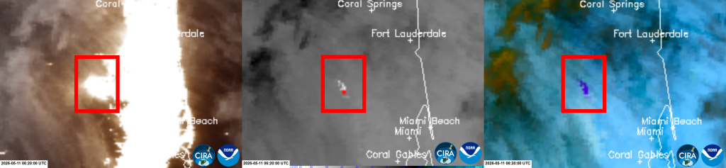
The VIIRS instrument on-board polar-orbiting satellites observed the fire at night at 750-m resolution. In the VIIRS 3-panel imagery comparison below, a red box encapsulates where the Max Road Miramar Fire is located. The VIIRS GeoColor (left) incorporates near-real-time Day/Night Band (DNB) data at night, where it shows the emitted lights produced from the fire, along with the nearby emitted city lights. The VIIRS (M12) 3.7 um (center) and the VIIRS NGFS Microphysics RGB (right) depict the thermal hotspots in white/red pixels in the shortwave infrared and purple pixels in the RGB. Within the red box, the fire hotspots correspond with a subset of emitted lights, indicating that these lights are produced from the fire. Note, lights that do not have a corresponding thermal signature can be inferred as emitted city lights.
VIIRS 3-Panel [GeoColor, M12 – 3.7 um, NGFS Microphysics RGB] at 0620Z, 11 May 2026
The VIIRS Active Fires product also captured the Max Road Miramar Fire, where it displayed numerous fire points in yellow, orange, and red colors that indicate an increasing fire intensity (a.k.a., Fire Radiative Power, expressed in MegaWatts, MW). A sample pixel readout of the product can be seen on 10 May 2026, where the red pixel observed a higher fire intensity of ~179 MW.
NOAA-21 VIIRS Active Fires at 1758Z, 10 May 2026

At the time of this blog entry, no infrastructures were impacted by this brush fire.
Posted in: Uncategorized, | Comments closed
Early May Rocky Mountain Snowstorm
May 8th, 2026 by Jorel TorresA rare winter storm impacted the central Rocky Mountains during early May 2026, bringing heavy wet snow that provided temporary relief to the drought-stricken region. Per NWS WFO Boulder, CO, the winter storm brought substantial snowfall accumulations, where Estes Park, CO, a town embedded within the Front Range Mountains, observed 30+ inches. Below, users can refer to the WFO’s infographic that depicts the observed snowfall totals across northern Colorado along with a video capturing the snowfall in Estes Park (per Denver’s 9News local station).
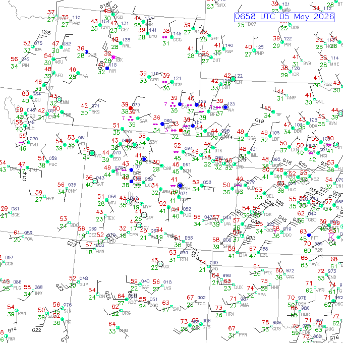
Surface observations highlight the precipitation that fell across southern Wyoming, Colorado and western Kansas over a ~40 hour period. Notice, several weather observation sites transition from rain (dot symbols) and drizzle (curly apostrophe symbols) to snow (asterisk symbols), as the air temperatures gradually get colder and the winter system moves toward the southeast.
Surface observations from 6Z, 5 May 2026 to 23Z, 6 May 2026
During the same timeframe, liquid equivalent, instantaneous snowfall rates, provided by the Snowfall Rate (SFR) product, can be seen below. SFR is derived from multiple passive microwave instruments on-board polar-orbiting satellites, where the product locates the snowfall extent and observes the most intense snowfall rates across the domain. The product fills the observations gaps where radar coverage is poor and or limited, however, exhibits an infrequent temporal resolution.
Snowfall Rate (SFR) observations from 5-6 May 2026
As the winter system passed through the region, geostationary satellites observed the extensive snow cover (seen in green pixels) across the central Rockies, where the snow melted rapidly due to the warmer daytime temperatures. This is most strikingly apparent across southwestern Wyoming.
GOES-19 ABI Day Cloud Phase Distinction RGB from ~15-23Z, 6 May 2026
Zooming in along the Front Range and southeastern Wyoming, JPSS VIIRS instruments observed the snowmelt over a two day period and at 750 meter spatial resolution.
VIIRS Snowmelt RGB daytime images on 6 and 7 May 2026
Posted in: Uncategorized, | Comments closed
Southern Georgia Fires
April 24th, 2026 by Jorel TorresEarlier this week, the National Weather Service (NWS) Atlanta, Georgia, posted a social media infographic describing the significant drought conditions across the state of Georgia, where approximately 90% of the state experienced severe to exceptional drought (i.e., D2 to D4 on the drought intensity scale). Subsequently, these conditions were conducive to fire initiation and spread, where two fires, the Pineland Road Fire and the Brantley Highway 82 Fire, erupted over southern Georgia. The two fires have scorched thousands of acres, forced road closures, and destroyed infrastructure. As of 23 April 2026, the Pineland Road Fire burned ~30,000 acres and the Brantley Highway 82 Fire burned ~4,400 acres (per Watch Duty).
High temporal resolution geostationary satellites observed the fires and corresponding smoke plumes during the afternoon of 21 April 2026. Pictured below, an Advanced GeoColor product named ‘GeoFire’, blends the GeoColor and Fire Temperature products together, where the product imagery depicts the fire hotspots and intensities (i.e., red, orange, yellow and white pixels) while also observing the aerosols and clouds during the daytime. The product is currently accessible on CIRA SLIDER and has a one kilometer spatial resolution.
GOES-19 ABI GeoFire Product observations from 15-20Z, 21 April 2026
At ~19Z, 21 April 2026, a satellite imagery comparison between the GOES-19 ABI Day Fire RGB and the VIIRS Day Fire RGB is shown below. The GOES RGB version exhibits a coarser 2-km spatial resolution compared to 375-m, provided by VIIRS. Although having a coarser temporal resolution, the VIIRS Day Fire RGB depicts the finer details of the active fires (red pixels), the fire perimeter, along with smoke (blue) and clouds (cyan). Enhanced resolution of the rivers, lakes and vegetation can be seen as well.
GOES-19 ABI Day Fire RGB and NOAA-21 VIIRS Day Fire RGB at ~19Z, 21 April 2026
One way users can observe fires at night is via the VIIRS Nighttime Microphysics RGB. The RGB’s main application is to identify cloud types from the low, middle and upper parts of the atmosphere, however, the RGB contains secondary applications, such as fire hotspot detection. At 750-m spatial resolution, fires are captured in dark magenta colors in contrast to the light pink, land surface background. Note, the RGB includes the 3.7 um, that is incorporated into a brightness temperature difference within the green spectra of the dataset. A VIIRS Nighttime Microphysics RGB animation observes the fire hotspots within the white boxes, during the early morning hours of 23 April 2026.
VIIRS Nighttime Microphysics RGB from 0700-0750Z, 23 April 2026
Posted in: Uncategorized, | Comments closed
Mid-March Nebraska Fires
April 17th, 2026 by Jorel TorresApproximately a month ago, several fires erupted across western Nebraska, where the Morrill Fire and the Cottonwood Fire burned ~642,000 acres and 130,000 acres, respectively. An aerial view of the Cottonwood Fire is provided below via social media.
Both fires erupted during the afternoon of 12 March 2026. Smaller fires also ignited in Nebraska, Kansas and western South Dakota during the same time period. The high refresh rate from geostationary satellites captured significant cloud cover across the domain, while the fires appear in white and red pixels at 2-km spatial resolution. In the GOES-19 ABI 3.9 um animation, the Morrill and Cottonwood fire hotspots initiate, rapidly spread to the southeast, then shift to the south, as a gusty cold front approaches from the north. Refer to the 24 hour animation below. The Morrill Fire is located east of Scottsbluff, NE, and south of Alliance, NE, while the Cottonwood Fire was detected to the southeast of North Platte, NE.
GOES-19 ABI 3.9 um from ~15Z, 12 March 2026 to ~15Z, 13 March 2026
During the early morning hours of 13 March 2026, the JPSS NOAA-21 satellite detected the emitted lights from the fires, along with emitted city and town lights, provided by the VIIRS Day/Night Band (DNB). A comparison animation can be seen below, that highlights the nighttime visible imagery and the shortwave infrared to help identify which emitted lights are associated with the fires and which lights correspond with cities. Thermal hotspots and their corresponding emitted lights are observed within the yellow boxes in the animation. Note, emitted lights that do not have a thermal hotspot can be inferred as city lights. Both datasets exhibit 750-m spatial resolutions.
NOAA-21 VIIRS DNB and 3.7 um (M12) comparison at 0810Z, 13 March 2026
Posted in: Uncategorized, | Comments closed