Fog and Low Clouds over Snow Cover in the Midwest: A case from 10 December 2018
January 16th, 2019 by ed szokeAreas of snow cover can often lead to areas of persistent fog and low cloudiness under the right conditions. And determining the areas of fog and low clouds from snow cover can be tricky during the daytime hours. Here we look at a case from 10 December 2018 over the Midwest the snow cover likely contributed to low cloudiness and fog that either was slow to clear or lasted through the day in some areas. We’ll use a couple of CIRA products for this case.
We begin with a look at the extent of low clouds and fog around pre-dawn (1202 UTC on 10 Dec) using the CIRA GeoColor product from GOES-16 displayed using the CIRA SLIDER tool (available at http://rammb-slider.cira.colostate.edu).

GeoColor is not an operational product, but it is available for display on AWIPS and is widely used across the NWS (if you don’t have this product at your WFO and would like to get this product on AWIPS send us an email). In the nighttime city lights are displayed in the background and low clouds (water clouds) or fog are colored blue, while higher (ice) clouds are white. Observations at this time (shown below) suggest that much of the blue area in MN into WI is fog, with more low cloudiness in the area farther to the east.

During the daytime hours GeoColor uses the visible band 2 with a true color background. A look at the GeoColor image at 1802 UTC on 10 Dec shows that it can be hard to distinguish snow from clouds or fog with the visible band during the daytime.

Here is the NOHRSC snow cover analysis for this day.

There are RGB products that can be used to help discriminate clouds from snow (such as the Day Snow/Fog product developed by EUMETSAT. CIRA has developed a product that also discriminates clouds and fog from snow but retains white as the color for the snow cover. The CIRA Snow/Cloud Layer Discriminator product for the same time as the image above is shown below.

The color scale is shown at the bottom of the image. This product is also experimental but should soon be available for AWIPS as well. In this version of the product there is a discrimination made between lower (water) clouds and higher (ice) clouds, adding additional information. This product is for use during the daytime hours, with the image for a couple of hours later showing some breaking up of the low clouds and fog in areas without snow cover but otherwise the low clouds and fog persisting, in fact through the day as shown in the GeoColor image for 2202 UTC.


Posted in: Miscellaneous, | Comments closed
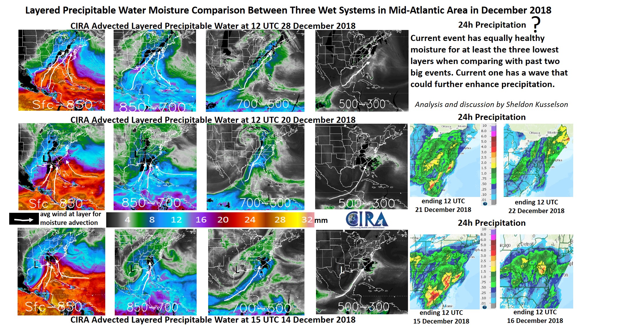
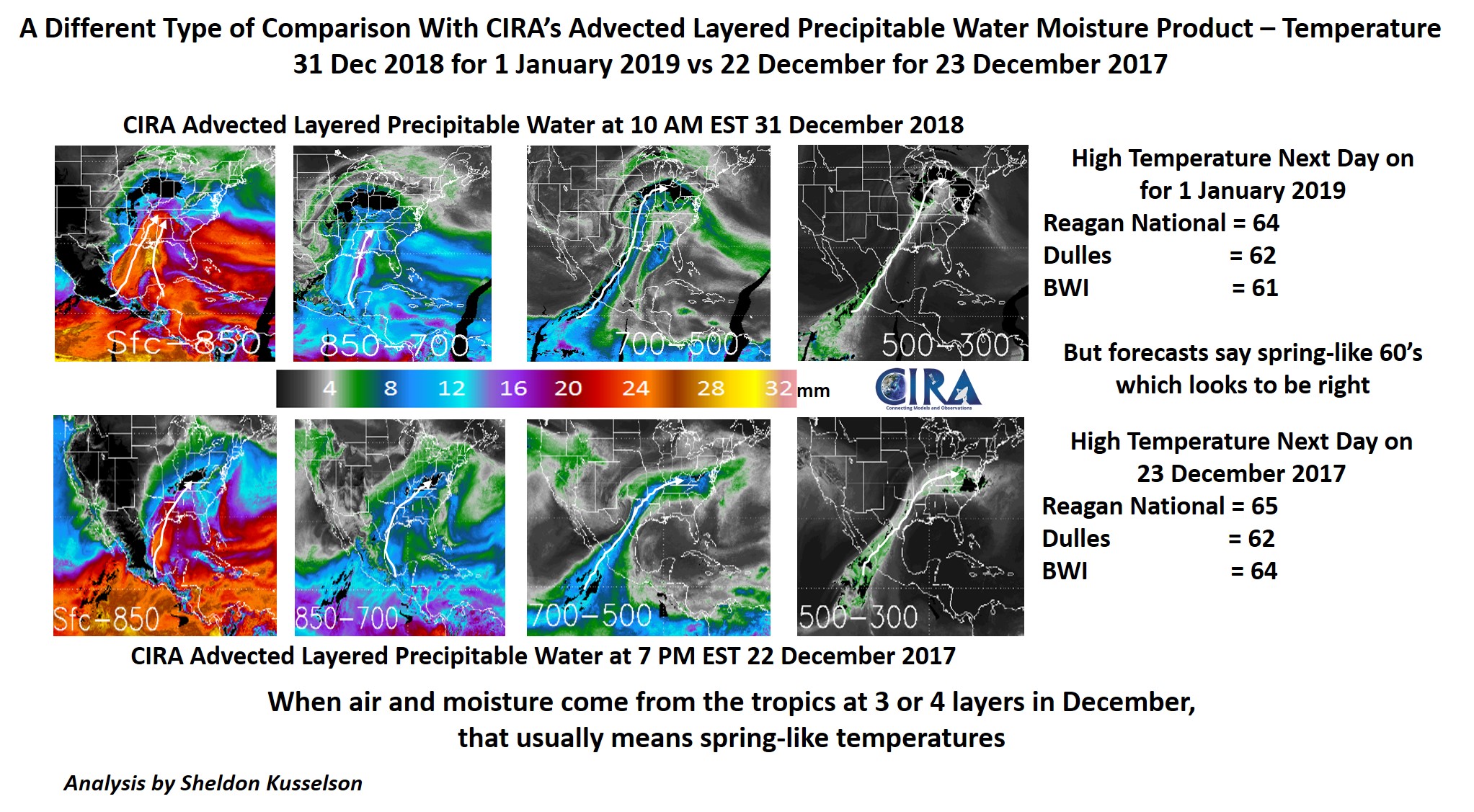
Advected Layer Precipitable Water (ALPW) comparison for events in December 2018 – January 2019
January 2nd, 2019 by Dan Bikos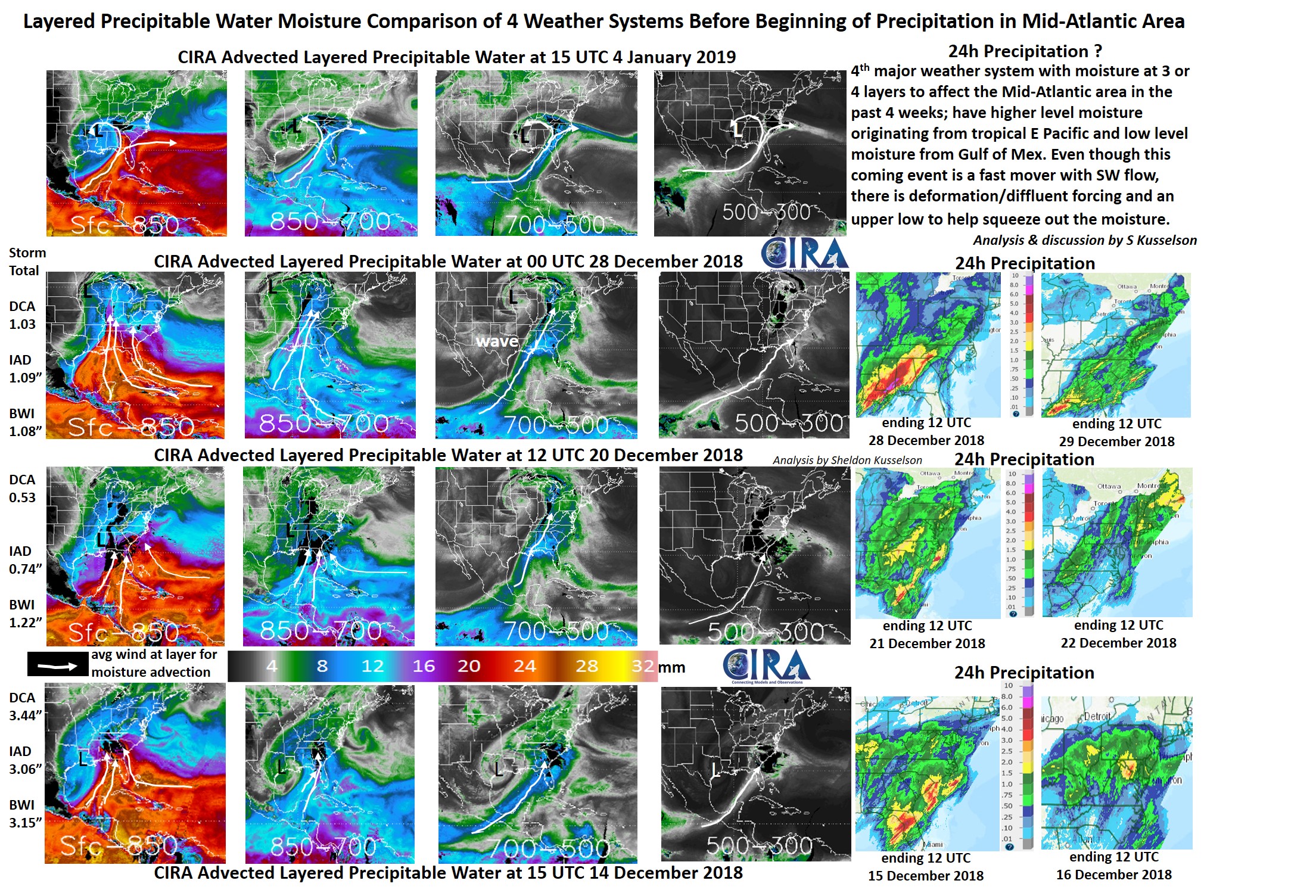
Posted in: Heavy Rain and Flooding Issues, Hydrology, POES, Satellites, | Comments closed
New Mexico Snowstorm
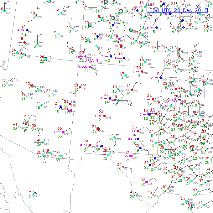
December 28th, 2018 by Jorel TorresDue to an upper-level disturbance passing through the southwestern United States, abundant snowfall has fallen in New Mexico, southwestern Colorado and parts of Texas (see social media snowfall image here). Snow totals range from a few inches to 16 inches at higher elevations. Snowfall has been observed via surface observations and by satellite this morning, 28 December 2018 at ~16Z. Surface observations and satellite images are offset by ~13 minutes.
RAP Real-Time Weather Data – Surface Observations @ 1558Z, 28 December 2018.
Snowfall is observed (i.e. weather station plots displaying purple, asterisk symbols) in parts of New Mexico, Texas, and southwestern Colorado. Multiple asterisks imply heavier snow rates observed by site. Notice, large areas of New Mexico, that do not have surface observations; this is where satellite and radar data are helpful in observing snowfall rates in ‘surface data’- sparse regions.
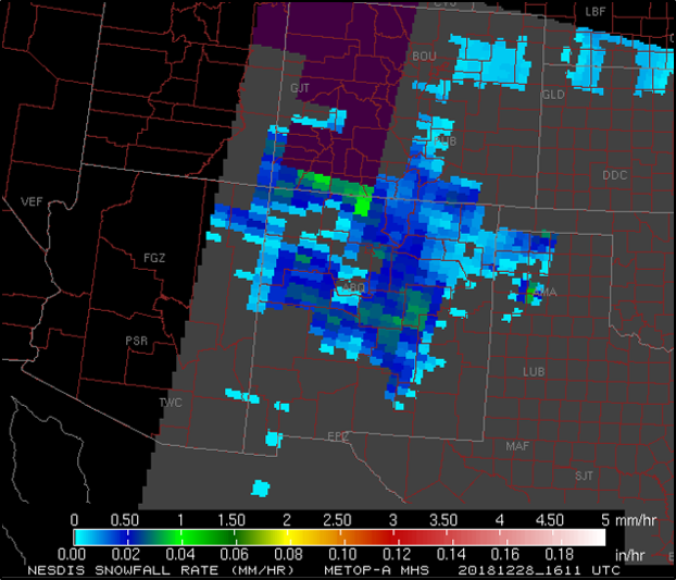
NESDIS Snowfall Rate Product (NASA-SPoRT) – Snowfall Rate Product @ 1611Z, 28 December 2018.
The NESDIS Snowfall Rate Product utilizes microwave snowfall rate data derived from polar-orbiting satellites (e.g. S-NPP, MetOp, DMSP; note more polar-orbiters are implemented into the algorithm). Snowfall rate is shown in ‘liquid equivalent’, displayed in inches per hour, and millimeters per hour. Product utility is in observing snowfall rates in data-sparse regions, and identifying areas of heaviest snow. The image below, highlights the snowfall rate product at approximately 13 minutes after surface observations were observed. Snowfall rate product imagery indicates a widespread distribution of snowfall rates in New Mexico, and the surrounding states, where areas of heaviest snow are indicated in southwestern Colorado, central New Mexico and northern Texas. Maximum values range from 1-1.5 mm/hr or 0.04-0.06 inches/hour.
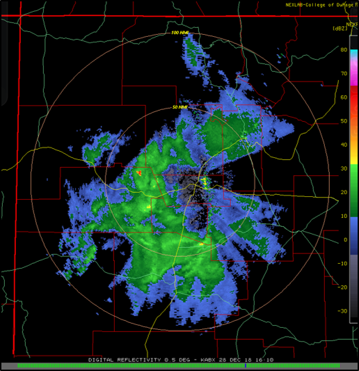
COD Weather – Radar Imagery @ 1610Z, 28 December 2018.
Collocated in time with satellite observations, the Albuquerque, NM radar imagery, shows regions of precipitation (green-to-yellow colors), in this case, areas of snowfall. However, take note that Albuquerque, NM is at high elevation (i.e. ~5300 feet) and is surrounded by high terrain. The Albuquerque, NM radar will interact with mountain ranges that may produce anomalous features (e.g. high dBZ values in an areas where it is not snowing). Radar coverage can also be poor in some areas, due to high terrain blocking radar signals, obscuring ambient atmospheric features.
More snowfall is expected for Albuquerque, NM for the next 24 hours.
Posted in: POES, Winter Weather, | Comments closed
20 December 2018 Heavy Rain event in the Mid-Atlantic area
December 20th, 2018 by Dan Bikos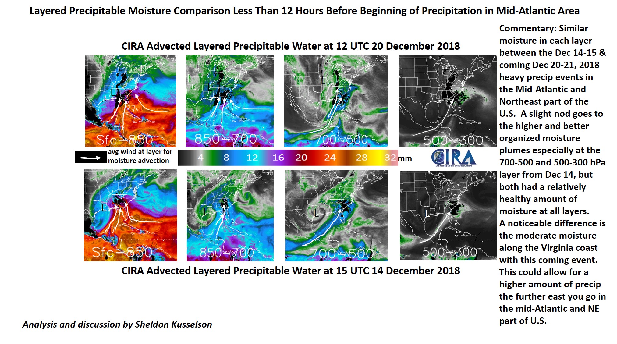
Posted in: Heavy Rain and Flooding Issues, Hydrology, POES, | Comments closed
Advected Layer Precipitable Water (ALPW) for 14 December 2018 event
December 14th, 2018 by Dan Bikos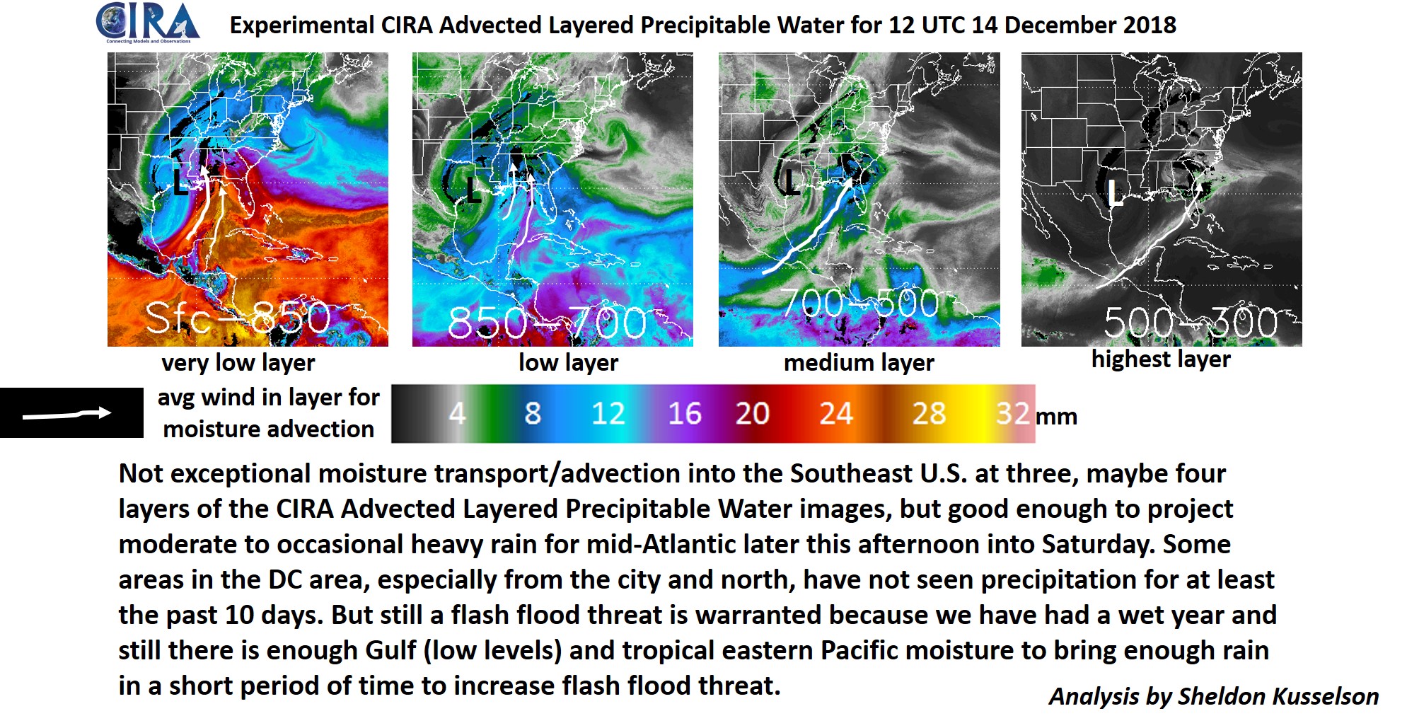
View the ALPW loop here:
Posted in: Heavy Rain and Flooding Issues, Hydrology, POES, | Comments closed